Users abandon websites within seconds when they can’t find what they need.
Information Architecture in UX design determines whether users succeed or fail at their goals. Poor site structure creates confusion, frustration, and lost conversions.
Good IA organizes content logically, labels navigation clearly, and creates pathways that match user mental models.
This guide covers organization systems, navigation design, content modeling, and testing methodologies. You’ll learn proven patterns from Jakob Nielsen and Peter Morville, discover tools like OptimalSort and Treejack, and understand how taxonomy development and metadata architecture support findability.
Whether designing websites, mobile apps, or enterprise systems, these principles help users reach their destination.
What is Information Architecture?
Information Architecture is the structural design of shared information environments.
It organizes, labels, and connects content so users find what they need without confusion.
Information Architecture combines organizational schemas, labeling systems, navigation structures, and search functionality into a cohesive framework that supports user goals.
Jakob Nielsen and Peter Morville pioneered modern IA methodology in the late 1990s, establishing it as a distinct discipline within user experience design.
The practice emerged from library science and information retrieval theory but evolved into something uniquely suited for digital interfaces.

Core Components of Information Architecture
Organization Systems in Information Architecture
Organization systems determine how content groups together.
Hierarchical structures arrange information from general to specific, creating parent-child relationships that mirror mental models.
Sequential structures guide users through ordered steps. Matrix structures let users navigate through multiple pathways. Database structures store content with flexible retrieval options based on user queries.
Exact organizational schemes include alphabetical ordering, chronological timelines, and geographical grouping.
Ambiguous schemes rely on topic-based categories, task-oriented groupings, audience-specific sections, and metaphor-driven structures that connect familiar concepts to new interfaces.
Navigation Systems for User Interfaces
Navigation connects content pieces and provides wayfinding.
Global navigation appears consistently across an entire site. Local navigation changes based on section context. Contextual navigation offers related links within content itself.
Supplementary navigation includes search bars, sitemaps, and utility links.
Breadcrumb navigation shows the current page’s position within the site hierarchy. Visual hierarchy principles determine which navigation elements receive prominence.
Faceted navigation systems let users filter content through multiple dimensions simultaneously.
Footer navigation typically contains legal links, contact information, and secondary page access.
Labeling Systems in Digital Products
Labels communicate content categories to users.
Textual labels use words or short phrases. Icon-based labels rely on visual symbols. Contextual labels adapt based on user location or behavior.
Index terms create connections between related content pieces.
Label consistency prevents confusion (users shouldn’t see “Products,” “Items,” and “Goods” referring to the same category).
Label brevity matters because attention spans drop with verbose navigation options.
Search Systems
Search interfaces let users query content directly rather than browsing.
Search algorithm selection determines result quality and relevance ranking.
Query-based retrieval responds to user input. Browse-based retrieval suggests content through structured exploration.
Search result presentation includes snippets, filtering options, and sort controls.
Auto-suggest functionality reduces query typing and guides users toward successful searches.
Filters refine large result sets through characteristics like date ranges, categories, or price brackets.
Information Architecture Methodologies
Card Sorting Techniques
Card sorting reveals how users naturally group content.
Open card sorting lets participants create their own category names and structures.
Closed card sorting asks users to organize items into predefined categories.
Hybrid approaches combine both methods (users sort into existing categories but can suggest new ones).
Remote card sorting through platforms like OptimalSort generates data from distributed participants. In-person sessions provide richer qualitative insights through observation and follow-up questions.
Research from Nielsen Norman Group indicates 15-30 participants produce reliable patterns in most card sorting studies.
Analysis identifies agreement levels, category stability, and terminology preferences across participant groups.
Tree Testing Methods

Tree testing validates navigation structures before visual design.
Participants receive text-based hierarchies and complete specific tasks.
Task completion rates measure whether users find target content. Directness scores track how efficiently users navigate (fewer wrong turns indicate better structure).
Success metrics combine completion rates with path efficiency.
Time-on-task measurements reveal friction points in the hierarchy.
First-click analysis shows where users initially expect to find information (often the most predictive metric for task success).
User Research for Information Architecture
User research informs IA decisions through direct input.
User interviews uncover mental models and vocabulary preferences.
Contextual inquiry observes users in their natural environment.
Surveys and questionnaires gather quantitative data about content priorities and findability issues.
Analytics analysis reveals actual user behavior patterns across existing sites.
Heatmap studies visualize where users click and how far they scroll.
Session recordings capture specific user journeys and pain points.
Information Architecture Planning Process
Content Inventory Creation
Content inventory catalogs every piece of existing content.
Content audit procedures systematically document URLs, page titles, content types, and metadata.
Qualitative assessment evaluates content usefulness, accuracy, and tone.
Quantitative metrics track page views, time-on-page, and conversion rates.
Content gap identification reveals missing topics or underserved user needs.
Content duplication detection finds redundant information that confuses users and dilutes SEO value.
Content Analysis
Content analysis structures information for systematic organization.
Content categorization groups similar items using consistent criteria.
Metadata schema development creates standardized descriptive fields.
Taxonomy creation builds hierarchical classification systems (broad categories subdividing into specific topics).
Controlled vocabulary establishment limits terminology variations. Users searching “automobile,” “car,” or “vehicle” should reach identical results.
Tagging systems provide flexible classification beyond rigid hierarchies.
Sitemap Development
Sitemaps visualize site structure before development.
Visual sitemap creation maps page relationships and navigation pathways.
Page hierarchy definition determines content depth and breadth.
URL structure planning creates logical, readable web addresses that support SEO and usability.
Relationship mapping shows how pages connect through links and conceptual associations.
Wireframe Integration
Wireframes translate information architecture into visual layouts.
Low-fidelity wireframes sketch basic structure without design elements like color or typography.
High-fidelity wireframes include detailed component placement and interaction patterns.
Navigation wireframes specifically focus on menu structures and wayfinding elements.
Interactive wireframes allow stakeholders to click through proposed structures and test user flows.
Information Architecture Patterns
Hub and Spoke Pattern
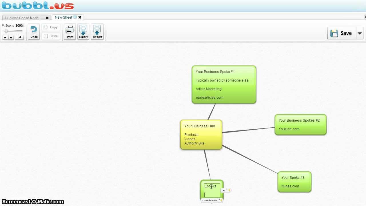
Hub and spoke centers users around a main dashboard or homepage.
Specialized sections branch off from this central point. Users return to the hub between tasks rather than moving laterally between sections.
Works well for applications with distinct functional areas (email, calendar, and documents each accessible from a unified home screen).
Nested Doll Pattern
Nested doll architecture progressively reveals detail through hierarchical layers.
Each level provides more specific information than the previous one.
Common in e-commerce (categories → subcategories → product listings → individual products).
Users drill down through increasing specificity until reaching target content.
Bento Box Pattern
Bento box layouts display multiple content types simultaneously.
Named after Japanese lunch boxes with separate compartments.
Dashboards frequently use this pattern to show different data streams in organized panels.
Each compartment functions independently while contributing to overall information density.
Filtered View Pattern
Filtered view architectures present large datasets with refinement controls.
Users start with comprehensive results then narrow through faceted filters.
Job boards, real estate sites, and product catalogs rely on this pattern.
Multiple filter dimensions work together (location + price + size + features).
Dashboard Pattern
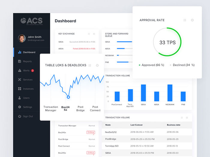
Dashboard information architecture aggregates key information in a single interface.
Metrics, charts, and quick actions appear together for at-a-glance comprehension.
Prioritizes the most important data points while providing drill-down access to detailed views.
Effective dashboards balance information density with cognitive load considerations.
Information Architecture for Different Platforms

Website Information Architecture
Websites require multi-level navigation depth.
Research from the Information Architecture Institute suggests three levels maximum for optimal user success rates.
Mega menu structures display multiple navigation levels simultaneously, reducing clicks to deep content.
Homepage architecture balances promotional content with navigation clarity.
Landing page structures focus on single conversion goals with minimal navigation distraction.
Mobile App Information Architecture
Mobile constraints demand simplified navigation.
Tab bar navigation works best with 3-5 primary sections (iOS Human Interface Guidelines specify five maximum).
Hamburger menus hide navigation but reduce discoverability by 40% according to Nielsen Norman Group studies from 2016.
Bottom navigation patterns keep critical functions within thumb reach.
Gesture-based navigation leverages swipes and long-presses for efficiency.
Enterprise Information Architecture
Enterprise systems serve multiple departments with complex permission structures.
Role-based content access shows different navigation based on user credentials.
Multi-department structures require careful taxonomy to prevent siloed information.
Cross-functional navigation connects related content across organizational boundaries.
E-commerce Information Architecture
Product categorization creates browsing pathways.
Faceted search implementation lets shoppers filter by price, brand, size, color, and features simultaneously.
Checkout flow architecture minimizes steps while collecting necessary information.
Account management structures separate order history, wishlists, payment methods, and preferences.
Information Architecture and Findability
Search Engine Optimization Integration
URL structures support both users and search engines.
Descriptive URLs (designyourway.net/blog/information-architecture-ux) beat cryptic ones (designyourway.net/p=12345).
Internal linking architecture distributes authority and creates semantic relationships between pages.
Breadcrumb implementation provides navigational context and structured data for search results.
Schema markup enhances search engine understanding of content relationships.
Metadata Architecture
Metadata describes content characteristics.
Dublin Core metadata standards provide fifteen core elements including title, creator, subject, and date.
Custom metadata schemas extend standard fields with domain-specific attributes.
Metadata inheritance lets child pages automatically adopt parent characteristics.
Controlled vocabularies ensure consistent terminology across metadata fields.
Taxonomy Development
Taxonomies classify content hierarchically.
Flat taxonomies use single-level categories. Hierarchical taxonomies nest categories within parent topics.
Polyhierarchical structures allow items to exist in multiple classification paths simultaneously.
Faceted taxonomies organize content through multiple independent dimensions.
Tag-based classification offers flexible categorization without rigid hierarchy.
Information Architecture Documentation
Sitemap Documentation Standards
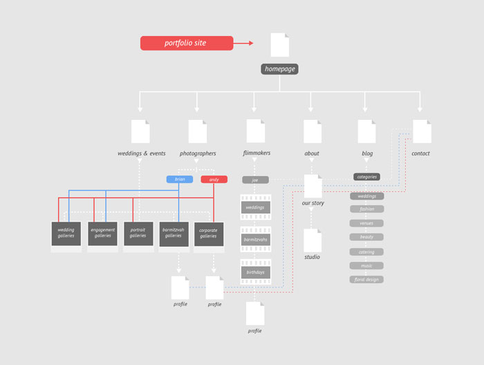
Documentation communicates IA decisions to stakeholders and developers.
Visual sitemap formats use boxes and connecting lines to show page relationships.
Annotated sitemaps include notes about page purpose, content requirements, and functionality.
URL mapping documents connect conceptual structure to actual web addresses.
Page relationship diagrams illustrate content connections beyond hierarchical structure.
Wireflow Documentation
Wireflows combine wireframes with user flows.
User flow diagrams map possible paths through the interface.
Task flow mapping shows specific goal-oriented sequences.
Decision trees visualize conditional navigation based on user choices.
Interaction specifications detail hover states, transitions, and feedback mechanisms.
Navigation Specification Documents
Navigation specs define behavior across states and contexts.
Navigation behavior rules describe what happens on click, hover, and focus.
State definitions clarify active, inactive, and disabled navigation appearances.
Responsive navigation specifications explain mobile versus desktop implementations.
Accessibility requirements ensure keyboard navigation and screen reader compatibility.
Information Architecture Testing and Validation
Usability Testing for IA
Testing validates whether users can complete tasks using the proposed structure.
Task-based testing scenarios simulate real user goals within the navigation system.
Success rates above 78% indicate acceptable navigation (based on User Experience Professionals Association benchmarks).
Time-on-task analysis identifies friction in information paths.
Error rate tracking reveals where users get lost or confused.
A/B Testing Navigation Structures
Split testing compares competing IA approaches.
Navigation placement tests evaluate horizontal versus vertical menus.
Label effectiveness tests determine which terminology resonates with users.
Menu structure variations compare shallow-wide versus deep-narrow hierarchies.
Search versus browse preferences reveal primary user behavior patterns.
Analytics-Driven IA Optimization
Analytics expose actual user behavior versus intended paths.
Navigation click tracking shows which menu items get used and which get ignored.
Search query analysis reveals terminology mismatches and content gaps.
Bounce rate by entry point identifies pages that fail to meet expectations.
Exit page analysis pinpoints where users abandon their journey.
Path analysis through site maps common user journeys versus designed flows.
Information Architecture Principles
Cognitive Load Reduction
Cognitive load measures mental effort required to use an interface.
Miller’s Law states working memory holds 7±2 items, suggesting navigation groups should stay within this range.
Research by Jakob Nielsen demonstrates users can effectively process 5-9 menu items before experiencing decision paralysis.
Chunking related items reduces perceived complexity.
Progressive Disclosure
Progressive disclosure reveals complexity gradually.
Initial views show essentials while hiding advanced options behind secondary clicks.
Studies from 2018 show staged information reduces task completion time by 22-35%.
Accordion patterns, expandable sections, and drill-down navigation apply this principle.
Consistency and Standards
Consistency reduces learning curves.
Label usage deviation below 10% maintains predictability across the interface.
Standardized navigation placement creates muscle memory (top horizontal bar, left sidebar, bottom tab bar).
Pattern library maintenance ensures components behave identically across contexts.
Design system integration connects IA decisions to reusable interface elements.
Information Architecture for Accessibility
WCAG Guidelines for Navigation

Web Content Accessibility Guidelines establish navigation requirements.
Keyboard navigation must support all interactive elements through tab, arrow, and enter keys.
Screen reader compatibility requires semantic HTML and ARIA landmarks.
Skip navigation links let keyboard users bypass repetitive menus.
ARIA landmarks (navigation, main, complementary) structure content for assistive technology.
Accessible Label Writing
Labels must work without visual context.
Descriptive link text communicates destination (avoid “click here” or “read more”).
Clear heading hierarchies (H2, H3, H4) create logical document structure.
Alt text for navigation icons ensures screen readers can announce functionality.
Meaningful page titles help users understand location and purpose.
Information Architecture and Content Strategy
Content Modeling
Content models define structure across content types.
Content type definitions specify fields, formats, and relationships for articles, products, events, and other entities.
Field-level specifications determine data types, character limits, and validation rules.
Relationship modeling connects content pieces (articles tag authors, products belong to categories).
Reusability planning lets content blocks appear in multiple contexts without duplication.
Structured Content Architecture
Structured content separates information from presentation.
Modular content blocks can rearrange across layouts and devices.
Component-based structures treat each interface piece as an independent, reusable unit.
Content APIs deliver structured data to multiple channels (web, mobile, voice assistants).
Headless CMS architecture stores content separately from display layer.
Common Information Architecture Mistakes
Overly Deep Hierarchies
Deep structures force excessive clicking.
Research from 2017 indicates optimal depth ranges from 2-4 levels, with user abandonment rising 15% per additional level beyond four.
Three-click rule (now debunked but still influential) suggests users should reach any page within three clicks.
Balance breadth and depth based on content volume and user mental models.
Unclear Labeling
Ambiguous labels frustrate users.
Jargon in navigation assumes expertise users may lack. Made-up terminology forces users to guess meaning.
Inconsistent terminology (switching between “Account,” “Profile,” and “Settings” for the same concept) creates confusion.
Overly creative labels prioritize cleverness over clarity.
Poor Mobile IA Translation
Desktop structures don’t automatically work on mobile.
Forcing horizontal navigation onto small screens creates usability problems.
Missing mobile-specific features like sticky headers or floating action buttons waste opportunities.
Inadequate touch target sizes cause mis-clicks and frustration.
Ignoring User Mental Models
Users arrive with expectations shaped by other sites and experiences.
Mental models research from Don Norman shows users expect certain patterns (shopping carts in the top right, search in the header).
Fighting conventions requires extraordinary justification. Studies indicate 62% of users expect standard navigation patterns.
Information Architecture Tools
| Tool Name | Primary Use Case | Key IA Features | Collaboration Model |
|---|---|---|---|
| Figma | UI/UX design with information architecture capabilities for wireframing and user flow mapping | Interactive prototypes, component libraries, user flow diagrams, design systems, vector-based wireframes | Real-time multiplayer editing with live cursors, comments, version history |
| Miro | Visual collaboration platform for brainstorming, journey mapping, and site structure planning | Infinite canvas, mind maps, user journey templates, card sorting frameworks, affinity diagrams | Unlimited team members, asynchronous collaboration, video chat integration, presentation mode |
| FlowMapp | Website planning tool specialized in sitemaps, user flows, and customer journey documentation | Visual sitemaps, user flow builders, content planning boards, personas creation, CMS integration exports | Team workspaces, client access controls, stakeholder review links, commenting system |
| Lucidchart | Diagramming software for flowcharts, org charts, and technical architecture documentation | Drag-and-drop interface, shape libraries, data linking, conditional formatting, automation features | Cloud-based sharing, real-time co-editing, integration with Slack and Microsoft Teams, permissions management |
| OmniGraffle | Precision diagramming application for macOS and iOS focused on detailed wireframes and blueprints | Stencils for IA patterns, layers management, precise alignment tools, export to multiple formats, custom styling | Desktop-first with cloud sync, shared layers, file versioning, limited real-time collaboration |
| Whimsical | Fast diagramming tool for wireframes, flowcharts, and mind maps with minimal learning curve | Lightweight wireframing, quick flowcharts, sticky notes, docs integration, keyboard shortcuts | Real-time multiplayer mode, guest access, commenting threads, unified workspace for teams |
| Axure RP | Advanced prototyping software for complex interactive prototypes with conditional logic and variables | Dynamic panels, adaptive views, repeater widgets, conditional flows, specification documentation generation | Team project sharing, SVN integration, review mode with annotations, password-protected prototypes |
| Octopus.do | Sitemap generator focused on website structure planning and content hierarchy visualization | Automated sitemap creation, hierarchical tree views, page properties, SEO metadata fields, XML sitemap exports | Team collaboration, client presentation mode, shareable links, feedback collection, project management |
Diagramming Software
Figma handles wireframes, prototypes, and sitemaps in one tool.
Sketch pioneered modern interface design workflows.
Adobe XD integrates with Creative Cloud.
Miro excels at collaborative remote workshops.
Lucidchart specializes in flowcharts and diagrams. OmniGraffle offers Mac-native diagramming.
IA-Specific Tools
OptimalSort conducts card sorting studies with remote participants.
Treejack tests navigation structures through task-based scenarios.
XMind creates mind maps for brainstorming taxonomy structures.
Dynomapper generates visual sitemaps from existing websites.
Research and Testing Platforms
UserTesting connects researchers with participants for remote studies.
Maze tracks click paths and task completion in interactive prototypes.
UsabilityHub runs quick tests for first-click, preference, and five-second studies.
Hotjar combines heatmaps, recordings, and surveys in one platform.
Information Architecture Career Skills
Technical Skills
UX research methodologies including interviews, surveys, and usability testing form the foundation.
Wireframing proficiency in Figma, Sketch, or Adobe XD translates concepts to visuals.
Prototyping tools demonstrate interactive behavior before development.
Analytics platforms (Google Analytics, Mixpanel) reveal actual user behavior patterns.
HTML/CSS basics help understand technical constraints and possibilities.
CMS platforms (WordPress, Contentful, Drupal) shape content structure decisions.
Soft Skills
Stakeholder communication translates user needs into business language.
Workshop facilitation guides teams through card sorting and collaborative exercises.
User empathy interprets behavior and feedback accurately.
Systems thinking connects individual decisions to broader patterns.
Problem decomposition breaks complex structures into manageable components.
FAQ on Information Architecture
What is the difference between information architecture and UX design?
Information architecture focuses specifically on organizing, labeling, and structuring content within digital products.
UX design encompasses the entire user experience including IA, visual design, interaction design, and usability testing. IA serves as one component within the broader UX discipline.
How do you create an information architecture for a website?
Start with content inventory and user research to understand needs and mental models.
Conduct card sorting to reveal natural groupings. Develop taxonomy and navigation systems based on findings. Create sitemaps and wireframes. Validate through tree testing and usability studies.
What tools do information architects use?
Figma and Sketch handle wireframing and visual sitemaps.
OptimalSort conducts card sorting studies. Treejack tests navigation structures through task scenarios.
Miro facilitates collaborative workshops. Analytics platforms like Google Analytics reveal actual user behavior patterns for optimization.
How deep should website navigation be?
Research indicates 2-4 levels work best for most sites.
Each additional level beyond four increases user abandonment by approximately 15%. Balance breadth and depth based on content volume and user mental models rather than arbitrary click counts.
What is card sorting in information architecture?
Card sorting reveals how users naturally categorize and label content.
Participants organize topics into groups that make sense to them. Open card sorting lets users create category names. Closed card sorting uses predefined categories. Results inform taxonomy development.
How does information architecture affect SEO?
Logical URL structures help search engines understand content relationships.
Internal linking architecture distributes authority across pages. Breadcrumb navigation provides structured data for rich results.
Clear hierarchies improve crawlability and indexation. Effective IA reduces duplicate content issues.
What is the difference between taxonomy and ontology?
Taxonomy classifies content hierarchically through parent-child relationships.
Ontology defines relationships between concepts beyond hierarchy. Taxonomies answer “what categories exist.” Ontologies explain how entities relate, interact, and depend on each other semantically.
How do you test information architecture?
Tree testing validates navigation structure through task-based scenarios.
Usability testing observes users completing real goals. First-click tests measure whether users initially navigate correctly.
Analytics track navigation clicks, search queries, and exit patterns revealing structural problems.
What makes good navigation labels?
Clear labels use familiar terminology without jargon or ambiguity.
Consistency prevents confusion across the interface. Brevity improves scannability and comprehension.
Descriptive text communicates destination accurately. Labels should work without visual context for accessibility.
How does mobile information architecture differ from desktop?
Mobile requires simplified navigation due to screen constraints.
Touch targets need larger hit areas. Progressive disclosure becomes critical for managing limited space. Bottom navigation keeps frequent actions within thumb reach. Gesture-based patterns supplement traditional menus.
Conclusion
Information Architecture in UX design transforms chaotic content into intuitive experiences that users can navigate effortlessly.
Effective site structure combines organizational schemas, labeling systems, and search functionality into cohesive wayfinding mechanisms. Card sorting and tree testing validate decisions before development costs accumulate.
Tools like Figma, OptimalSort, and Treejack streamline the design process while analytics reveal actual user behavior patterns.
Whether building hierarchical structures for e-commerce or hub-and-spoke patterns for enterprise applications, strong IA reduces cognitive load and supports findability. Peter Morville and Louis Rosenfeld established principles that remain relevant across platforms.
Master taxonomy development, content modeling, and wireframe integration to create digital products users actually understand. Good navigation architecture separates successful interfaces from abandoned ones.

Renowned for his expertise in logo design and visual branding, Bogdan has developed a multitude of logos for various clients.
His skills extend to creating posters, vector illustrations, business cards, and brochures. Additionally, Bogdan's UI kits were featured on marketplaces like Visual Hierarchy and UI8.
He also wrote in the past years on sites like Design Your Way, WebDesignerDepot, WPDean, Designmodo, Speckyboy, Slider Revolution, and more.
- The Substack Logo History, Colors, Font, And Meaning - 2 October 2026
- How UX Design Impacts SaaS User Retention and Churn - 1 October 2026
- How to Embed Fonts in PDF for Reliable Printing - 30 September 2026

Bogdan Sandu is a seasoned designer who has been designing websites since 2008. Renowned for his expertise in logo design and visual branding, Bogdan has developed a multitude of logos for various clients. His skills extend to creating posters, vector illustrations, business cards, and brochures. Additionally, Bogdan's UI kits were featured on marketplaces like Visual Hierarchy and UI8. He also wrote in the past years on sites like Design Your Way, WebDesignerDepot, WPDean, Designmodo, Speckyboy, Slider Revolution, and more.
You Might Also Like