


You designed it in RGB, approved it on screen, and sent it to print. Then the colors came back wrong. That gap between screen and paper almost always traces back to one missing piece: a print color profile.
A print color profile is a standardized ICC file that tells your printer exactly how to interpret and reproduce color. It is the foundation of any reliable color management workflow.
This guide covers what color profiles are, how they work, which types exist, and how to use them correctly in software like Adobe Photoshop and InDesign.
By the end, you will know how to avoid the most common color accuracy mistakes before your file ever reaches the press.
What is a Print Color Profile
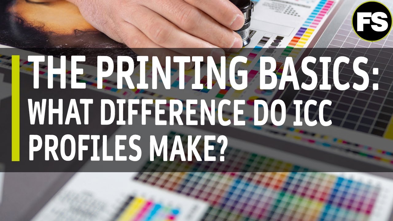
A print color profile is a standardized data file that describes how a specific device captures or reproduces color. It acts as a translation layer between your digital file and the physical output, telling the printer exactly how to interpret color values so the result matches your intent.
These files follow the ICC format (.icc or .icm), a cross-platform standard created and maintained by the International Color Consortium. Every device in your workflow, from your monitor to your press, can have its own profile.
Color profile files map values from a source color space to a destination color space. Without this mapping, a red that looks vivid on screen can print as muddy, shifted, or completely wrong.
Industry data shows standardized color proofing for print workflows reduce customer complaints by 40-60% and cut ink waste by 8-12% (SIM Printing Supplies). That gap between expectation and output is exactly what a print color profile closes.
The color management software market was valued at USD 1.2 billion in 2024 and is projected to reach USD 2.5 billion by 2033, with the printing industry capturing roughly 40% of that market in 2023 (Verified Market Reports). Color accuracy is no longer optional for competitive print operations.
—
How Color Profiles Work
Every device sees color differently. A Canon inkjet, an Epson wide-format printer, and an offset press all reproduce the same CMYK values in slightly different ways. Color profiles solve this by providing a common reference.
The Profile Connection Space
The Profile Connection Space (PCS) is the neutral intermediary that makes device-independent color possible. It uses either CIELAB (Lab*) or CIEXYZ as its reference.
Here is the basic flow:
- Source device profile converts file colors into PCS values
- PCS serves as the neutral reference point
- Destination profile converts PCS values into the output device’s color language
The Color Management System (CMS) handles this translation automatically. In most print workflows, the CMS is built into Adobe Photoshop, InDesign, or the RIP (Raster Image Processor) driving the press.
Rendering Intents
When source colors fall outside what the output device can reproduce, the profile needs a rule for handling them. That rule is the rendering intent.
| Rendering Intent | What It Does | Best For |
| Perceptual | Compresses all colors proportionally to fit output gamut | Photographs with saturated colors |
| Relative Colorimetric | Clips out-of-gamut colors; adjusts white point | General print use, solid colors |
| Absolute Colorimetric | Simulates source white point on output device | Hard proofing, press simulation |
| Saturation | Pushes colors to maximum saturation | Logos, vector graphics, charts |
FOGRA recommends D50 (M1) measurement conditions as the standard for building general-purpose ICC profiles. Most press profiles in Europe are built under these conditions.
A 2024 print industry survey found uncalibrated systems waste up to 30% more materials through reprints and adjustments (BJPDS). The rendering intent choice is one of the least understood variables contributing to that waste.
How Adobe Applications Use Profiles
Assign vs. Convert: two different operations that designers routinely confuse.
Assigning a profile tags the file with color space information without changing the actual numbers. Converting a profile changes the underlying color values to match the destination space. In Photoshop, Edit > Assign Profile and Edit > Convert to Profile are separate menu items for a reason.
InDesign and Illustrator handle profiles at export. When you export a press-ready PDF, the color settings you have configured determine whether profiles get embedded, converted, or stripped.
—
ICC Profiles vs. Other Color Standards
ICC profiles are not the only system for managing print color, but they are the most widely adopted cross-platform standard. Understanding where they fit next to other standards matters for any print workflow.
ICC vs. Proprietary Profiles
Printer manufacturers like Epson and Canon supply their own profiles for specific ink and paper combinations. These are technically ICC profiles, but they are built and optimized for that manufacturer’s hardware.
The difference is control. A proprietary profile from Epson works well if you never change paper or ink. The moment you switch substrates or use third-party consumables, you need a custom-built ICC profile to maintain accuracy.
ICC v2 vs. ICC v4
ICC v2 is older and more widely supported across legacy software and hardware. ICC v4 handles perceptual rendering intent more precisely and uses a different black point handling method. Most modern profiling software like X-Rite i1Profiler generates v4 profiles by default, but some older RIPs still read v2 more reliably.
Worth knowing: not all software renders ICC v4 perceptual intent the same way. Profiling vendors each implement it slightly differently, which is one reason two v4 profiles can produce different results even from the same data.
Relationship to Color Space Standards
| Standard | Type | Common Use |
| sRGB | Color space | Web, consumer devices |
| Adobe RGB | Color space | Professional photography, pre-press |
| FOGRA39 | Press profile | Coated offset, European standard |
| FOGRA51 | Press profile | Updated coated offset, ISO 12647-2:2013 |
| GRACoL 2006 | Press profile | Coated offset, North American standard |
| SWOP | Press profile | Web offset publications, US magazines |
FOGRA51 replaced FOGRA39 as the European coated paper standard following updated ISO 12647-2:2013 requirements. Many print shops still use FOGRA39 for legacy jobs, though the newer profile reflects how modern coated papers actually behave.
—
Types of Print Color Profiles
Not all ICC profiles do the same job. They are categorized by the type of device or workflow they describe.
Input Profiles
Input profiles describe how a capture device sees color. Scanners and cameras each have their own gamut and response curve, and an input profile maps that device’s output into a standard working color space like Adobe RGB or sRGB.
These are most relevant in pre-press workflows where scanned artwork or photography feeds directly into print production.
Display Profiles
Monitor calibration is where display profiles live. A display profile describes how your screen reproduces color, and it is what makes monitor calibration for print meaningful.
Without an accurate display profile, soft proofing is pointless. You are comparing your file against a screen that is not showing you accurate color to begin with. This is one of those basics that gets skipped constantly in smaller studios.
Output Profiles
Output profiles are the most directly relevant to print production. They describe a specific printer, ink set, and substrate combination. Change any one of those variables and you need a different profile.
- Desktop inkjet: separate profiles for matte, glossy, fine art paper
- Offset press: FOGRA39, FOGRA51, GRACoL 2006 for standardized production
- Wide-format: per-substrate profiles for banner, canvas, backlit film
Device Link Profiles
Device Link profiles are a separate class. Instead of routing through the PCS, they map directly from one device’s color space to another. This is a one-step conversion rather than two.
The practical advantage: better ink coverage control and more predictable black generation when converting from RGB to CMYK. Packaging workflows and large commercial printers use Device Link profiles heavily because they give tighter control over total ink limits.
—
Where Print Color Profiles Are Used
Print color profiles show up at almost every point in a professional print workflow. The specific profile type and standard depends on the output context.
Desktop Inkjet Printing
This is where most designers first encounter ICC profiles. Epson, Canon, and HP all provide free downloadable profiles for their printers paired with specific paper types.
The catch is that these generic profiles are built under average conditions. If your printer is aging, your ink is from a different batch, or you are using third-party paper, the manufacturer profile may not give you accurate results. Custom profiling with a spectrophotometer like the X-Rite i1 gives noticeably better results for critical output.
Commercial Offset Printing
ISO 12647-2 compliance is the benchmark for commercial sheet-fed and web offset printing. Print shops working to this standard use FOGRA or GRACoL profiles to characterize their presses and maintain consistent output across runs.
For multinational brand clients, ICC profiles with defined Delta E tolerances achieve over 95% color consistency across facilities in different countries (SIM Printing Supplies). That kind of consistency is not achievable without standardized color profiles at every site.
Wide-Format and Signage
Wide-format printing introduces extra variables: UV inks, solvent inks, latex inks, each on dozens of possible substrates. A profile built for one combination simply does not transfer to another.
Operators typically maintain a library of profiles, one per media type per printer. It is time-consuming to build but necessary for consistent output on jobs like retail signage, trade show graphics, and vehicle wraps where brand color accuracy is contractually required.
Soft Proofing in Adobe Applications
Soft proofing uses a print output profile to simulate press output on screen. In Photoshop, View > Proof Setup lets you load any installed ICC profile and preview how your file will look when printed to that specific device and substrate.
This only works reliably when your display profile is accurate. Soft proofing on an uncalibrated monitor gives you a false sense of confidence. It is one of the more common ways designers send files to print expecting one result and getting another.
—
How to Install and Assign a Print Color Profile
Getting a profile onto your system and into your workflow is straightforward. The part most people get wrong is understanding when to assign versus when to convert.
Where to Get Profiles
Manufacturer websites are the first stop for desktop printer profiles. For press-standard profiles, the main sources are:
- printing.org (IDEAlliance) for GRACoL and SWOP profiles
- fogra.org for FOGRA39, FOGRA51, and related standards
- eci.org (European Color Initiative) for ECI RGB and ISO Coated profiles
- Paper and ink manufacturers for substrate-specific custom profiles
Installing on Windows and macOS
Windows: right-click the .icc or .icm file and select “Install Profile.” This copies it to the system color folder at C:WindowsSystem32spooldriverscolor.
macOS: double-click the profile file and click Install, or drag it to /Library/ColorSync/Profiles for system-wide access. Once installed, the profile appears in any application’s color settings.
Assigning vs. Converting
This is where mistakes happen. The distinction matters.
Assign: tags the file with a color profile without changing the actual pixel values. Use this when the file’s color space is mislabeled or unknown.
Convert: recalculates all pixel values to match the destination profile. The numbers change, but the appearance stays as close as possible to the original. Use this when preparing files for a specific output device.
For print-ready file setup, the standard practice is to convert to the press profile (FOGRA51, GRACoL, etc.) before export, then embed that profile in the PDF. This tells the press operator exactly what color space the file is in and removes guesswork from the reproduction chain.
Embedding the profile in a print-ready PDF with proper bleed ensures the receiving end, whether a print shop or commercial printer, can correctly interpret your color data. Missing embedded profiles are one of the most common causes of color shifts at the press.
How Print Color Profiles Are Created
Building a custom ICC profile comes down to three things: a printed target chart, a spectrophotometer to measure it, and profiling software to process the data.
Generic manufacturer profiles are a starting point, not a solution. Every combination of printer, ink set, and substrate behaves differently. A profile built for your exact setup will consistently outperform a downloaded generic.
Printing and Measuring the Target Chart
Step one is printing a standardized color target without any color management applied. Common targets include the IT8 chart, ECI2002, and the i1Profiler default patch sets (which can run from 400 to over 1,700 patches depending on the accuracy level you need).
The printer must be in stable condition before measuring. Clean heads, warmed up, same ink and media you intend to profile for. A profile is a snapshot of your printer’s current state. If the hardware changes, the profile becomes unreliable.
Measurement happens with a spectrophotometer, not a colorimeter. The X-Rite i1Pro 3 is the most common professional tool. The i1Pro 3 Plus adds an 8mm aperture and polarization support, which matters for textured media like textiles and ceramics.
Profiling Software Options
X-Rite i1Profiler is the standard for professional output profiling. It supports RGB, CMYK, and multicolor (up to CMYK + 4 additional channels) across print, display, and projection devices.
Other options used in production environments:
- CGS ORIS Color Tuner, common in trade shops and packaging converters
- BasICColor print, respected for its profiling algorithms
- Curve4, used for G7 press calibration and gray balance control
- Built-in RIP profilers from Onyx, Caldera, and EFI for wide-format
What Affects Profile Accuracy
Profile quality depends on conditions, not just tools.
Key variables that degrade accuracy:
- Measuring under the wrong lighting (D50 standard is required)
- Optical brighteners in paper interfering with UV measurement
- Printer drift between the profiling session and production use
- Insufficient patch count for complex CMYK+ color spaces
A high-end trade shop will use an X-Rite i1iO automated scanning table to reduce manual measurement error across large patch sets. The automation matters less for desktop printers but is significant for press profiling where hundreds of measurements need to be consistent.
Standardized color workflows reduce waste by 15-30% and cut customer complaints by 40-60% (SIM Printing Supplies). Getting the profile right at the start is cheaper than correcting output after the fact.
Common Color Profile Errors in Print
Most color failures in print are not press problems. They are profile problems, and they almost always start in the file preparation stage.
According to Gartner, 50% of business waste is composed of paper products. A significant share of print-specific waste traces back to color management errors, missed profiles, and wrong conversion settings caught too late in the workflow.
Mismatched or Missing Profiles
The most frequent problem in prepress. A file arrives without an embedded profile, or with a profile that does not match the press standard being used.
In InDesign, if your working color space is ISO Coated v2 but the document is tagged as U.S. Web Coated SWOP, the export will use the wrong profile and shift colors at output. Adobe applications flag this as a profile mismatch warning, but many designers click through it without understanding what it means.
Fix: check Edit > Color Settings in every Adobe application to make sure the working space matches your press profile before you start any job destined for commercial print.
Wrong Rendering Intent for the Content Type
Relative colorimetric with black point compensation is not the right choice for every file. It depends entirely on what you are printing.
| Content Type | Recommended Intent | Why |
| Photographs, wide gamut images | Perceptual | Preserves tonal relationships across the whole image |
| Spot colors, corporate branding | Relative Colorimetric | Keeps in-gamut colors accurate, clips out-of-gamut |
| Press simulation / hard proofing | Absolute Colorimetric | Simulates the paper white of the source profile |
| Logos, vector graphics | Saturation | Maximizes color vividness for solid fills |
Applying perceptual intent to a vector logo will shift your brand colors. Applying relative colorimetric to a photograph with highly saturated values will clip shadow detail. Both are easy mistakes in a fast-moving production workflow.
RGB Files Sent to CMYK Output Without Conversion
Sending an untagged RGB file to a CMYK press is a guaranteed color shift. The RIP or print driver will make its own conversion using default settings, which rarely match your intent.
The correct approach is to convert RGB to CMYK in Photoshop using your specific press profile before export, not after. Letting the RIP handle it at the last step removes all control from the designer’s hands.
This connects directly to understanding RGB versus CMYK color modes and when each applies in a print workflow. RGB has a wider gamut. CMYK is what the press uses. The conversion is where color data gets lost if the profile chain is wrong.
Soft Proof Not Matching Physical Output
Three causes, in order of frequency:
- Uncalibrated monitor, so the soft proof display is inaccurate to begin with
- Wrong output profile loaded in the proof setup (using sRGB instead of the press profile)
- Paper white simulation turned off, making the proof look brighter than print will be
A 2024 print industry survey found that uncalibrated systems waste up to 30% more materials through reprints (BJPDS). Soft proofing on a calibrated screen with the correct press profile loaded is one of the most effective ways to catch color issues before ink touches paper.
The relationship between your spot color versus process color decisions also affects soft proofing accuracy. Spot colors simulated in CMYK will rarely match their Pantone equivalents exactly on screen or on press without careful profile management.
For a complete picture of how color accuracy feeds into the broader print preparation process, the guides on crop marks, trim size, and safe zones in print layouts cover the structural setup that surrounds color in a press-ready file.
FAQ on What Is A Print Color Profile
What is a print color profile?
A print color profile is an ICC file (.icc or .icm) that describes how a specific device reproduces color.
It maps color values between your digital file and the output device, so what you see on screen matches what comes off the press.
What does ICC stand for in color profiles?
ICC stands for the International Color Consortium, the organization that created the cross-platform standard for color profile files.
Founded in 1993, the ICC maintains the specification used by every major operating system, printer, and design application today.
What is the difference between RGB and CMYK color profiles?
RGB profiles describe additive color used by screens and cameras. CMYK profiles describe subtractive color used by printers and presses.
Converting between the two without a proper output profile is the most common cause of unexpected color shifts at print.
Do I need a color profile for home inkjet printing?
Yes. Epson, Canon, and HP all provide free ICC profiles for their printers paired with specific paper types.
Using the wrong profile, or none at all, means the printer driver makes its own color decisions, and those rarely match your intent.
What is the difference between assigning and converting a color profile?
Assigning a profile tags the file without changing pixel values. Converting a profile recalculates the actual color data to match the destination space.
Assign when a file is mislabeled. Convert when preparing a file for a specific press or output device.
What is FOGRA39 and when should I use it?
FOGRA39 is a standard ICC output profile for coated paper on offset presses, widely used across Europe.
Use it when your commercial printer specifies ISO 12647-2 compliance on coated stock. FOGRA51 is the updated version for modern coated papers.
What is soft proofing and how does it relate to color profiles?
Soft proofing simulates how a file will look when printed, using an output profile loaded directly in Photoshop or Acrobat.
It only works accurately on a calibrated monitor with the correct press profile selected in the proof setup.
Why does my print look different from my screen?
Usually one of three reasons: your monitor is not calibrated, the wrong output profile is embedded in the file, or the rendering intent does not match the content type.
Each issue has a specific fix. Guessing wastes ink, paper, and time.
What is a rendering intent in a color profile?
A rendering intent tells the color management system how to handle colors that fall outside what the output device can reproduce.
The four options are perceptual, relative colorimetric, absolute colorimetric, and saturation. Each suits different content types.
How do I create a custom ICC profile for my printer?
Print a standardized target chart, measure it with a spectrophotometer like the X-Rite i1Pro, and process the data in profiling software such as i1Profiler.
Profile for one specific printer, ink, and paper combination. Change any variable and you need a new profile.
Conclusion
This conclusion is for an article presenting what is a print color profile, and the core takeaway is straightforward: color consistency does not happen by accident.
Every reliable print workflow depends on a properly built ICC output profile matched to a specific device, ink set, and substrate.
Whether you are working with FOGRA51 for commercial offset, a custom inkjet profile, or a Device Link conversion for packaging, the logic is the same.
Assign correctly. Convert with intention. Choose the right rendering intent for your content type.
Get those three things right, and the gap between your calibrated monitor and the final printed sheet gets very small, very fast.

Renowned for his expertise in logo design and visual branding, Bogdan has developed a multitude of logos for various clients.
His skills extend to creating posters, vector illustrations, business cards, and brochures. Additionally, Bogdan's UI kits were featured on marketplaces like Visual Hierarchy and UI8.
He also wrote in the past years on sites like Design Your Way, WebDesignerDepot, WPDean, Designmodo, Speckyboy, Slider Revolution, and more.
- The Cursor Logo History, Colors, Font, And Meaning - 24 September 2026
- Top 7 Web Design Subscription Services That Replace Full-Time Hires - 24 September 2026
- Canva vs PowerPoint: Which Is Better for Presentations? - 22 September 2026

Bogdan Sandu is a seasoned designer who has been designing websites since 2008. Renowned for his expertise in logo design and visual branding, Bogdan has developed a multitude of logos for various clients. His skills extend to creating posters, vector illustrations, business cards, and brochures. Additionally, Bogdan's UI kits were featured on marketplaces like Visual Hierarchy and UI8. He also wrote in the past years on sites like Design Your Way, WebDesignerDepot, WPDean, Designmodo, Speckyboy, Slider Revolution, and more.
You Might Also Like


