

25 Data Visualization Tools To Visualize Information
Visual storytelling? That’s the superpower today’s data visualization tools gift us, turning rows of sleep-inducing spreadsheet data into vivid, understandable stories. Imagine this: oceans of data magically morphing into charts, graphs, and heatmaps—a visual feast that unveils what numbers whisper.
In this digital landscape, where data grows like wild, decoding it into plain sight is not just a skill—it’s necessary. That’s where the plot thickens. You’re here to embark on a quest to mine insights with the ease of a click, swipe, or drag-and-drop.
By the wrap of this read, you’ll grasp the power that BI visualization, interactive dashboards, and infographic creators wield—a toolkit for crafting clarity out of chaos.
Dive into our trove of knowledge and emerge with the savvy to:
- Spot trends with charting applications.
- Narrate data-driven tales using analytical reporting tools.
- Master the art of data presentation platforms.
Ready? Let’s paint the digital canvas with data.
The best data visualization tools
Infogram
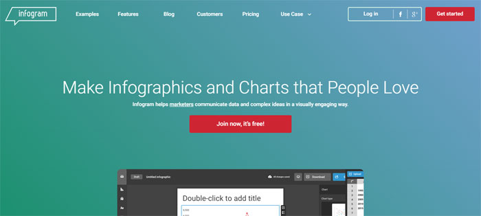
The first of these data visualization tools is Infogram. Infogram is one of world’s best known online inforgraphics tool that also helps create accurate and understandable charts. You can use its limited version for free, or purchase any of the two paid packages with over 200 maps, icons, and private sharing features.
The interface is a no-brainer, and charts are designed within minutes. The only bug customers mention is that their logos modify each time they embed interactive charts on their websites (happens only in the free version).
Visme’s Graph Maker
Use the easy and versatile Graph Maker to visualize boring raw data into beautiful visuals in minutes.
Plotly
Plotly was developed for graphing and web-based data analytics, and offers a solid library of chart types and social-sharing features. All of its elements are elegant and professional – once your data is inside, you can customize any aspect that could enhance their looks, including the legends, notes, layouts, and axes.
ChartBlocks
As indicated by the name, ChartBlocks allows users to build charts online. These charts are rather basic and limited, but the system still covers all common types organizations need to arrange their most important data. A distinctive benefit is that ChartBlocks pulls in data from several external sources, including local databases and spreadsheets. The charts can later on be embedded on websites and social media, or shared as PNG and SVG files.
Tableau
Tableau Public may as well be the leading BI and data processing platform in recent years, and an awesome productivity bundle that assembles graphs, charts, maps, and similar data visualization tools under the same roof. It is available for free, and lets you embed all types of charts on your websites. If lacking inspiration, you can check their gallery of visualization templates, and choose one that will work for you.
What distinguishes Tableau from its competitors is the quality of graphics and charts, which is why we believe you should definitely give it a second look. Excellent paid versions for additional functionalities are also available.
Datawrapper
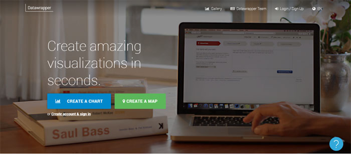
Datawrapper is another one of these data visualization tools. With all CSV data uploaded to the system or pasted directly inside the field, you can trigger Datawrapper to geneate lines, bars, and other similar visualizations. Datawrapper is the favorite tool of many news and reporting organizations, as they need a dynamic system that will enhance their posts with live graphs and charts. Using Datawrapper is easy, but you can still check out some of the excellent tutorials available online.
Visage
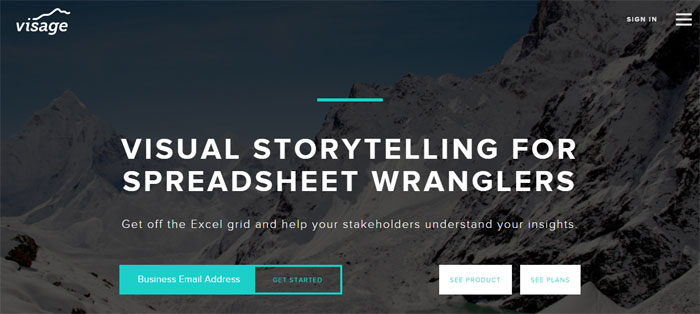
Visage’s developers didn’t always agree on how to build a data visualization platform, but they were unanimous when it came to their product’s target audience – everyone. According to them, data intelligence bundled in a beautiful package should not be the gift of few financially powerful agencies and organizations, but a tool that even small businesses and start-ups can afford. The tool was developed in 2009, by NewYork’s industry leader Column Five.
Sketch
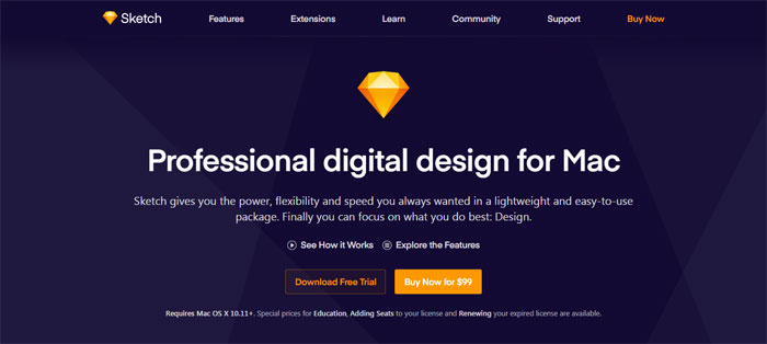
Sketch is a proficient digital design platform for Mac users, supplying them with the speed, flexibility, and power they need packed in a streamlined and user-friendly package. Designers can now focus on what genuinely matters to them – their designs. Sketch helps them do their job right at every stage, in particular as it offers Art boards and multipage support. Other popular features are the shared styles and symbols, thanks to which designers can locate and reuse elements they’ve already created. They won’t be challenged to create even complex shapes, as Sketch gives them first-class vector tools and layer styles for Boolean operations. As expected, the platform is based entirely on vector workflows, and can thus turn every design into a masterpiece.
Scriptographer
Scriptographer is the classic Adobe illustrator scripting plugin that lets you expand the functionality of this system with JavaScript language. It is the number-one choice of non-traditional designers looking for advanced tools and capabilities.
Sankey Diagram
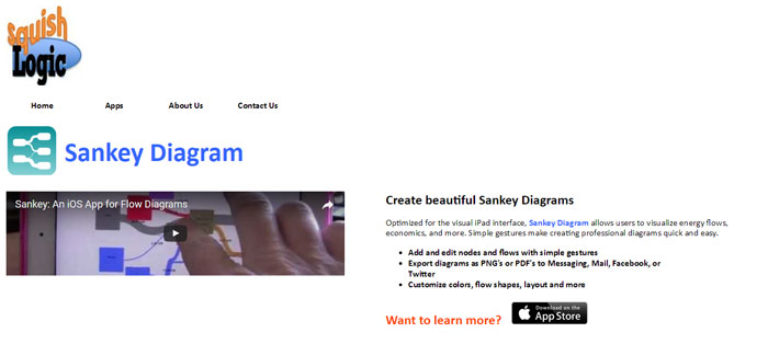
The professional Sankey Diagram drawing platform will offer a plethora of one-of-a-kind possibilities: its diagrams are interactive, and come with moving flows and nodes. For instance, they will display flows whose width is absolutely proportional to their flow, and where each element can be tweaked and edited upon need.
Paper Js
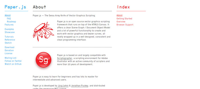
Paper.js is the leading framework for vector graphic scripting you can find for free, built and running on top of HTML5 Canvas. It is recognizable by its clutter-free Document Object/Scene Graph modelling, and the variety of Bezier curves that make working with vector graphics a breeze for inexperienced users. All elements come packed on a hassle-free interface, and work seamlessly with Adobe CS6 and newer versions.
Pixcone
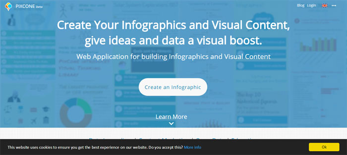
PixCone is the pioneer of data-driven inforgraphics, and a really powerful web editor that gives users total freedom to customize their infographics. Using it, you can rearrange your images, edit charts and canvas shapes in the last-minute, and add elements of your own. Among other things, you will also be able to add text in different fonts, sizes, and styles.
Datylon
Datylon’s target audience are creative designers, who will for the first time be able to turn charts and maps into beautiful works of art. The analytic heavy-lifting is to be left entirely in the hands of analysts, who will have their data ready to use and arranged in story templates. All of the stories can then be shared among contributors and embedded on websites and applications.
Easelly
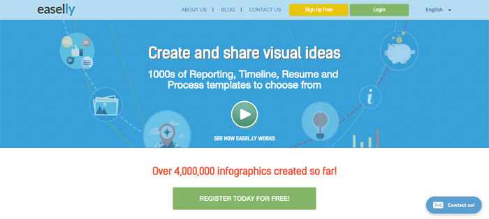
Easelly is a platform that enables users to create and distribute ‘vhemes’ (visual ideas and custom themes). All you need to do is to drag-and-drop your vheme onto the canvas, and turn it into an operable idea. As simple as that!
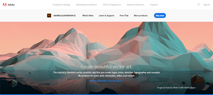
Adobe Illustrator
Adobe Illustrator also holds the reputation of its dev company’s top rated creative suite, being a super-powerful and dynamic platform that will help you create staggering electronic illustrations. While it is commonly accepted that statistical tools are the best fit for creating graphs, it is only visual tools like Adobe Illustrator that offer the features and capabilities to make those graphs work in favour of a business. With this tool, you will have total control over your existing graphs, as well as a possibility to create new, hand-crafted inforgraphics. Here are some examples and references you can use: Billion-Dollar-A-Gram, Literary Organism, and Visualisations tagged with Adobe Illustrator.
Affinity Design
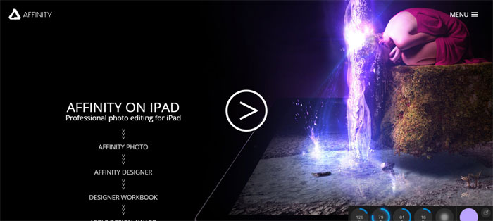
Affinity Designer is a smooth, fast, and very precise vector graphic designer for Mac users. It is the preferred system of marketers and website owners, fully equipped with icons, layouts, and other creative UI elements.
D3.js
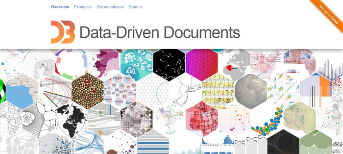
D3.js, or Data Driven Documents, is one of the first names to ring a bell in the data visualization niche. All of us have at least once seen a beautiful chart or diagram rendered with D3, having in mind that the tool supports and uses SVG, CSS, and HTML. There is virtually no visualization D3 cannot produce, and the best part of the story is that it will produce it absolutely for free.
Note that D3 won’t blend that easily with your prebuilt charts, but that won’t be a problem with all out-of-the box chart templates collated in its gallery. What could be slightly more concerning is the steep learning curve, and limited compatibility (IE9 or higher). For this reason we suggest you to test it with older browsers before you decide to invest in it.
FusionCharts
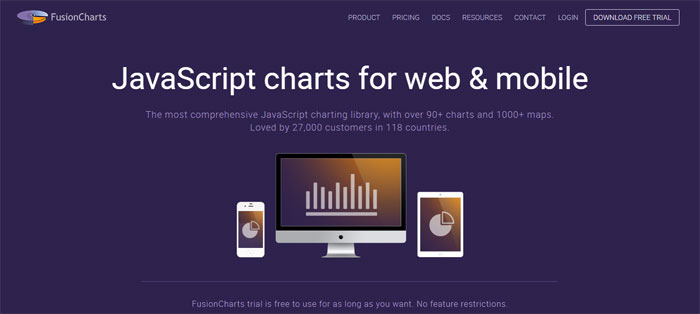
FusionCharts is the crown of data visualization, and one of the most sophisticated, premium chart-and-map libraries to purchase nowadays. It supports more than 90 charts and 965 maps, and keeps innovating its service to keep users in line with recent trends. You can apply it on all standard and modern browsers, from IE6 onwards.
FusionCharts offers support for XML and JSON data formats, and allows you to export JPEG, PDF, PNG, and SVG charts. The tool is simply ideal for business users who need exclusive and rich dashboards, and inspiring demos.
FusionCharts’ impeccable reputation derives from the fact that maps and charts display well wherever accessed, and that the interactions with them are streamlined and highly customizable. All of this comes at a price comparably higher to the one of similar tools, but the investment is more than recommended for those who can afford it.
Chart.js
Chart.js is one of the tiniest, yet best-known open-source chart libraries with a lot of chart examples to check out, that supports 6 basic chart types: bar, radar, pie, polar, line, and doughnut. This combination doesn’t come as a surprise, having in mind that these types are commonly paired to accomplish a single project. For larger and more complex applications, however, we’d still recommend you to opt for more advanced libraries such as FusionCharts and Google Charts.
Chart.js makes use of HTML canvas elements to render responsive, flat-designed charts and offers plenty of developing documentation available online.
Google Charts
Google Charts renders SVG/HTML5 charts to ensure cross-platform portability and cross-browser compatibility for Android and iOS users. The platform uses VML to support several older IE versions.
All commonly built chart types are already covered, including pies, bars, areas, and gauges. As this is a Google product, you can expect a familiar and friendly environment to work in, and plenty of premade templates you can tweak in line with your business specifications.
Highcharts
Highcharts is also a frontrunner in the charting arena which builds advanced maps and charts in a fashion similar to FusionCharts. Its best known feature is Highstock, a handy package full of stock charts considerably richer in detail than their traditional counterparts.
With Highcharts, you can export your charts as JPG, SVG, PDF, and PNG files. You can also access the product’s demo section to find some interesting chart templates. If you’re a non-commercial user, Highchart will be available for free. Businesses, on the other hand, can deploy it against a reasonably-priced single-payment license.
Leaflet
Popular developer Vladimir Agafonkin built Leaflet to let users prepare interactive maps for mobile screens. The first thing you will notice about it is the extremely small size (nothing more than 33kb), which still covers all important mapping features. To render maps in a way which suits all users, Leaflet uses both CSS3 and HTML5, and functions impeccably on mobile and desktop platforms.
You can also add features and expand its functionality with many different plugins, including heatmaps and animated markers. This is why Leaflet is a number-one choice for all users looking to embed maps in their apps or websites.
dygraphs
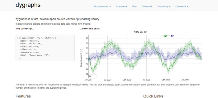
diygraphs is a JavaScript based, open-source charting library able to process huge data sets. It is very customizable, flexible, and fast, and works well on any major browser (IE8 included). Using it, you will also be part of a large and active community, and exchange experience eto leverage the most of what it can do for you.
dygraphs has already defined its use-case niche, and may not respond to all of your needs. Nevertheless, you can find some extra space for it and keep it in reserve, as it will certainly be useful for larger sets in future. Check the vendor’s demo to understand how this product works.
Raw
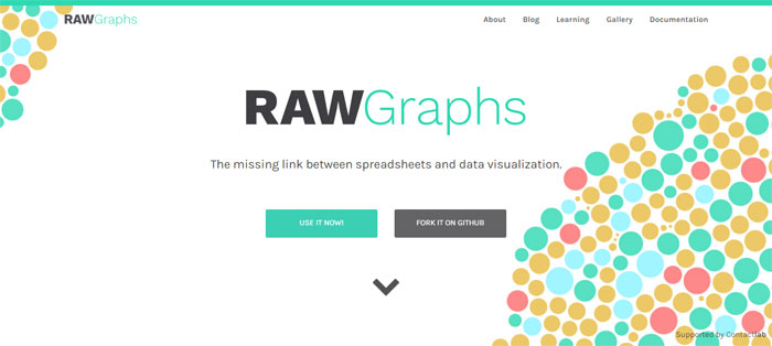
Raw developers like to call their product ‘the missing link between spreadsheets and vector graphics’, and they are in their full right to do so. The platform was developed and designed on top of D3.hs, and offers a very user-friendly interface where you don’t even have to register. The tool is also an open-source one, and you don’t have to pay in order to use it.
Raw’s library is still the best a free chart library can get, with a total of 16 chart types to consider, and in-browser data processing. Regardless of Raw being free and community-managed, it still guarantees top-class data protection, and lets users expand it in all desired manners (even to accept new and custom layouts).
Timeline JS
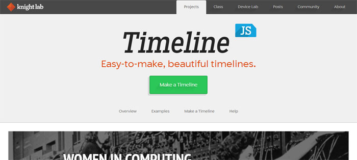
Timeline JS, as you probably concluded by now, is developed to draft functional and beautiful timeliness, and spare users the effort and coding expertise usually associated with this process. The tool is open-source and free, which is why it is used by thousands of companies worldwide. On its large list of prominent users, you will also find names such as Radiolab and Time.
Creating a timeline with Timeline JS will be very easy, as they system allows you to embed media coming from all external sources, and supports YouTube, Vimeo, Flickr, Vine, Twitter, Google Maps, Dailymotion, SoundCloud, Wikipedia, and many similar platforms.
FAQ on data visualization tools
What Exactly Are Data Visualization Tools?
They’re a blend, really. Software that lets you turn numerical chaos into visual sense—graphs, charts, dashboards—so your brain can digest it. They’re like graphic designers for your data, creating visuals that make spotting patterns and telling stories with numbers easier than tying your shoelaces.
How Do These Tools Help in Business Intelligence?
In the game of BI, data visualization tools are your MVPs. Picture interactive dashboards slicing through the fog of data, dishing out actionable insights on-the-fly. Businesses call the shots quicker because trends scream out from the screen, not hiding in spreadsheets. Speed and clarity? That’s what they bring to the strategy table.
Can I Use Data Visualization in Real-Time Analysis?
Absolutely, and it’s like seeing the matrix in HD. Real-time analysis? These tools are spot-on, churning out live data feeds into visuals that breathe. You’re catching the pulse of what’s happening this second, helping you react with the nimbleness of a street-performer in a bustling crowd.
Are Data Visualization Tools Intuitive to Learn?
You bet. Most are built for earthlings, not just data wizards. Drag-and-drop interfaces, templated designs, a bit of tinkering here and there—you’ll get the hang of it. They’re like friendly tech sidekicks, easing you into creating those slick-looking reports without a hitch.
Which is Better: Tableau or Power BI?
“It’s like choosing a favorite ice cream flavor—they’ve both got their charms. Tableau’s the artist, with visualization finesse that’ll wow you. Microsoft Power BI, on the flip side, is the Excel-savvy analyst’s dream with seamless integration. Your pick depends on priorities—looks or lineage.
What Types of Visualizations Can I Create?
Wanna keep it classic? Bar charts and line graphs have got your back. Feeling fancy? Dive into heatmaps, scatter plots, or network diagrams. There’s a whole visual vocabulary—at your fingertips. Data storytelling isn’t just pie charts anymore—it’s about bringing the right context and color into the conversation.
Is There a Learning Curve with Data Visualization Software?
Let’s be real—anything worth doing has a curve. Start simple; pick a user-friendly platform (cough, Google Data Studio). Work those tutorials. Flex those data muscles with practice. Before you know it, you’re the one answering questions at the water cooler.
How Much Does Data Visualization Software Cost?
There’s a spectrum: from your trusty free companions to high-roller, premium suites. No-cost options tackle basic needs splendidly. But when you’re playing in the big leagues with Adobe Illustrator for infographics or eyeing enterprise-level insights, that’s when the price tags match the prowess.
Can Custom Visualizations Be Integrated Into These Tools?
Sure thing. Flexibility’s their middle name. Custom visuals? Consider it done. Most of these tools welcome your unique touch with open arms. Got the coding chops? APIs from D3.js or Python libraries will let you stretch those creative legs.
How Crucial Is Data Security with These Visualization Tools?
Let me lay it out—data security is king. Trust no one that treats it like an afterthought. Good news? Big players like Looker or QlikView are built like fortresses. Beefy encryption, robust access controls—they’re not just putting out pretty pictures; they’re guarding your gold.
Conclusion
And there you have it. The world of data visualization tools laid out like a picnic on a sunny day. Easy to reach, everything in place for that perfect bite of insight. You’re no longer fumbling with data in the dark; now, you’ve got a visual power-up to light the way.
Flip through the kaleidoscope of charting applications, dashboards, and whiz-bang interactive displays that’ll make your next conference room show-and-tell session pop. You’ve seen how these tools are more than pretty faces; they’re the backstage crew making your numbers sing in tune.
Walk away knowing there’s a tool with your name on it, ready to craft visual stories from rows of data that once seemed as unruly as a tangled headphone cord. So grab one – maybe it’s Looker or Tableau or something else – and start turning your data into a masterpiece.
If you liked this article about data visualization tools, you should check out these as well:
Bogdan Sandu, a seasoned designer with 15 years of diverse experience, has been designing websites since 2008.
Renowned for his expertise in logo design and visual branding, Bogdan has developed a multitude of logos for various clients.
His skills extend to creating posters, vector illustrations, business cards, and brochures. Additionally, Bogdan's UI kits were featured on marketplaces like Visual Hierarchy and UI8.
Latest posts by Bogdan Sandu (see all)
- Nature Color Palettes Inspired by the Outdoors - 25 April 2024
- The Epic Games Logo History, Colors, Font, And Meaning - 24 April 2024
- Spread Joy: Happy Color Palettes for Uplifting Designs - 24 April 2024