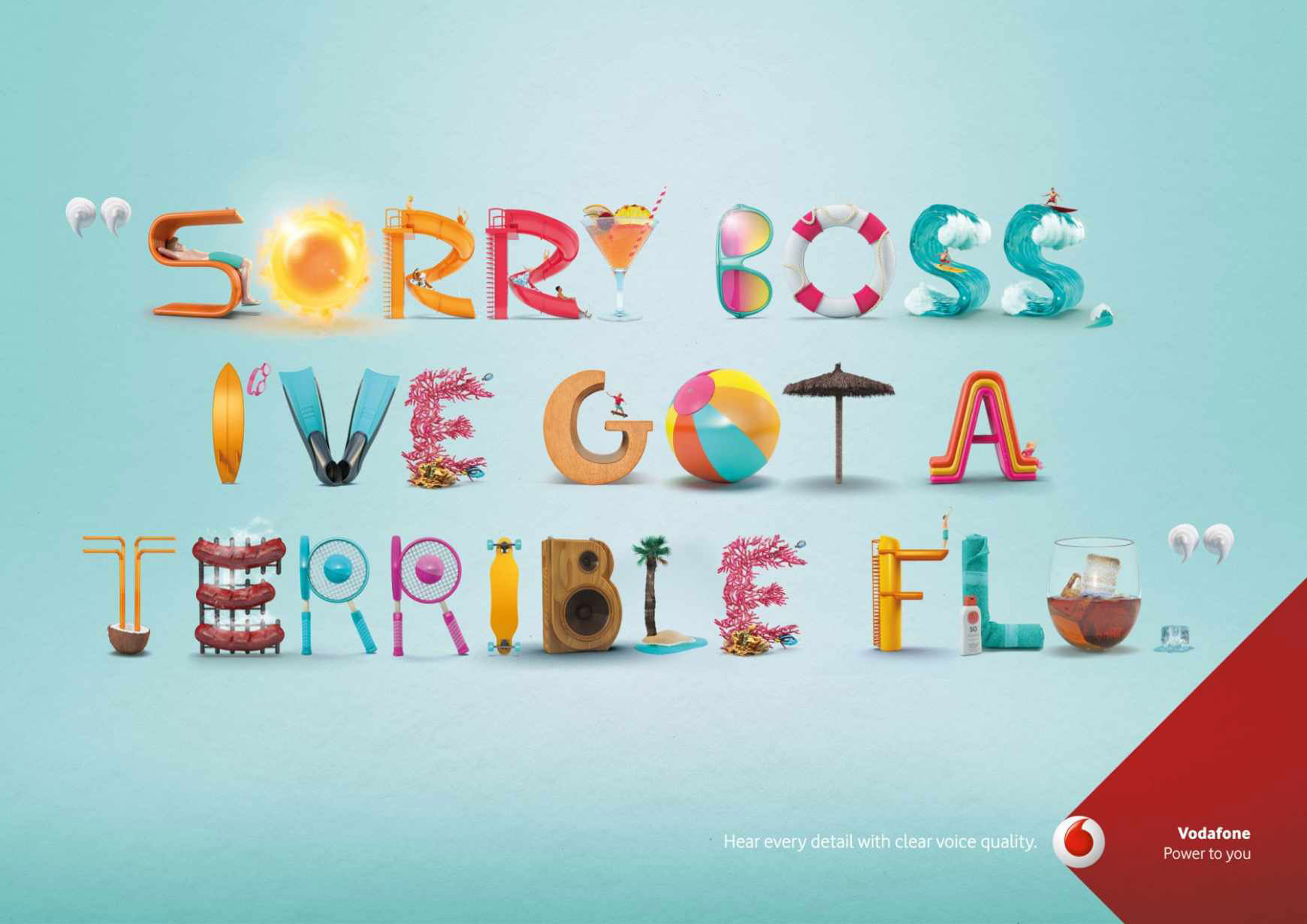
Designing a brochure isn’t just about arranging text and images on a page-it’s an art form. It’s the visual voice of a brand, speaking directly to potential clients, captivating them with stunning visual communication and compelling marketing materials.
Brochure design examples can serve as powerful inspiration, showcasing how creative layouts and thoughtful graphic design trends can transform a simple piece of paper into an impactful marketing campaign.
This article dives deep into the world of brochure design, providing you with an array of creative brochure designs that exemplify branding strategies and effective user experience (UX) design.
You’ll discover professional brochure samples that employ smart typography selection, vibrant color schemes, and strategic content creation to captivate and convert.
By the end of this article, you’ll have a comprehensive understanding of what makes a brochure not just good, but extraordinary.
So you want to know how to create a brochure design?
Tips for learning how to create a brochure design that rocks
Know What Your Reader Wants
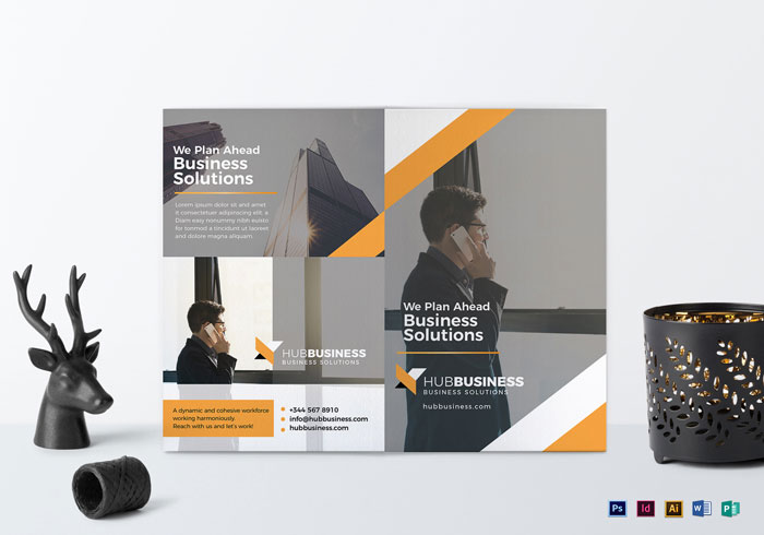
There’s one famous quote: if you want to catch a thief think like a thief. The situation with potential customers is very similar.
If you want a customer to come to your office, to buy your goods, to use your service, the first thing you should think of is the information your customer will be interested in.
You can be the best in your city in your field, the best in your country, but all the benefits you can offer are risking to remain unnoticed unless you represent them in the right way. Your pamphlet designs should, therefore, begin with looking at your business through your clients’ eyes.
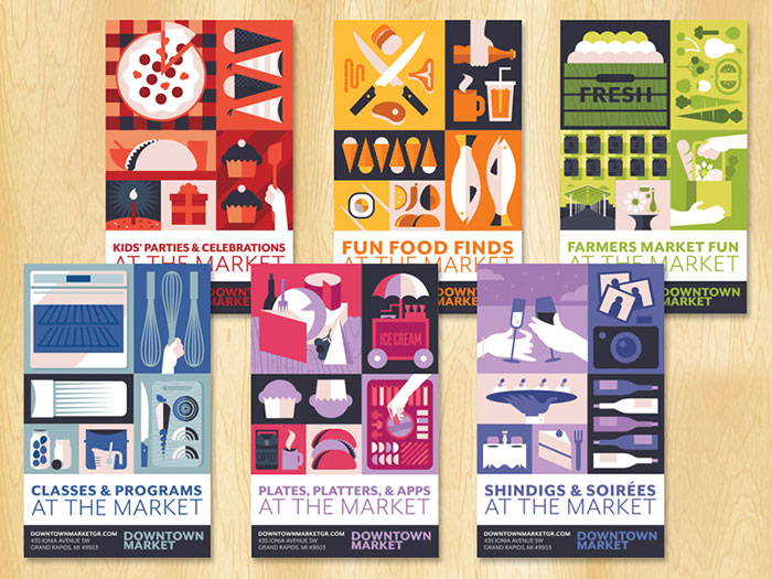
Once you have taken your clients’ perspective into account, fill your brochure layout with the information your customer is most likely to be interested in.
That is to think thoroughly about all the key points concerning your goods and services and provide answers to the most crucial questions in the logical sequence of thoughts which may arise in mind of potential customers. This is an important step in creative pamphlet design.
Visuals in a marketing brochure
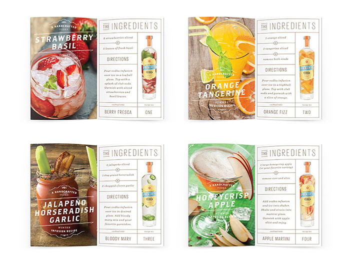
Recent studies have shown, that we perceive 80% percent of information around us only visually. This fact leads to the conclusion that one of the most important parts of your brochure layout is a photo or illustration.
Your brochure cover design should be attractive and be inviting, able to grab attention at a glance and to make the customer interested in reading the information you want to deliver.
It goes without saying that quality and resolution of graphic materials should be as high as it’s possible nowadays. One more tip: if you want to promote your company on the whole or to launch the brand it’s worth placing the emblem of company or motto where it can be easily noticed.
Colors should be bright and eye-catching, but should also correspond with the ones used in the brochure images, to make your pamphlet designing look more organic.
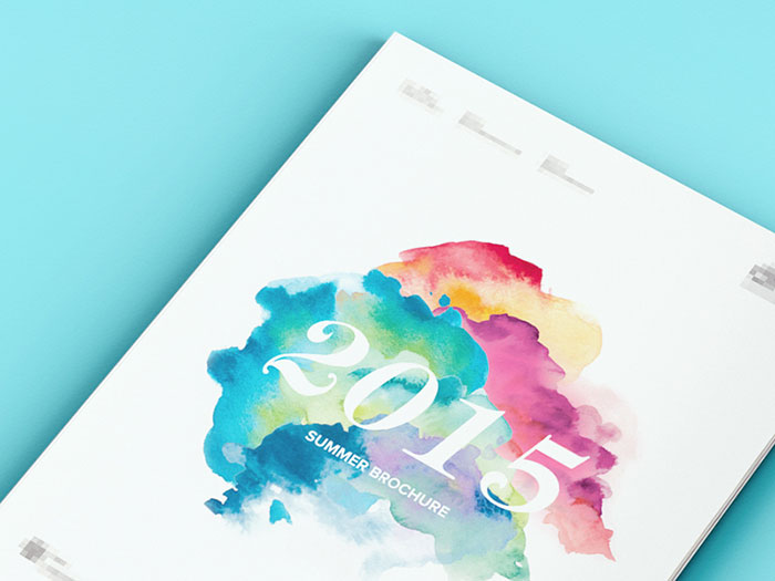
Bear in mind that in marketing different colors deliver different messages. So make sure the shades you choose to correspond with the aims you pursue. Violet usually implies luxury and opulence, while blue and all its hues represent intelligence.
One more important thing is the brochure graphic design and format. If you want to advertise a funeral service, it’s better to create a modest leaflet, while promoting spa services you should use a luxurious look that will invite you to indulge yourself with the pleasant relaxation you deserve. The same thing is valid when designing spa websites.
Your booklet design would, therefore, be linked to your business goals and the services you offer.
Think of simple statements
Everything is good in moderation. In your attempts to make the marketing brochure as noticeable and eye-catching as possible it’s important not to overdo your design and clutter your brochure. Bear in mind that your corporate brochure should be created for the average person who may need a simple explanation of your services. Your business brochure should, therefore, be simple and easy to understand.
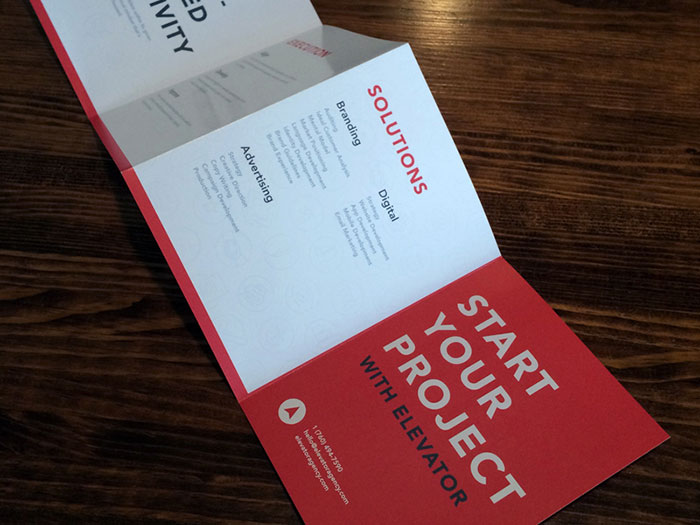
Brochure layout and fonts also matter. Although many people often try to stand out so much that a simple design often gains more attention. Many designers and agencies often use the same design strategies for a huge amount of projects while making creative brochures. Go for a unique design and ask for a pamphlet sample from your printers to ensure you’re happy with your choices.
Designers often use a standard approach because professionals notice objective laws common for all the brochures and other types of advertisement they produced.
One type of font attracts attention at a glance and another is so blatant that it rather distracts. However, even while using frequently used layouts or fonts, you can still offer up a unique product if you brainstorm brochure ideas with your designer.
Readability in a brochure design
The leaflet shouldn’t simply be good-looking and bright; it also should be readable and informative. The brochure template is supposed to cover the most important and relevant information. Brochure backgrounds should contrast to your print to ensure legibility. Keep your choice of fonts to a minimal when brochure designing to keep your page clean and legible.
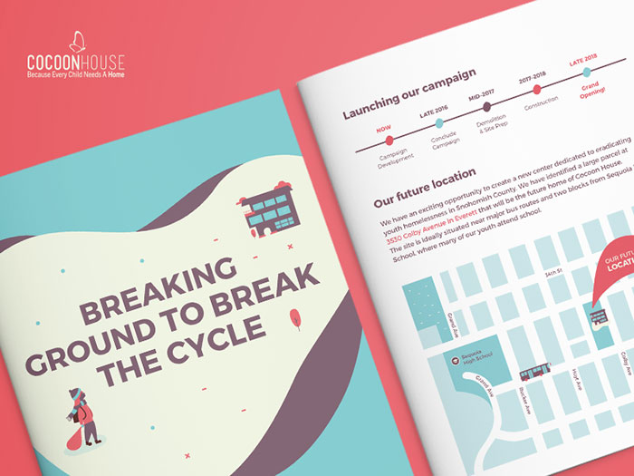
It sometimes happens that a brochure is quite big. In this case, it’s better to include a list of contents in your catalog designs. This will simplify navigation when making a brochure.
Motivate your reader to look inside your creative brochures
The leaflet should be inviting and understandable. Keep your catalog cover design simple. If you scare away the customers with complicated and alien terms from the very first page, you’ll fail to promote the product. Try to invent a statement or a phrase that will make even an average man interested in the thing you advertise through your professional brochure.
People are always looking for some benefits, so try to introduce some discount or special offer on the front page so that the reader has at least slight interested in looking inside the brochure.
As soon as you’ve attracted their attention, they’re on the hook. Now you can familiarize them with everything you considered to be important concerning your product.
Describe your product in the marketing brochure
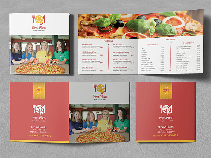
While describing your product it’s necessary to outline obvious benefits of your products in your company brochure design. For example, if you describe a hairdryer, it’s not enough to tell that you can dry your hair with it.
You need to explain what it is that sets your product apart from the competition. This is as true for a travel brochure design as it is for a college brochure design. Well designed brochures should always include this aspect.
Make it Personal when making a brochure
While delivering a speech to the huge audience eye contact is inevitable. But printed advertisement doesn’t include personal interactions. Best brochure design practices will communicate your message on your behalf.
While considering different brochure ideas, it’s more effective to address your audience with warmth. If people are addressed this way they feel some sort of their uniqueness, individuality and perceive it as a friendly conversation rather than intrusive, irritating advertisement.
Talk about your reader’s needs in your creative brochure
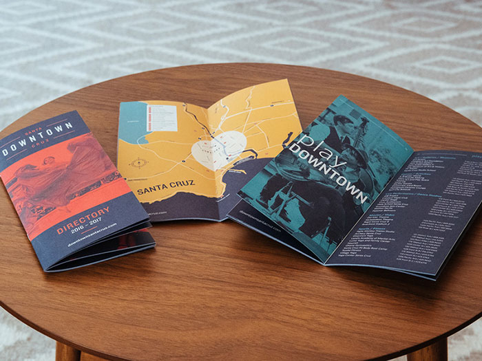
No matter how much you like your business and your company, professional pamphlet designs will should speak to your audience. People want their problems to be solved and solutions found. You could collect pamphlet samples or explore catalog design ideas to explore successful brochures.
A creative pamphlet which is well constructed will keep your audience interested.
Brochure design inspiration
There are times when every designer feels uninspired but there are more than enough brochure design examples to draw inspiration from.
As professionals, we all appreciate professional flyer design ideas that are completed to perfection. Enjoy this great collection of product catalog design inspirations!
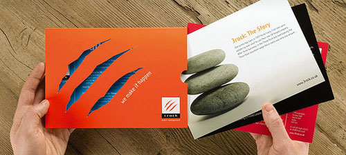
3rock Corporate Brochure
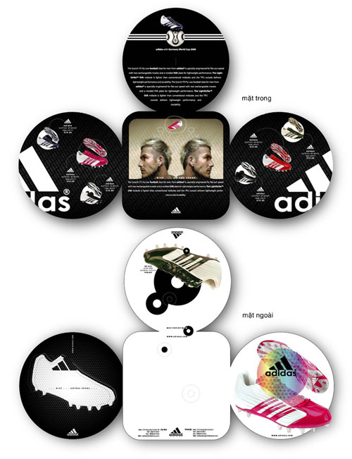
adidas Creative Brochure
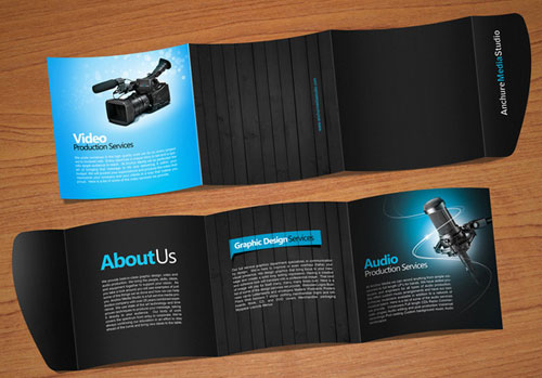
Anchure modern brochure design
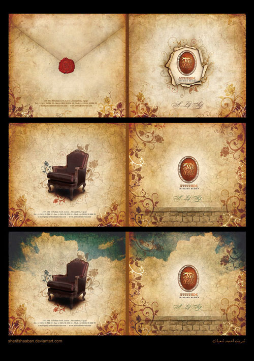
Attitude Brochure
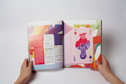
British High School of Art and Design Brochure
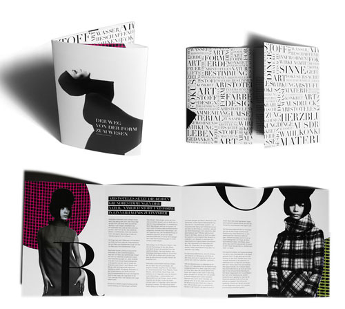
Cool brochure
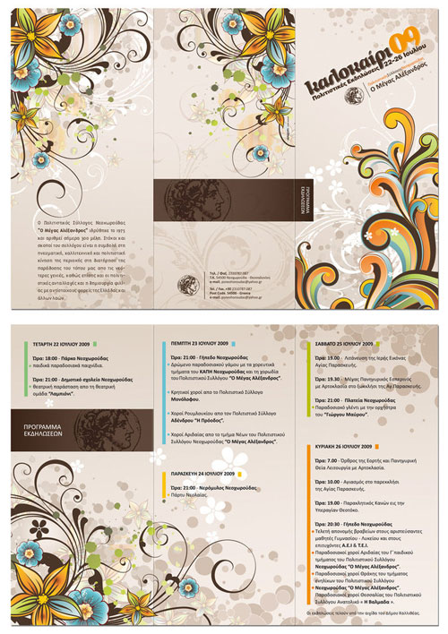
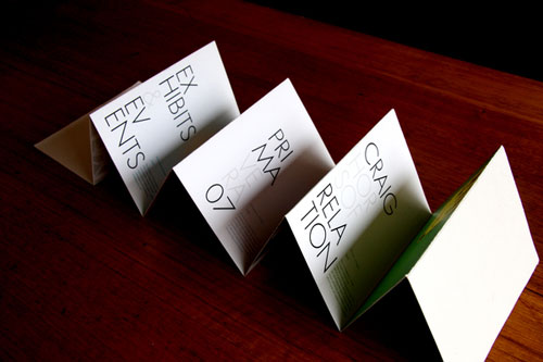
Cultural events tri-fold brochure
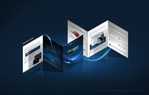
Tri-fold brochure
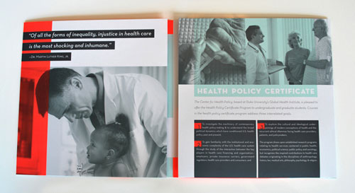
CHP modern brochure design
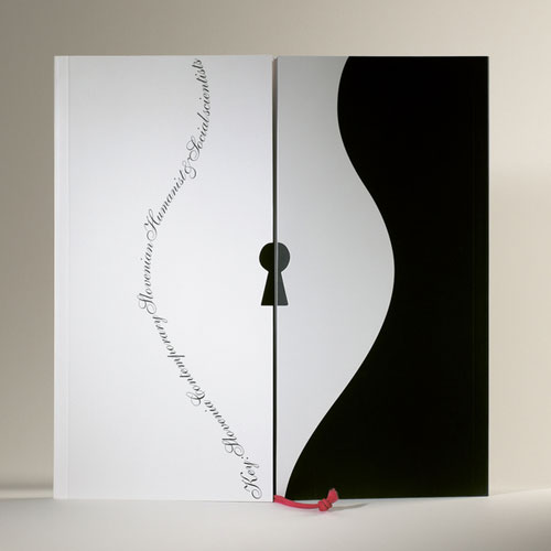
Contemporary Slovenian Writers
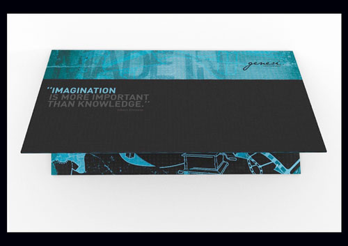
Creative Brochure Genesi
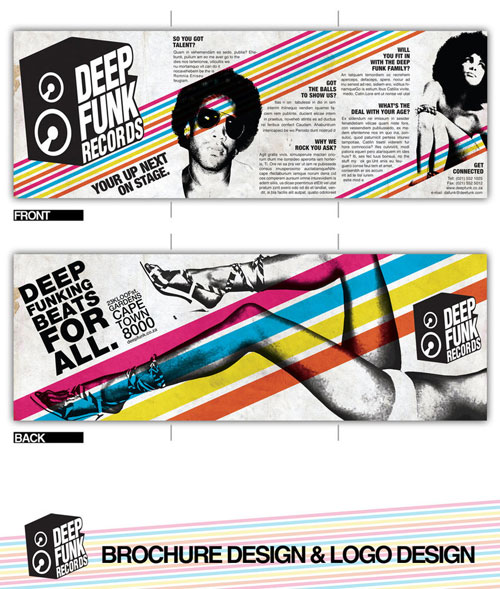
Deep Funk Records Tri-Fold Brochure
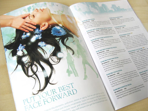
Elmwood Spa – cool brochure
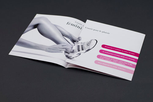
Entre Elles Tri-Fold Brochure
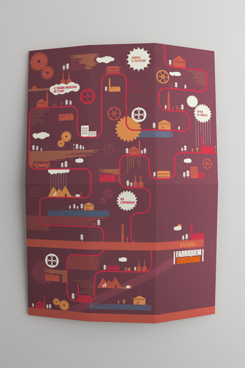
Fabriquem Emocions modern brochure design
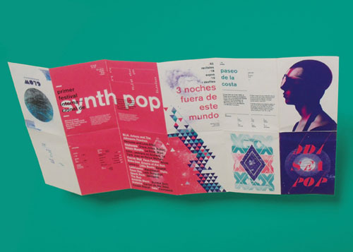
Festival event brochure
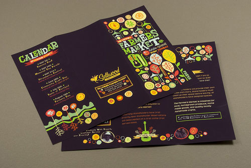
Farmers Market Tri-Fold Brochure
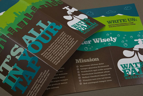
Water Company Brochure
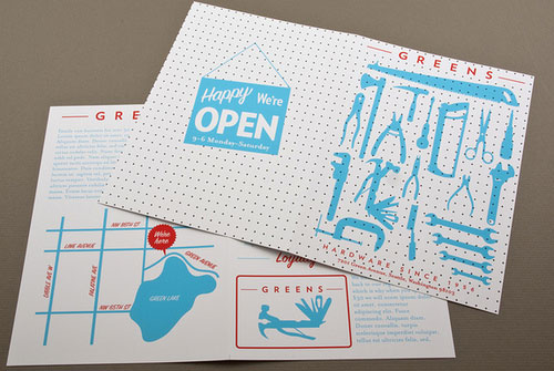
Hardware Store Brochure
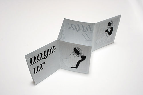
hopefulvoyeur.com Brochure
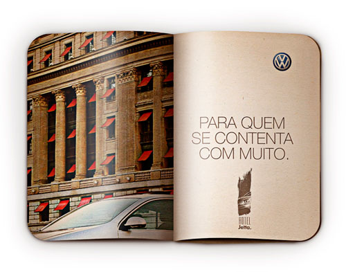
Hotel Jetta modern brochure design
IamExpat creative brochure
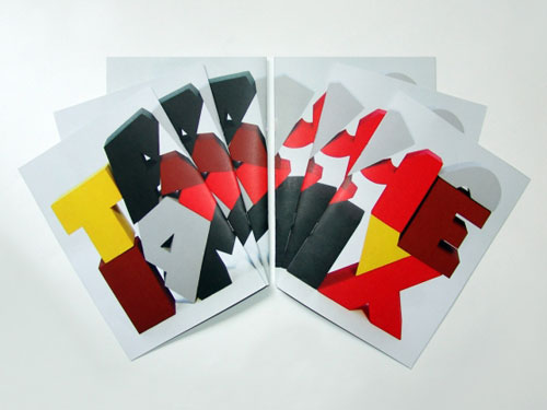
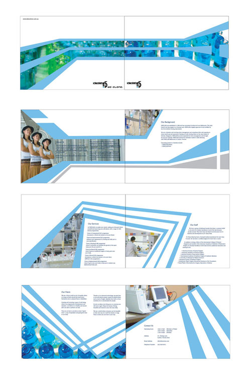
IdeoLab Brochure
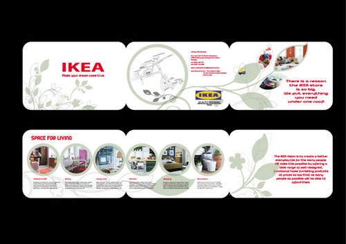
IKEA Tri-Fold Brochure
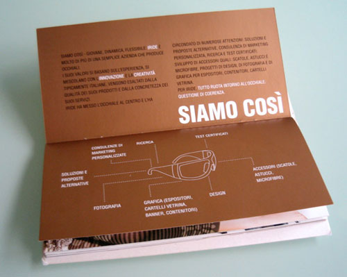
Iride professional brochure
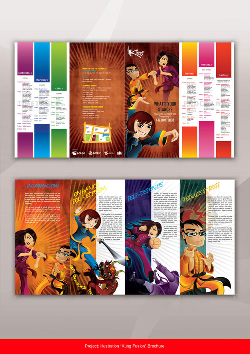
Kung Fusion creative brochure
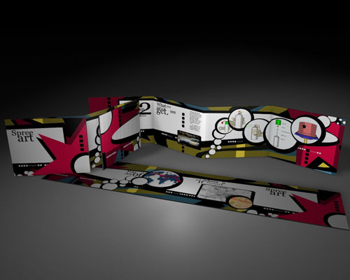
Leporello Street Art modern brochure design
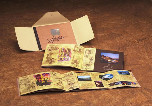
Lifestyles modern brochure
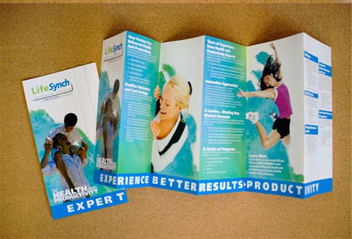
LifeSynch Capabilities Brochure
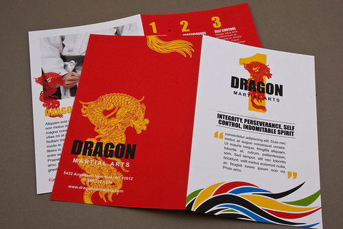
Martial Arts Academy Brochure
MCA – A5 Brochure Design
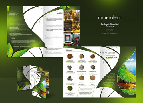
MineralKat creative brochure
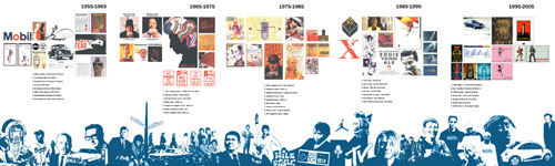
Moma modern brochure
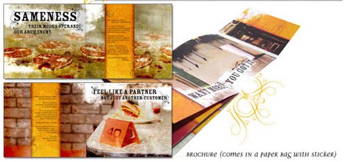
moreYELLOW creative brochure
MV Teachers modern brochure design
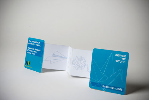
Nick Cave
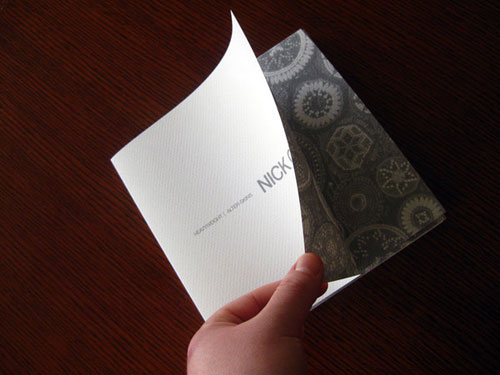
North Star Fund professional brochure
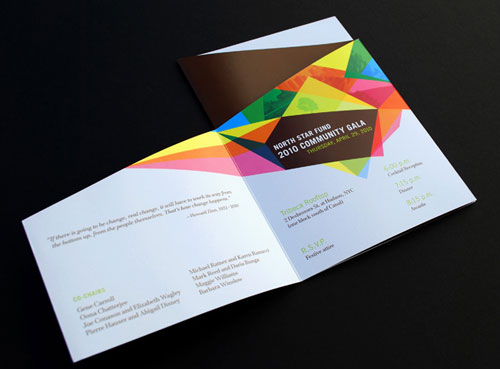
Rebrand – modern brochure
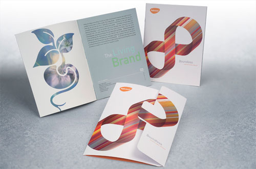
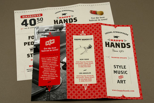
Retro Barbershop Brochure
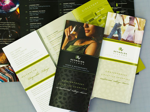
Reynolda Village
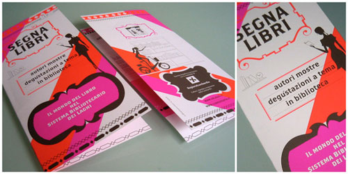
Segna Libri modern brochure
Simpson’s Brochure Pack
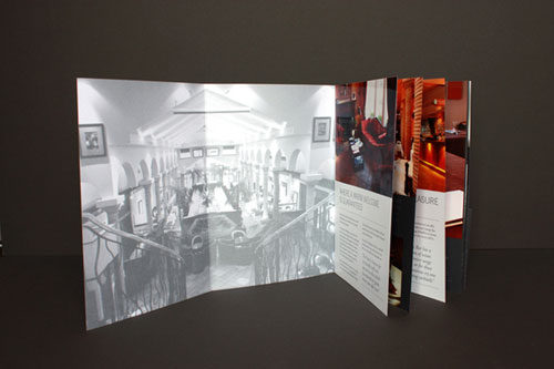
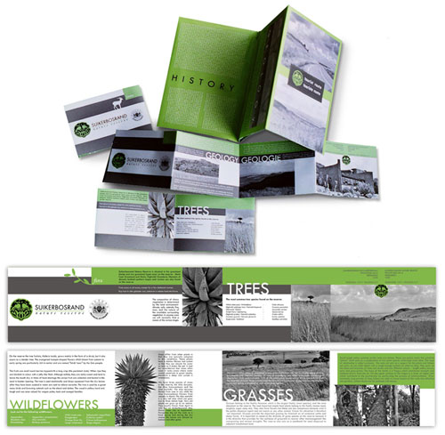
Suikerbosrand brochure design
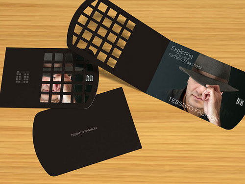
Tessuto Fashion modern brochure design
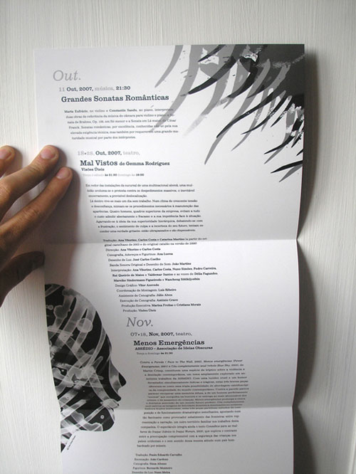
THSC professional brochure
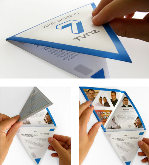
TVNZ 7 creative brochure
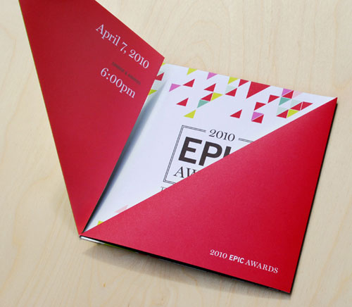
TWHP 2010 EPIC Awards
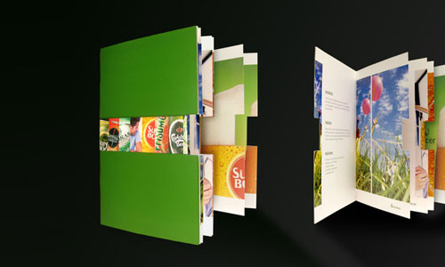
Unicer Corporate Brochure
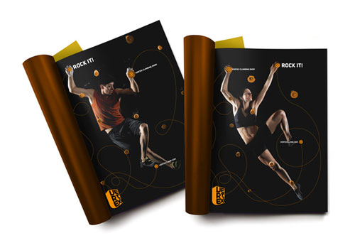
Vertex professional brochure
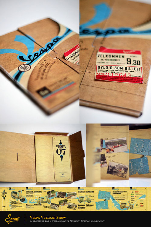
Vespa brochure
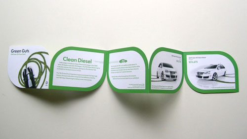
Volkswagen creative brochure
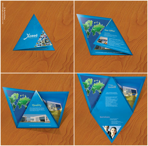
Xceed professional brochure
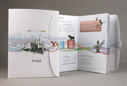
Yahoo Search Marketing Brochure
FAQ On Brochure Design Examples
What are the key elements of a successful brochure design?
A successful brochure design combines visual communication, branding strategies, and compelling content creation. It includes clear, engaging headlines, concise copy, high-quality images, and a well-structured layout.
Effective use of color schemes and typography selection enhances readability and captures attention. Always include a strong call-to-action (CTA).
How do you choose the right layout for a brochure?
Choosing the right layout depends on the brochure’s purpose and audience. Consider brochure layout ideas like tri-fold, bi-fold, or Z-fold.
The layout should guide the reader naturally through the content, using white space and graphic design elements to avoid clutter and ensure a smooth flow.
What role does color play in brochure design?
Color schemes play a crucial role in evoking emotions and reinforcing a brand’s identity. Use colors that align with the brand guidelines and appeal to the target audience.
Contrasting colors can highlight important information, while harmonious tones create a pleasing aesthetic that enhances the user experience (UX) design.
How can I ensure my brochure stands out?
To make your brochure stand out, focus on unique creative brochure designs and innovative design ideas. Incorporate high-quality imagery, bold typography, and engaging visuals.
Utilize design software like Adobe InDesign for professional results. A distinctive branding strategy and clear marketing message are key.
What are the best practices for choosing typography in brochure design?
Typography selection should reflect the brand’s personality and ensure readability. Use no more than two or three fonts to maintain consistency.
Consider the hierarchy of information, using larger fonts for headlines and smaller for body text. Print media requires careful attention to font size and spacing.
How important is the choice of paper in brochure printing?
The choice of paper significantly impacts the brochure’s look and feel. High-quality paper enhances the print design and reflects a premium brand image.
Consider factors like weight, finish, and texture. Print services often provide samples to help choose the best option for your marketing materials.
Can digital brochures be as effective as printed ones?
Digital brochures are highly effective, offering interactive features and broad distribution. They can include links, videos, and animations, enhancing digital media design.
While print media has its advantages, digital formats are cost-effective and environmentally friendly, reaching a global audience effortlessly.
How do I create a brochure that aligns with my brand?
Align your brochure with your brand by using consistent branding strategies, colors, and typography. Reflect your brand’s voice in the copy and imagery.
Showcase your brand identity through cohesive visual communication. Ensure all elements, from layout to content creation, reinforce the brand message.
What tools can help in designing a brochure?
Several design software tools aid in creating stunning brochures. Adobe InDesign, Illustrator, and Canva are popular choices.
These tools offer templates, layout design principles, and customization options. Topic modeling tools and structured data can help refine content for better SEO performance.
How can I measure the success of my brochure?
Measure the success of your brochure through metrics like distribution reach, reader engagement, and conversion rates.
Track responses to call-to-actions (CTA) and gather feedback from recipients. Analyzing these data points helps refine future marketing campaigns and enhances overall content quality.
Conclusion
If you liked this article about creative brochure design, you should check out these articles as well:
- How to make an album cover: 50 album cover design examples
- Calendar Design: Tips To Design Your Own Calendar
- Concert posters: Design, Ideas, and Inspiration
- Free brochure templates to use for creating your brochure
- 43 Flyer templates you should download for your clients

Renowned for his expertise in logo design and visual branding, Bogdan has developed a multitude of logos for various clients.
His skills extend to creating posters, vector illustrations, business cards, and brochures. Additionally, Bogdan's UI kits were featured on marketplaces like Visual Hierarchy and UI8.
He also wrote in the past years on sites like Design Your Way, WebDesignerDepot, WPDean, Designmodo, Speckyboy, Slider Revolution, and more.
- The Windsurf Logo History, Colors, Font, And Meaning - 10 October 2026
- How to Remove Background From Product Photos (No Photoshop) - 10 October 2026
- How Designers can Build a Stronger Online Creative Identity - 9 October 2026

Bogdan Sandu is a seasoned designer who has been designing websites since 2008. Renowned for his expertise in logo design and visual branding, Bogdan has developed a multitude of logos for various clients. His skills extend to creating posters, vector illustrations, business cards, and brochures. Additionally, Bogdan's UI kits were featured on marketplaces like Visual Hierarchy and UI8. He also wrote in the past years on sites like Design Your Way, WebDesignerDepot, WPDean, Designmodo, Speckyboy, Slider Revolution, and more.
You Might Also Like