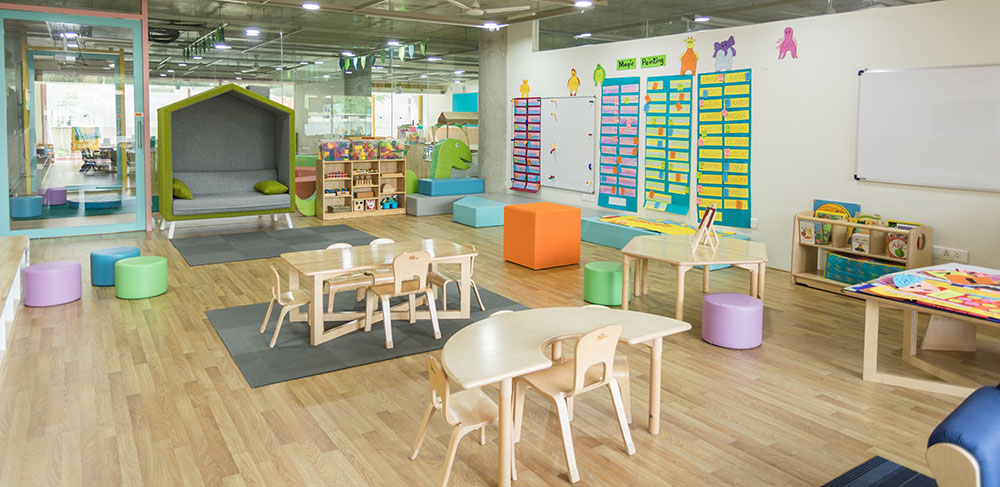
Parents shopping for a preschool look at a website roughly the way they’d peek through a classroom door. They’re not scoring the color scheme. They want a read on whether the place feels safe and whether an actual person is behind it.
That’s the line between a kindergarten site that works and one that’s just a template with a logo swapped in. Independent preschools, Montessori schools, daycare franchises, and nonprofit early learning centers all publish these sites now, and none of them get graded on polish first.
Here’s a number worth sitting with: visual appeal registers within 50 milliseconds of a page loading, according to a study published in Behaviour and Information Technology (Lindgaard et al., 2006). Fifty milliseconds doesn’t leave a cluttered homepage much room to win back a parent who’s already reaching for the back button.
What Is Effective Kindergarten Website Design?
Templates fail here for a specific reason. They weren’t built to talk to a parent comparing three centers on a Tuesday night, phone in hand, toddler asleep down the hall.
The mechanics underneath a good kindergarten site aren’t special. Contrast, spacing, load speed, the same rules apply whether you’re running a preschool or a gym. What’s different is the job the page has to do. It needs to move someone from nervous browsing to booking a tour, and it usually gets about one visit to manage that.
A 2026 survey commissioned by The Goddard School found that 27% of parents check a child care provider’s website directly before enrolling, alongside phone calls and social media checks (Talker Research, 2026). That’s not most parents. It’s enough that a half-finished site quietly loses enrollments nobody ever traces back to it.
What Are the Best Kindergarten Website Design Examples?
The strongest examples split less by taste than by budget and audience. A single-location preschool with one classroom needs something completely different from a ten-campus franchise, and pretending otherwise is usually how a site ends up feeling generic.
| Category | Design Priority | Typical Constraint |
|---|---|---|
| Independent preschool | Warmth and personal voice | Small budget, one location |
| Montessori school | Calm, uncluttered visuals | Method-specific messaging |
| Daycare franchise | Consistent branding across sites | Corporate template limits |
| Bilingual or international center | Dual-language navigation | Translation upkeep |
| Nonprofit early learning center | Balancing donations and enrollment | Limited design staff |
NY Kids Club

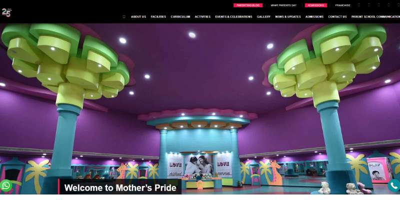
Mother’s Pride
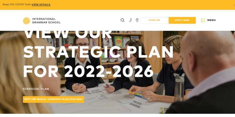
International Grammar School Sydney
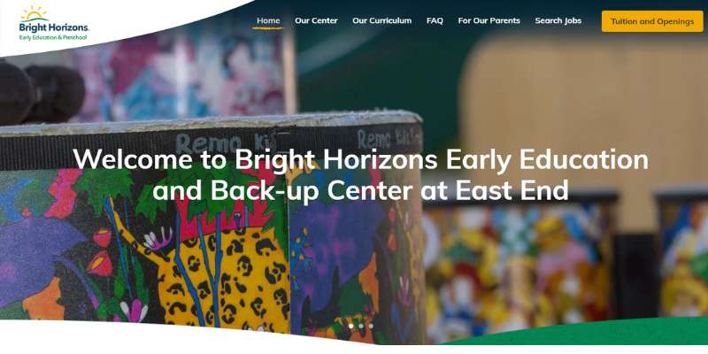
Bright Horizons
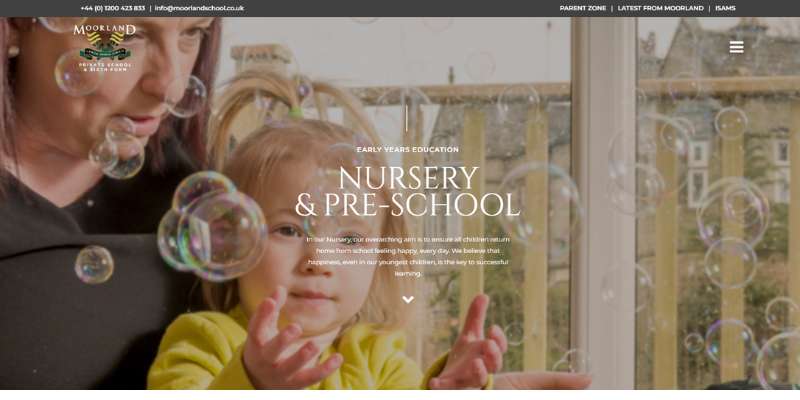
Moorlands
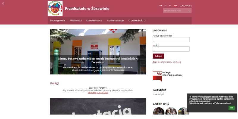
Przedskole
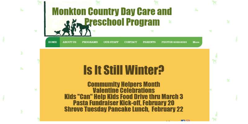
Monkton
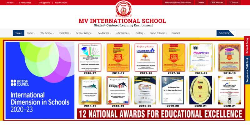
MV School
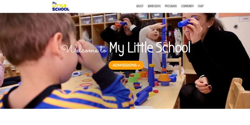
My Little School NYC
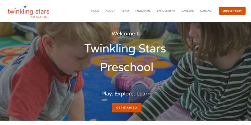
Twinkling Stars Preschool
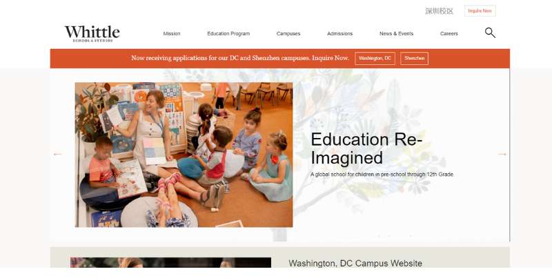
Whittle School & Studios
Milo’s House
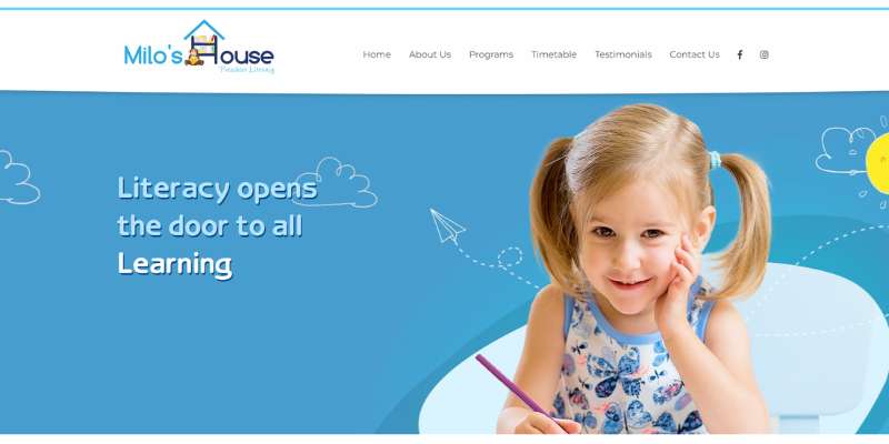
South Rowan Academy

PBS Kids
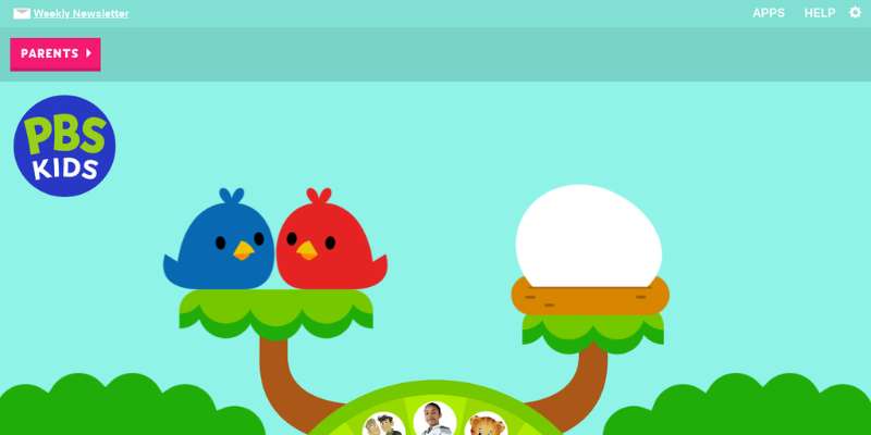
La Petite Academy

Shining Stars
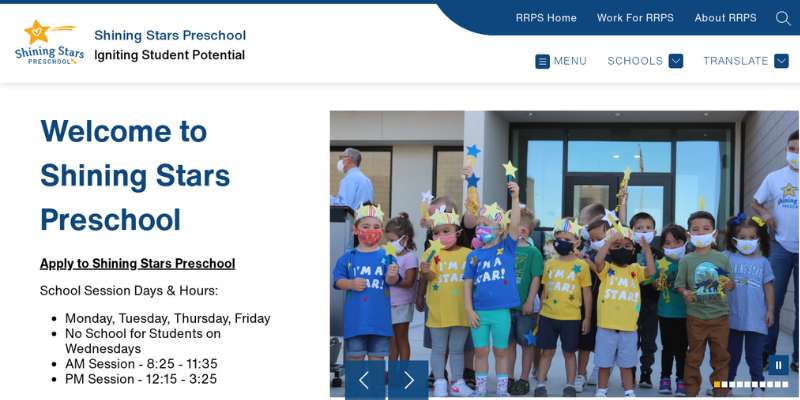
JumpStart
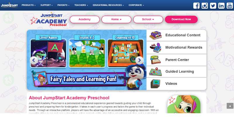
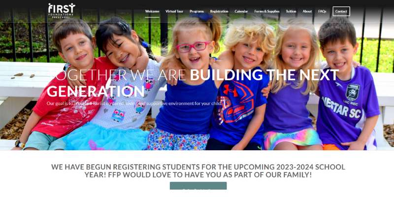
First Foundations Preschool
What Layout Structures Work Best for Kindergarten Websites?
One location and a handful of programs usually works fine as a single scrolling page. Once enrollment, staff, and multiple age groups each need their own space, that stops being enough and a multi-page site takes over.
A single-page layout is faster to build and cheaper to maintain, and everything stays within one scroll so nothing gets buried in a menu. It starts to strain once the program count, or just the word count, grows past a certain point.
A multi-page site gives every program, staff bio, and tuition tier its own indexed page, which also makes it easier for one specific page to rank for one specific search. It costs more and needs more content to fill it out properly, which is the trade a lot of smaller centers aren’t ready to make yet.
Single Page Layout
This fits one location, one age range split across two or three classrooms, and a short list of programs. Nothing more complicated than that.
Generous white space between sections keeps a long scroll from turning into a wall of text. Each block needs room to breathe, or the whole page starts to feel like a brochure nobody edited.
Anchor links in the header jump a visitor straight to the section they actually want, instead of making them scroll past everything else first.
Multi Page Layout

Multiple age groups, a dedicated tuition page, a staff directory big enough to need its own space, that’s when a multi-page structure earns its cost.
Homepages on these sites often build on grid systems, previewing each program in an equal-sized card so a parent can scan several options at once without clicking around blindly.
- Dedicated URL for each program page
- A separate curriculum page apart from the general program overview
- A blog or news section becomes realistic to maintain
Mobile Responsive Behavior
Only 48% of mobile websites passed all three of Google’s Core Web Vitals thresholds in 2025, according to the HTTP Archive Web Almanac. That’s less than half.
A kindergarten site loses more from a broken mobile layout than most small business sites do, because the parent checking availability during school pickup is holding a phone, not sitting at a laptop.
- Buttons sized for a thumb, not a mouse cursor
- Program cards that stack vertically instead of shrinking sideways
- Forms that don’t require pinch-zooming to read a label
What Visual Design Choices Work Best for Kindergarten Websites?
Color, type, and imagery carry more weight here than on almost any other kind of business site. Parents are judging warmth and safety, not competence alone, and a palette that reads corporate or cold undoes every other good decision on the page.
Color Palette Choices

The palette’s energy level should match the age group on that specific page, not whatever color the director personally likes best.
| Palette Type | Mood It Signals | Best Fit |
|---|---|---|
| Bright primary colors | Energetic, playful | Toddler and pre-k programs |
| Soft pastels | Calm, gentle | Infant and nursery programs |
| Muted neutrals with one accent | Orderly, focused | Montessori and academic-leaning centers |
Soft pastel blue or a calming mint green shows up constantly on infant and toddler pages for exactly that reason. It reads as gentle instead of loud.
Whatever the palette ends up being, the logo colors and the site’s accent colors need to match exactly. Not approximately, exactly.
Typography Pairing
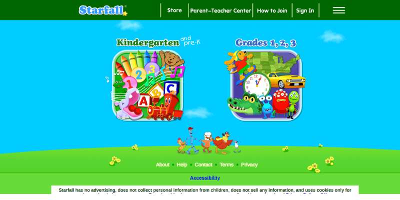
Two fonts, two jobs. One rounded and friendly for headings, one plain and easy to read for body copy.
- A display font for the homepage headline
- A clean, readable font for paragraphs and forms
- No more than two font families on the entire site
Mismatched font pairings are common enough that whole guides exist just to fix them, which says something about how often centers get this wrong.
Most kindergarten sites do better sticking to a clean sans-serif for anything a parent actually has to read, tuition steps, an enrollment checklist, that kind of thing.
Photography Versus Illustration
Real photography of actual classrooms, actual teachers, and actual kids, with signed release forms, builds trust faster than any stock photo or illustration ever will.
Illustration still has a place. Icons work fine for wayfinding, little program markers and the like, but they shouldn’t stand in for real photos of the classroom and staff.
A dedicated photo gallery page, updated each season, does more for parent confidence than a handful of images scattered across the homepage. Centers that lean entirely on illustration or stock photography tend to read as generic, even when the program itself is genuinely excellent.
What Navigation Structure Should a Kindergarten Website Use?
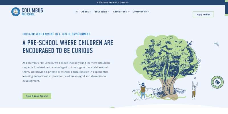
A single-location center needs a top navigation bar with five items or fewer. Past that, parents start losing track of where things are.
Mobile devices account for roughly 51% of all global website traffic as of mid-2026, according to StatCounter data reported by Statista, so the mobile version of that menu matters just as much as the desktop one, arguably more.
A hamburger icon on mobile is standard now and rarely confuses anyone, but it needs to open into a full-screen menu. Not a cramped little dropdown that feels like an afterthought.
Menu Structures for Multi-Program Centers
Centers running infant, toddler, and pre-k programs under one roof usually need a dropdown that groups programs by age, not a flat list.
- Programs grouped by age range, not alphabetically
- Tuition, class schedule, and enrollment kept as separate top-level items, not buried under “About”
- A maximum of seven top-level menu items before a parent starts losing track
The enrollment link usually gets its own visual treatment inside the menu, a different color, a button shape, or just being placed last where the eye naturally lands.
Where Should the Enrollment Call to Action Go?
Above the fold on the homepage. Repeated in the header. Repeated again at the bottom of every program page. That’s the short answer.
A hero section with no visible next step is wasting the single most valuable piece of real estate on the entire site.
The button needs real color contrast against its background so it reads as clickable at a glance, not just another line sitting there.
- Placed inside the hero section, next to the headline
- Repeated in a sticky header that follows the scroll
- Labeled with a specific action like “Schedule a Tour” rather than a flat “Contact Us”
On a page with a large hero photo, the enrollment button should double as the focal point. It shouldn’t have to compete with the photo for attention.
A joint Google and Deloitte study found that a 0.1-second improvement in mobile page speed produced an average 8.4% lift in retail conversion rates (“Milliseconds Make Millions,” Google and Deloitte, 2020). A slow enrollment form does the same damage in reverse. Every extra second before that form loads costs completed submissions, quietly and without any obvious warning sign.
Secondary placement matters too. Staff, curriculum, and tuition pages should each end with a smaller version of the same button, rather than assuming a parent will scroll all the way back to the homepage to find it again.
What Trust Signals Should a Kindergarten Website Include?
Parents look for proof before they call, not after, so trust signals need to sit near the top of the page instead of buried on a separate About Us tab nobody clicks.
The strongest signals are the ones a parent can actually verify on their own: a license number, an accreditation logo, a staff member with an actual name attached.
Accreditation Badges
An accreditation badge from a body like NAEYC signals a level of review a parent can’t assess just by walking through the building once.
- State child care license number, ideally with its expiration date
- National accreditation logos placed near the footer or homepage header
- A direct link to the licensing agency’s public record, when one exists
These work best when they’re actually displayed, not just mentioned somewhere in a paragraph a parent has to read closely to even notice.
Staff Bios and Testimonials
Named staff, not job titles. A page listing “Lead Teacher” with no photo and no name reads as generic. A bio with an actual name and a few years at the center reads as somebody you could hold accountable.
Testimonials work best placed right near the enrollment form, since that’s the exact moment a parent is deciding whether to commit.
A quote does more work when it names something specific, a child’s progress, a particular teacher, than when it’s just another vague “great school” line.
Licensing and Safety Certifications
Safety certifications matter more here than on almost any other type of small business site, for obvious reasons.
Parents tend to check for the same handful of things: current state licensing status, CPR and first aid certification for staff, and a background check policy stated plainly instead of just implied.
A center that hides this information forces a parent to call and ask, which is one more step toward calling a competitor instead. Some centers now add a login-protected parent portal for daily reports and photos. That’s a nice convenience feature, but it’s not really a trust signal for someone visiting the site for the first time.
Which Website Builder Is Best for a Kindergarten Website?
WordPress with Elementor suits centers that want full control and plan to eventually add a blog or several staff-managed pages. Squarespace or Wix works better for a center that just wants something finished fast without hiring a developer, and that covers a lot of small preschools, honestly.
| Platform | Best For | Starting Price | Key Feature |
|---|---|---|---|
| WordPress + Elementor | Multi-page sites needing a blog or plugins | Free software, hosting from a few dollars monthly | Unlimited customization |
| Squarespace | Fast setup with limited technical staff | $19 per month, billed annually | Built-in templates and hosting |
| Wix | Drag-and-drop simplicity | $17 per month, billed annually | Visual editor, no code required |
| Webflow | Agencies building custom multi-location sites | $15 per month, billed annually | Pixel-level design control |
WordPress still runs 43.3% of all websites worldwide and 60.7% of every site built on a content management system, according to W3Techs (October 2025). That scale means more themes, more developers who know it, and more troubleshooting help than any other option on this list.
Squarespace and Wix trade some of that flexibility for speed. A center with no in-house tech support usually finishes a Squarespace build in a weekend, which a custom WordPress theme almost never matches without paying someone.
Webflow sits at the other end. It’s actually cheaper than most WordPress hosting on its base tier, but the learning curve fits an agency better than a solo director trying to squeeze this in between naptime and pickup.
How Much Does a Kindergarten Website Cost?
A template-based site typically runs a few hundred dollars a year in software costs alone. A fully custom build runs into the thousands once design and copywriting get added, and that’s true regardless of which platform sits underneath it.
- Squarespace or Wix subscription: $17 to $29 per month, billed annually
- Webflow subscription: $15 to $25 per month, billed annually
- WordPress hosting plus a premium theme: roughly $10 to $30 per month
- A freelance-built custom site: commonly $1,500 to $6,000 as a one-time project fee
- An agency-built multi-location franchise site: often $10,000 or more
Cost by Website Builder
Subscription platforms bundle hosting into the monthly fee, so there’s no separate hosting bill floating around to track.
- Squarespace Core plan: $29 per month, billed annually, includes hosting and templates
- Wix Core plan: $29 per month, billed annually, adds basic e-commerce tools
- Webflow Basic plan: $15 per month, billed annually, no built-in CMS
WordPress flips that model. The software itself is free, but hosting, a theme, and a page builder all get purchased separately, so the total ends up varying more from one center to the next.
Cost by Design Complexity
A single-page site built from an existing template costs the least, simply because there’s no custom layout work involved.
A fully custom multi-page build usually bundles in a brand style guide, original photography, and copywriting as part of the project fee.
- Custom photography session
- Professional copywriting for program pages
Ongoing costs matter too, even if nobody budgets for them upfront. Domain renewal, email hosting, and the occasional content update add a modest yearly cost on top of whatever the initial build ran.
How Do You Build a Kindergarten Website Step by Step?
Planning comes before building. Always, not sometimes.
Most builds start with reference screenshots pulled into a mood board, gathered before a single real page gets touched.
- List every program, age group, and page the site needs before opening a website builder
- Choose a platform based on budget and in-house technical skill
- Build the homepage first, then program pages, then the enrollment form
- Add real photography and staff bios once the layout is locked
- Test the site on an actual phone, not just a resized browser window
- Publish, then submit the site to Google Search Console
Tools Needed Before You Start
A short checklist saves real time once the actual building starts.
- Logo files in vector format, not just a low-resolution PNG
- Brand colors already converted into web-ready codes
- A list of program names, ages served, and tuition ranges
- At least ten usable photos of the actual space and classrooms
Converting a printed logo’s Pantone color into a web-ready code is a lot easier with a Pantone to HEX converter than guessing at a close match by eye and hoping nobody notices.
Skipping this checklist is the most common reason a build stalls halfway through. Most of the delay on these projects comes from waiting on photos and copy that should have been ready on day one.
What Accessibility and Privacy Rules Apply to Kindergarten Websites?
A kindergarten site has to satisfy accessibility standards, US child privacy law, and international privacy law if it serves families abroad, all at the same time.
Getting any one of these wrong carries actual legal exposure, not just a worse user experience.
WCAG Compliance
Plaintiffs filed 2,452 website accessibility lawsuits in US federal court in 2024, a 13% drop from 2023 but still a heavy volume, according to Seyfarth Shaw’s ADA Title III tracking.
Being a small, single-location business doesn’t grant automatic exemption here, whatever a lot of directors assume.
- Alt text on every meaningful image, not just the logo
- Enough color contrast between text and background to read at a glance
- A site that’s fully usable by keyboard alone, without a mouse
COPPA and Child Data Privacy
COPPA applies to any operator collecting personal information from children under 13, and yes, an enrollment form asking for a child’s name, age, and photo counts as exactly that.
Parental consent has to be verifiable before that information gets collected or stored. Implying consent by letting someone submit a form isn’t the same thing, legally.
The FTC can fine violators up to $53,088 per violation, and that figure applies per instance, not per company. Repeated small mistakes add up faster than most people expect.
GDPR Considerations for International Sites
GDPR kicks in the moment a center markets to or enrolls families based in the European Union, no matter where the school itself sits.
Consent has to be explicit and opt-in under GDPR, not assumed from some pre-checked box nobody reads. Parents can request a copy of, or the deletion of, their child’s stored data, and cookie banners need a genuine reject option instead of just an accept button.
Most single-location US kindergartens never trigger any of this. Bilingual centers marketing to expat families sometimes do, though, often without realizing it until someone points it out.
When Does Kindergarten Website Design Fail or Not Apply?
83% of small businesses in the US now run a website, up from 64% in 2018, according to Clutch’s 2025 survey research. That leaves a real minority where building one still isn’t the right move, at least not yet.
- The center has fewer than 10 enrolled children and a waitlist already exceeding capacity
- The location is part of a franchise locked into a corporate template with no local customization allowed
- The surrounding area has unreliable broadband, making image-heavy pages slower than a phone call
- The center’s families almost entirely find it through word of mouth or a single Facebook group
In any of these situations, a well-maintained Google Business Profile and one active social media page usually does the job a full site would otherwise handle.
The math flips the moment a center starts a real waitlist marketing push, opens a second location, or wants to show up in local search beyond word of mouth. At that point, a proper site is worth building.
FAQ on Kindergarten Website Design
What is the difference between a preschool website and a daycare website?
Preschool websites put curriculum and school readiness front and center, and most organize that by age group.
Daycare sites care less about curriculum on the homepage and more about hours and drop-in flexibility. A lot of centers blend the two terms anyway, since preschool and daycare programs often run under the same roof.
Can a kindergarten use a free website builder?
A free tier from Wix or WordPress.com works fine as a temporary placeholder. It comes with a subdomain and platform branding attached, though, and that undercuts the trust signals parents are looking for. Most centers upgrade to a paid plan before the site actually goes live.
How often should a kindergarten website be redesigned?
Most need a visual refresh every three to five years, roughly matching how fast branding and photography start to look dated.
Content updates, new staff bios, a tuition change, happen far more often than that and don’t call for a full redesign.
Does a kindergarten website need multiple languages?
Only when the center actually serves a bilingual or immigrant population. A single-location, English-speaking preschool rarely gets anything out of a language toggle, while a center advertising dual-language immersion usually needs at least one more language option.
How long does it take to build a kindergarten website?
A template-based single-page site usually takes one to three weeks from content gathering to launch. A custom multi-page build with original photography commonly runs six to ten weeks, and most of that time gets eaten up waiting on photos and program details.
Should a kindergarten website include a virtual tour video?
A short walkthrough, kept under two minutes, helps parents who can’t visit in person before shortlisting a center. It works best embedded near the top of the homepage, not buried on some separate page nobody scrolls down to find.
What photos should a kindergarten avoid publishing for privacy reasons?
Avoid pairing a child’s full name with their photo, especially on any page search engines can index. Skip images that reveal a pickup schedule or the exact classroom layout too. Both create real privacy exposure for families who never agreed to that level of detail being public.
What is the ideal page load speed for a kindergarten website?
Google recommends a Largest Contentful Paint under 2.5 seconds for a good user experience. Homepages loaded with unoptimized photography miss that mark constantly, and it’s probably the single most common technical issue on these sites.
Do kindergarten websites need a blog?
A blog helps a multi-page site rank for seasonal searches, things like enrollment deadlines or summer camp openings. A single-location preschool running a single-page layout usually skips it, mostly because there’s rarely enough staff time to keep it updated anyway.
What Should You Fix First in Kindergarten Websites?
Mobile layout comes first, before anything else. A broken phone experience costs more enrollment inquiries than a mismatched palette, an outdated font pairing, or an unpolished logo ever will, and it’s not close.
- Mobile layout and page speed
- Enrollment call-to-action placement
- Trust signals like accreditation badges and staff bios
Fixing layout before branding means living with an imperfect palette a while longer. That’s a trade most directors are happy to make once they realize what it’s costing them on mobile.
Just over half of visits now arrive on mobile, and under half of mobile pages pass Google’s speed thresholds. Put those two numbers together and most centers are failing the exact channel carrying most of their traffic.
From there, the next thing worth fixing is how homepage elements build visual hierarchy. Layout and speed fixes only pay off once the page also knows how to point the eye toward that enrollment button.

Renowned for his expertise in logo design and visual branding, Bogdan has developed a multitude of logos for various clients.
His skills extend to creating posters, vector illustrations, business cards, and brochures. Additionally, Bogdan's UI kits were featured on marketplaces like Visual Hierarchy and UI8.
He also wrote in the past years on sites like Design Your Way, WebDesignerDepot, WPDean, Designmodo, Speckyboy, Slider Revolution, and more.
- The Windsurf Logo History, Colors, Font, And Meaning - 10 October 2026
- How to Remove Background From Product Photos (No Photoshop) - 10 October 2026
- How Designers can Build a Stronger Online Creative Identity - 9 October 2026

Bogdan Sandu is a seasoned designer who has been designing websites since 2008. Renowned for his expertise in logo design and visual branding, Bogdan has developed a multitude of logos for various clients. His skills extend to creating posters, vector illustrations, business cards, and brochures. Additionally, Bogdan's UI kits were featured on marketplaces like Visual Hierarchy and UI8. He also wrote in the past years on sites like Design Your Way, WebDesignerDepot, WPDean, Designmodo, Speckyboy, Slider Revolution, and more.
You Might Also Like