Imagine spending hours crafting an infographic, only to see it fall flat, failing to engage or inform. We’ve all been there, and it’s painful.
Examples of bad infographics are everywhere, and they serve as a stark reminder of how crucial good design and clear data presentation are.
Visual storytelling has the power to captivate and communicate complex ideas swiftly, but when it goes wrong, the results can be disastrous-misleading data, cluttered visuals, and ineffective communication.
In this article, we’ll delve into the common pitfalls and design errors that lead to ineffective infographics. You’ll learn how to spot these mistakes and, more importantly, how to avoid them in your own work.
From poor graphic design to misleading infographics, we’ll uncover the major blunders and how to correct them.
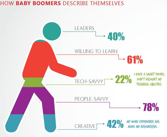
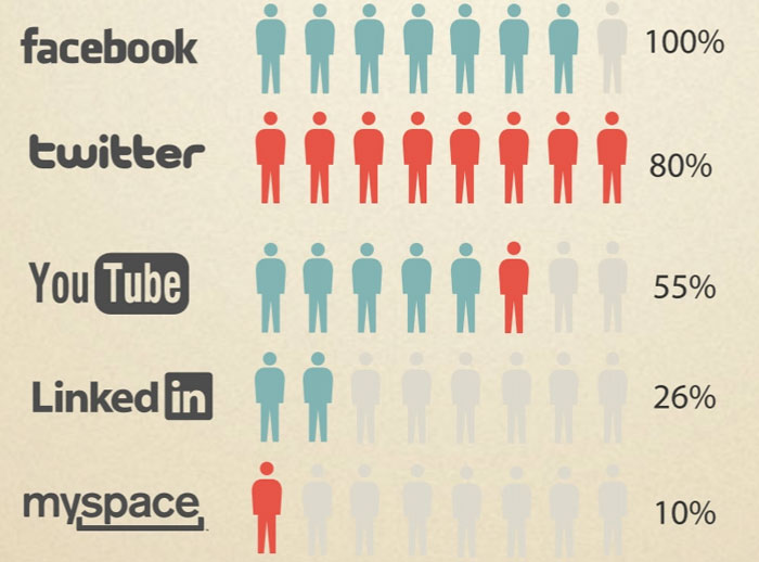
He’s 243% baby boomer
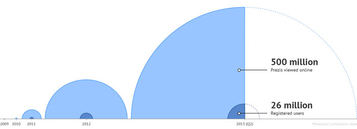
As the crow flies

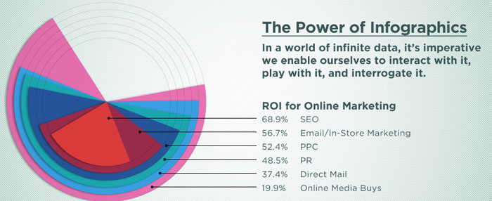
You know you’re in trouble when your design firm opts for the overlapping wedges for their homepage banner
The spiral staircase
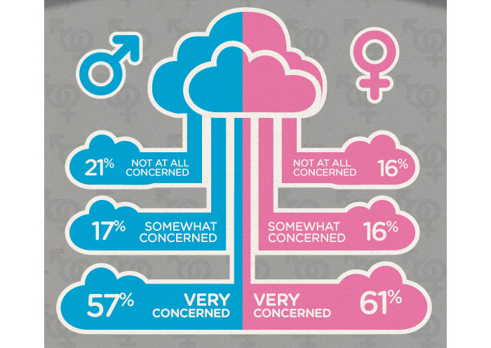
100% chance of cloudy data
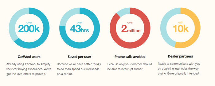
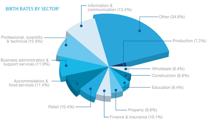
Donut charts are mostly for decoration, right?
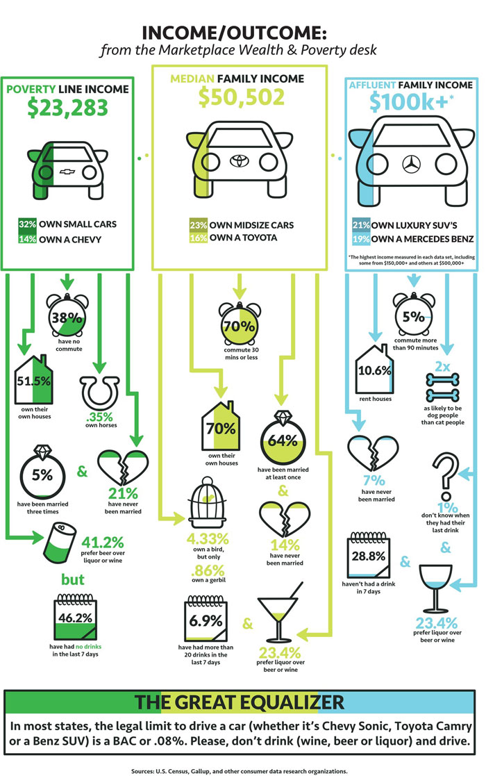
Ugh, poor people

Apparently we are supposed to make a connection between income, driving and ???
Lovely user humps
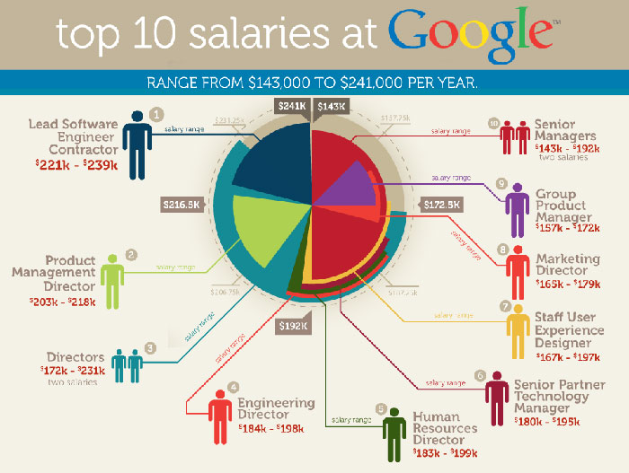
Top 10 salaries at Google
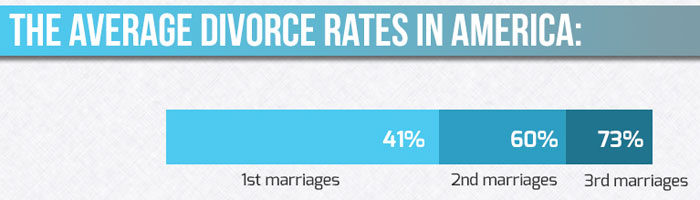
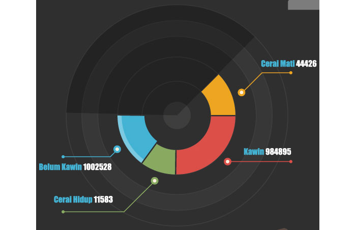
Divorced from data
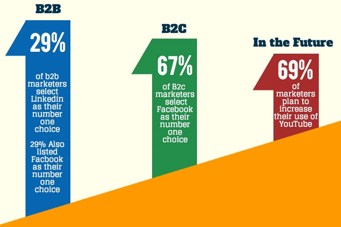
In the future
Parabolic labeling
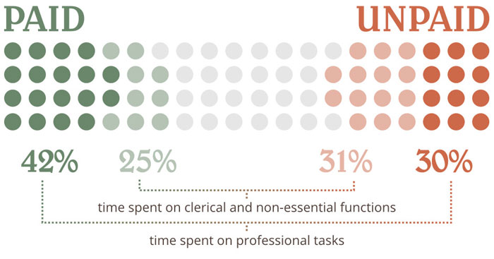
Unpaid design work
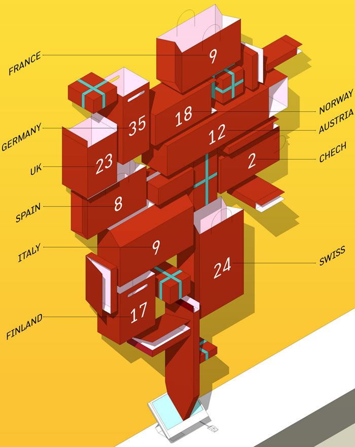
Blueberry pie
Recursive donuts
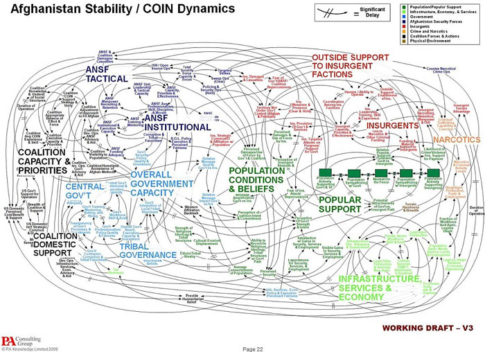
Just a working draft
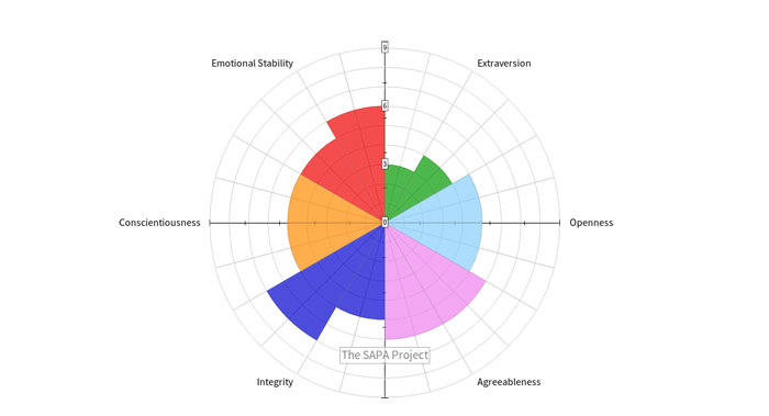
Personality circle
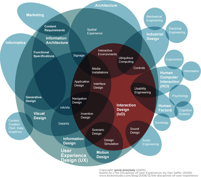
Mindmap mindfuck
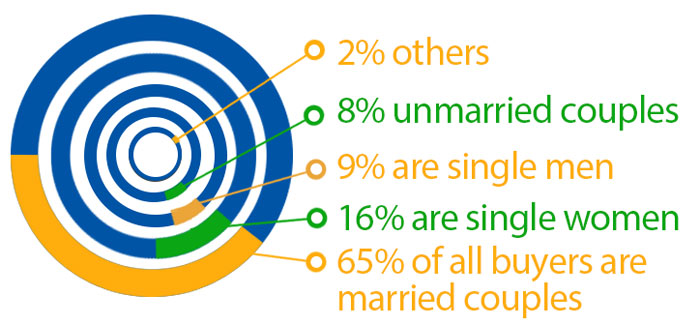
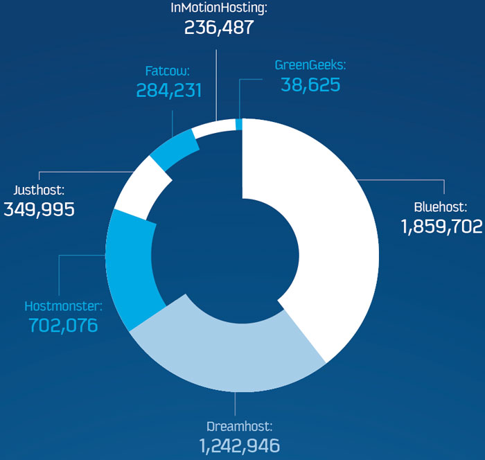
The donut ring explosion
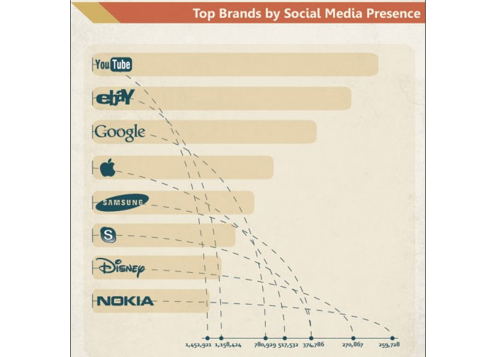
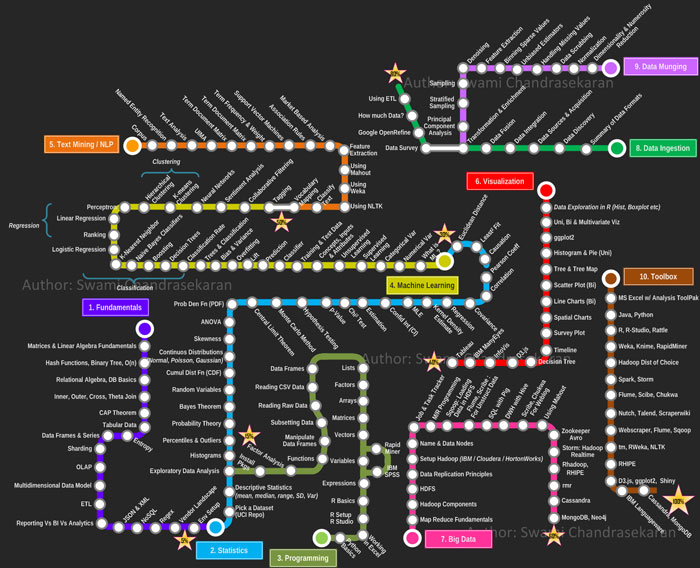
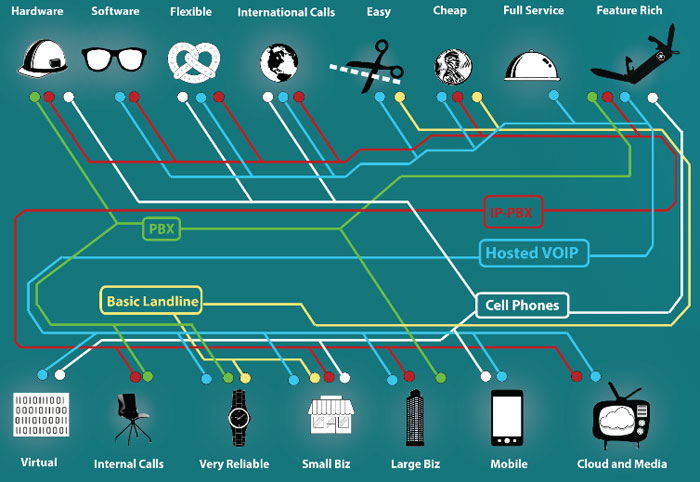
Disconnected subway map? Sequential, linear relationships?
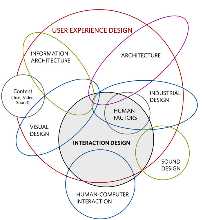
Fantastically designed user experience. /s
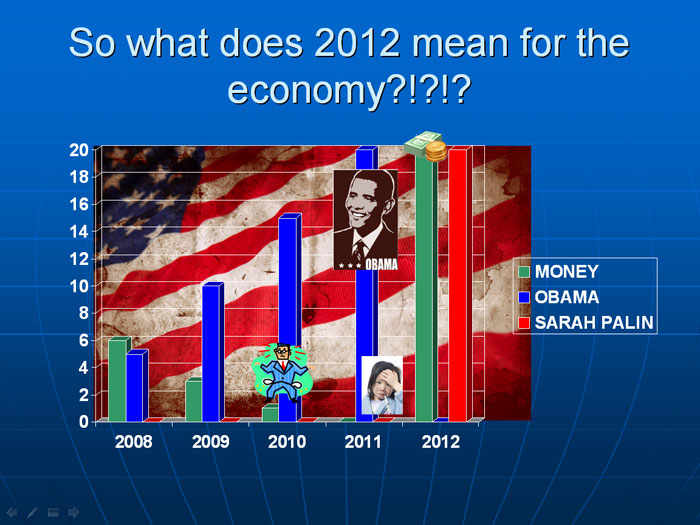
20 Obamas is just too much for our economy
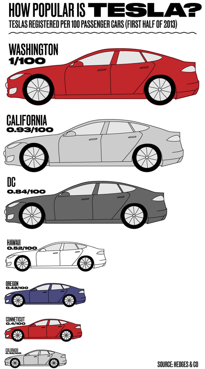
Honey I shrunk the car
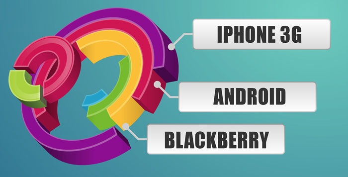
Well, that clears things right up. /s
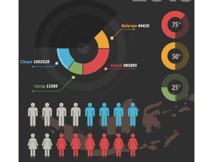
Pay close attention to the 75% donut chart
Data darkness
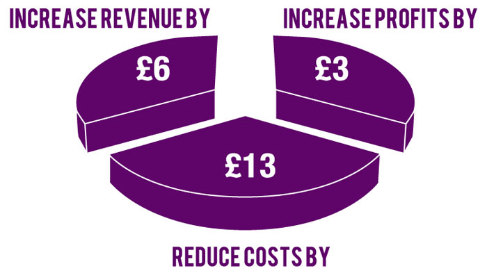
The layered pie slices
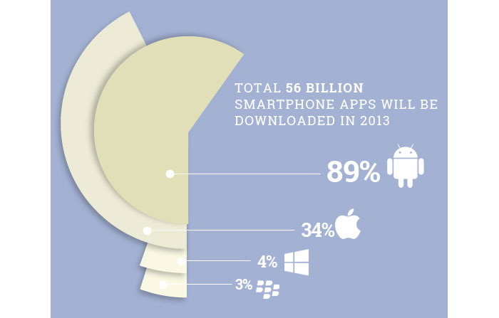
The percentages
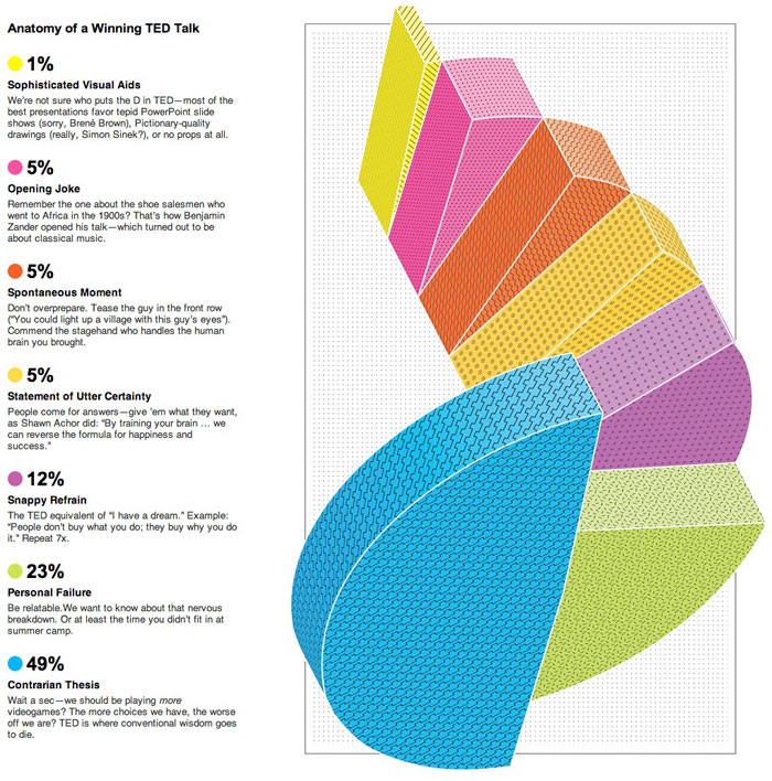
The nautilus
The dehydrating donut chart
Let the data out of the bag
FAQ On Exampels Of Bad Infographics
What makes an infographic bad?
A bad infographic fails in visual storytelling. It has cluttered visuals, confusing data, or lacks a clear message.
Ineffective communication and poor graphic design turn an infographic into a confusing mess rather than a helpful tool. Always aim for clarity and simplicity in your design.
How can bad infographics affect user engagement?
Bad infographics can significantly harm user engagement by causing confusion and frustration. If data is misrepresented or visuals are unclear, users will quickly lose interest. A high bounce rate and low user engagement metrics can result from poorly designed infographics.
What are the most common design flaws in infographics?
Common design flaws include overloading with information, using inconsistent colors, and poor font choices. These design errors make it difficult for viewers to understand the message. Effective infographics should be clean, consistent, and easy to read.
How does poor data visualization impact the effectiveness of an infographic?
Poor data visualization can lead to misleading infographics and misunderstandings. When data is not presented clearly, it can confuse or misinform the audience. Ensuring accurate and easy-to-interpret data is crucial for the infographic’s success.
What are the key elements of a successful infographic?
A successful infographic features clear data presentation, a compelling narrative, and effective visual elements. It should be visually appealing, easy to understand, and provide valuable information. Focus on quality over quantity to make your infographic stand out.
Why is user experience important in infographic design?
User experience (UX) is vital because it determines how easily users can understand and engage with the infographic. A well-designed user experience enhances comprehension and retention, making the infographic more effective and enjoyable to interact with.
How can I avoid common infographic mistakes?
Avoid common mistakes by planning thoroughly and testing your design. Ensure your data is accurate and your visuals are clear. Seek feedback from others to catch design flaws you might have missed. Keep it simple and focused.
What role does storytelling play in infographic design?
Storytelling is crucial as it guides the viewer through the information in a logical, engaging manner. Effective visual storytelling combines data and design to create a compelling narrative that holds the viewer’s attention and communicates the message clearly.
How do misleading infographics damage credibility?
Misleading infographics can severely damage credibility by spreading false or confusing information. This not only undermines trust in the content but also in the creator. Always ensure accuracy and clarity to maintain credibility and trust with your audience.
What tools can help improve infographic design?
Tools like Canva, Adobe Illustrator, and Infogram can greatly enhance infographic design.
These tools offer templates and design elements that help you create visually appealing and effective infographics. Use them to streamline the design process and ensure high-quality output.
Conclusion
Renowned for his expertise in logo design and visual branding, Bogdan has developed a multitude of logos for various clients.
His skills extend to creating posters, vector illustrations, business cards, and brochures. Additionally, Bogdan's UI kits were featured on marketplaces like Visual Hierarchy and UI8.
He also wrote in the past years on sites like Design Your Way, WebDesignerDepot, WPDean, Designmodo, Speckyboy, Slider Revolution, and more.
- Canva for Teams Review: Is It Worth the Business Plan? - 24 July 2026
- 5 Brand Compliance Checkpoints Every Enterprise Should Automate - 23 July 2026
- Timeless Open Sans Font Pairing for Any Project - 22 July 2026
Bogdan Sandu is a seasoned designer who has been designing websites since 2008. Renowned for his expertise in logo design and visual branding, Bogdan has developed a multitude of logos for various clients. His skills extend to creating posters, vector illustrations, business cards, and brochures. Additionally, Bogdan's UI kits were featured on marketplaces like Visual Hierarchy and UI8. He also wrote in the past years on sites like Design Your Way, WebDesignerDepot, WPDean, Designmodo, Speckyboy, Slider Revolution, and more.
You Might Also Like