


Calligraphy for beginners (Guide on learning calligraphy)
Are you interested in learning calligraphy?
If that’s the case, you’ve just come across the perfect article to do that.
Learning calligraphy is not an easy process, but with the right guidelines in place it may take less time than you think.
What is calligraphy?
The term is borrowed from old Greek and refers to the skill of beautiful writing.
Rather than a simple ability to write pretty letters, calligraphers are expected to follow a number of rules and conventions, including such that govern how letters are positioned and arranged in the text.
How to do calligraphy? More importantly, does it really make sense to do it?
If you’re a designer, for instance, modern calligraphy will be a great skill to add to your resume, and the fastest way to attract clients with elegant logos, signs, cards, invitations, and more.
Our calligraphy for beginners article will help you familiarize with all these things and help you in learning calligraphy, and give your work a recognizable and personalized touch.
And if you would like to learn more about calligraphy, you can look for online courses on this topic on different educational platforms like Ojowo.
Here comes our compact calligraphy guide:
Learning calligraphy – where to start
Image source: Colin Tierney
How to learn calligraphy? The first step down the road is to get the right equipment, including the best calligraphy pens. Pointed-pen calligraphy will require you to learn how to use a dip pen, referring to the ones made of metal tips and nibs, and attached to special nib holders.
All similar guides on calligraphy basics recommend these pens, as they don’t contain ink inside and can’t cause any damage – instead, you dip them into the special container while writing, and benefit from their flexibility to experiment with line variations. This way, your pen will never corrode or clog; despite of the number of different inks you have to use to complete your project.
How to use calligraphy pens? These are the tools you will need:
- Nibs
- Nib holders
- Paper suitable for fountain pens
- Ink
The nib
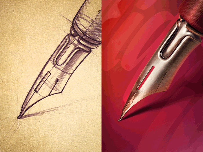
Image source: Mike I Creative Mints
The nib we’d recommend to beginners learning how to use a calligraphy pen is Nikko G-Nib, having in mind that it is relatively firm, and produces this and nice lines with the desired level of flexibility.
The nib holder
There are two types of nib holders: Straight and oblique. The first time suits better upright calligraphy styles, while oblique holders facilitate the combination of several different styles.
A high-quality and affordable alternative is the Speedball Oblique Pen Nib Holder, as well as Tachikawa Comic Pen Nib Holder for Various Pen Nib – Model 25 (great choice for upright styles, as it holds the nib more firmly than other similar alternatives).
There are also designers who use the same holder for all calligraphy pens, but we advise beginners to try several different options before they choose a single holder.
The paper
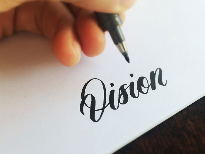
Image source: Matt Vergotis
The roughness of ordinary paper will make it impossible for you to use it for calligraphy purposes. Among other problems, you will encounter situations of your nib catching on the paper, and creating annoying ink splatters.
On top of that, regular printing paper has more fibers and consequently absorbs the ink and lets it spread inside, which will likely prevent the smooth and clean lines calligraphers are trying to achieve.
In order to make calligraphy more effective and enjoyable, purchase paper that can withstand fountain and dip pens, as for instance popular brand Rhodia that is very smooth and ink tolerant. There are several types available: blank, lined, or with dot grids.
The ink
Image source: Matt Vergotis
There are several types of ink suitable for dip and calligraphy pen, but beginners should always go for quality black samples. Our choice here would be Speedball Super Black India, as this ink is very dark, waterproof, and on top of that reasonably priced.
Preparation tips
The same as any creative practice, calligraphy is done the best in a pleasant working environment.
A convenient and well organized desk where you can place all your supplies, and feel positive and relaxed is the best place to work on your calligraphy skills.
Choosing the best writing location
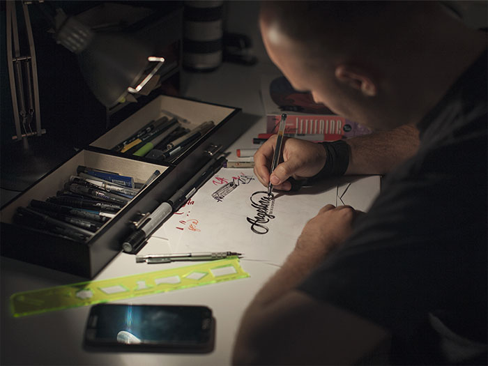
Image source: Eddie Lobanovskiy
To make the most of your calligraphy practice, pick a comfortable and relaxing place where you can rest your feet flat on the floor. Organize supplies well, and keep the place uncluttered to ensure enough moving space for your arm.
The writing paper should be placed over a special writing board, or at least 5-6 sheets of scrap pieces to write on. This way, you will have a soft surface that allows you to write more naturally than you would on the tabletop, and the surface won’t let your paper move around.
Preparing the tools
Image source: Jason Carne
Make sure there are a non-linty towel and a cup of water around, so that you can clean the nib here and there. Paper towels are also fine, but have in mind that their fibers happen to snag on the nib and cause frustrating splatters.
Your ink should be placed in a wide-mouth bottle or jar to avoid touching the sides, and placed where you won’t easily knock it over. Basically, your working tools should be within your reach, but yet on a safe distance. For instance, we’d place them inside a tape roll, or even keep them closed to avoid any risk.
As mentioned before, you should place the nib inside a nib holder. The easiest way to do that is to grasp the nib somewhere close to its base, and then push it inside the holder using its outer ring.
Make sure you’re not holding the nib by its tip, as it may bend out of shape. To do this right, look for a YouTube tutorial and follow the instructions.
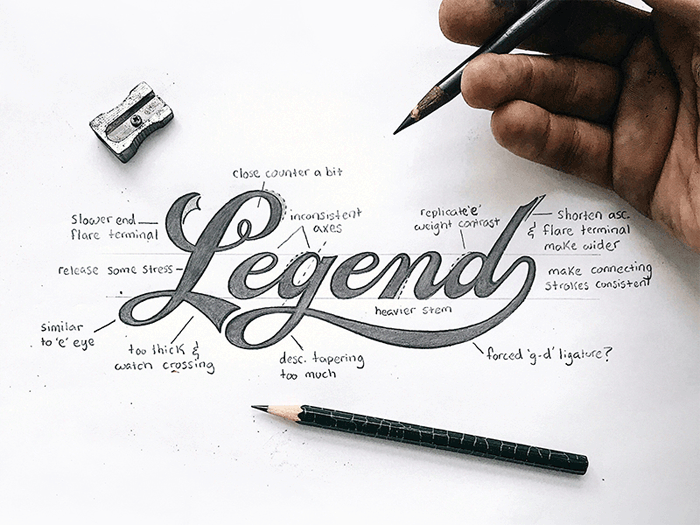
The basic strokes of calligraphy
Image source: Paul von Excite
Calligraphy’s building blocks are thick downstrokes and thin upstrokes. The thin upstrokes are easy to draw, as you hold your pen lightly and move it upwards.
Thick ones, on the other hands, require more pressure as the nib is being moved downwards. Of course, you should balance and combine both movements to produce the best possible line variation.
Before you begin, dip the nib deeply inside the ink jar, making sure that the breather hole on the nib’s back is completely covered. Wipe the excess ink on the sides off, and you can begin writing.
These are the rules you should follow:
Image source: Jeroen van Eerden
Downstrokes come first. As you hit off, don’t apply any pressure, as this will help observe the changes in line thickness. This way, you will also protect your nib.
Experiment with different loops, and combine thinner upstrokes and thick downstrokes. The continuous line loops will help you connect them, and come up with the perfect combination.
The following step is to press the drills, and then release them. Proceed with thick downstrokes, and release the pen slowly as you move towards the bottom.
Change the order. Draw your downstrokes in a way that they seem to flow into the downstrokes.
Continue with ovals. Apply heavy pressure on the left hand side and lighter pressure on the rights side.
It happens often that a new nib draws two parallel lines instead of a single one, or ‘railroads’, as experienced calligraphers describe it. The reason is that you either applied too much pressure, or have no more ink to work with.
Equipment and stroke tips for professionals
For those of you who feel confident to start writing professionally, we’ve prepared some pizzazz to add to your beautiful lettering.
Modifiable characters
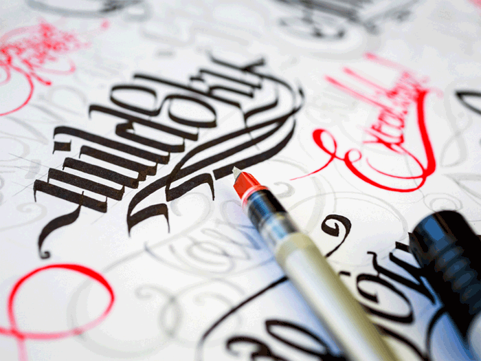
Image source: Mike I Creative Mints
An easy way to give your writing a proficient look is to change the slant, something you can easily do adjusting the width of the strokes and the length of their connectors. Start by changing the distance between letters, and giving the baseline an angled, staggered, or curved look.
Such modifications will help alter the feeling your writing inspires, as well as the message it conveys. Is it formal, dynamic, or whimsy? Think about it!
You can also change the way in which you form letters, and make them a bit thinner, rounder, or even joined in a different way. Do this several times, and you will for sure come up with a brand new design.
Flourishes and frills
Image source: Paul von Excite
Your are learning calligraphy so you need to do some flourishes. Flourishes can be added to your text as curlicues and loops, so that it will turn our more beautiful and easy to notice. For instance, you can cross heavy lines with lighter ones to show that you do care about the text’s visual balance.
Another alternative is to trim the calligraphy with special drawings coordinated with your words, or use banners to highlight important lines. The more complicated your design is, the smarter it will be to start out with a pencil drawing and test it.
Traditional calligraphy
Image source: Inkration
Spencerian and Copperplate are the perfect examples of traditional calligraphy scripts, as there is little of their modern descendants’ variations to be seen on them, but the classic elegance is undisputed. Special projects may require you to familiarize with them, an idea that is also useful to improve your calligraphy discipline.
The perfect nibs
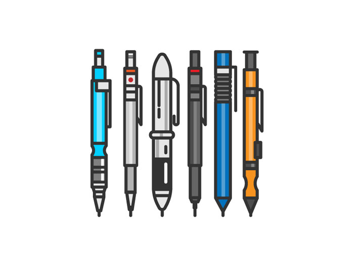
Image source: Kemal Sanli
Your ideal nib should be sharp, flexible, and very responsive. In such way, you will be able to draw thinner lines, and enrich them with dramatic and fine finishes. For sensitive projects, we recommend three great nibs in particular:
- Speedball No. 101
- Brause 361 Steno Blue Pumpkin
- Brause 66 Extra Fine Arrow
None of these nibs will be easy to use, but the effort is absolutely worth it.
Useful tricks
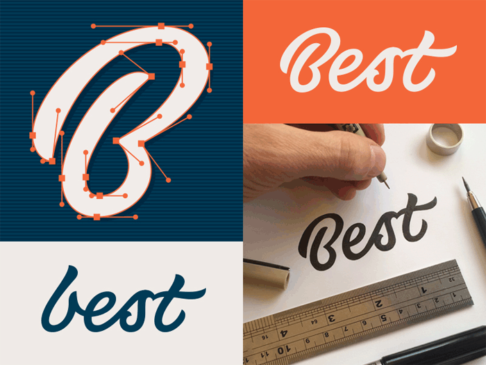
Image source: Matt Vergotis
You’ve just started monetizing your calligraphy skills, but something still looks quite wrong with it. It may be that you’re having problems using the nib, in which case you may find the following tips useful:
If you’re facing problems with the strokes:
- Instead of jumping on the bandwagon, try out faux calligraphy and see how the strokes look and fill. Write cursively, and fill in the spaces for the downstrokes. This way, you will mimic the ideal line variation, and see what you’re actually supposed to do.
- Practice on printable sheets until you’ve learned perfectly how to shape your letters. It shouldn’t be difficult to find some basic stroke and capital samples on the Internet.
- Start with lighter pencil drawings, and trace over them slowly with your pen. Once the ink is dry, erase all pencil traces.
- Large letters make it easier to depict critical mistakes.
If you got a sloppy-looking slant
- Use slanted guidelines while practicing. Draw one of your own using a protractor, or even apply regular paper. A guide sheet under the paper will make the process easier.
- In order to create the right slant, rotate the paper. You will see immediately which the best position for you is.
- In order to skip rotating the paper, replace your current nib holder with an oblique one.
If your hand is too shaky or tired to work:
- Use practice strokes to warm up
- Hold the pen loosely, and shake the hand out
- While writing, move the entire arm instead of the wrist.
- Spend more time practicing. Do more drills, even when you’re simply using your phone. This will help move the hand smoothly and naturally.
If the ink simply won’t stay on the nib
- Some of the new nibs have a very thin oil coat that may not coincide with your ink. To prevent a serious problem, rub it with alcohol (or with a softer toothbrush and paste), or simply pass it through flame.
- The problem may also be that there is some remaining, dry ink on the nib that is interrupting its flow. In such case, take a pen cleaner and scrub it off.
- Keep in mind that a regularly used nib requires occasional cleaning and maintenance. To clean it properly, remove it from the nib holder, brush it thoroughly, and let it dry completely before you apply it again.
If your work could use some refreshment:
- Change the nibs, and try several new ones.
- Change the ink. You will find many types of calligraphy-friendly ink to work with, but dip pens can usually tolerate any liquid able to leave lasting marks when applied over paper. Some designers even choose to use nontraditional methods, and make their drawings with watercolors, coffee, or berry juice.
Choose a style
Image source: Paul von Excite
Unlike calligraphers of the past, designers today are free to choose whatever style they like, or even professionalize in several ones to complete different projects. As discussed before, knowledge on several calligraphy styles is useful to showcase the writer’s personality, convey an important message, or simply complement a formal occasion. Here are some popular ideas that could inspire you:
Formal flourishes
Image source: Eddie Lobanovskiy
If the tone is classic and vintage, that doesn’t mean that the script won’t look modern. Combining styles like these will impress everyone who sees your work, starting from your friends to the Queen of England!
Elegant calligraphy
Image source: Joshua Bullock
Writings can be fun and sophisticated at the same time, and elegant calligraphy is there to prove it. Mixing classic lettering with dynamic flourishes is the best choice you have to design invitations for weddings and other special occasions.
Romantic and artistic
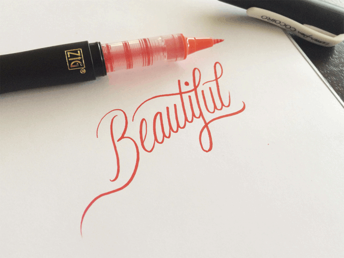
Image source: Matt Vergotis
Did it happen to you that a particular slender script reminds you of romance?
These lace-like writings have scrolled and high angle flourishes, and are thus suitable for delicate letterforms and invitations that will captivate your guests’ attention.
Whimsy
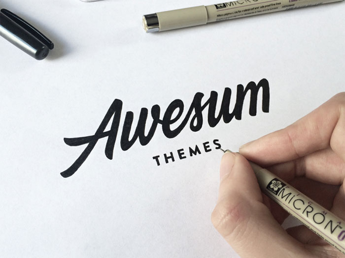
Image source: Paul von Excite
Whimsy writings feel breezy and relaxed, and usually inspire us to think of fairytales and getaways. It is because of their fluid baseline and dynamic angles that these writings capture our mood, the way a well written poem makes us dream of adventures.
Bouncing balls
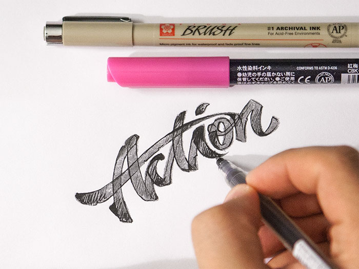
Image source: Eddie Lobanovskiy
Regardless of your age, you will always be attracted by good-looking invitations, a trick designers often use to get the fun rolling and sell well. The perfect script for such invitations is the romping one, achieved with playful baselines and rounded letters to set the good time tone.
Important calligraphy facts
- Calligraphy doesn’t happen overnight. You must practice, as much and as often as you can.
- It won’t take more than a couple of hours and few attempts to understand whether you can actually do calligraphy.
- If you’re not 100% focused, it won’t work. And that’s the end of the story.
- Calligraphy is not only about how you write, but also what you’ve written. This is why you should always write ‘real’ words, and convey a meaningful message.
- You must learn continuously. While doing so, you will discover a vast and fascinating world that sucks you in with and keeps you looking for more. The fun involved is just unparalleled.
- What makes the difference is quality, so make sure you buy some top quality supplies.
- Calligraphers are usually friendly people and awesome communicators. Thus, they are your best source of information and inspiration, and you should immediately start looking for a mentor.
The top five calligraphy options
Next, we will set down the most important calligraphy outlines categorized in five different approaches and sets of lines and letterforms. The section will also help learn on diverse tools and techniques that can be used for your projects, and we recommend you to try all of them.
Double-pencils
Double-pencils are both simple and very helpful for those constructing calligraphic letters. They can also be applied to create large and captivating lettering for posters, banners, and similar promotional materials.
You need a couple of well-sharpened pencils with two rubber bands. First, shave some of the pencils’ side surface off to place them in an adjacent position, and to make sure they are close enough.
Rest them together in a vertical, point-down position, and make sure their peaks are at the very same level when touching the paper. For the purpose, you can fasten them with tapes or rubber bands on both ends.
Then, take the double-pencil and hold it in your usual drawing position. Ideally, it should be pointed front-left, and at an angle of about 45 degrees.
While both pencils are placed upon the paper, press them lightly, and point them both forwards and left. The distance between their points is what forms the so-called ‘invisible nib’.
As you move your hand, you will be drawing a double line, and if you decide to make circles while pointing it in the same direction, your double pencil will create unique thin-and-thick ribbons with unparalleled precision.
If you don’t feel familiar with pen angles, or are lacking the confidence to produce the thin-and-thick effect, think carefully of all moves and directions involved.
This process will require three different skills: working with the pen angle; directing the hand movement; and putting the right pressure on the paper.
Felt-tip pens
These pens are more than convenient, very cheerful, and most importantly – much cheaper than all similar tools.
Of course, this doesn’t come without a toll, and the ink of these pens tends to fade in time, or maybe look too heavy and be damaged easily under the slightest pressure. This is why these pens are a great tool to practice, but not a top rated alternative when completing important projects.
To get one of your own, get a pen and a piece of paper. In case you tend to mess around with first-time experiments, get two – a 3-5mm and a 1.5-2 mm pen. Start with the broader one.
You won’t have to worry about paper either: felt-tips pens will work just fine on printer samples, parchment (not ideal for beginners), or similar materials.
The pressure here must be light and even, as many calligraphers undergoing training make the mistake of pressing too heavily. Doing so won’t help your felt-tip pen work perfectly, but only soften and splay the only tool you have to practice with. Keeping clinging contact with the paper, on the other hand, will produce much better results.
Touch the paper with only one corner of the nib, and then proceed with the other to get an overview on how your writing is going to feel.
Rest all of the nib’s end-width on the page, and then rock it slowly: does it feel that one of the corners is leaving the paper while the other still remains there? It is almost like magic!
This time, place the full width of your nib on the page, making sure that both corners are touching it appropriately. Remember that this is the ideal writing contact, and that pressing harder may cause any of the nib corners to lift.
The pen angle and the pressure are two different points, and the pen should point out to the left and the front at approximately 5 degrees. Doing that, the hand should be moved to form light and beautiful ribbons.
For sharper and crisper lines, consider getting a higher quality marker, but you should be considering this only once you feel confident to practice calligraphy professionally.
The best value and best-buy pack we recommend is Sharpie Calligraphic, which contains 12 nibs with different colors and sizes; and Staedtler Duo, a 2-piece fair quality marker set. The superior pack that doesn’t smudge and bleed is called Calligraphy Pen Set, and comes with four light-fast ink pieces in the primary colors.
As discussed previously, it makes no sense to buy special calligraphy paper while you’re practicing, as printer paper is both satisfactory and affordable.
Still, if you find yourself annoyed by constant ink stains you can consider Ampad’s Dual Ruled Pads or thin at cartridge paper such as the one used in UK, but have in mind that they will cost slightly more.
Writing calligraphy with refillable, cartridge, and fountain pens
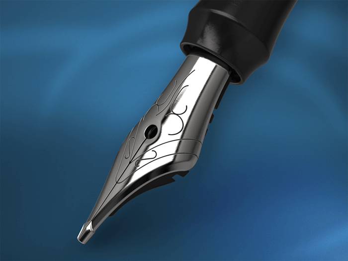
Image source: Moran Goldstein
What you will need is: a pen, a separate ink supply (a refill bottle, or an included cartridge).
If looking to understand how refillable and cartridge pens work, think of their fountain counterparts: Each pen will hold a large reservoir filled with thinner ink, and that ink will flow through the barrel’s baffles controlled by an internal mechanism. This way, it will run straight inside the nib unit, and spread easily onto the page.
With a pen like this, you will also get multiple nib units in different sizes, and a wide selection of cartridges to use with the pen’s main body.
The biggest benefit of using refillable and cartridge pens is that they’re easy to work with on horizontal surfaces, thanks to their advanced mechanism for mechanical control of ink flow.
Unlike dip pens, they’ll prevent you from running out of ink in the middle of a word, and are certainly a much safer option for clumsy beginners.
Cartridge ink is slightly thinner, in order not to dry out and clog on the innards of your pen, and this also gives it a jolly thin look when applied on paper.
The nib unit is also notably rigid, having in mind that its mechanisms have to screw within the barrel. This means that cartridge ink combined with a flexible and responsive nib may indeed revamp your whole calligraphic experience.
The same as fountain pens, cartridge calligraphy pens leak in a spectacular manner.
This doesn’t change the fact that the ink left inside them over time can dry out and clog, which imposes the need to maintain them properly. Here and there, you will have to wash their nib unit really carefully, but you can never remove all ink stuck on their basin.
A bonus tip
Image source: Paul von Excite
Refillable and cartridge calligraphy pens are considered most productive by calligraphy professionals, and are also typical for many popular websites. For this reason, beginners are highly recommended to use them.
Dip-pens and quills
There are many different types of dip pens, but there are few essential principles that apply to all of them. For instance, all dip pens are built with these elements:
- Handles and nib holders – Holders and handles are the area where the writer will grip while working, and should therefore be comfortable and soft to his hand. Most of the time, they come with internal metal arrangements on both ends of the nib, so that you can move them in and out securely.
- Nibs – Nibs are the pen’s metal endings that have two separate parts, and an extending ‘tongue’ that keeps those together. Their tip is square-cut to make full contact with paper, and usually flexible enough to allow ink to spread crisply and evenly on your surface.
- Reservoirs – Reservoirs are sometimes built within the structure of your nib, and look like small depression cups on the side used to feed the slit. Some of them are provided as separate metal cups you have to fiddle on the nib before you can use them, including such that are place on top and underneath the nib. The main function of reservoirs is to accommodate a small ink supply and keep it ready at the slit’s top, so that you’re able to write at least few words before you replenish with ink.
The reservoirs will not always be built within the nib, which makes it possible to buy each of the three elements separately, namely to mix-and-match between them. The options are endless, and can’t possibly be put together in a single guide, but the experience of popular calligraphers may help you make the right decision.
As a beginner, you may also want to save some time and effort, and thus consider buying a preassembled dip-pen kit. In most cases, you will be given 4-6 different nibs with holders and reservoirs, and they will cost less put together than what you’d pay buying them separately. We once again recommend Speedball’s Calligraphy Lettering kit, where you will find a holder and even 6 different nibs.
Ink may or may not be included in your set, so start looking for a suitable one.
The best ink types for dip pens
These are the best inks you can use with dip pens:
The best results are achieved with opaque and thicker inks such as Chinese stick ink, India ink, or even gouache paint you’ve previously diluted to make its consistency half-creamy.
For wishy-washy and undefined strokes, you can consider watery inks typical for fountain pens.
What you can do instead is to get a medium-sized brush suitable for watercolors, and then refill the reservoir at the nib-slit’s upper portion.
Writing calligraphy on slopes
With a dip pen as your preferred tool, you will find it easier to write on slops than writing desks, including easels and boards perched within your lap and supported by the desk’s edges. Calligraphy will take its time, so make sure you’re comfortable.
- First and foremost, choose a stable writing surface that won’t slide away.
- Adjust seating, and make sure you’re comfortable and set up on a working height you find relaxing.
- If possible, fix the paper surface on the slope (you can use blu-tac and masking tapes such as the ones medieval monks used to hang weight on).
If you’re using a quill or a dip pen:
- Keep the ink/paint opened, and placed close to your non-writing hand.
- Choose a good ‘parking place’ to load the brush safely once you’ve dipped it, and avoid ink from splotching on other surfaces. You can get a small saucer that will accommodate your tools while you’re having a coffee break or attend a call.
Pay attention: Resting the loading pen/brush across the open ink bottle will cause ink to spread on the handle, and eventually end up messing up your fingers while working.
How to load a quill/dip pen
- Take the pen in your writing hand, and hold it in a horizontal position
- Dip the loading brush in a way that allows you to take only few drops.
- Preserve the pen’s horizontal position while applying ink from the dropper/brush tip to the reservoir.
- Replace the saucer and the brush on their saucer, and preserve the pen in a horizontal position. Otherwise, you may end up cleaning ink stains from your lap.
- Take a piece of scrap paper and test the flow of the ink on each side of the sloping board. Only after you’ve done that you can proceed with your main tasks.
The choice of your ink, nib, and writing surface will determine how often you have to reload your reservoir. In the best scenario, you will do so after few words instead of few letters, but this may also depend on the speed you’re working at.
The very same rules apply when you’re using a quill. Unlike steel nibs, quills are more flexible and wear down easily, especially when you’re using them on cheap and abrasive paper.
Because of the slit nibs of quills and dip pens, these tools happen to damage paper when handled by a non-professional.
Unless you’re absolutely sure that you know what you’re doing, we recommend you to look at similar calligraphy methods that take less effort to learn.
Writing calligraphy with sponges and square-end brushes
Image source: Matt Vergotis
Here comes the ‘messiest’ calligraphy approach we prepared in this guide:
The thinner the brush’s sides are the better results you will achieve. The recommended width is somewhere between 6 and 20 mm, preferably with a firmer texture (sable and nylon instead of bristle, for instance). Brushes are also categorized as flat and bright, the later being consider as a better option that preserves line control with its shortness and stiffness.
You can take a normal cleaning sponge and cut it into block, and then turn it into the most remarkable calligraphy tool. When using it, don’t forget to protect your hands with ink-proof gloves.
There are several important differences between writing calligraphy with a nib and a square brush.
The brush, for instance, is very flexible and soft, and will respond to higher pressure by creating thicker lines, and that’s not what traditional nibs actually do. Another characteristic of brushes is that they tend to run out of ink quite fast, and happen to produce a modern texture and unique, scratchy look.
The best way to use brushes is on a sloping surface (approximately 30 degrees). Horizontal writing surfaces will also do well, as long as you they grip the color well.
We recommend using sponge nubs for bold and large letters, as their firmness can make your strokes unbelievably crisp.
You must, however, control the pressure you apply, as any variation may squash the finesse of your lines and cause paint to run down the page, but you can of course do this deliberately (looks absolutely adorable!).
Another interesting effect of sponges is that when running out of ink, they produce patchy effects similar to the ones of the brush, and create interesting contrasts and fading lines that are very attractive.
Ideally, you should use a thick and opaque ink as for instance India, extra thin poster paint, or diluted gouache colors for your sponges and brushes. All other runny and watery ink won’t stay long on the sponge, and will thus make your letters look drippy and patchy.
The biggest advantage of using sponges and large brushes is that they leave enough space and wet ink on the letter line for you to add additional colors, blend them in an interesting manner, or simply let them flow.
When mixing several colors in a single letter, take a slight scope is whatever bright color (white is also fine), and draw a basic letterform. Afterwards, place it on a horizontal surface, and pour several drops of darker and contrasting colors. Don’t move it until it dries completely, unless your original intention was to blend it more, and make it look unique.
Mastering faux calligraphy
Faux calligraphy is in fact modern calligraphy that has been created with a standard pen (gel, ballpoint, and so on). For many designers, standard pens help get acquainted with calligraphy altogether, and there are two important reasons for that:
The thing with standard pens is that they’re not intimidating, and are often more flexible and more approachable than other types. At the end of the days, these are tools you’ve used ever since you can remember, and there’s already enough muscle memory to work with and create beautiful calligraphy.
Faux calligraphy, nevertheless, is not only there for beginners. Regardless of your proficiency level, you can find it useful to practice for your important projects.
Assembling a great calligraphy dip pen kit of your own
Here is what you’re going to need:
- A couple of Nikko G nibs – At the beginning of this post, you had the chance to read more on the quality of these nibs, often referred to as the best beginner-friendly nibs on the market.
- A straight pen – A good choice is a Manuscript pen, as it has a universal nib insert. We also recommend General’s cork pens because of their flexibility and ease of use.
- 32# Laser jet paper – Or simply put –printing paper. This is a cost-effective solution that nevertheless prevents ink from bleeding and feathering.
- Screw-top containers and Sumi ink (India ink will do as well). Both of these inks are opaque, and will provide your work with smoother viscosity.
- ‘Art water’ – To clean the nib from time to time, you will need a cup of water.
- Non-fibrous towels and cloths – You can also use paper towels, but you should be careful keeping the nib away from catching their fibers
Instead of buying expensive, overrated calligraphy kits for beginners, we recommend you to put together one of your own, and pick only the tools that are beginner-friendly, affordable, and genuinely useful to you.
Cleaning the nibs
Upon purchase, all nibs come with manufacture oil on them, as this oil helps keep them sellable and well-preserved. It will be almost impossible to keep oil and ink on the nib at the same time, so clean the nib thoroughly before you start using it.
Once done, you will see how ink flows off the nib smoothly and seamlessly, and doesn’t blob on your paper as it would with oil in it.
Assembling the dip pen
Most beginners opt for Speedball’s plastic pens because of their Nikko G nib, but there is nothing wrong with using universal-insert dip pens either.
These pens have a rim and even 5 metal petals, and can thus accommodate many different sizes and types of nibs.
Holding the pen
Gripping a dip pen is no different than gripping a standard one, which means you’re still supposed to use the thumb and the forefinger, pinch the holder with them, and place the middle finger behind the pen for additional support. While drawing, use the ring finger and the pinky to drag light lines.
Dipping the pen in the ink jar
The nib you’re using won’t matter – the quality will still depend on whether you’ve dipped it deep enough.
In technical terms, this means dipping slightly above the vent hole (the central one), in order to avoid putting too much ink on the nib, and letting it flow down while you’re writing.
You should also shake the nib firmly over the art water to make sure all excess ink has fallen off.
You are ready to go!
The main difference between regular ballpoint pens and dip pens is the angle: modern calligraphers should be looking to keep the nib angle related to the paper constant.
You should never hold your pen vertically, but shoot for an angle of 45 degrees between your pen and the paper.
Holding it too upright is not a good idea either, as the nib may catch on the paper’s fibers, and affect the way in which your ink flows.
Bogdan Sandu, a seasoned designer with 15 years of diverse experience, has been designing websites since 2008.
Renowned for his expertise in logo design and visual branding, Bogdan has developed a multitude of logos for various clients.
His skills extend to creating posters, vector illustrations, business cards, and brochures. Additionally, Bogdan's UI kits were featured on marketplaces like Visual Hierarchy and UI8.
Latest posts by Bogdan Sandu (see all)
- Light Up Your Designs with These Light Color Palettes - 19 April 2024
- How to Measure Brand Loyalty Effectively - 19 April 2024
- The Square Enix Logo History, Colors, Font, And Meaning - 18 April 2024