


78 Great Examples of Cool Website Designs

Did you say cool websites? We have them. It isn’t easy to build one of these cool designs, but it is worth every single effort.
The layouts of great websites have a design much different compared to a couple of years back.
In the past years, there have been major changes, thanks to HTML5, CSS3 and the jQuery library that everyone loves. The impact of these nice patterns and the trends they’ve generated is massive for the web design industry.
Before the cool design we are used to nowadays, we had websites with a layout based on a standard grid or on a somehow rigid platform.
This change is a good thing because the designs are getting more and more visual and designers are paying much more attention to user interface design and user experience in general.
I’m happy to see the wheels moving forward in web design and I’m inviting you to check out some of the coolest websites around the web.
Also, if you want a website like the ones showcased in this article, you can design it yourself or you can use a website builder. Check out the best website builders and pick the one you like the most.
A complete guide to the website design questionnaire will help you ask the right questions to get a result that meets your expectations.
And one more thing, you know what could easily make a website cool and intriguing? CSS text effects. If the effect is not over the top, you can add it to your website and make it look really neat.
Cool awesome websites to check out
Booqable
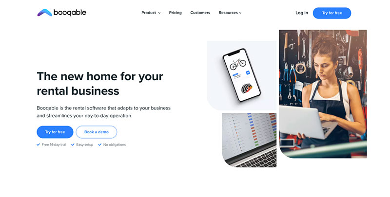
Booqable’s rental software is making rental management simple for teams worldwide. It provides companies of all sizes with the tools they need to accept bookings, serve customers, and manage their rental business online.
Amelia WordPress Booking Plugin
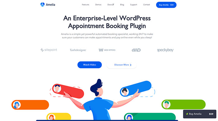
Amelia is a simple yet powerful automated booking specialist, working 24/7 to make sure your customers can make appointments and pay online even while you sleep!
Volusion
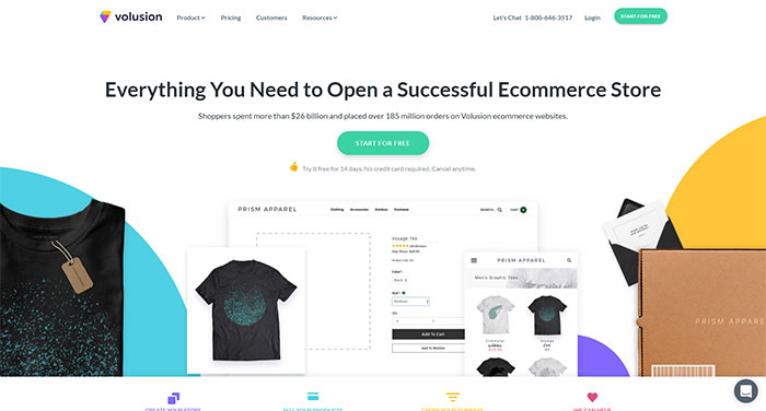
Volusion is a fully hosted, all-in-one shopping cart software trusted by over 30,000 merchants. The platform, designed for small and medium business owners, includes everything you need to succeed in terms of cool website design.
BigCommerce
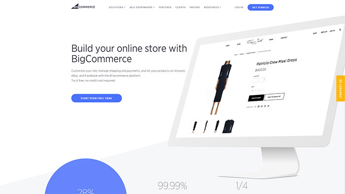
Another one of these cool websites is BigCommerce. It is a robust, flexible eCommerce platform providing established and emerging brands everything they need to launch, promote, manage and scale a successful online store. “BigCommerce does a great job of providing plenty of customization that provides flexible design features as well as necessary options for search engine optimization,” says Igor Kholkin, founder of a top-ranked Los Angeles SEO agency Avidon Marketing Group.
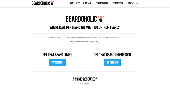
Beardoholic
Wealthsimple
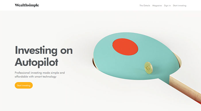
This company invests your money across thousands of companies using Exchange Traded Funds (ETFs), tracking different global economic sectors.
This way, you can bet on bigger slices of the economy while taking advantage of market diversification, without being affected by the growth or loss of one company. In a few easy steps, they’ll determine the right mix of investments that suits your personal goals. Cool web designs can be used for specific companies as well.
Ramotion
Ramotion is a top website design agency that has been delivering amazing solutions for a lot of clients.
InSymbiosis
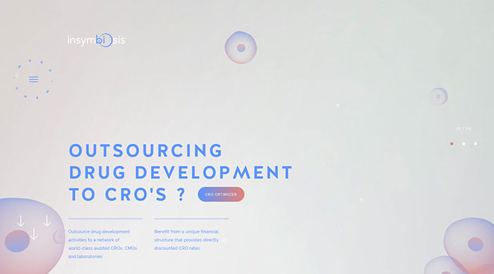
With its cool simple designs, it provides the biopharma industry with an alternative strategy for outsourcing for speeding-up drug development programs while providing lower costs for the patients. It enables critical new drugs to reach patients faster.
Chaptr
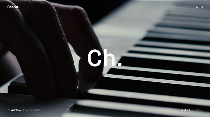
Chaptr provides end-to-end creative products to forward-thinking brands. Their handcrafted digital experiences tell stories that connect with people. It has a good website design, visually powerful, and unforgettable.
MENDO
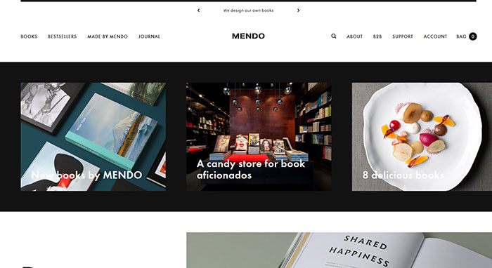
Another one of these cool website designs belongs to MENDO. It is a candy store for book aficionados with a flagship store situated in one of Amsterdam’s most inspirational neighborhoods, called The 9 Streets (De 9 Straatjes). The store is fully dedicated to sharing the love for beautiful books.
Envato Elements
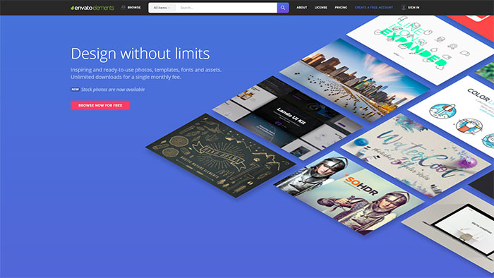
All the awesome UI Kits you need, as well as many other design elements (including 240,000+ fully licensed stock photos), are available for a single monthly subscription by signing up to Envato Elements.
The subscription costs $29 per month and gives unlimited access to a massive and growing library of 29,000+ items that can be downloaded as often as you need.
Héloïse Thibodeau Architecte
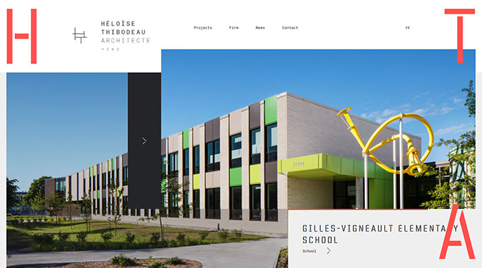
This is another example of interesting websites. The main goal of the architecture firm is to outline the most innovative standards of excellence in design while maintaining superior norms in the field of construction.
The company believes in the importance of applying high standards for every project. From conception stages to the final outcome, the team aims at guaranteeing to both the clients and their users the best functionality and design which makes each project a long-term success.
QC Terme
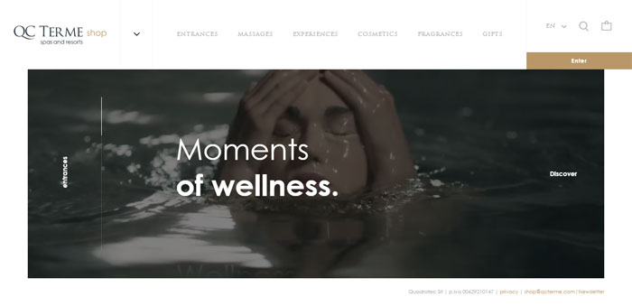
A restyling of the e-commerce for QC Terme spas and resorts, but also a new seamless, cool and good omni-device experience for the user.
Bulgari Serpentiform
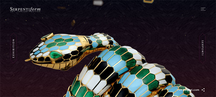
Design your Serpenti is an interactive project, allowing the user to be one of the artists of the Serpentiform exhibition, from the Singapore ArtScience Museum and at Mori Tower of Tokyo.
Piero Milano
Piero Milano Gioielli is synonymous with excellence and prestige, creating the most original lines of jewelry, reflected in the awesome designs of the websites too.
PeekaBeat
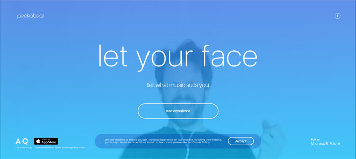
The right playlist at a glance. PeekaBeat uses the Facial Action Coding System for recognizing your mood and suggesting a customized playlist on Spotify. You can add this one to the really cool websites.
Pal Zileri
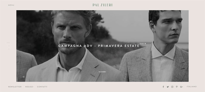
The high-end Pal Zileri men’s label was launched in 1980 and continues to embody the tailoring excellence and a strong contemporary creativity. It has cool and simple patterns and timeless elegance.
Linea Light
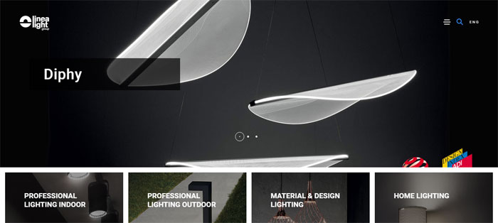
Linea Light Group combines the research on the best lighting solutions with the concepts of technology, sustainability and quality, through cool easy designs.
Cecchi Winery
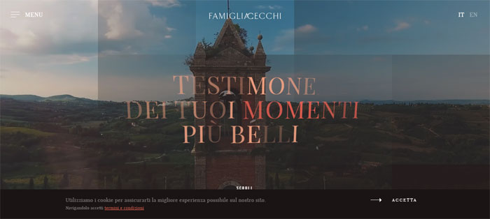
Cecchi Winery is part of the history of the Italian wine, handled with passion by Cecchi Family.
Claraluna
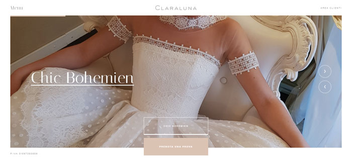
Claraluna makes every bride’s dream come true, with elegant and timeless wedding gowns displayed on a great website design.
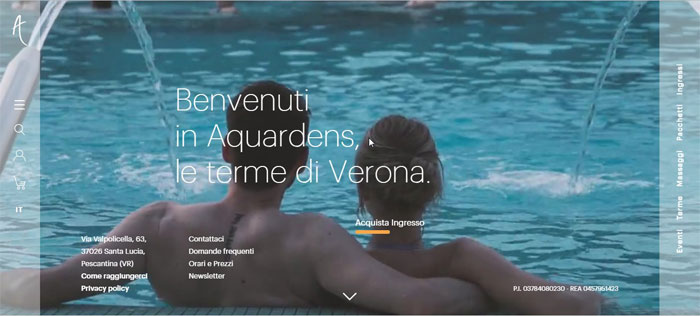
Aquardens
Müller
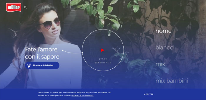
Tap your way into the world of flavors, almost too sinful to resist and savor your journey in the realm of Müller.
Assos
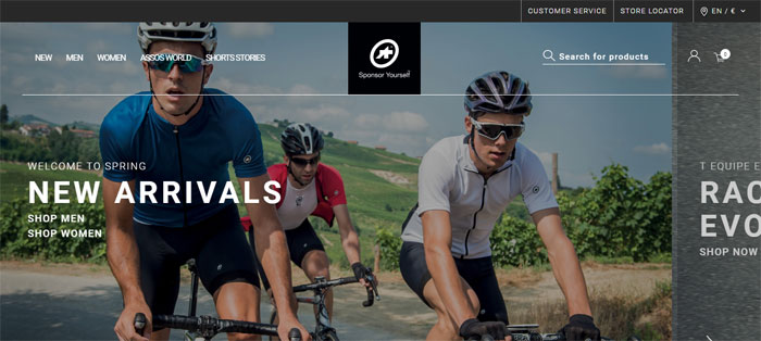
A top cycling apparel brand that focuses its attention on the perfect product performance requires a website that not only is distinguished, sporty and modern but includes all of its niche interests and cool articles.
Citco
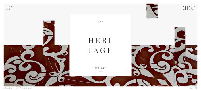
Citco creates stunning marble surfaces capable of generating a scenic impact that speaks contemporary languages in one of the most inspiring great websites designs.
Cars and Coffee
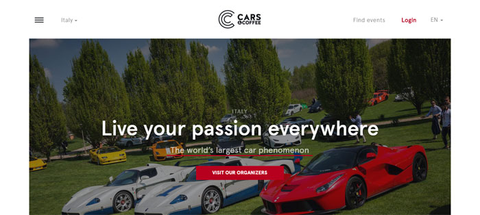
Cars and Coffee is not just a rendezvous for cars but also one of the websites with good design: it’s a meeting point for the supercar owners’ passion, super sporty and prestige vintage cars.
Galvan Mobili
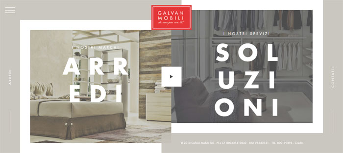
The tradition and the innovation in a single Italian name: Galvan Mobili. More than 50 years of passion and dedication that meet the needs and tastes of everyone in the heart of Veneto in good examples of good websites.
Risotteria Melotti
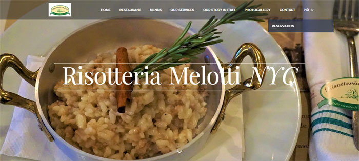
When eating is motivated by pleasure, rather than hunger. The websites designs is a combination of traditional craftsmanship and the quality of “Made in Italy”.
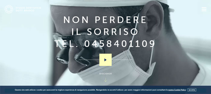
Studio Brusco
Grand Hotel a Villa Feltrinelli
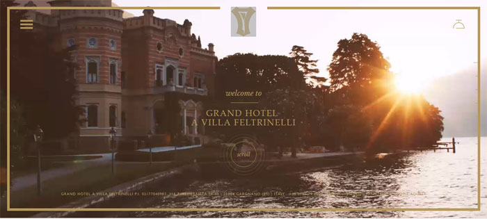
Villa Feltrinelli was restored in 1997 and transformed into a deluxe hotel by the famous hotelier, Bob Burns, the founder of Regent International Hotel. It is one of the great web design examples in the hotel industry.
Space Style Concept
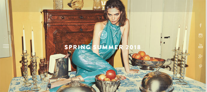
Another one of those amazing websites: The Space Style Concept nourishes by creativeness and values “Made in Italy”, for a strong and ultra-feminine identity, beyond the boundaries of conventional luxury.
Four days in Paris
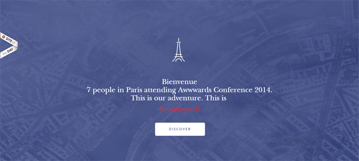
Bienvenue! 7 people in Paris attending Awwwards Conference 2014. This is #aquestparis. The answer to ‘show me something cool!’.
Lubiam | Luigi Bianchi Mantova
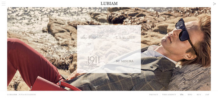
One of the few Italian companies still run by the family of its founder, Luigi Bianchi, who in 1911 set up Primaria Sartoria Luigi Bianchi – menswear and women’s dresses. Its unique web designing has cool stuff to look at.
Andrè Maurice
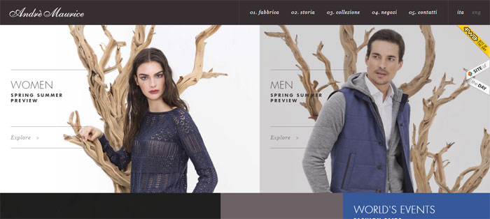
Andre Maurice can be counted among fascinating websites and combines contents and production processes of a modern industrial company with traditions and taste of the old handicraft.
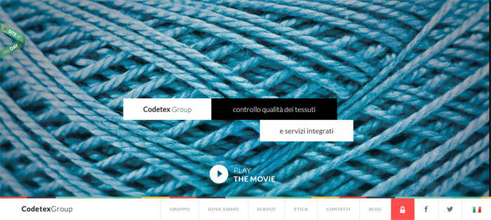
Codetex Group
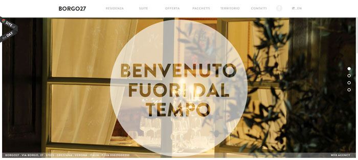
Borgo 27
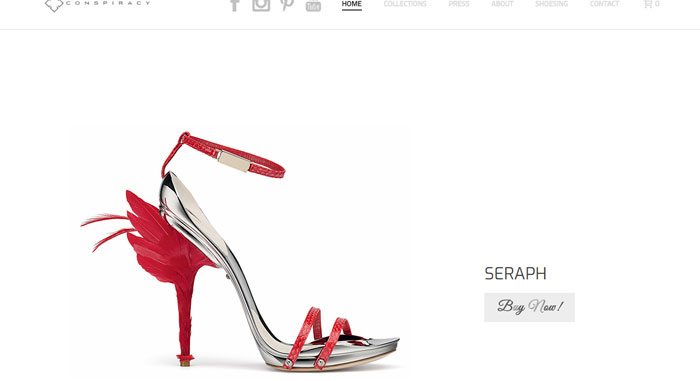
Conspiracy
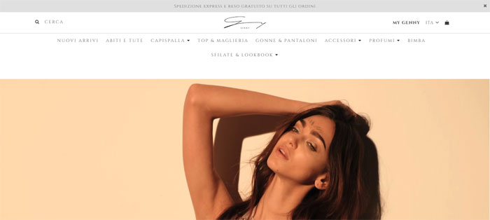
Discover Genny
Digpro
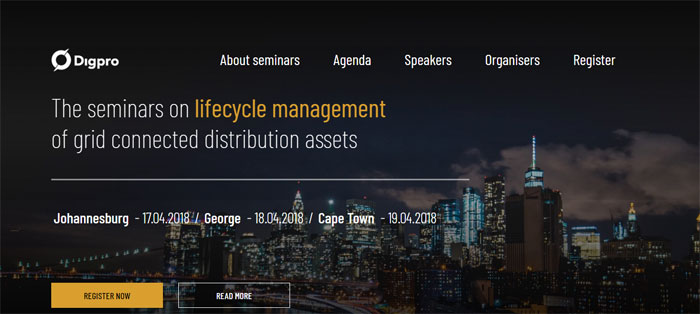
Digpro company provides cutting-edge technology to their clients all over the world and can be counted among the websites to visit if you are looking for geek stuff.
Spa Monkeys
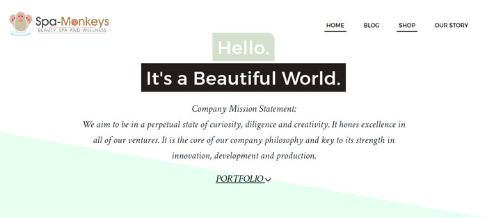
Spa Monkeys is all about beauty and wellness. Recommended to include it among the examples of great websites, its aim is to gradually implement a local service catalog, online shop, and blogging, in a way guaranteeing the highest comfort for users.
EZYcount
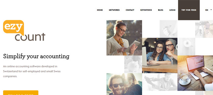
Among the neat websites, EZYcount provides an easy and secure online accounting solution. This clear and well-structured information architecture is a result of the challenging knowledge mix – design, UX and UI.
Planet Escape
Re-design always generate a lot of controversies – how to find a trade-off between funny solutions beloved by the current audience and the need of changing the branding. With its cool designs patterns, this website seems to have solved some of those issues in a very smart way.
Seasoning School
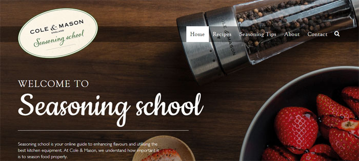
Seasoning School is an online guide with many tasty graphics and visuals. This Responsive Web Design Website with a well-organized set of tiles make it easy to find desirable recipes and designed kitchen equipment to prepare the dishes. Do you like this cool web design, isn’t it?
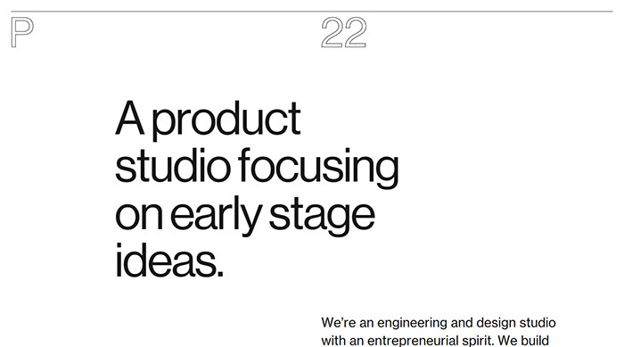
P22
Shantell Martin
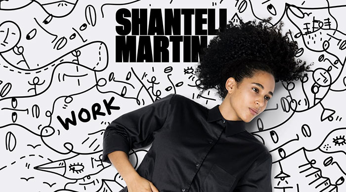
Autobiographical and dreamlike, Shantell Martin bridges the fine art and commercial world, as well as the objects, places and conversations of the everyday experience with a cool website design.
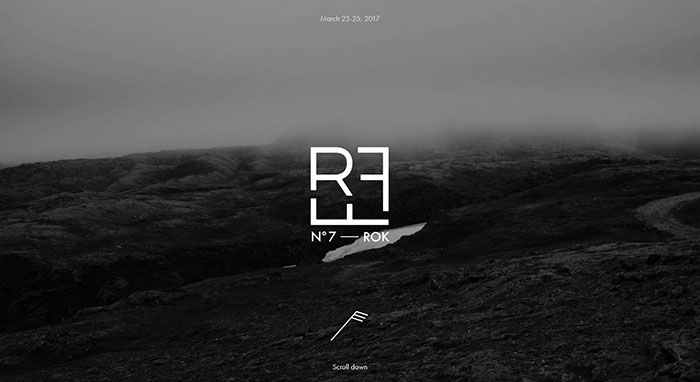
RFF — Reykjavik Fashion Festival
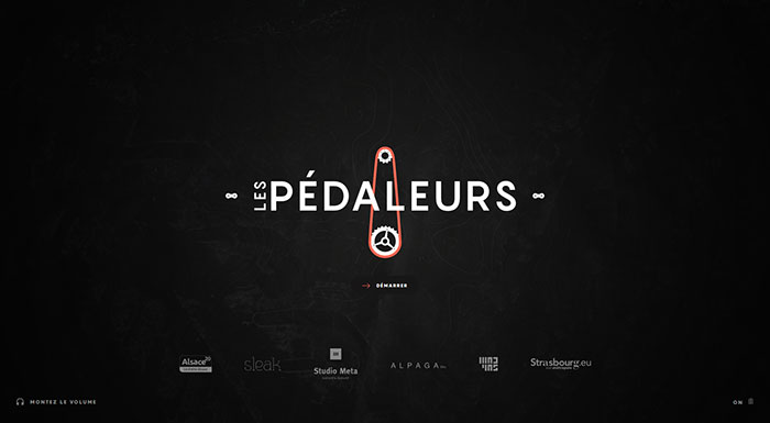
Les Pédaleurs
Size
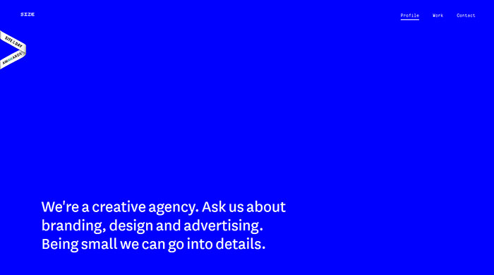
Size is a small creative agency based in Zagreb, Croatia. They do branding, design, and advertising. And they have designed a website with cool simple patterns for themselves, worth to can be included among good website designs.
The New Panamera
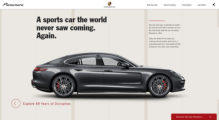
Redesigned, Reimagined, Reborn: The new Panamera is like no other sedan in the world. This presentation site is one of the cool web sites included in this article.
European Music Incubator
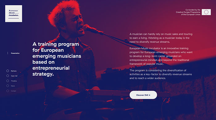
An innovative European cooperation aimed at developing support programs breaking the boundaries between music sector and other creative sectors at local and European level, you can count European Music Incubator among the cool websites to visit.
All the organizations of the partnership operate throughout the music value-chain.
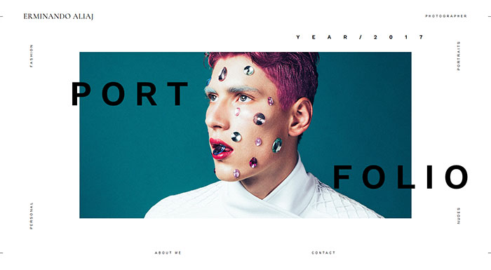
Erminando Aliaj
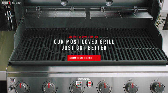
Genesis II
Volta Footwear
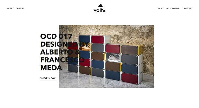
Since the launch of its first collection, Volta’s design idea was instantly clear: the blending of different and sometimes even apparently contrasting aesthetic realms.
Volta’s research focuses on designing and manufacturing the original Instant Classic, synonymous with a contemporary style withstanding the wear and tear of time. The cool website layouts are a good medium for sending this message.
Anagram.paris
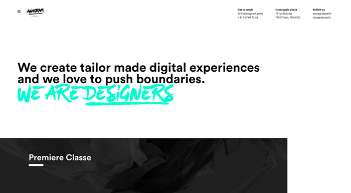
They’re not just another digital agency. They are passionate digital creatives in love with the web and its unlimited possibilities. And they have really cool designs too.
Taptaro
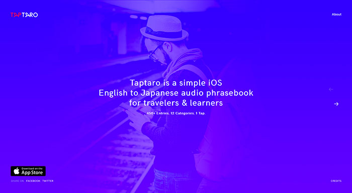
Taptaro is a simple yet effective audio phrasebook of more than 450 useful English words and phrases translated and recorded by native Japanese speakers helping you communicate better and learn more about the Japanese culture. One of the best websites if you are looking to learn and improve your Japanese.
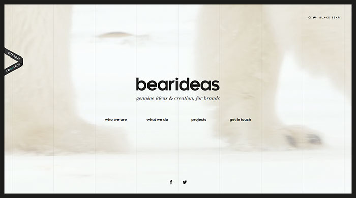
bearideas
DOT
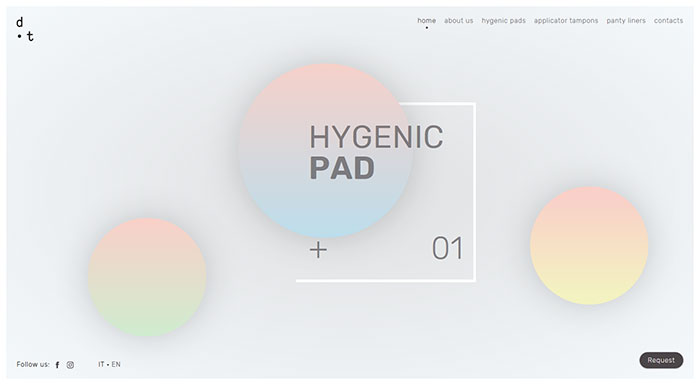
DOT is a line of innovative products, dedicated to feminine and hygienic issues during the menstrual cycle. Thanks to their 100% Cotton composition and to its special Combimedica patent, they are not only hypoallergenic but also naturally antibacterial. Probably the best website dedicated to such an issue.
It is quite clear that the company cares about their image, as their cool website was designed by a great agency.
HotelTonight
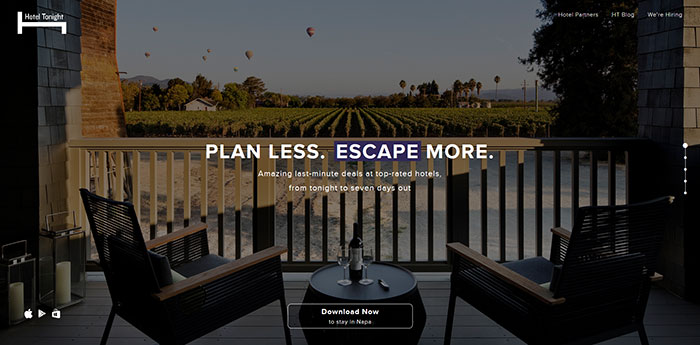
One of the good websites on this list is HotelTonight. It was built because the owners don’t think the big booking websites offer such great mobile experiences, and they felt the world needs a fresh approach – a reinvention of hotel booking for the mobile era.
Still want more cool website designs?
Our list of most interesting websites continues.
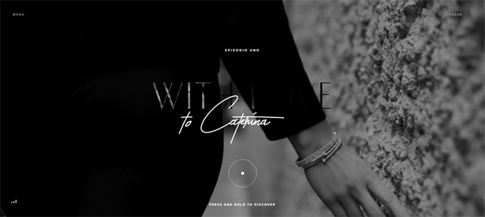
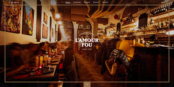
l’Amour Fou
Character
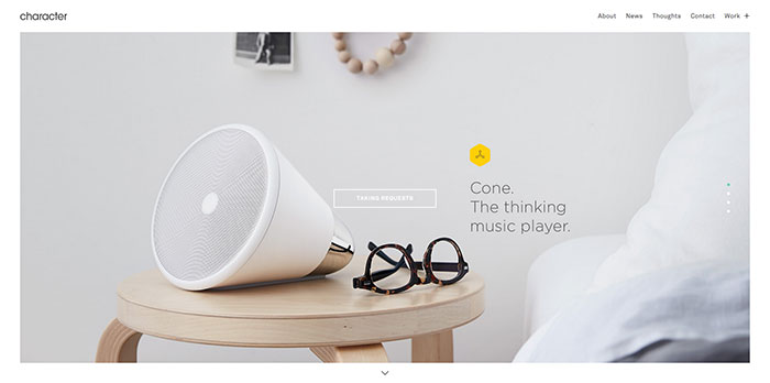
Character is one of the awesome cool sites from this list. It is a San Francisco-based branding and design agency with a passion for launching, rejuvenating and supporting interesting brands.
Their goal is to create lasting and meaningful relationships between their client’s brand and their audience through smart thinking and thoughtful design. They aim to do this by crafting stories touching people on a personal level, sparking a change in their everyday behavior. They also have amazing website ideas.
You Gotta Love Frontend
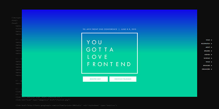
You Gotta Love Frontend has a cool website, providing a fun, energized atmosphere in which the freshest minds in this field can share their experiences, creative ideas and latest technologies – over pints of beer. Like-minded developers find an enriching opportunity to interact with each other, learn from one another and establish a professional network of communication.
Madeo Acadaemy
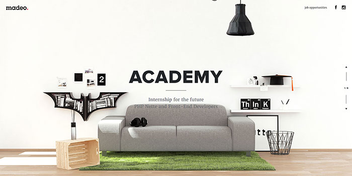
Based on the experience of the founders, you can learn few of the things necessary for the everyday coding practice. This is available, especially when working in a team. Therefore, they decided to run madeo.academy – a challenge for all future web developers. Based on their previous know-how, the participants will be offered well-tailored pieces of advice.
Helbak
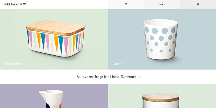
Danish ceramist, Malene Helbak, combines the simplicity of Scandinavian design with a world of exquisite colors. Her ambition is to produce articles for everyday use that make a difference, attract positive attention and become a source of joy in our daily lives. This webpage is among the unknown websites but can be added to the list of cool sites to visit.
Why only ever use a cup for drinking coffee or tea? Why not use it for flowers or pencils? Malene Helbak’s simple designs can be perfectly used in multiple ways.
Pen & Quill
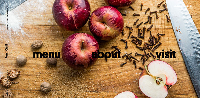
Located at the corner of N. Charles and E. Lanvale, Pen & Quill offers quality food and drinks in a refreshed setting that’s right at home in Station North. Now, one of Baltimore’s most famous buildings is once again full of great food, drinks, and life. One of the best unknown websites to visit if looking for some foodie inspiration.
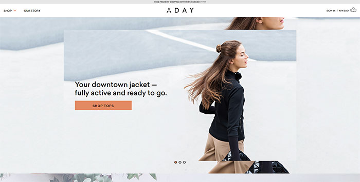
ADAY
Goodmoods
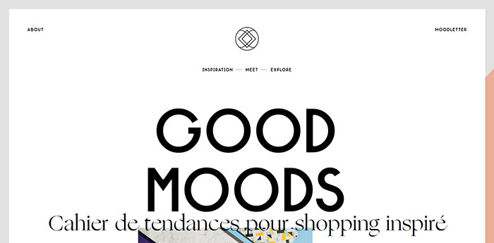
Another one of these great websites examples is Goodmoods. This is a place of inspiration dedicated to the eShopping with the mix of product styles: vintage design with new publishers, art streetwear, from handmade to home-made.
The products mix & match creating specific moods and styles offer are a trend, a time, a combination of colors, a place, an artistic movement. Everything is an inspiration and the web is an endless source of products and talents. One of the websites you should visit.
Scottie & Russell
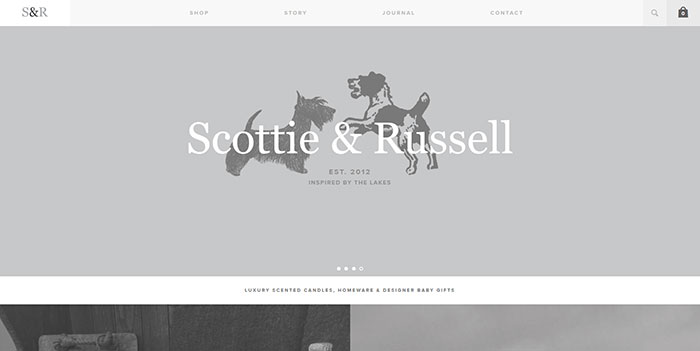
Scottie & Russell was established in 2012. After visiting small county shows & St.Tropez markets, Lucy Bee was inspired to develop her own range of fragrance candles & supplying beautiful baby gifts & accessories. Scottie & Russell is now a successful online business featured in Glamor magazine, along with an ever-increasing select list of stockists throughout the United Kingdom. You can count it among simple websites with great design.
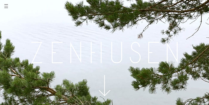
Zenhusen
One World
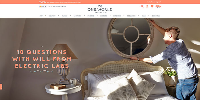
One World Trading Company offers beautiful things for home at great prices, without compromising on quality, customer service or delivery – whilst maintaining a fun and rebellious spirit along the way. No boring websites here!
Freddie Meadows
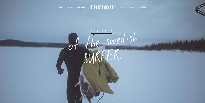
Coming from Sweden and being a surfer aren’t two things regularly connected. Especially on a professional level. Freddie was introduced to waveriding at a time when the Swedish surf team was compared to the Jamaican bobsled team.
Since his first wave in Sweden aged 13, he has navigated his way to being the first Swedish professional surfer and after many years on tour, he is currently on a sabbatical from the contest world; instead, residing at home amongst the familiar swells of the Baltic Sea in search of a little magic. One of the most amazing websites for those in love with sports but also with a unique life story.
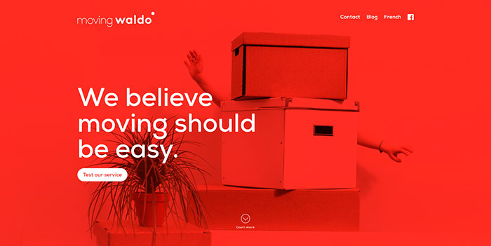
Moving Waldo
Fhoke
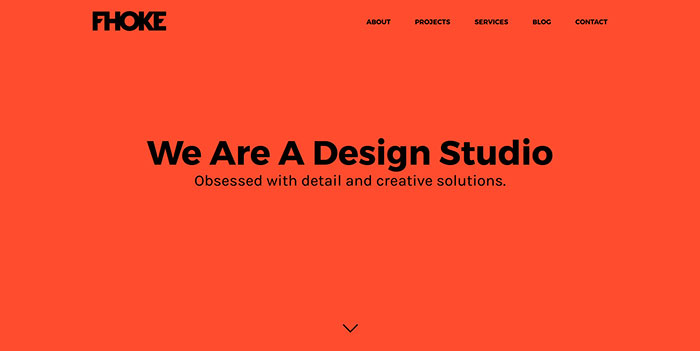
They’re honest folk believing in hard work and building lasting relationships. They enjoy making companies look better with great design, going above and beyond to please the clients.
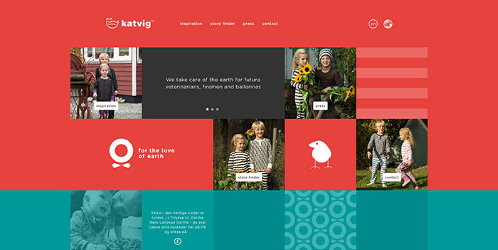
Katvig
Cultivated Wit
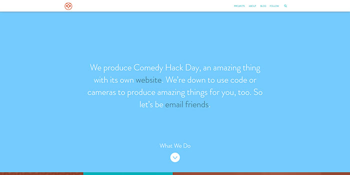
Having an awesome design made them worth including them among the random cool websites. They are a company of creative conspirators telling stories, building community, making products, and teaching too. They collide comedy, design & technology to bring good ideas to “Earth.”
Ginventory
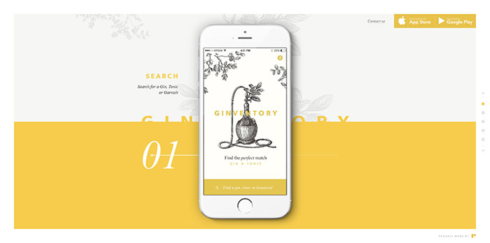
Ginventory offers one of the great websites design examples. On the site, you can search for your favorite gin, tonic or garnish and find the Perfect Serve. Discover the best Gin & Tonic combinations according to distillers and connoisseurs.
Creative Clash
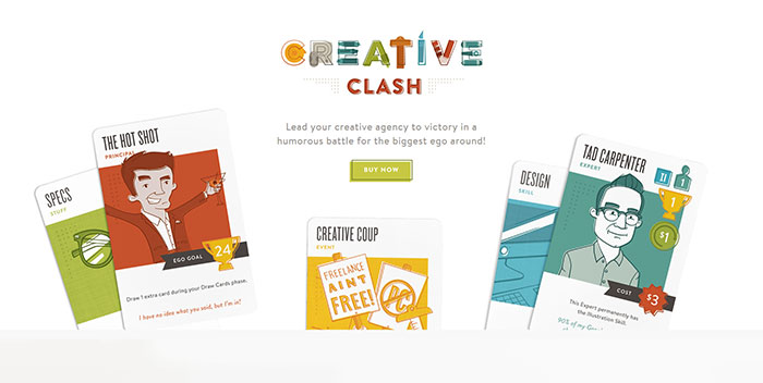
Creative Clash is one of the coolest websites ever, created and produced by The Infantry, a design and branding studio from Lancaster, PA. It’s always been a dream of their growing agency to make a game based on their experiences in the wide world of advertising and design and they finally made it! It is one of the cool websites for guys, but not only. Count it among the stuff to do online without wasting your time.
Postbox
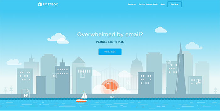
Postbox is a new desktop messaging application that can be used in a smart and efficient way. You can check and view your email messages and their content, organize your work life, and simply get things done.
Postbox works behind the scenes to catalog everything in your email: every bit of text, contact, address or link, every picture, document, or attachment. This smart information engine provides ultra-fast search, smarter and more intuitive views, and tools to help you organize and focus.
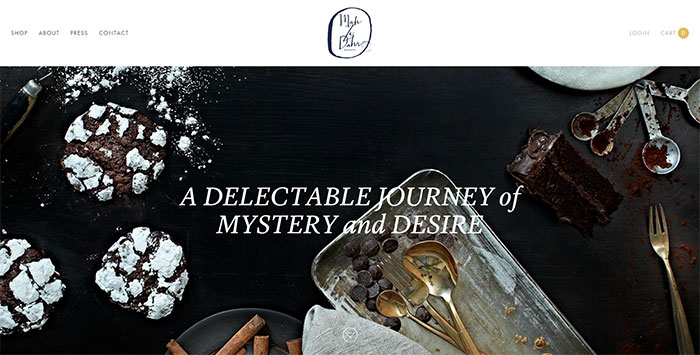
Mah-Ze-Dahr Bakery
Tan Handbags
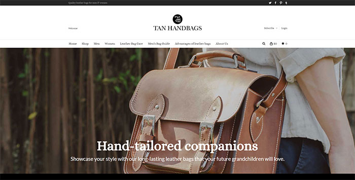
Another example of websites with cool stuff is the Tan Handbags. They are a company specializing in all sorts of leather handbags. Their bags are manufactured from high-quality leather. Skilled designers with a long experience in this field are creating stylish and practical bags handcrafted with precision for a flawless appearance.
P & Co
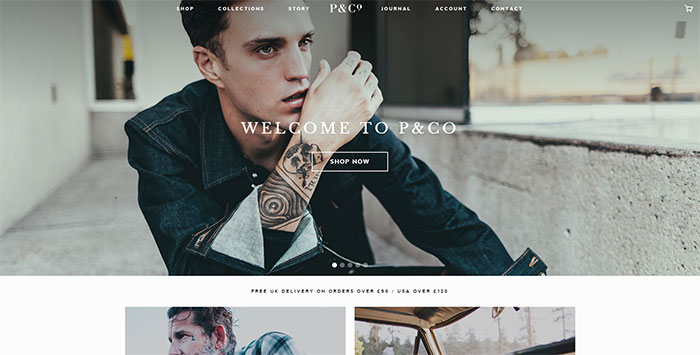
P&Co as a brand has now traded online by Clark & Timms for almost three years reaching customers from around the world. Continually creating products and ideas, there’s lots more to come from the pair and the brand’s journey will most likely continue. The awesome website designs give a lot of hope for the future.
Frank Digital
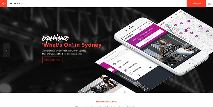
Frank Digital offers good website design examples. Their beautiful digital work is only one part of the story. For them, every part of the experience must be beautiful – from user interactions to your journey throughout the development process (and beyond). The experience of their team and the projects developed by the agency are a guarantee for this.
By combining strategy, creativity, and technology, they’ve made a deliberate commitment to putting the user ‘front-of-mind’, engineering every aspect of the process aimed at achieving this outstanding experience. Their simple cool designs are a guarantee in this respect.
8 Bis Agency
Besides being counted among good web site examples, 8 Bis is an innovative brand, design and communication agency creating consistent dialogues and emotional experiences between brands and customers.
Award winning websites you should check out
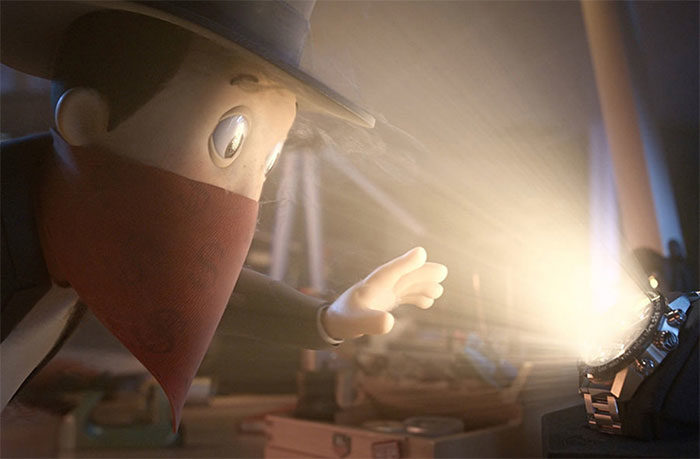
STERLING
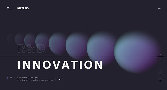
A visual experience that mixes colors, 3D models and sound-fx into the alchemy of the steroidal production.
Dominic Berzins
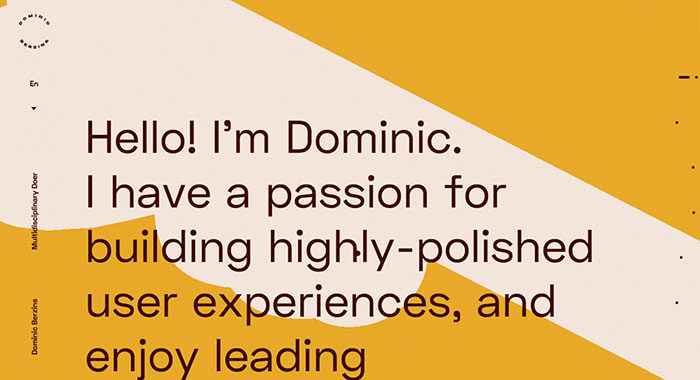
Dominic is a digital leader, based in London, UK. Experienced in high-end web, VR/AR, apps & games.
Mirage Festival – 7e Édition
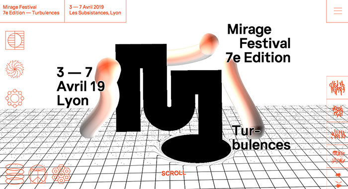
An interactive website for the Mirage Festival 7th edition. It’s using three.js and curtains.js WebGL libraries and features a lot of small animations as well. Fully responsive and mobile friendly.
BRANU Rebranding
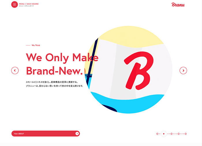
We created a website for BRANU Inc. which develops industry cloud dedicated digital solutions and construction industry.
Twist: The Game
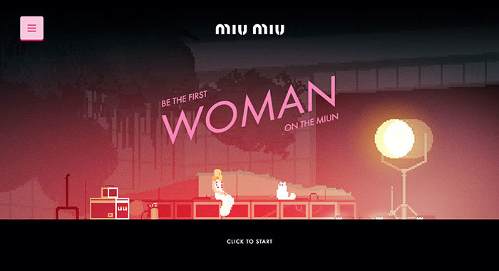
To celebrate the launch of Miu Miu new fragrance, we created a pixel art game inspired by Elle Fanning space odyssey. Join the adventure to become the first woman on the MIU-n!
TAG Heuer – Alec Monopoly
In order to communicate on the limited edition with Alec Monopoly, TAG Heuer asks Bonhomme to create the visuals of the campaign and the design of their website.
Adel Vakula
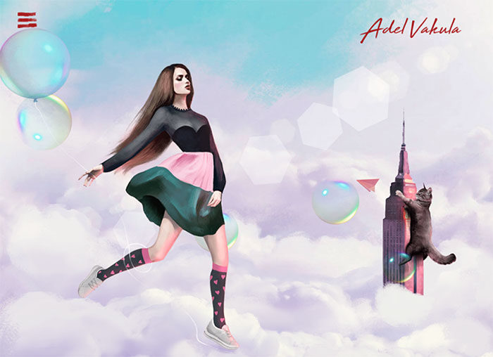
The world-famous model, charismatic and intriguing personality. Website designed and illustrated by us emphasizes its uniqueness and its creative nature.
Won Hundred
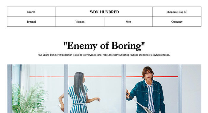
Won Hundred is a Danish fashion brand with deep roots in denim. The e-commerce site features a visible grid, a folding menu, different take on mobile navigation and everything just fits.
Zero Studios Birthday Site
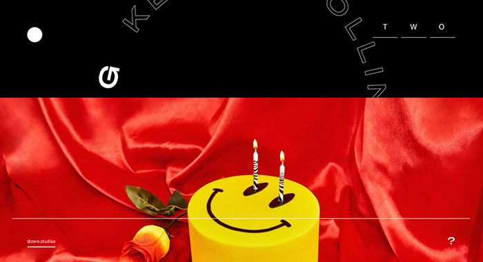
Zero Studios’ digital birthday party.
Perq Studio
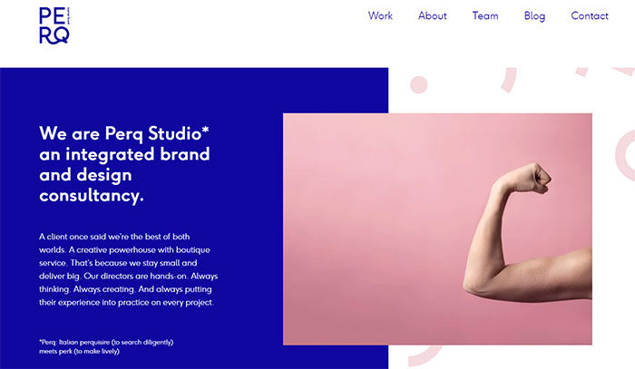
We are Perq Studio, an integrated brand and design consultancy. A client once said we’re the best of both worlds. A creative powerhouse with boutique service.
Superrb
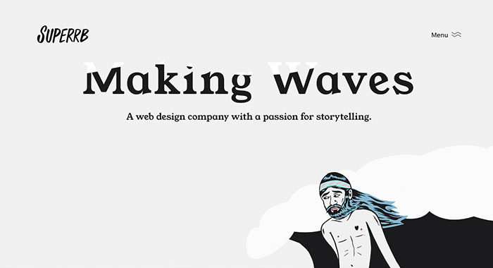
A web design company with a passion for storytelling.
Le Bon Marché, L’homme à venir
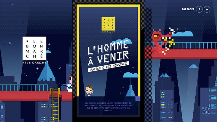
The famous Parisian shop “Le Bon Marché” asked us to imagine a universe full of pixels and monsters. We designed & produced a mini-game for mobile to win many gifts and have fun!
Sonoma Valley Museum of Art
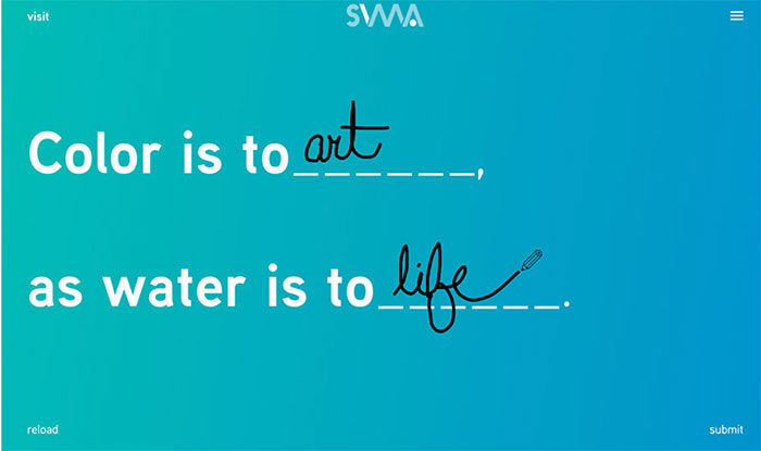
Visitors to SVMA’s new site are invited to personally redefine art, talent, and imagination through an interactive fill-in-the-blank homepage experience.
Bruegel – Once in a Lifetime
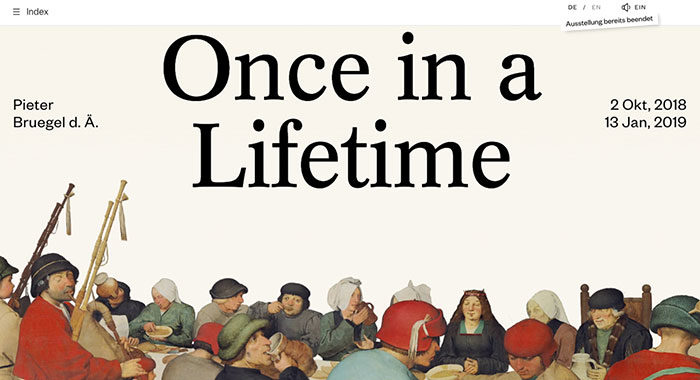
An interactive info site for the once in a lifetime exhibition about Pieter Bruegel the Elder, initiated by the Art History Museum in Vienna.
TommySport
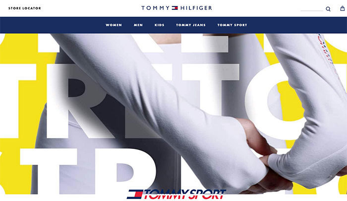
TommySport. Bringing fun into performance. This is an entry-page for Tommy HIlfiger’s new division. Providing a clear entry into the new collection.
Flume, Inc.
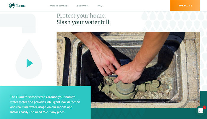
Flume, Inc. is a sensor that allows saving water and money providing intelligent leak detection and water management via their mobile app.
Borraginol Town
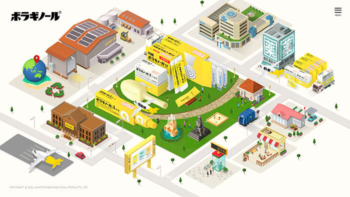
Explore Borraginol Town and discover Borraginol a Japanese pharmaceutical company and its history.
Versett
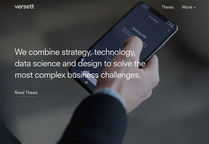
A Product Design and Engineering Consultancy in Toronto, Calgary and New York
It’s worth it
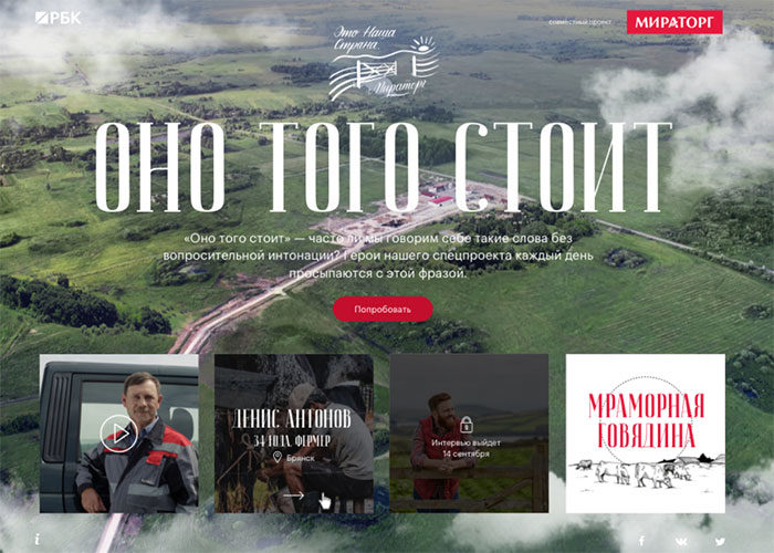
The project is about people of different professions who produces steaks for restaurants and shops. A farmer, a cook, and a technologist talk about their life’s work.
Hinderer and Wolff
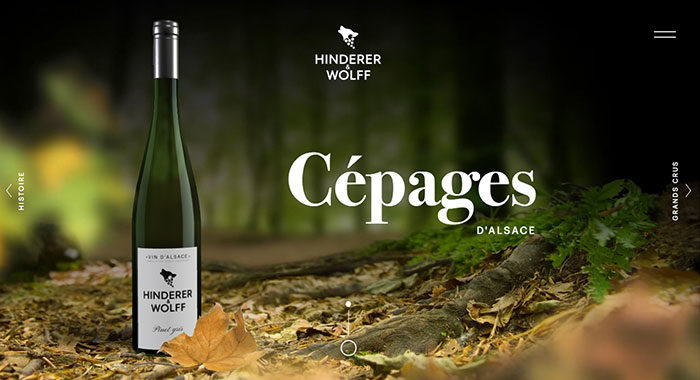
Hinderer & Wolff is a new brand of great Alsatian wines. Its 3D website immerses the spectator in the heart of the authentic Alsace through four different universes.
Curiious
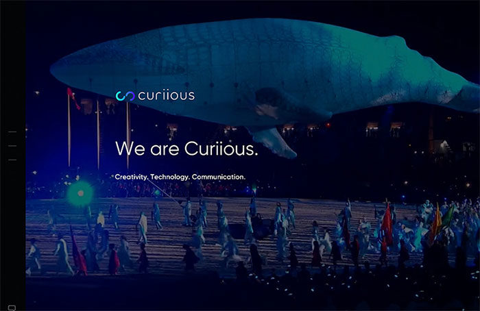
We are Curiious. Creativity. Technology. Communication.
MAGU KOMBUCHA
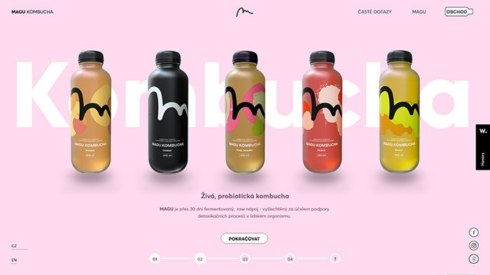
Minimalist E-Commerce website representing newly established Czech foodtech startup
Watson Design Group
Watson Design Group launched a new agency website showcasing our latest work and capabilities. We build immersive digital campaigns for clients in the entertainment space.
Christopher’s World Grille
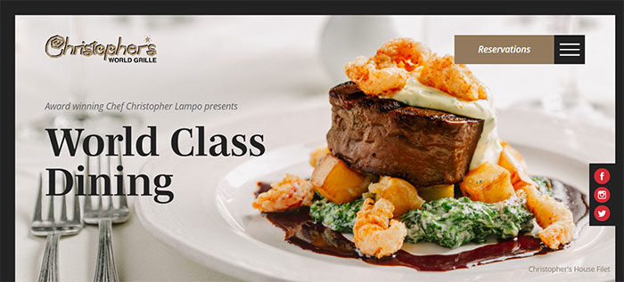
Christopher’s World Grille is a fine dining restaurant with a rich history and world class cuisine located in Bryan, Texas.
Dapper Fundation
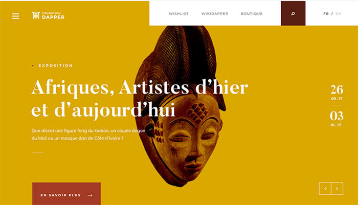
Since its creation in 1986, the Dapper Foundation’s objective is to promote arts and cultures of Africa, the Caribbean and their diaspora.
ultranoir.com
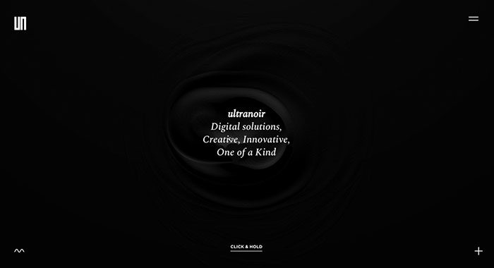
Here is the new version of our website. ultranoir is a French Awards Winning Digital Agency. We craft bold and deeply inspired digital experiences.
A new special SWISS livery
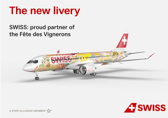
As colorful as the new SWISS Int. Air Lines livery designed by Fichtre, the website is the core of a campaign based on a short movies series where the audience influences the story.
Sydney as a Smart City
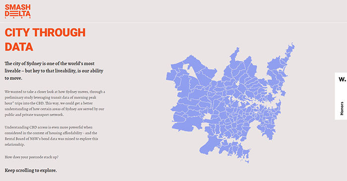
A visualized storyline of mobility and housing in Sydney – analyzed from the perspective of each suburb and how well they are served. Part of our initiative to democratize data for all.
PropertyClub
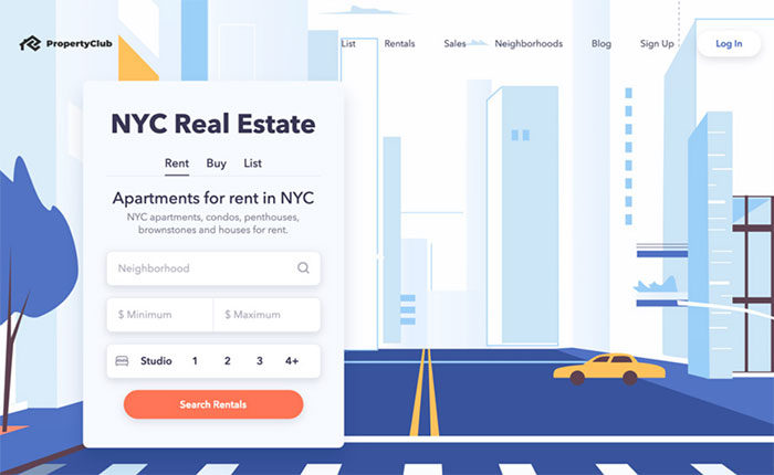
New York City’s Blockchain Real Estate Marketplace. Search for and List Properties while Earning Cash and Crypto Rewards when you Rent or Buy!
FAQ about cool website designs
What are the key elements of a cool website design?
Well, it’s all about balance and functionality. You want to have an attractive layout, good use of white space, and easy navigation. A cool design should also be responsive, meaning it looks great on any device. Don’t forget about typography, color schemes, and including engaging visuals like images or videos. The design should be consistent across the site, and you want to make sure it’s accessible for all users.
How can I make my website stand out from the crowd?
One word: originality. Be unique with your design choices, and don’t just copy popular trends. Use a creative color palette, mix up fonts, and maybe even add some custom illustrations or animations. Tell your brand’s story through visuals and content. Focus on creating a user experience that’s memorable and enjoyable, and make sure your website is fast-loading and easy to navigate. People will remember a site that feels fresh and different.
What are some cool web design trends to watch for?
Trends come and go, but here are some that have been popular lately:
- Dark mode: Easy on the eyes and battery-saving.
- Parallax scrolling: Creates a 3D-like effect when scrolling.
- Minimalism: Clean and simple designs.
- Large, bold typography: Grabs attention and makes a statement.
- Gradients: Adds depth and visual interest to elements.
- Illustrations: Custom artwork for a unique touch.
- Micro-interactions: Small animations to enhance user experience.
Remember, though, don’t just follow trends blindly. Pick the ones that fit your brand and audience.
How do I choose the right color scheme for my website?
It’s important to think about your brand and the message you want to convey. Consider your target audience and the emotions you want to evoke. Research color psychology to understand how different colors can affect people’s perceptions. Also, take a look at your competitors’ websites to see what colors they’re using. Finally, test out different color combinations and get feedback from others. Choose a scheme that feels right for your brand and is visually appealing.
What’s the importance of responsive design?
Responsive design is crucial in today’s digital world. It ensures your website looks great and functions well on any device, from desktops to smartphones. With more and more people accessing the web on their phones, having a responsive design can improve user experience and increase engagement. It also helps with search engine rankings, as Google prioritizes mobile-friendly websites in search results. Bottom line: don’t skimp on responsive design!
How can I improve my website’s user experience?
Listen to your users! Get feedback from them on what works and what doesn’t. Make sure your website loads quickly and has easy-to-understand navigation. Keep your content clear, concise, and engaging. Use visuals to break up text and improve comprehension. Prioritize accessibility, making sure your site works well for users with disabilities. Finally, continually test and optimize your site, and keep an eye on analytics to see where you can make improvements.
What’s the role of typography in web design?
Typography plays a huge role in web design. It helps convey your brand’s personality and can make or break the user experience. The right font choices can improve readability, make your site more visually appealing, and help guide users through your content. Stick to 2-3 fonts max and make sure they’re easy to read on any device. Also, consider using web-safe fonts or custom fonts that match your brand’s style.
How important is website speed?
Website speed is super important. A slow-loading website can frustrate users, leading to higher bounce rates and lower engagement. In fact, studies have shown that even a one-second delay in load time can cause a significant drop in conversions. Additionally, Google considers site speed as a ranking factor, so a faster site can lead to better search engine visibility. To improve your site’s speed, optimize images, use a good hosting provider, and minimize the use of plugins and unnecessary scripts.
What are the best practices for creating accessible web design?
Creating an accessible website is essential, as it ensures that your content can be enjoyed by everyone, including users with disabilities. Here are some best practices to follow:
- Use descriptive alt text for images.
- Ensure proper heading structure for easy navigation.
- Choose high contrast color schemes for better readability.
- Use descriptive link text instead of generic phrases like “click here.”
- Include keyboard navigation for users who can’t use a mouse.
- Add captions and transcripts for multimedia content.
- Test your site with accessibility tools and get feedback from users with disabilities.
How can I optimize my website for search engines (SEO)?
Optimizing your website for search engines is crucial for driving organic traffic. Here are some tips:
- Do keyword research to find phrases people are searching for.
- Create high-quality, engaging content that answers users’ questions.
- Optimize your meta tags, like title tags and meta descriptions, with relevant keywords.
- Use descriptive, keyword-rich URLs for your pages.
- Improve site speed and ensure your website is mobile-friendly.
- Build high-quality backlinks from reputable websites.
- Monitor your site’s performance and make adjustments as needed.
Remember, SEO is an ongoing process, and it’s important to stay up-to-date with best practices and algorithm updates.
If you liked this article with cool website designs, you should check out these other articles with awesome designs:
- Graphic Designer Websites (31 Creative Examples)
- Modern Website Layout Ideas (27 Examples)
- Portfolio Website Examples And Tips To Create Them
- Awesome New Website Designs To Inspire You
Bogdan Sandu, a seasoned designer with 15 years of diverse experience, has been designing websites since 2008.
Renowned for his expertise in logo design and visual branding, Bogdan has developed a multitude of logos for various clients.
His skills extend to creating posters, vector illustrations, business cards, and brochures. Additionally, Bogdan's UI kits were featured on marketplaces like Visual Hierarchy and UI8.
Latest posts by Bogdan Sandu (see all)
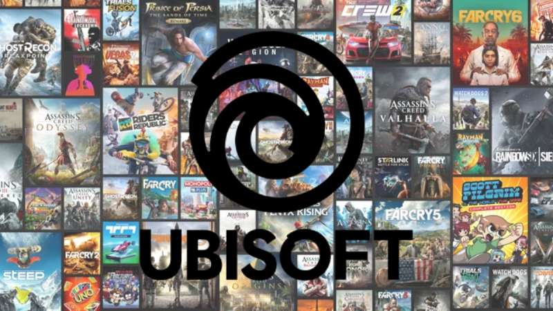
- Vintage Color Palettes That Bring the Past Alive - 16 April 2024
- The Ubisoft Logo History, Colors, Font, And Meaning - 16 April 2024
- Trending Tones: The Most Popular Color Palettes of the Year - 15 April 2024