Most people don’t stop to think about why a screen feels off. They just close the tab. Something like fifty milliseconds is all it takes for someone to size up a screen’s visual appeal, according to research out of Carleton University, and that judgment lands before they’ve read a single word on the page. It’s part of why strong user interface design examples get studied so closely in product reviews and design critiques alike.
Get the hierarchy wrong and people hesitate over where to look first. Bury the navigation three taps deep and they give up trying to find it. Contrast works differently: skimp on it and anyone with low vision, or anyone just squinting at a phone in direct sun, is gone before they’ve worked out why the page felt hard to read.
Apple and Google both build entire guideline systems around this idea, treating interface quality as something to test rather than something to eyeball. Most product teams with any real design budget do the same.
What Is User Interface Design
A button someone taps. A field they type a password into. That’s the raw material this discipline works with, shaping the screens and controls a person actually uses to run a digital product. It sits inside the wider field of interaction design and covers everything between a login screen and a checkout button.
The building blocks stay mostly the same no matter what you’re designing: buttons, navigation menus, input fields, icons, typography. How those get arranged depends less on visual taste and more on the product’s elements of design and its underlying information architecture.
Most teams don’t jump straight to a finished screen. A wireframe comes first, then a static mockup, then something closer to real: a clickable prototype, usually built in Figma, Sketch, or Adobe XD, long before a developer writes a line of production code.
UI and UX aren’t the same job, even though people mix them up constantly. Interface design is about how an individual screen looks and functions. UX design is the bigger path: research, comparison, purchase, support, everything a person goes through on the way to a goal.
Carleton University’s number for this, again, is fifty milliseconds: that’s how fast people judge a screen’s visual appeal, before they’ve processed a single word (Lindgaard et al., 2006). A cluttered first screen loses someone’s trust before the product ever gets a fair shot.
Apple’s Human Interface Guidelines and Google’s Material Design are still the two most-cited rulebooks for how a modern interface should look and behave. Bigger companies build on top of those: Airbnb, for instance, keeps its own internal design system so that hundreds of screens stay visually consistent across a huge product.
What Are the Core Principles Behind Effective Interface Design Examples
Usability heuristics catch problems in how someone flows through a screen. Interaction laws like Fitts’s Law and Hick’s Law measure something more physical, how hard a target actually is to reach or choose between. And then there’s WCAG 2.2, which sets a much harder floor: ignore it and part of your audience literally cannot use what you built, no matter how pretty the layout looks.
Usability Heuristics That Shape Examples
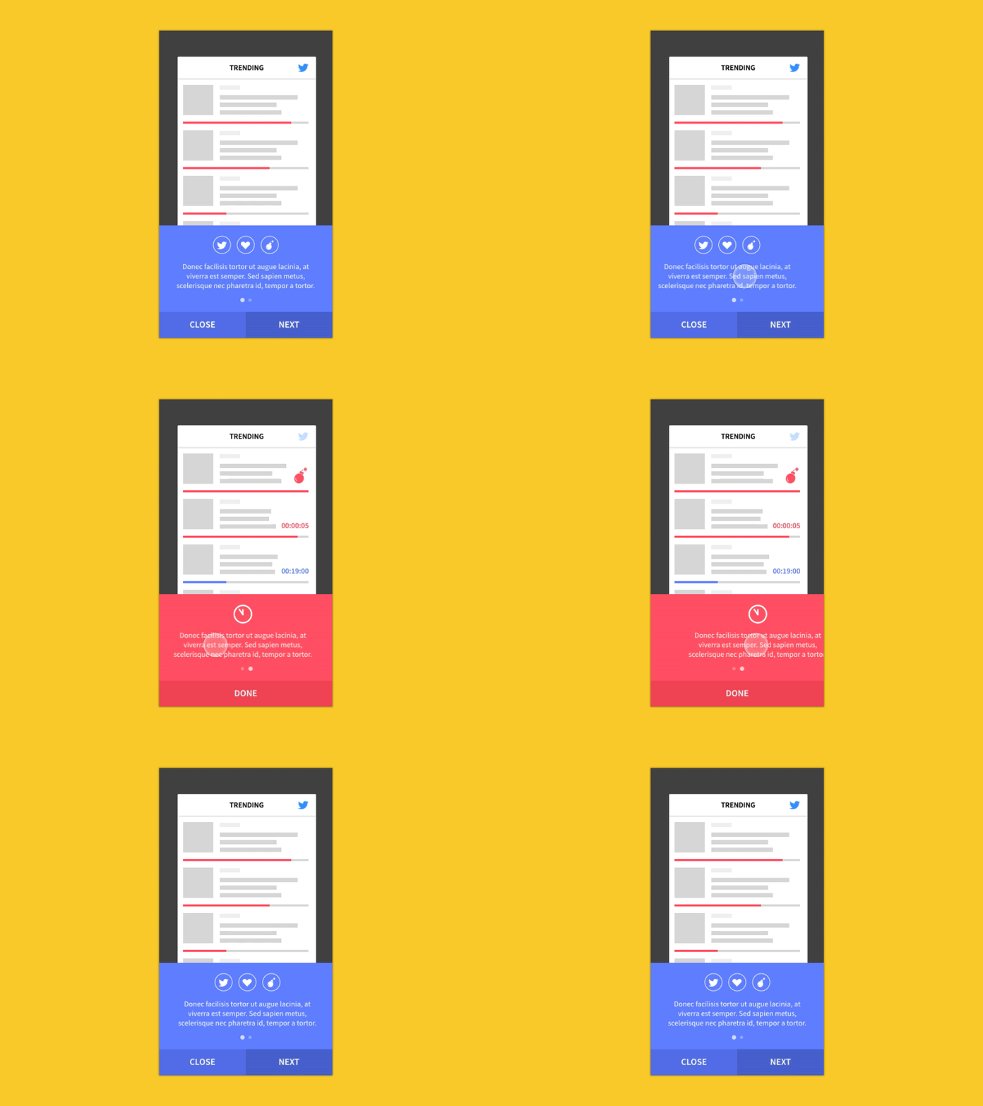
Image source: Youlanda Kuo
Jakob Nielsen’s ten usability heuristics are still the baseline checklist most reviewers reach for, covering things like visibility of system status, user control and freedom, and consistency across a product.
Fitts’s Law and Hick’s Law come up constantly alongside them. Fitts’s Law says a target gets easier to hit the bigger it is, and the closer it already sits to a user’s cursor or thumb. Hick’s Law works from the opposite direction: every extra choice in a menu adds real, measurable time to the decision.
Nielsen and Tom Landauer’s original usability testing formula, from 1993, found that five test users surface 85% of a product’s usability problems. The Nielsen Norman Group still cites that number today.
Don Norman coined the term “user experience” while at Apple back in the 1990s, and he made basically the same argument decades before anyone was talking about interface design examples: you test usability with real people. You don’t guess at it internally and hope for the best.
Visual Hierarchy and Contrast Standards
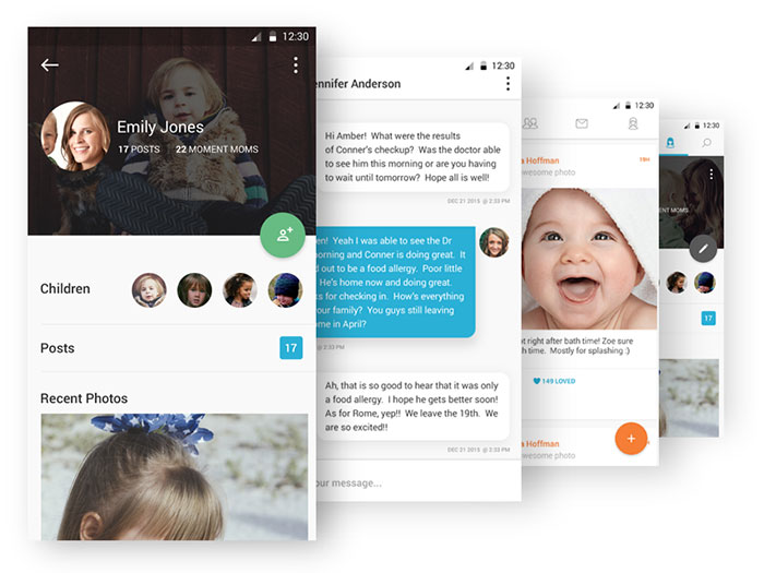
Image source: Eric Hoffman
WCAG 2.2 puts a hard number on this: normal text needs a contrast ratio of at least 4.5:1 against its background to pass Level AA. Most sites don’t clear that bar. WebAIM’s 2026 audit of the top 1,000,000 homepages found that 95.9% carry at least one detectable WCAG 2.2 failure, averaging 56.1 errors per page.
A lot of that gets fixed before it even becomes a contrast problem, through basic visual hierarchy: size, spacing, and color doing the work of guiding someone’s eye before they’ve consciously decided where to look.
Contrast ends up doing two jobs at once in most interface design examples. It separates a primary button from a secondary one, and it keeps text legible for anyone with low vision. Getting contrast right isn’t polish you add at the end. It’s closer to a pass or fail requirement.
Mobile App Interface Design Examples
Mobile interface design answers to two rulebooks that don’t always agree: Apple’s Human Interface Guidelines for iOS, and Google’s Material Design for Android. Both set a minimum size for tap targets, because touchscreens punish a small button immediately. Miss the tap and someone just lost a full extra step, sometimes more if the miss triggers the wrong action.
Advertisement
| Platform | Guideline | Minimum Touch Target |
|---|---|---|
| iOS | Apple Human Interface Guidelines | 44 x 44 points |
| Android | Google Material Design | 48 x 48 dp |
Typography follows the same platform split as button design, and picking the wrong fonts for mobile apps can quietly undercut an otherwise solid layout on a small screen.
iOS Interface Patterns
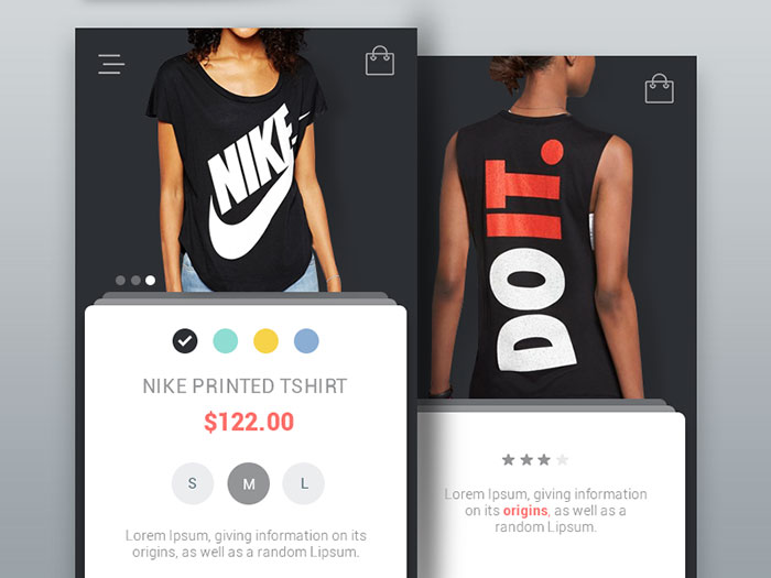
Image source: Ranjith Alingal
Thumb zone placement drives most of the layout decisions on iOS. One-handed use puts the bottom third of the screen within easy reach, so that’s where the important stuff lives.
- Instagram and Spotify both anchor primary navigation to a bottom tab bar
- Core actions sit inside that thumb zone, while secondary settings get pushed deeper into the hierarchy
Duolingo takes a different approach on its home screen, keeping a streak and XP bar pinned at the top as a constant progress indicator instead of tucking it away. It’s working: by Q3 2025 the app had passed 50 million daily active users, up 36% year over year (Duolingo, Q3 2025 shareholder letter).
Android Interface Patterns
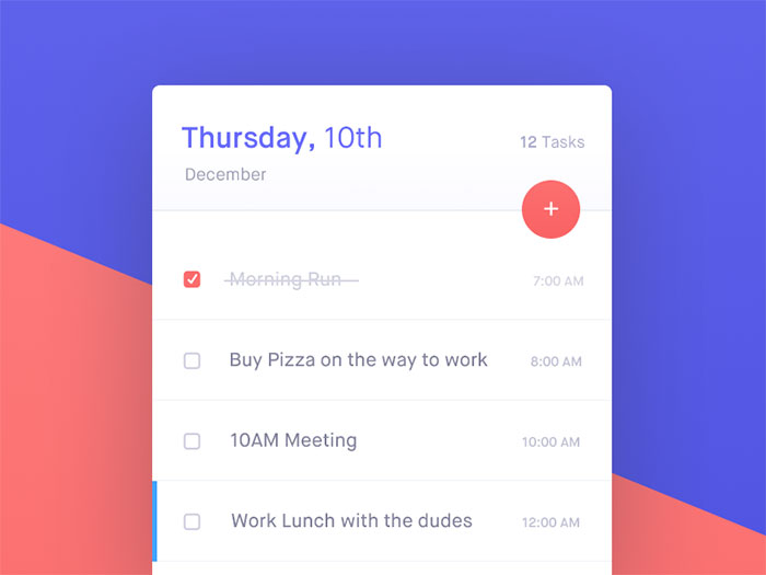
Image source: Ennio Dybeli
Material Design’s touch target grid runs a bit larger than Apple’s (48dp against 44 points), and that small difference changes how dense a screen full of controls can get before it starts to feel cramped. Robinhood leans hard into that extra density on its Android trading screens, packing live price charts and order controls into one scrollable view underneath a bottom tab bar for portfolio, search, and account access. Getting finance app design right matters more here than in most categories, since a mistap on an order screen has actual financial consequences, not just an annoying redo.
Material Design’s elevation and shadow system is what makes screens like that legible at all, visually separating a live chart from the buy and sell controls sitting right on top of it.
Web and Desktop Application Interface Examples
Web and desktop interfaces start from the same place, someone at a keyboard and a mouse, looking at a large screen. The moment window management enters the picture, though, the layout choices split fast.
| Factor | Web Application | Desktop Software |
|---|---|---|
| Window behavior | Single browser tab, responsive breakpoints | Multiple resizable windows |
| Navigation design | Left sidebar or top nav bar | Menu bar plus toolbar |
| Update cycle | Continuous, no install step | Versioned releases |
Web Application Examples
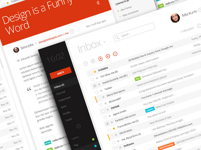
Image source: Eduardo Santos
Notion, Linear, and Figma all lean on card-based layouts built from a shared design system, with a persistent sidebar on the left for navigation. It’s become something close to the default SaaS look.
Responsive design decides how that same layout collapses down onto a tablet, and good web design plans for that collapse from day one instead of patching it in after launch. Design tokens and a documented style guide are what keep spacing and color consistent across dozens of screens as a product grows past its first few features.
Superhuman and Raycast both popularized the command palette pattern, a keyboard shortcut that opens a searchable list of every action in the app. It’s one of the more copied interaction patterns in modern SaaS right now, for good reason: it’s genuinely faster than clicking through menus once you learn it.
Desktop Software Examples
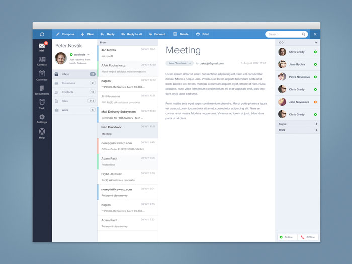
Native desktop software still runs on conventions the web never fully picked up. A top menu bar groups commands by type, File, Edit, View, rather than by task. Multiple independent windows let someone compare two documents side by side without any weird tab-switching. And file dialogs are native to the operating system instead of the upload widgets that are standard in web apps.
Version releases mean a desktop interface can stay unchanged for months at a stretch, which is exactly why a redesign in that world tends to draw louder complaints than a quiet update to a web app ever does. People get attached to a layout they haven’t had to relearn in a year.
Dashboard and Data Visualization Interface Examples
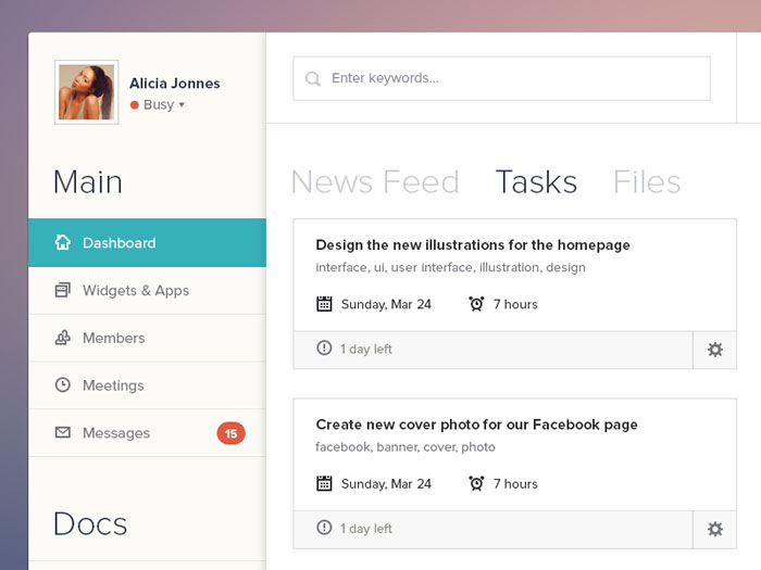
Image source: Ionut Zamfir
A dashboard exists to answer one question fast: what changed, and does it need attention right now. Everything else is secondary to that.
Omni Analytics’ design guidance holds that executive dashboard viewers glance at a screen for three to five seconds before forming a conclusion, which is exactly why well-built dashboards cap themselves at five or six headline KPIs instead of trying to show everything at once.
| Tool | Primary Chart Strength | Best Fit |
|---|---|---|
| Google Analytics 4 | Trend lines and funnels | Marketing and traffic reporting |
| Mixpanel | Event-based cohort charts | Product and retention analysis |
| Tableau | Custom, high-density visuals | Business intelligence teams |
Card-based grouping shows up across all three tools above, each metric boxed into its own card inside a bigger grid system.
- Color-coded status indicators (red, amber, green) let someone scan for problems without reading every single number
- Filter and date-range controls sit at the top of nearly every dashboard, since the same chart answers a different question depending on the window you pick
Grouping related metrics together follows a basic proximity rule: items placed near each other read as related, even before anyone consciously notices the shared label above them.
The color palette for status colors has to stay locked across every chart on the page. Otherwise red stops meaning trouble the second one chart reuses it for something completely neutral, and the whole scanning shortcut falls apart.
E-commerce Interface Design Examples
Baymard Institute’s meta-analysis of 50 published studies puts the average cart abandonment rate at 70.22%, probably the single highest-leverage number in ecommerce interface design. Seven out of ten shoppers who add something to a cart never actually complete the purchase, and a large share of that drop-off traces back to checkout friction rather than price.
Amazon’s product grid pairs a filter sidebar with sort controls (price, rating, relevance) so a catalog with millions of items still feels searchable rather than overwhelming.
- Product image galleries with zoom-on-hover let a shopper inspect detail without ever leaving the listing page
- Cart previews with inline quantity adjustment skip the full page reload for what should be a tiny change
Baymard’s checkout research is really a form design problem wearing an ecommerce costume: fixing documented usability issues lifts conversion by up to 35.26%, and the average checkout still asks for 23.48 form elements against an ideal of 12 to 14. That gap alone probably explains a chunk of the abandonment figure above.
A product photo, or a primary Add to Cart button, works as the page’s focal point, the one thing the eye lands on first without being told to.
Button color plays into this too. Checkout flows lean on color psychology to make the primary action stand out from every secondary link nearby, which is part of why Shopify’s default themes keep the buy button in one dominant, consistent color.
Onboarding and Sign-up Flow Interface Examples
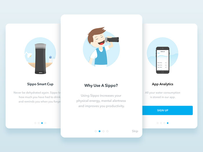
Image source: Dejan Markovic
An onboarding flow is just the path between signup and a new user’s first real action inside a product. Nothing more mysterious than that, though plenty of teams treat it like a mystery.
Progressive disclosure is the technique behind most onboarding flows that actually work: reveal one feature at a time instead of front-loading a full tour that nobody remembers past the third screen.
- Slack’s guided setup checklist walks a new workspace through creating a channel and inviting a teammate before it shows anything else
- Empty states carry a clear next-action prompt instead of just sitting there blank
Tooltip and coach mark sequences fit into this too, introducing features gradually and tied to whatever the user just did, rather than dumping every feature explanation at once.
VWO’s research puts the stakes plainly: 77% of daily active users stop opening an app within the first three days of installing it. Airship’s Q2 2024 benchmark data, reported through EMARKETER, found that apps running onboarding campaigns saw a 20% next-day return rate against 16% for apps without one, plus a 24% engagement score against 17%.
Good onboarding app design leans on generous white space on those early screens specifically. A cluttered first impression undoes the same trust that a clean one builds inside that fifty-millisecond window from the start of this article.
Design Style Examples: Flat, Skeuomorphic, Neumorphic, and Glassmorphic Interfaces
Interface style is a separate decision from interface function, worth remembering whenever a redesign starts to feel more like a mood board exercise than actual product work. The same button can work identically under four completely different visual treatments.
| Style | Visual Trait | Known For |
|---|---|---|
| Flat | Solid color, no shadow or texture | Microsoft Fluent Design |
| Skeuomorphic | Real-world texture and depth | Early iOS Notes and Calendar |
| Neumorphic | Soft, low-contrast extruded surfaces | Dribbble concept UI |
| Glassmorphic | Frosted, translucent panels | macOS and visionOS |
Flat Design
Flat design strips away shadows, gradients, and textures, leaving solid color blocks and simple icons to do all the work. The idea goes back to Bauhaus design thinking, where function dictated form and ornament got treated as waste rather than style.
Microsoft rebuilt much of Windows around this with the Metro design language, which eventually evolved into today’s Fluent Design System. Most minimalist design work you see in software interfaces now traces back to that same shift, whether the designer knows the history or not.
Skeuomorphism
Early iOS took the opposite bet: copy real-world materials onto digital controls so a new feature feels familiar the moment someone sees it. Leather stitching, wood grain, paper texture, all of it showed up across Apple’s first-party apps, paired with drop shadows and bevels that made buttons look physically pressable.
It didn’t last. Apple dropped most of this styling starting with iOS 7 in 2013, and the early Notes and Calendar apps, right down to the torn paper edge at the top of a note, are still the most cited example of what got left behind.
Neumorphism
Neumorphism never really made it past the concept-work stage, and its own defining feature is probably why. Every control gets built from the same background color, with soft inner and outer shadows doing the job that color and borders normally handle, making a button look pressed in or raised out from the surface around it.
That low contrast is also the style’s biggest weakness. A neumorphic button relying on shadow alone often fails basic legibility checks for anyone with low vision, which is a big part of why so few shipped products actually use it as-is.
Glassmorphism
Glassmorphism layers a frosted, semi-transparent panel over a blurred background, so whatever’s behind a card stays faintly visible instead of fully hidden. Apple introduced it system-wide in macOS Big Sur back in 2020, then carried it into visionOS, where translucent panels now float over a real camera passthrough view of the room around you.
Soft gradient overlays usually sit on top of the blur to fake a subtle light source. That detail is basically the difference between a glass panel that looks intentional and one that just looks foggy.
Micro-interaction and Animation Interface Examples
A micro-interaction is a small, single-purpose animation that confirms something just happened. A like. A refresh. A toggle flipping from off to on.
On X, pulling the timeline down triggers a small animated loading icon, then the feed springs back once new posts land. The heart-shaped like button on the same app bursts into a brief particle animation on tap, turning what’s really just a click into something that feels like a small reward.
Skeleton loading screens replaced plain spinners across most major feeds, LinkedIn and YouTube included, because a gray outline of the incoming layout gives someone something to anticipate instead of just staring at a blank wait.
That switch isn’t universally settled science, though, and it’s worth saying so. A 2017 study from product studio Viget found that participants shown a plain spinner actually reported a shorter perceived wait time than those shown a skeleton screen, which is more or less the opposite of what most current design advice claims.
Toggle switches keep it simpler than either of those: a short slide-and-color-change animation is the entire feedback mechanism. No label change needed. The movement itself tells you the new state.
Voice and Conversational Interface Examples
Voice Assistant Interfaces
Edison Research’s Infinite Dial 2025 study found that 35% of Americans aged 12 and older, roughly 101 million people, own a smart speaker. That’s a huge number of interactions happening with no screen involved at all.
Waveform feedback has become the standard visual cue for this category anyway. The Amazon Alexa app shows a pulsing waveform on screen the moment it starts listening, giving someone a clear signal that the microphone actually picked them up.
That visual layer matters more than it sounds like it should, because voice alone gives no confirmation that a command registered. A waveform, or a glowing ring, closes that gap.
Chatbot and AI Interfaces
Zendesk’s 2026 CX Trends report, based on more than 11,000 respondents across 22 countries, found that 76% of customers would pick a company that let them drop text, images, and video into the same chat thread without restarting the conversation.
- Intercom’s chat widget sits fixed in the bottom right corner with quick-reply buttons instead of a blank text field for common questions
- ChatGPT’s message thread keeps every turn in a single scrolling column, with no separate windows per topic
Multimodal input inside a single thread, text one moment and an image the next, is quickly turning into the baseline expectation for a conversational interface rather than some premium extra.
Accessibility-Focused Interface Design Examples
Accessible interface design has to account for how people using assistive technology actually move through a screen, not just how the screen looks to someone scrolling with a mouse.
WebAIM’s Screen Reader User Survey #10, based on 1,539 respondents surveyed in late 2023 and early 2024, found JAWS and NVDA sitting in near parity as the two leading primary screen readers, at 40.5% and 37.7% primary usage. That split matters for how you write labels: something built only for VoiceOver often reads poorly, or not at all, in JAWS or NVDA.
| Feature | WCAG Criterion | Purpose |
|---|---|---|
| Visible focus state | 2.4.7 Focus Visible | Shows keyboard position on screen |
| Reduced motion toggle | 2.3.3 Animation from Interactions | Turns off non-essential motion |
| High-contrast mode | 1.4.3 Contrast Minimum | Raises text legibility |
WebAIM’s 2026 Million report found 84.3% of home pages had at least one ARIA landmark defined, up from 80.5% the year before. That’s the structural cue letting a screen reader jump straight to navigation or main content instead of reading through everything in order.
GOV.UK is one of the most cited real-world examples of accessibility-first interface design, built around plain fonts for accessibility and keyboard-first navigation from the ground up rather than bolted on afterward.
Most design teams checking their own work for contrast failures just run a color contrast checker against every text and background pairing before anything ships.
Where to Find and Study Interface Design Examples
The fastest way to study interface design examples is through libraries built specifically to catalog shipped, production screens, not concept work someone dreamed up for a portfolio piece.
Mobbin is the biggest of these by far, with more than 600,000 searchable mobile and web app screenshots pulled from real, live products.
Page Flows takes a narrower approach, recording full end-to-end user flows, a complete signup sequence or a checkout process, as short screen-capture videos rather than static screens.
- Dribbble and Behance lean toward concept and exploratory work, more useful for style direction than for production patterns
- Google’s Material Design gallery and Apple’s Design Resources remain the two official pattern libraries tied directly to their own platform guidelines
Real production apps hold more value as reference material than a polished concept shot ever will, mostly because a shipped screen already survived contact with actual users, edge cases, and messy real data.
Anyone moving between disciplines might find a broader glossary of graphic design terms useful too, since interface design borrows a lot of its vocabulary from print and branding work.
More User Interface Design Examples
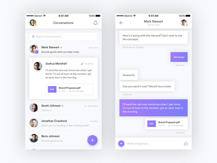
Messaging App iOS Concept
Leaderboard
The Weather
Kick Score
Tab Bar
Menu
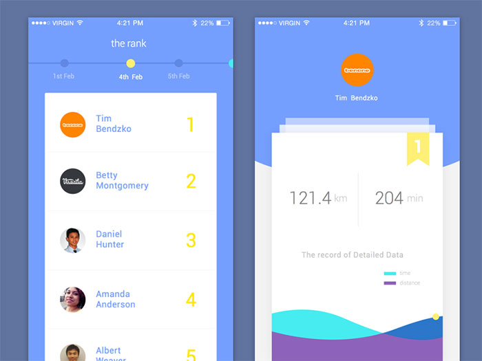
Leaderboard
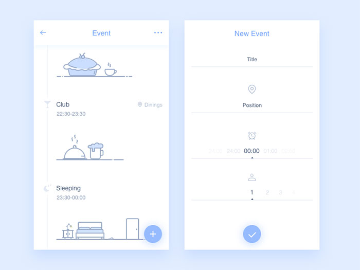
Event
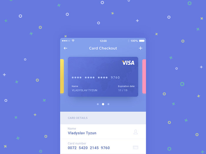
Card Checkout
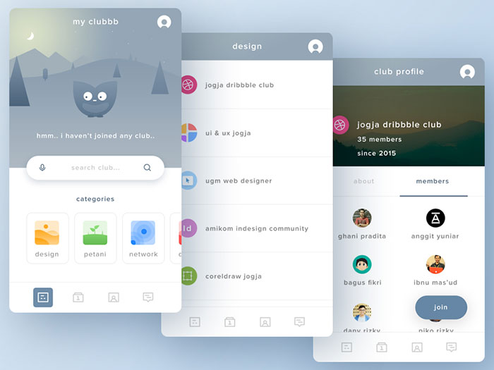
Clubbb
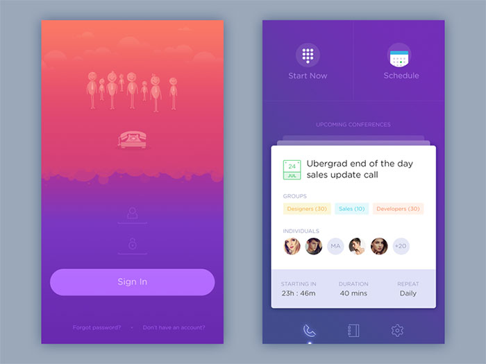
Yconference
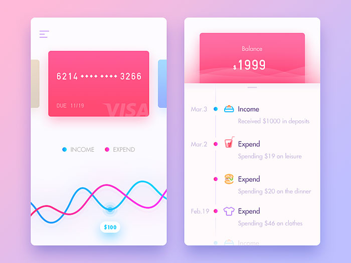
Payment
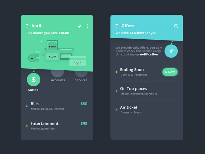
Finance app
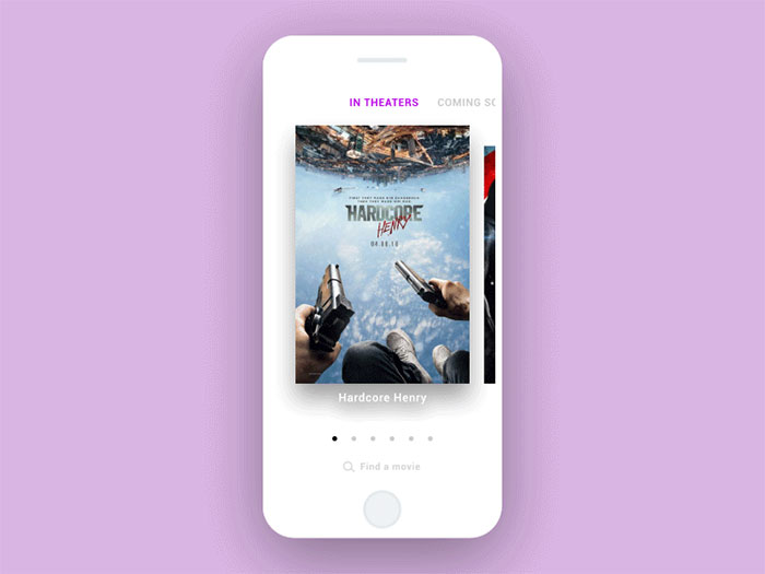
Movies
Onteloo City Bike Rent
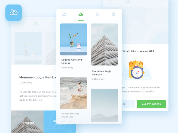
Locations

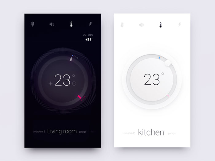
Smart Home Controls
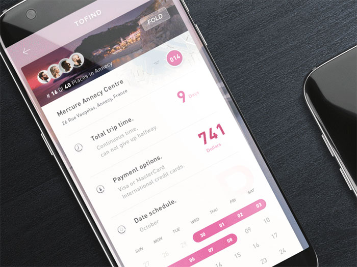
ToFind Card Stream
Habit
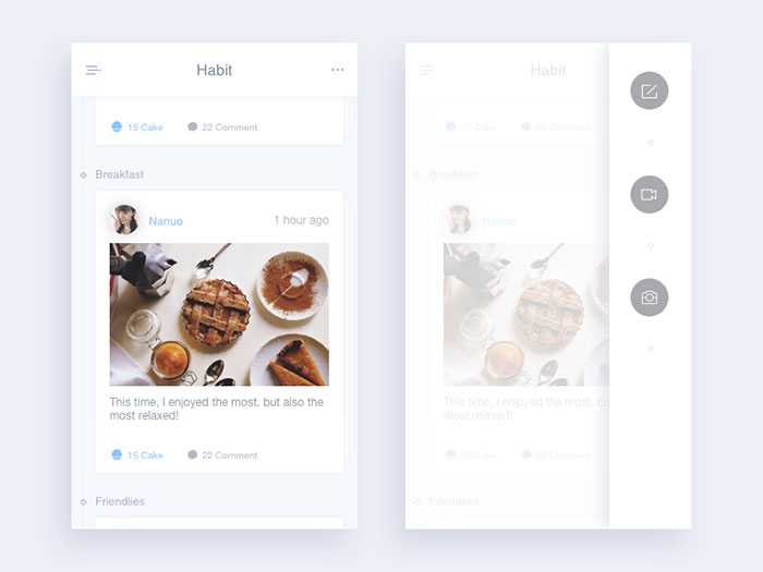
Daily Ui-Day#25
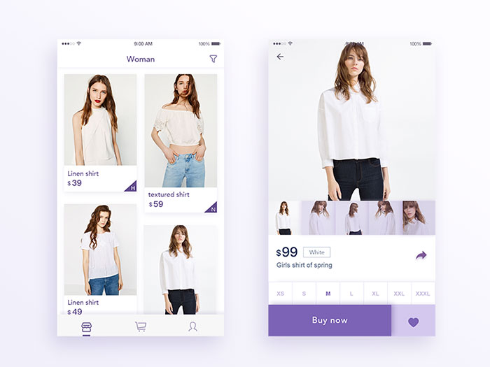
Investments with explore
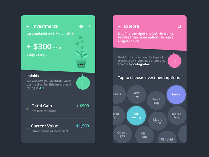
Poof Food Management
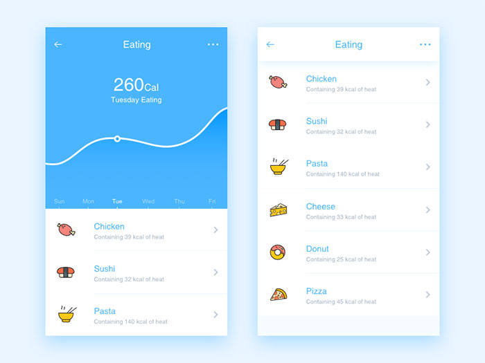
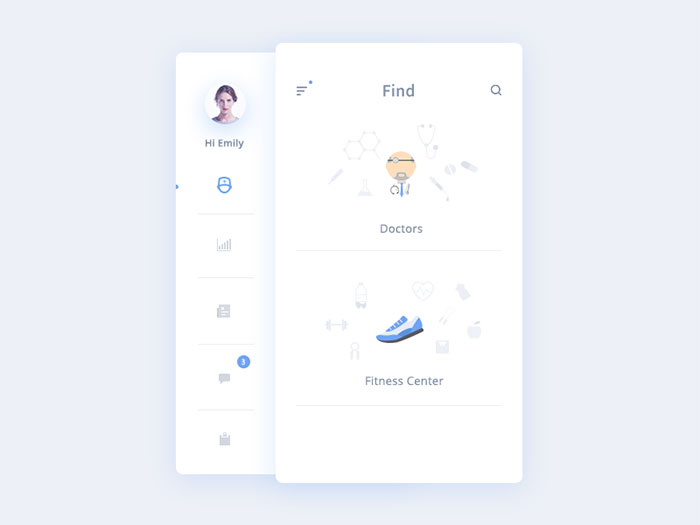
Find + Sidemenu from Medical app
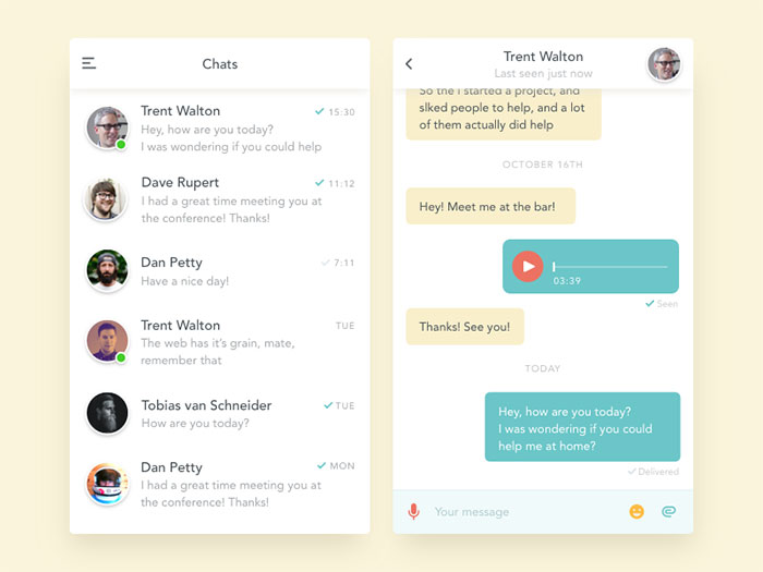
Simple chat app
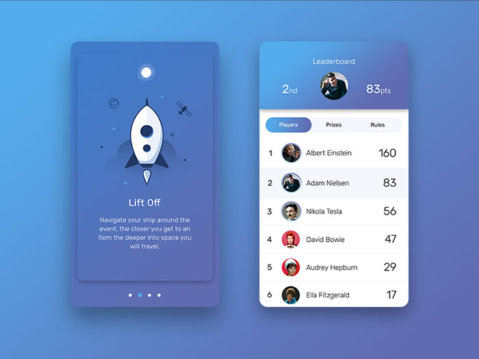
App Screens
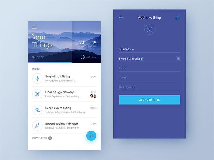
Dreamlist
Intro Screens from chat app
Calendar App
Cinema Application
Payment
FAQ on User Interface Design
What software do designers use to create interface design examples?
Figma leads for collaborative screen design and prototyping, with Sketch and Adobe XD as established alternatives. Wireframing usually happens first in simpler tools before a design moves into a full mockup, then a clickable prototype that’s ready for developer handoff.
How much does professional UI design work cost?
Rates vary enormously by scope, experience, and region, anywhere from a few hundred dollars for a single screen to tens of thousands for a full product design system. Freelancers typically bill hourly, while agencies tend to quote a fixed project price instead.
What is the difference between UI design and graphic design?
Graphic design covers static visual communication: logos, posters, print layouts, packaging. Interface design is interactive and functional, built around how someone clicks, taps, and moves through a live product. The two disciplines share visual principles but they’re solving genuinely different problems.
How long does it take to design a full interface?
Timelines depend entirely on scope. A single landing page might take one to two weeks, while a complete product with a full design system can run several months from the first wireframe through final handoff and testing.
What is a UI kit?
Buttons, input fields, navigation bars, icons, all pre-built and matched to a consistent style, ready to drop into a new screen instead of building every element from scratch each time. That collection is what people mean by a UI kit.
What is the difference between a wireframe and a finished interface design example?
Strip away the color, the type, everything but layout and structure, and you’ve got a wireframe: a low-fidelity skeleton of a screen. A finished interface design example is the opposite end of that process, the polished, final-fidelity screen that’s ready for development, complete with real typography, color, and content.
Can someone learn UI design without knowing how to code?
Yes. Tools like Figma require no coding at all, and most design roles focus on layout, usability, and visual decisions rather than implementation. Some developer-adjacent roles benefit from basic HTML and CSS knowledge, but it’s not required.
What screen resolutions should interface design examples target?
Mobile designs commonly start at a 375 or 390 pixel wide base frame, while desktop layouts typically design around 1440 pixels wide. Responsive design then adapts that base layout across breakpoints, rather than someone creating a fixed, single-size screen and hoping for the best.
Are free interface design examples available to study or reuse?
Plenty of libraries let designers browse real, shipped screens for free, though most restrict actual reuse of copyrighted assets. Treat these as reference material for patterns and flow, not as source files to copy directly into a paid product.
What makes an interface design example strong enough for a design portfolio?
A strong portfolio piece shows the reasoning behind decisions, not just the final screen: the problem, the constraints, and how the layout actually solved them. Recruiters look for process and outcome together, not a polished visual on its own.
Conclusion
The strongest user interface design examples share one habit most teams skip: someone actually tested them with real users before launch, not after the complaints started coming in.
If time is tight, contrast and keyboard navigation matter more than chasing whatever visual trend is popular this year. Trends fade. A screen a keyboard user can’t operate stays broken regardless of how it looks.
A reasonable next step is picking one screen that’s already live in your product, running it past a color contrast checker, and then watching one real person try to complete a task on it without any help from you. That one audit, repeated screen by screen over time, tends to catch more than any style guide or component library ever will sitting on a shelf.