Step into the realm of bold fonts examples, where each character vies for the spotlight, yet only the boldest triumph. Imagine the alchemy that empowers certain phrases to leap off the page and captivate the imagination—this is the landscape we traverse.
Enlisted in this visual odyssey is the essence of contrast, the whispers of typography design reaching crescendos, the shapers of digital narratives.
Through this virtual canvas, an understanding unfolds not merely of how bold fonts amplify message and meaning, but why they do so.
Expect to walk away with a rich arsenal of impactful typeface selections curated to carve intention into the digital stone.
From the bravado of header fonts to the finesse of brand identity, the elements beckon. We’ll disentangle the threads of visual hierarchy, decode the syntax of digital clarity, and emerge with the fluent literacy of font aesthetics.
Bold fonts to download
| Font | Category | Style | Serif/Sans-serif | Notable Attributes |
|---|---|---|---|---|
| Aleo | Web, Print | Text | Serif | Soft lines, semi-rounded |
| Peace Sans | Display | Sans-serif | Sans-serif | Friendly, bold |
| Mosk | Display | Sans-serif | Sans-serif | Ultra-thin to ultra-bold |
| Bariol | Web, Print | Sans-serif | Sans-serif | Rounded |
| Nexa | Display, Web | Sans-serif | Sans-serif | Geometric, clean |
| Morton Typeface | Text | Sans-serif | 1920s newspaper style | |
| Lovelo font | Display | Sans-serif | Sans-serif | Geometric, retro |
| Qanelas Soft Typeface | Display, Web | Sans-serif | Sans-serif | Modern, friendly |
| Musket | Display | Serif | Serif | Sturdy, traditional |
| Archive | Display, Web | Sans-serif | Sans-serif | Contemporary, sharp |
| Zaguatica | Display | Sans-serif | Sans-serif | Quirky, bold |
| Aquino | Print, Web | Sans-serif | Sans-serif | Modern, bold |
| Biko Font Family | Print, Web | Sans-serif | Sans-serif | Geometric, strong |
| Frank font family | Print, Web | Sans-serif | Sans-serif | Versatile, neutral |
| ADAM.CG PRO | Logo, Display | Sans-serif | Sans-serif | Sharp, modern |
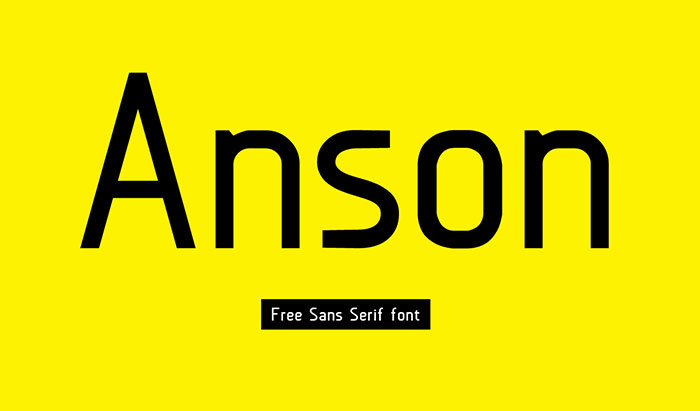
| Anson | Print, Web | Sans-serif | Sans-serif | Inspired by British twin-engine bombers |
| League Gothic | Display, Web | Sans-serif | Sans-serif | Tall and narrow |
| Fela – Free Font | Display | Serif | Serif | Bold, expressive |
| Sheep Sans | Display, Web | Sans-serif | Sans-serif | Warm, rounded |
| Glamor – Chic & Modern | Print, Web | Serif | Serif | Fashionable, elegant |
| Verb | Print, Web | Sans-serif | Sans-serif | Energetic, robust |
| Source Sans Pro | Print, Web | Sans-serif | Sans-serif | Professional, versatile |
| Phenomena font | Display, Web | Sans-serif | Sans-serif | Modern, geometric |
| Hanken Round | Print, Web | Sans-serif | Sans-serif | Soft, friendly |
| Nevis | Print, Web | Sans-serif | Sans-serif | Strong, assertive |
| Ostrich Sans | Display, Web | Sans-serif | Sans-serif | Tall, skinny |
| Code Free Font | Web, Print | Sans-serif | Sans-serif | Sleek, minimalistic |
| Oswald | Print, Web | Sans-serif | Sans-serif | Re-working of classic style |
| Cabin | Print, Web | Sans-serif | Sans-serif | Humanist, open |
| Lato | Print, Web | Sans-serif | Sans-serif | Transparent, strong |
| BONKERS | Print, Display | Sans-serif | Sans-serif | Thick and playful |
| MUNICIPAL | Display | Sans-serif | Sans-serif | Urban, contemporary |
| Varela | Print, Web | Sans-serif | Sans-serif | Elegant, functional |
| Myra free font | Print, Web | Sans-serif | Sans-serif | Vivid, modern |
| Hammersmith One | Print, Web | Sans-serif | Sans-serif | Contemporary, readable |
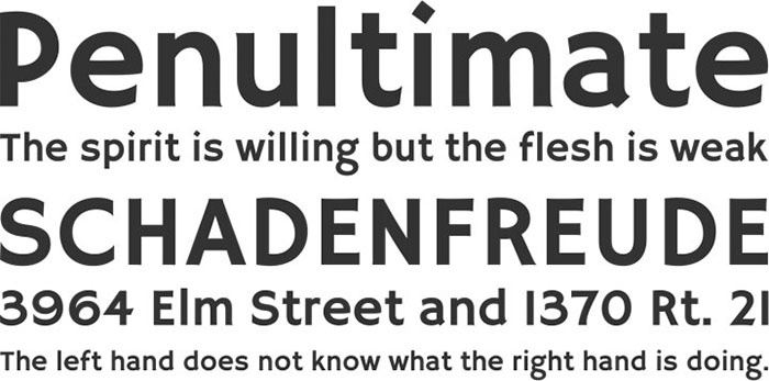
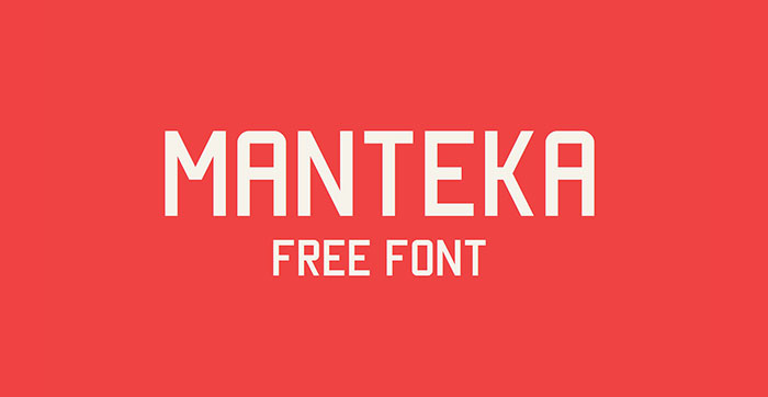
| Manteka | Display, Web | Sans-serif | Sans-serif | Functional, clean |
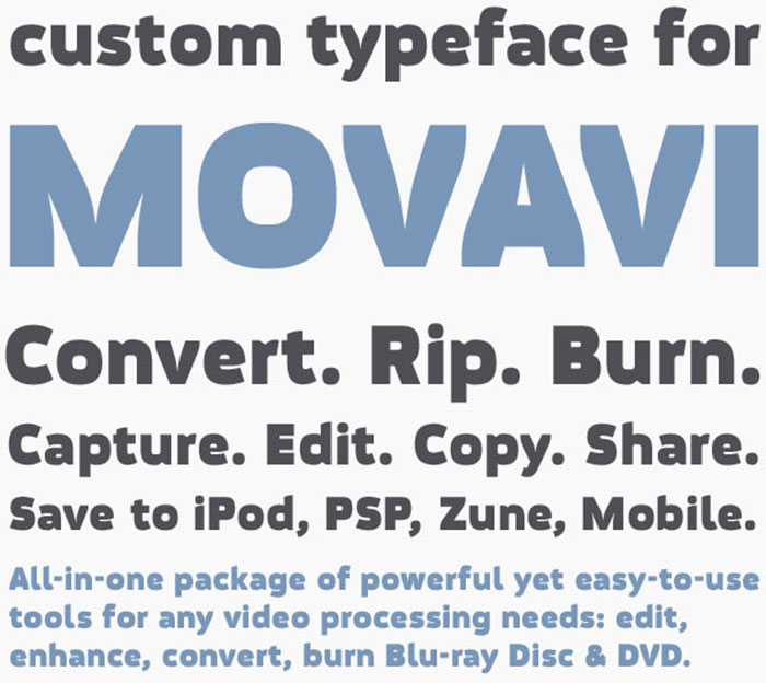
| Movavi Grotesque Black | Display | Sans-serif | Sans-serif | Bold, impactful |
Now let’s look at them in detail.
Improvie
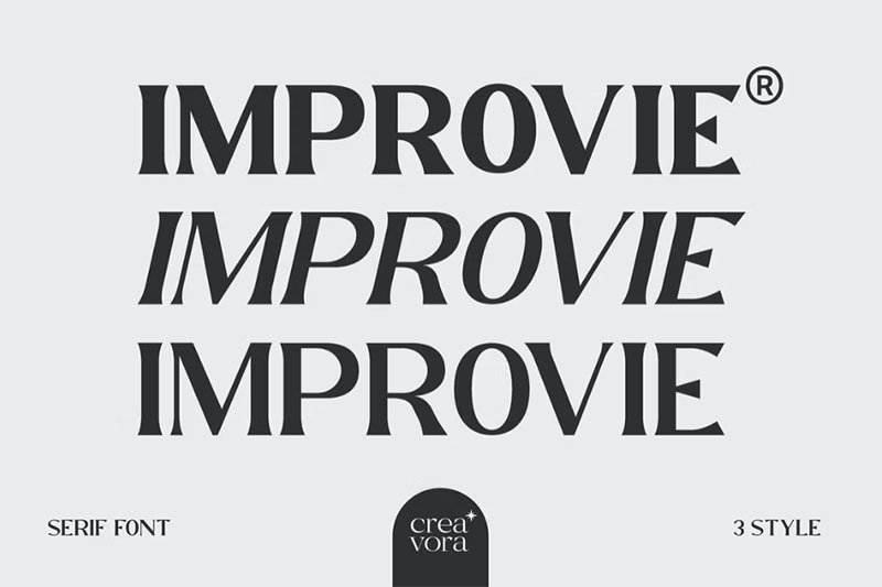
Improvie is designed to reflect industrial, it creates a sense of firmness and consistency. The concept was pushed in a usability-focused direction, to work as a bold tool and a beautiful communicator.
Essence Improvie allows fluid design in three styles, supports all major Latin-based languages. All three fonts are properly aligned enhancing aesthetics, bringing energy, and making them suitable for modern applications.
All three fonts blend organic curves and gentle repetition into a strong, harmonious type. This font is based on thickness and high contrast for clear legibility when it is used in logos and titles.
Aleo
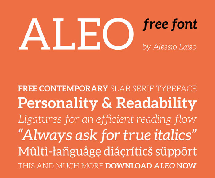
Aleo is a free impact font with a contemporary typeface designed by Alessio Laiso as the slab serif companion to the Lato font by Łukasz Dziedzic.
Aleo has semi-rounded details and a sleek structure, making it a strong font while still keeping readability high. The family comprises six styles: three weights (light, regular and bold) with corresponding true italics.
Bison
Bison is a strong font family and sophisticated sans serif. Inspired by the animal, its sturdy uncompromising style is felt through the controlled letterforms and modern touches. A balance of hard lines and smooth curves. Each font in the family can stand on its own, dynamic and authoritative in its own right.
Peace Sans
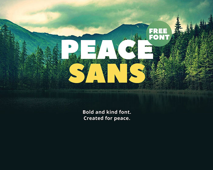
Peace Sans is a bold text font made with love! It can make your typography more peaceful and kind. Use it anyway, it’s absolutely free.
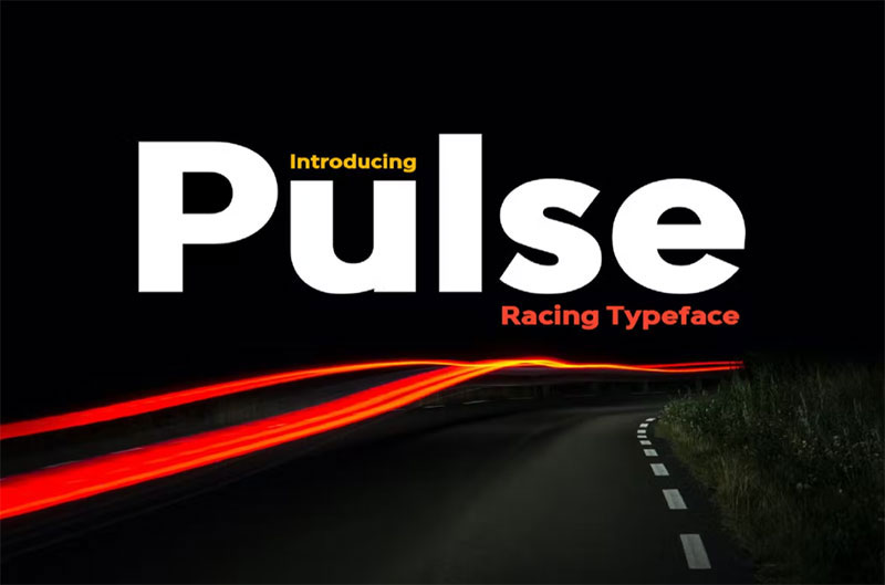
Pulse
Mosk
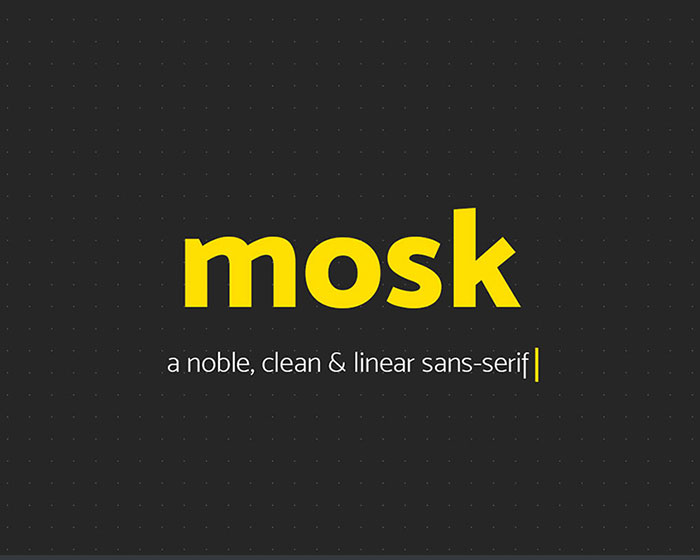
Mosk is a typeface family that consists of lowercase letters and edited versions in the uppercase version, for your logos and designs, Mosk makes great display fonts.
Advertisement
Headline
Chloe
Create bold, gorgeous headlines and elegant designs with a vintage flair. Chloe’s contrasting lines and curved terminals give a sleek, elegant look to logos, holiday cards, wedding invitations, quotes, advertisements, and more. Chloe is a versatile typeface that’s full of character and one you’ll come back to time and again. Create something beautiful today with Chloe.
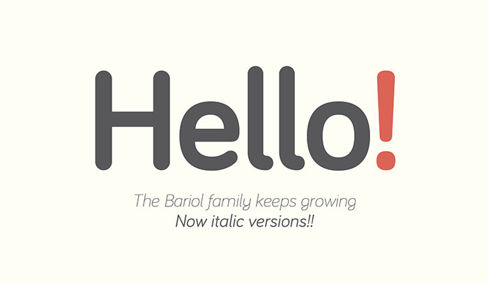
Bariol
Stink – Bold Serif Font
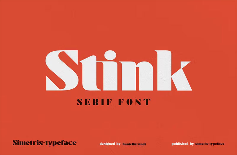
Introducing the “Stink” font designed elegantly and simply, with a combination of bold, thick, and symmetrical. This font is suitable for your work needs.
- Stink OTF, TTF
- Web font
- Uppercase
- Lowercase
- Numbers & Punctuation
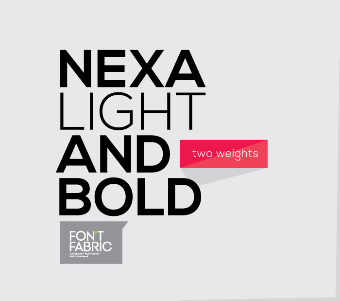
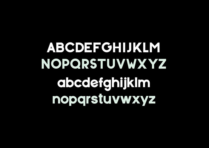
Nexa free font
Morton Typeface
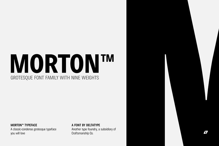
Morton, another modern grotesque typeface that delivers an extraordinary unique within typeface with the style of condensed let you create more impact with your design.
Morton Type Family are professional-looking fonts available in nine weights, the Thin weight delivers you a simple hairline stem until you reach the bold weight, you will get more dynamic with three stem weights which give you a modern, old school look and feel.
Tangerine
The bold curves pay homage to the big hair and bell-bottoms of the golden era. Tangerine fits perfectly into those nostalgic mood boards and vintage logos. It comes with unique lower and uppercase plus numbers, punctuation & multilingual letters.
Palfour
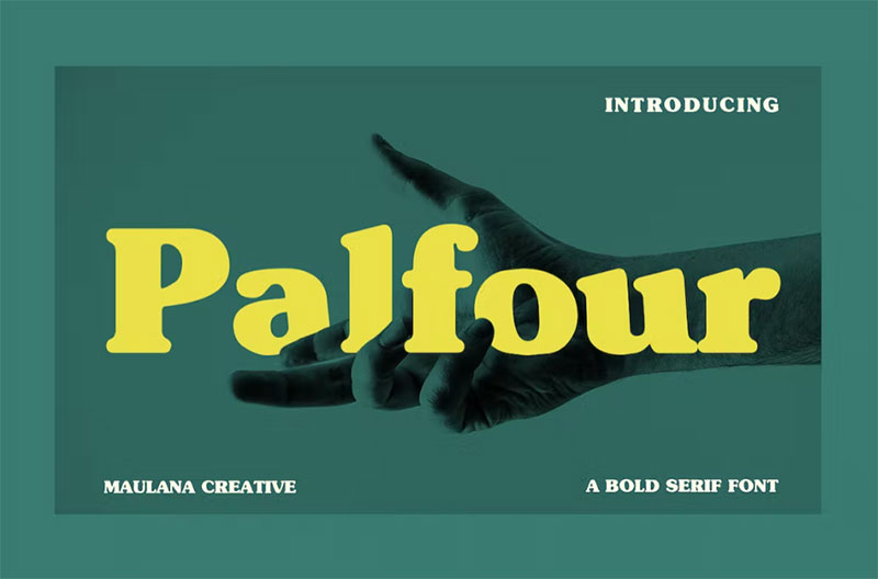
Palfour is a classic bold serif display font. With a bold stroke, fun character with a bit of ligatures and alternates.
The Palfour font supports multilingual more than 100+ language. This font is good for logo design, Social media, Movie Titles, Books Titles, a short text even a long text letter and good for your secondary text font with sans or serif. Make a stunning work with Palfour font.
Lovelo font
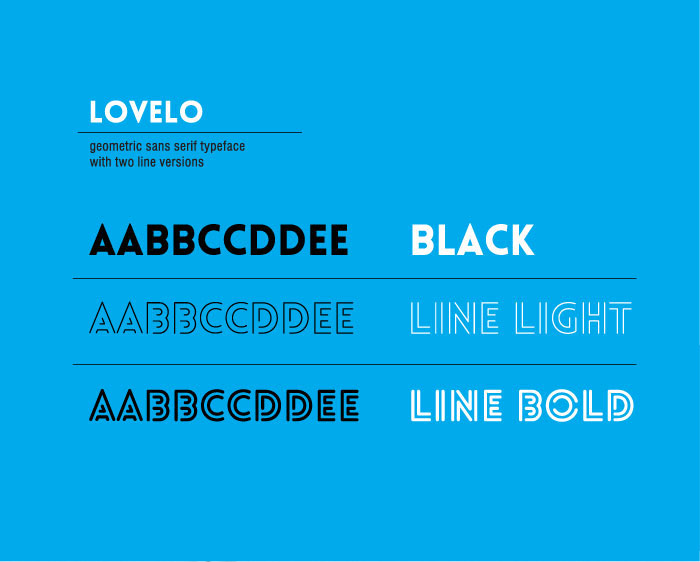
Lovely free font is a remake of the original Lovelo Inline – designed by Renzler Design, Vienna, Austria. These free bold fonts will add interest to your headlines or designs.
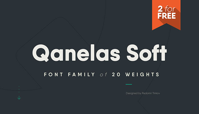
Qanelas Soft Typeface
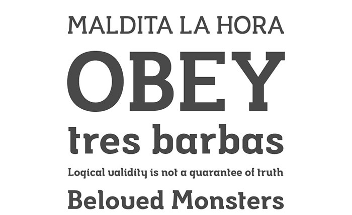
Musket
Sophillia
Sophillia is a unique ligature font that you won’t forget! It’s a high-contrast serif that has loads of style. A modern take on a Caslon style typeface, this font is ideal for those big bold headings or wedding invitations. It’s got hundreds of characters and ligatures plus all those European letters! Sophillia pairs perfectly with a light scripts font or minimal sans serif.
Archive
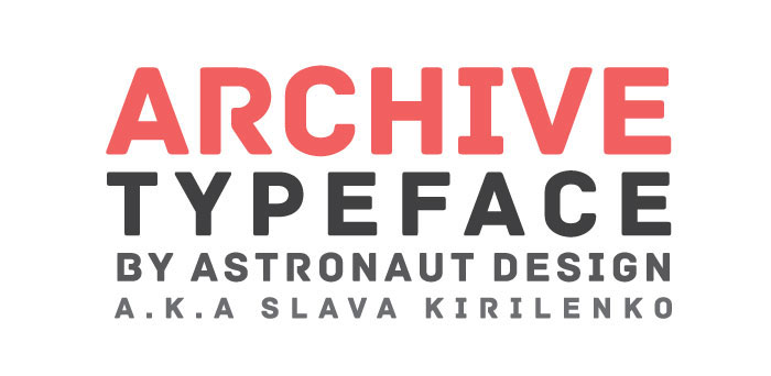
The archive is contemporary free font constructed with strong geometric forms. Applicable for any type of graphic design – web, print for banners, motion graphics, etc, and perfect for t-shirts and other items like posters and logos, this is a good font for creating an impact…
Designed by Slava Kirilenko – a graphic designer from Almaty, Kazakhstan.
Aquino: A soft and bold sans serif font
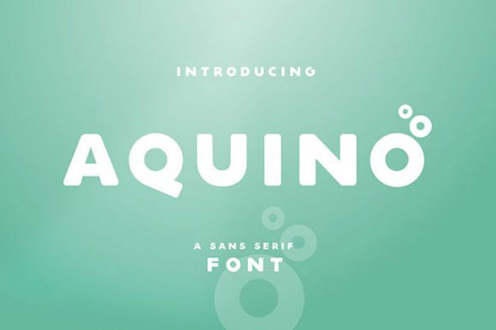
Aquino is a fresh new, soft bold and free font ideal for logo design and makes a great headline font. It is featured by rounded edges that make it clean and visual.
Bastia
Introducing Bastia – a brand new serif with a bonus sans for perfect pairing! I am constantly combining sans and serifs in my design work, and wanted to create the perfect combo for you too!
Bastia is a classy, bold upper and lowercase typeface that looks incredible in both large and small settings. Best used as a display for headings and logos, Bastia’s clean lines and smooth curves give any project an extra touch of class.
Biko Font Family
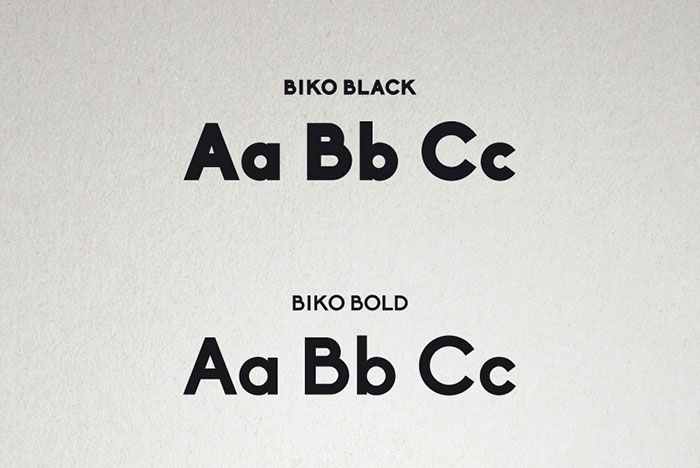
Biko, another one of the cool strong fonts, is a geometric sans serif with a strong and yet friendly character. The font is perfect for display, copy text and logos and it makes a great title font. The name is a tribute to Steve Biko: a South African anti-apartheid activist.
Frank font family
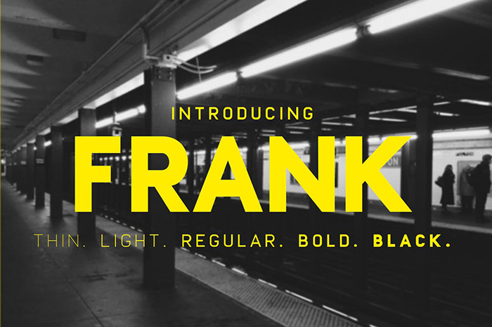
Proudly presenting this typeface inspired by the classics DIN, Eurostile and a dash of Futura. Perfect for prints, t-shirts, posters and one of the best fonts for flyers.
Comes in .otf and .ttf and of course web fonts.
Vintage
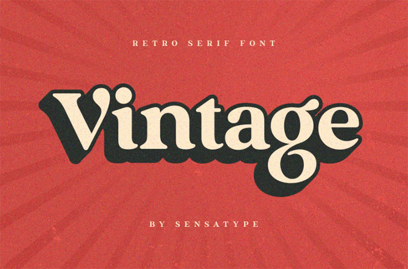
Vintage font is a well-balanced contemporary font with a fancy, unique, and versatile vintage serif font that you can combine to get any variations and unique shapes easily just in seconds with stack it. It is a serif display font with moderate contrast that perfect for branding projects, logo, wedding designs, social media posts, advertisements, product packaging, product designs, label, photography, watermark, invitation, stationery, and any projects, it makes with a high level of legibility.
ADAM.CG PRO – Free Typeface
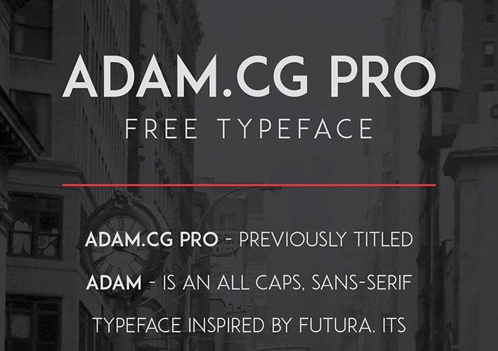
ADAM.CG PRO – previously titled ADAM – is an all caps, sans-serif typeface inspired by Futura. Its sharp, clean appearance makes it the best font for flyers, headlines, posters, titles and captions. It consists of 228 character glyphs and features numerous updates over the previous version, including brand new glyphs & over 2000 kerning pairs.
Anson
League Gothic
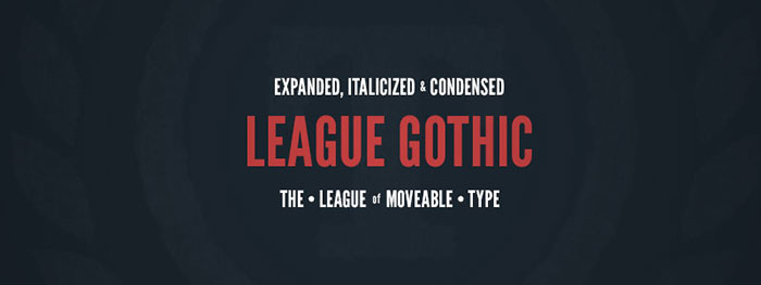
League Gothic is yet another example of these modern bold fonts and a revival of an old classic, and one of our favorite typefaces, Alternate Gothic #1. It was originally designed by Morris Fuller Benton for the American Type Founders Company in 1903. The company went bankrupt in 1993, and since the original typeface was created before 1923, the typeface is in the public domain. The bold lettering is great for headers, posters, and flyers.
Greycliff CF
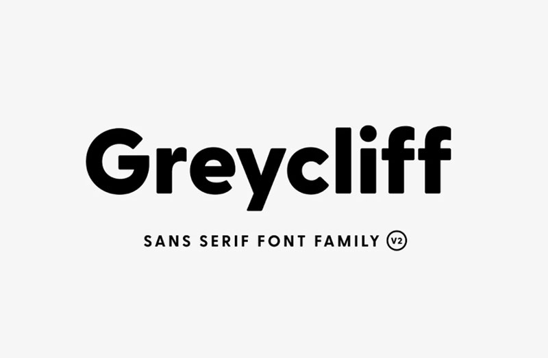
Rugged, hearty, and warm, Greycliff is a versatile font family. Strong capitals and a smooth, open lowercase are effective in a variety of applications. The geometric, near-monoline construction lends a classic durability, tempered by softened edges and vibrant shapes.
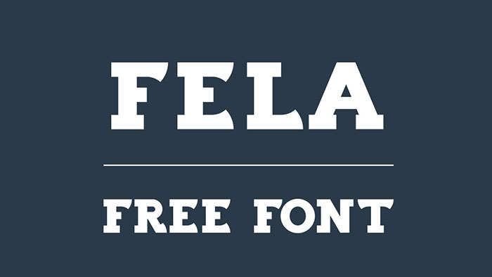
Fela – Free Font
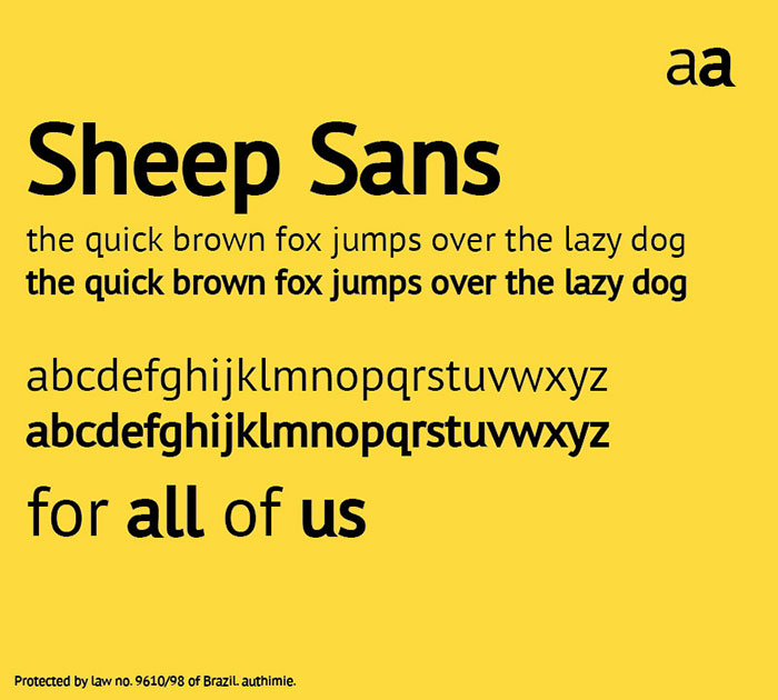
Sheep Sans
Glamor – Chic & Modern Free Type Family
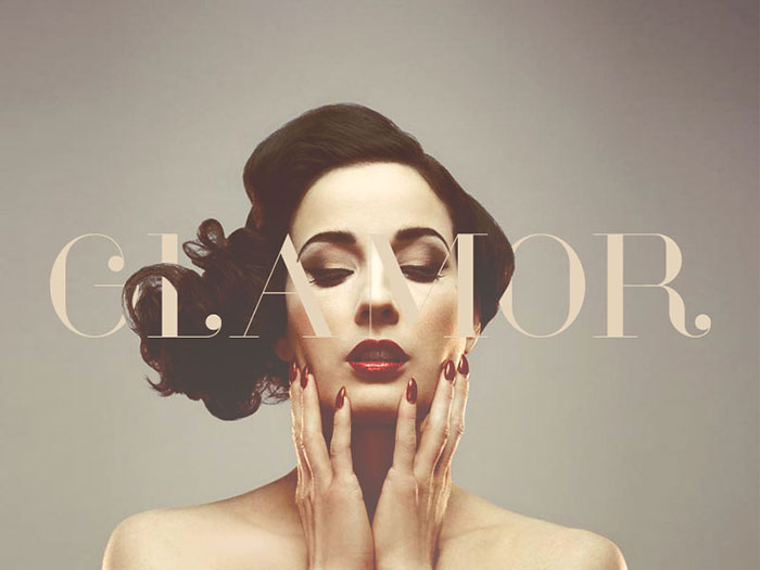
Glamor Type Family, including a set of 24 fonts with more than 200 unique characters per font, is free for use for personal and/or commercial works. It makes great header fonts.
Verb
The verb from Yellow Design Studio is one of these cool bold fonts. An 18-font sans-serif family that’s friendly and approachable, but trades huggable roundness for confidence and energy. The verb is lively, motivated and industrious but not too busy to say “hello”.
It’s packed with features including true italics, small caps, ligatures, old style and tabular numerals, extensive language support, and more. Verb provides great bold letter fonts for posters and flyers.
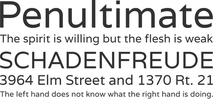
Source Sans Pro
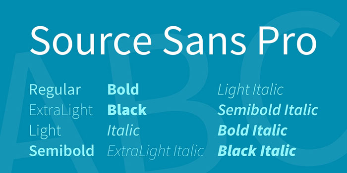
Source Sans Pro is a set of OpenType fonts that have been designed to work well in user interface (UI) environments. In addition to a functional OpenType font, this open source project provides all of the source files that were used to build this OpenType font by using the AFDKO makeotf tool. These bold lettering fonts make great headers, titles, and subtitles.
Phenomena font
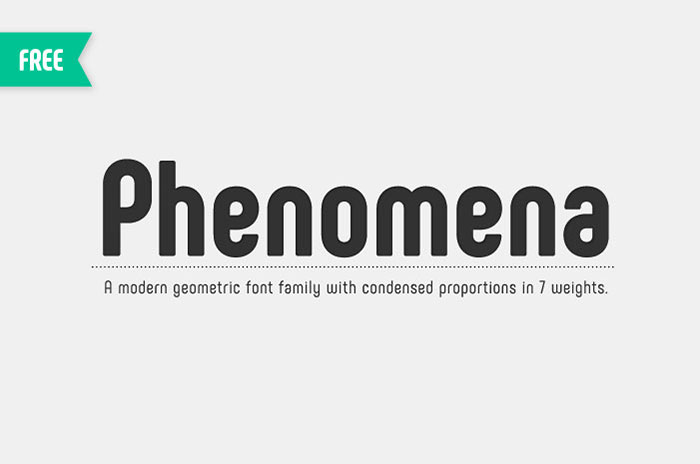
Phenomena is a modern sans serif font based on round geometric shapes. It is a powerful font with condensed proportions and slightly retro feel. The rounded corners soften the overall perception and supplement the geometric aesthetics of the family.
Phenomena contain more than 500 glyphs with a wide range of languages – extended Latin and Cyrillic character support as well as Bulgarian localization features. Phenomena free fonts by Fontfabric are available for both – personal and commercial use.
Hanken Round
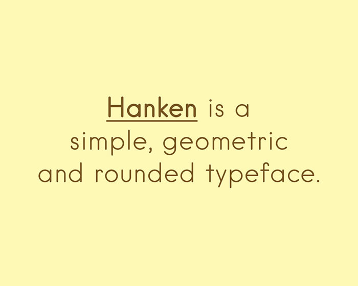
Hanken Round book and lightweight is a free and open source geometric font. It’s one of the best looking bold fonts in here. It makes a great header font and is great for adding bold writing to posters or flyers.
Nevis
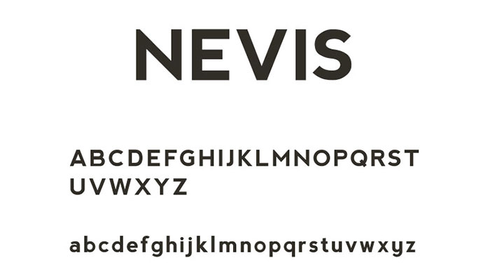
Nevis is a strong, angular typeface and its cool bold fonts are ideal for headings & buttons. It’s an assertive and bold font, but manages to retain a friendly tone, and looks especially good when used in all caps
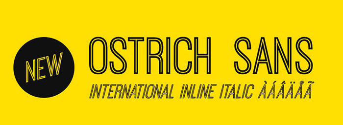
Ostrich Sans
Code Free Font
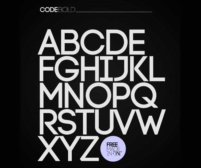
Code free font is applicable for any type of graphic design – web, print, motion graphics etc and perfect for t-shirts and other items like posters, logos. It makes cool title fonts.
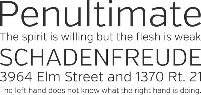
Oswald
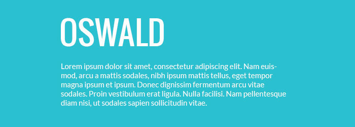
Oswald is a reworking of the classic style historically represented by the ‘Alternate Gothic’ sans serif typefaces. The characters of Oswald have been re-drawn and reformed to better fit the pixel grid of standard digital screens. This free bold font is designed to be used across the internet by web browsers on desktop computers, laptops, and mobile devices.
Cabin
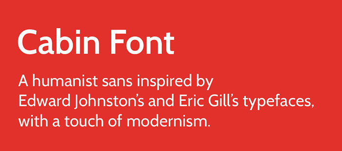
The Cabin Font is a humanist sans inspired by Edward Johnston’s and Eric Gill’s typefaces, with a touch of modernism. Cabin incorporates modern proportions, optical adjustments, and some elements of the geometric sans. It remains true to its roots but has its own personality. This cool bold font is one of my favorites.
Lato
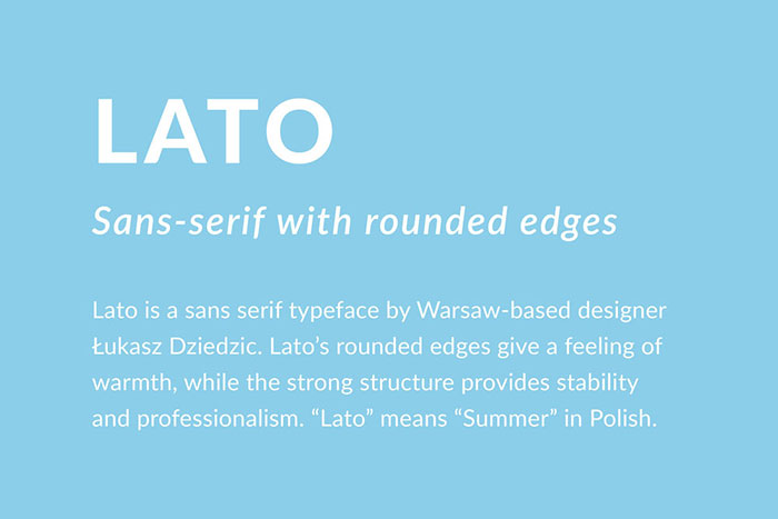
Lato is one of the serious bold free fonts that you need to have. Lato is a sanserif typeface family designed in Summer 2010 by Warsaw-based designer Łukasz Dziedzic (“Lato” means “Summer” in Polish). In December 2010 the Lato family was published under the open-source Open Font License by his foundry Poland, with support from Google.
In 2013-2014, the family was greatly extended to cover 2300+ glyphs per style. It now supports 100+ Latin-based languages, 50+ Cyrillic-based languages as well as Greek and IPA phonetics. In the process, the metrics and kerning of the family have been revised and four additional weights were created.
The semi-rounded details of the letters give Lato a feeling of warmth, while the strong structure provides stability and seriousness.
BONKERS
BONKERS is a super bold font that was designed for headlines, poster, title, etc. It’s free for personal use. It’s a thick font that looks good.
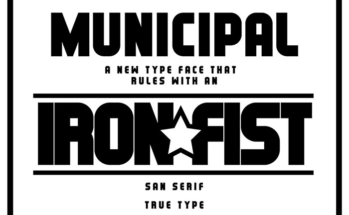
MUNICIPAL
Varela
Varela is a modern bold font that blends styles of many great typefaces. This bold sans-serif font’s uniqueness stems from vertical cuts on lowercase letters such as “a, c, e, g, s” and uppercase letters such as “C, G, J, S”.
Because it is extremely clean and minimalistic in design, it is able to sit well in body text at small sizes or be used for headlines and menu items. Varela is a great font for anything containing text or content.
Myra free font
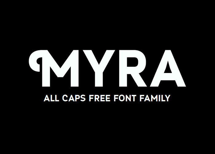
Myra another one of these best bold fonts, and a new contemporary bold sans serif font designed by Sergiy Tkachenko. He brings us some unique “deco style” feeling which is presented in classic sans serif curves that make the font applicable to both – retro and modern designs.
Myra free bold font is applicable for any type of graphic design – web, print, motion graphics etc and perfect for t-shirts and other items like posters, logos.
Hammersmith One
Another one of the good bold fonts is Hammersmith One. A very low contrast typeface inspired by the Johnston UK lettering tradition. Hammersmith One shows the quirks of a somewhat naive, handmade, brush-written letters including a wider than normal “e” and “s” as well as dark joins between stroke which are normally compensated for in type.
The sources for this design have been adapted not just for type but specifically for use as a web type. This bold text font works well to even smaller sizes than was originally expected.
Manteka
Movavi Grotesque Black
FAQs about bold fonts
When to Use Bold Fonts in Design?
Bold fonts are like exclamation points in a sentence; use them to punctuate ideas. Employ bold typography when you need to create emphasis, signal importance, or craft visual interest. They’re pivotal in headlines, call-to-actions, and anywhere you need to anchor a reader’s gaze.
Do Bold Fonts Affect Readability?
Certainly, they do. Bold typeface steps up to the readability challenge like a knight in shining armor.
When sprinkled with purpose, they carve out clearer paths for your reader’s journey. But beware the overdose; too much bold can clutter, confuse, and tire eyes.
How Do I Choose the Right Bold Font for My Brand?
Think of choosing a bold font like curating an art gallery. It’s about picking something that embodies your brand’s soul.
Study the brand’s voice, values, and the emotions you’d like to evoke. Cohesion is your lodestar—select a font weight that complements and enhances your brand identity.
Can Bold Fonts Improve SEO?
Yes, bold fonts wield power in the world of SEO entities. When you bold important words or phrases, it singles them out for search engine spiders, potentially boosting the SEO juice of your page. But remember, for efficacy, bold with precision—search engines value user experience first and foremost.
Is There a Difference Between Bold and Demi-Bold Fonts?
Amidst the family of font weights, bold and demi-bold are close kin yet distinct. Bold is the brasher sibling, louder and prouder.
Demi-bold holds back, offering a subtler strength. It’s like choosing between a firm handshake or a gentle grip—both assertive, each with a different touch.
What Are the Best Practices for Using Bold Fonts in Web Design?
Best practices for bold in web design are akin to seasoning a gourmet dish—a sprinkle here, a dash there.
Use them to highlight key content, aid navigation, or differentiate sections. As guardians of visual hierarchy, they should direct without dominating—letting the overall typography design breathe and balance.
How Does Bold Font Weight Correspond to CSS Properties?
In the realm of CSS, ‘font-weight’ is your command to control the muscles of your typeface. Font weights like ‘normal’ or ‘bold’ are just the start. Stretch further, and you encounter numerical values from 100 to 900. They let your text hit the gym, achieving anything from wiry to heavyweight.
Are Bold Fonts Suitable For Body Text?
Bold fonts for body text? Tread lightly. While they command attention, they’re not the marathon runners of readability.
Body text asks for legibility over long stretches—think of a trusty sans-serif at a trim weight. Reserve bold for moments of emphasis amidst your body text’s journey.
What’s the Impact of Bold Fonts on User Experience (UX)?
Bold fonts enter the UX stage like a dramaturge—they set the tone and guide emotions.
With deliberate use, they can improve navigation, clarify calls-to-action, and make interfaces memorable. They’re like signposts along a user’s exploratory path—their influence is subtle, yet indispensable for a seamless experience.
How to Pair Bold Fonts With Other Typefaces?
Pairing bold fonts is an art of balance. Like a good partner dance, it calls for give-and-take. Combine a bold header with a light, airy body font. The contrast is delightful, and the legibility remains unimpaired. Aim for harmony and contrast, a duo that performs seamlessly together.
Conclusion
Wielding bold fonts is to navigate the fine line between assertive charisma and visual clamor. Throughout this exposition, eyes have feasted on the myriad ways a font can go from whispering to resounding with nothing more than an adjustment of weight. The journey revealed that a thick lettering is no mere ornamentation but a functional cornerstone of typography design.
In the dance of digital aesthetics:
- The high-weight fonts have proven themselves as valiant focal points amidst the sea of content.
- Positive space and shadow have played, revealing how contrast fonts orchestrate rhythm on the screen.
- Header fonts have risen as the conductors of visual symphonies, ensuring each visitor’s voyage remains anchored in clarity.
Thus comes the close on the narrative of bold type—let it serve as inspiration, but also as a guiding principle. May each deployment of these powerful content tools be deliberate, enhancing the stories we tell and the experiences we craft with sophistication nuanced in strength.
If you liked this article with bold fonts, you should check out these as well: