People scroll through search results, ads, social posts, landing pages, and emails without much patience. They make quick decisions about what feels trustworthy, current, and worth their attention. That means your visual identity often shapes the first impression before your offer gets a real chance to speak.
People trust what feels clear and easy to use. The same thing happens in everyday digital tasks. When you can easily edit PDF online and send it back without confusion, the experience feels smooth and reliable. Brands work the same way. If your visuals feel clean, steady, and intentional, people are more likely to take you seriously.
People Judge the Look Before the Details
Most people do not begin with a careful reading of your copy. They notice the layout, colors, fonts, images, spacing, and overall order first. Those choices signal whether the brand feels organized, modern, practical, premium, warm, or careless. Even when users cannot explain what feels off, they still react to it.
That is why visual identity is more than decoration. It helps people decide how seriously to take you. A cluttered page suggests confusion. Weak typography can make useful information harder to absorb. Inconsistent graphics can make a company feel less established than it really is. Clean structure, readable type, and repeatable design cues create the opposite effect. They make the business feel more credible without forcing people to work for clarity.
A Logo Alone Cannot Carry the Brand
A lot of teams still reduce visual identity to a logo file and a couple of colors. That is too narrow to be useful. A strong visual identity also includes typography, image style, button treatment, icon style, layout patterns, document templates, and the rules that tie all those pieces together.
This matters because customers see the brand as a full experience, not a single mark in the corner. A polished homepage followed by an awkward quote sheet can weaken trust. A thoughtful sales page paired with low-quality social graphics creates the same problem. These mismatches make the business feel less careful, even when the actual product is solid.
Strong brands avoid that problem by building systems, not isolated assets. They decide how headings should look, how images should feel, how much white space to use, and how information should be organized across different formats. That kind of consistency helps people recognize the brand faster and move through its content with less effort.
Good Visual Identity Makes Everyday Use Easier
One of the biggest mistakes businesses make is treating design as surface work. In reality, good visual identity helps people complete tasks with less friction. It supports reading, scanning, comparing, clicking, and understanding. That practical side matters just as much as appearance.
Think about forms, invoices, onboarding pages, menus, proposals, and help docs. If information is hard to find, users get tired quickly. If the design makes the next steps obvious, people feel more confident. That is one reason a strong visual identity often improves results without dramatic changes to the offer itself.
For example, with a fillable 1099-NEC form, you could easily see where to enter key details, what fields need attention first, and what should be checked before sending it. A strong brand system should work the same way. It should guide the eye, reduce hesitation, and make action feel simple.
Small Design Choices Shape Perception in Real Ways
Color, shape, and typography affect how a brand is read. Blue is often linked with calm and dependability. Green often points to health, nature, or growth. Rounded shapes can feel more friendly. Strong geometric structure can feel more stable and professional. Typography also carries weight because certain fonts feel more classic, technical, modern, or approachable than others.
These signals work quickly because people process visual patterns before they process long explanations. A brand does not need a flashy design to benefit from that. It needs design choices that match its actual role in the market. A financial service should not look careless. A wellness brand should not feel cold and mechanical. A modern software company should not look like it stopped updating five years ago.
The strongest visual identities feel intentional because each element supports the same impression. That impression could be dependable, helpful, refined, direct, creative, or calm.
Consistency Builds Trust Faster Than Claims Do
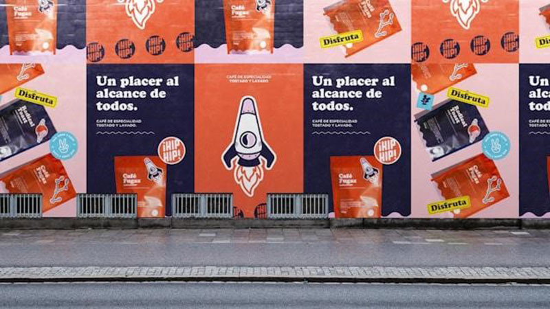
Many businesses say they care about quality, but their visuals tell a different story. A clean ad that leads to a messy landing page creates friction. A polished website followed by generic follow-up emails weakens the experience. People notice those gaps, even if they never mention them out loud.
Consistency matters because repetition builds memory and trust. When people keep seeing the same visual logic across your channels, the brand starts to feel more stable and familiar. That familiarity lowers resistance and makes the next click, reply, or purchase feel safer.

Renowned for his expertise in logo design and visual branding, Bogdan has developed a multitude of logos for various clients.
His skills extend to creating posters, vector illustrations, business cards, and brochures. Additionally, Bogdan's UI kits were featured on marketplaces like Visual Hierarchy and UI8.
He also wrote in the past years on sites like Design Your Way, WebDesignerDepot, WPDean, Designmodo, Speckyboy, Slider Revolution, and more.
- The Windsurf Logo History, Colors, Font, And Meaning - 10 October 2026
- How to Remove Background From Product Photos (No Photoshop) - 10 October 2026
- How Designers can Build a Stronger Online Creative Identity - 9 October 2026

Bogdan Sandu is a seasoned designer who has been designing websites since 2008. Renowned for his expertise in logo design and visual branding, Bogdan has developed a multitude of logos for various clients. His skills extend to creating posters, vector illustrations, business cards, and brochures. Additionally, Bogdan's UI kits were featured on marketplaces like Visual Hierarchy and UI8. He also wrote in the past years on sites like Design Your Way, WebDesignerDepot, WPDean, Designmodo, Speckyboy, Slider Revolution, and more.
You Might Also Like