

Optometrist Website Design: 12 Great Examples

Imagine this: your eyes, those diligent scouts of your every waking moment, are drawn to a website. It’s more than just a digital storefront; it’s a nexus where art meets precision and where first impressions can blossom into lasting patient relationships.
You’ve stumbled upon what could be a paradigm in optometrist website design examples.
In a landscape where attention drifts like dandelion seeds, a website that pairs visual flair with operational savvy is nothing less than a lighthouse for those seeking clear vision.
Here lies a rare junction – innovation knit tightly with the comforting fibers of professionalism. We’re not merely talking about a pretty interface, but a conduit for user empowerment, a template for success in the eyecare realm, harmonizing user-friendly dynamics with online appointment booking systems.
Swiftly navigated and brimming with educational eye health blog integrations, the avant-garde optometrist’s web presence is our canvass.
Pursue these pixels further, and you’ll unearth the alchemy of compelling visual health web themes interwoven with robust SEO for optometry websites, cementing the cornerstone of your digital edifice.
Stand Out with Top Notch Optometrist Website Design
Ever noticed how you can tell whether a site is worth exploring in mere moments? It’s the same with everyone. And that’s why first impressions are critical, especially online. Your site serves as a digital version of your practice that anyone can visit. By picking one of these website design inspirations, you can tailor your optometry website to match your practice’s vibe.
- Bold Colors to Catch Eyes: Make your site pop and grab attention with vibrant hues.
- Modern Design for a Fresh Look: Stay up-to-date with the latest design trends for a current feel.
- Simplicity for a Strong Impact: Sometimes, less is more. A clean, minimalist design can leave a lasting impression.
- Video Backgrounds for Dynamic Appeal: Incorporate video backgrounds to give your site a lively touch.
- Industrial Design for an Edgy Aesthetic: A gritty, urban look can elevate your site’s appeal.
- Warm Landscapes for a Welcoming Atmosphere: Create a cozy, inviting mood with serene landscapes.
- Illustrations for a Unique Flair: Swap traditional photos with fun illustrations to give your site a playful twist.
- Black, White, and a Pop of Color: A monochromatic theme with a color accent can give your site a chic look.
- Stylish Boutique Feel with Coronado: Get the boutique vibe using the sleek and elegant Coronado style.
Some of the Finest Optometrist Websites
A top-notch optometry website should be user-friendly, embody a neat and modern design, and be permeated with practical information for patients—including vision care and eye health tips. Such a website should also feature online booking options, eliminating the need for patients to navigate through convoluted appointment processes.
Furthermore, it’s paramount to incorporate all necessary information about your clinic, like address, hours, and contact details, fostering accessibility and convenience.
Whether you’re conceptualizing a new web design for your optometric practice or pinpointing areas for improvement in your current site, the following examples, resonating with the essence of professional web design services and brand identity for eye care clinics, will be illustrative.
SUNY OPTOMETRY
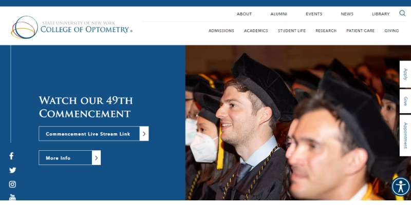
This site represents the State University of New York’s College of Optometry, an established entity in the educational landscape.
Emphasizing patient care and visual health education, it highlights the university’s leadership in the sector and dedication to service within the community.
The website also integrates essential features like patient management software for seamless operations.
SPECTRUM EYE CARE

The design of this site revolves around the company’s main themes of technology in optometry and optics.
Utilizing professional photography and a sophisticated black and golden yellow color scheme, it manages to capture attention to detail and commitment to top-tier eye care.
The site’s visual appeal is matched by user-centric elements such as accessible navigation and clear calls-to-action, encouraging prospective patients to book eye examinations or explore eyewear catalogs.
BLINK OPTOMETRY
The website’s modern aesthetic, characterized by vibrant colors and rounded, easy-to-read fonts, is emblematic of an effective user interface that enhances the user experience.
Creative navigation links and the display of eye vision corrective products emphasize the dual focus on ensuring clear vision and stylish appearance, appealing to a contemporary clientele.
CHICAGO VISION CLUB
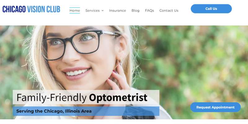
Here, a one-page scrolling homepage, featuring a video entices visitors immediately, offering a glimpse into the personal experience of trying out glasses.
By displaying office hours prominently and including a Groupon offer on the homepage, the site successfully combines functionality with marketing tactics. A cool parallax effect further augments the site’s dynamic user experience.
PRO OPTIX EYE CARE
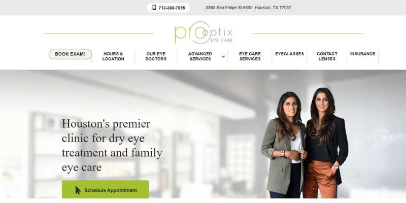
Care providers featured on the site establish direct credibility, supported by patient testimonials and social media integration.
High-quality imagery underlines their comprehensive eye care services, while clear navigation aids direct users to essential information such as major eyewear brands offered and directions to the clinic.
BAY RIDGE FAMILY EYECARE
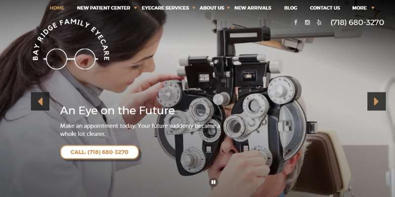
The website’s friendly vibe offers a counterpoint to the often-perceived rigidity of medical websites, providing a welcoming atmosphere.
Additionally, the impressively quick loading time exemplifies the technical optimization behind the site’s user-friendly interface, aligning with mobile optimization standards and best practices in website performance.
SHELBURNE OPTOMETRY

The Shelburne Optometry site immediately draws attention with its style-focused approach, as evidenced by its logo and fashionable eyewear focus.
The layout accentuates user-friendly access to information and features a diverse array of images that preview the content. User reviews, bolstered by links to external review platforms, and real-time social media feeds enrich the site’s connectivity and presence.
WARBY PARKER
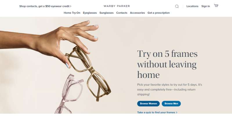
The Warby Parker site is a beacon of clean design, characterized by its elegant approach and intuitive navigation, including well-organized product showcases for effortless online shopping.
The inclusion of a comprehensive footer and calls-to-action, such as a question form and the online shop, cater to various user intents, from inquiries to purchases.
PACIFIC RIMS OPTOMETRY
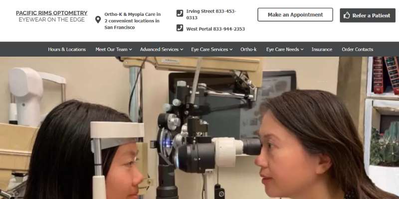
With a homepage that embodies the essentials of an outstanding optometry site, Pacific Rims Optometry manages to convey its array of services and affiliations.
The direct approach fosters ease of use, while the booking form serves as a strategic point of engagement for users intent on securing an eye exam.
CCRS CLEAR VISION
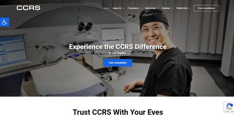
CCRS demonstrates current practices in optometry through its website, spotlighting advanced technology and innovative eye-care procedures.
The site manages to seamlessly integrate calls-to-action, a critical component for user engagement, within its grid-inspired layout.
LENSCRAFTERS
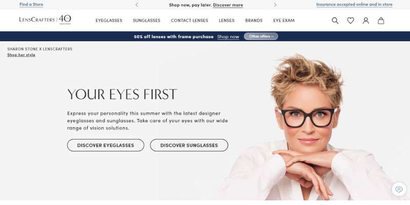
Navigating the LensCrafters site is intuitive and time-efficient, with prominent calls-to-action inviting user interaction.
Rich product imagery and meticulous design elements echo the brand’s commitment to quality, while site responsiveness attests to its mobile optimization. Furthermore, the “Book an Eye Exam” feature simplifies the process of locating nearby clinics, emphasizing user-centric design.
FAQ On Optometrist Websites
What elements are crucial for an optometrist website design?
Visual clarity is king in optometrist website design. Ensure your site is a haven of user-friendly interfaces and accessible layouts. Integrate an online appointment booking system – your site’s not just a billboard; it’s a functional piece of your practice.
How does color scheme impact an optometrist website?
Colors aren’t just pretty; they’re communicative. Website color schemes should evoke comfort, trust, and professionalism. Opt for blues and greens; they’re easy on the eyes – no pun intended – and they convey a sense of health and serenity.
What makes for effective navigation on an eye care website?
Effective navigation equals simplicity plus intuition. Your menus should guide patients like a well-lit path.
Eye examination website navigation must lead seamlessly to services, bios, and contact information, ensuring users find what they need without squinting or the digital equivalent of stumbling.
Why should I integrate patient testimonials into my website?
Nothing speaks louder than success stories. Showcasing patient testimonials isn’t just bragging; it’s providing social proof. Reading positive experiences straight from other patients builds credibility and trust faster than the sharpest vision chart.
Can optometrist websites benefit from a blog?
Absolutely, blogs are like a multifocal lens for your online presence. An eye health blog demonstrates expertise and keeps content SEO-rich. Educative posts about eye care serve your patients and improve search engine rankings, a win-win!
Should I display credentials and bios online?
Yes, and prominently so! Highlighting optometrist biographies and credentials lends a personal touch, fostering connection while affirming the expertise that backs your practice.
We’re talking board certifications, education – the works. It reassures visitors they’re in good hands.
What’s the value in a mobile-responsive design?
Here’s the deal: everyone’s glued to their phones these days, even when searching for an optometrist. A mobile-responsive design ensures that no matter the device, potential patients experience your website at its best, no pinching or zooming necessary.
How important is ADA compliance for an optometrist website?
Super important. ADA compliance isn’t just a legal safeguard; it’s about inclusivity. Ensuring your eye care website is accessible to all users, including those with disabilities, is critical. It’s a reflection of your commitment to patient care, online and off.
Should my website include a gallery for eyewear?
You bet. An online glasses gallery works wonders; it’s like window-shopping but better. Showcasing frames and contact lenses lets patients ponder their options in the comfort of their homes, leading to informed decisions and a smoother in-store experience.
What role does SEO play in an optometrist’s digital presence?
SEO is like the eyeglasses for your website; it brings everything into focus. Optometry website SEO enhances visibility, drawing more visitors – potential patients – to your digital doorstep.
Careful keyword integration and semantic relevance ensure you’re not just seen, but seen by the right eyes.
Conclusion
We’ve journeyed through a spectrum of optometrist website design examples, each a showcase of symmetry between aesthetics and functionality. From eye care web design principles to the nuances of patient engagement, it’s clear: the ideal website serves as a seamless bridge connecting optometrists to their community.
Effortlessly, as if flipping through the pages of a well-loved journal, the right design leads the eye, fosters trust, and opens a clear path to care. The visual health web themes we discussed, they’re more than just pleasing; they are a signal, a beacon, firing off neurons that whisper, “this is the place for your eye care needs.”
Wrapping up, remember, it’s the blend of patient-friendly navigation, ADA compliance, and crisp, SEO-rich content, that sets a website apart like a lighthouse in the digital sea. Dip into these waters; the currents of creativity and clarity await to elevate your digital presence.
If you liked this article about optometrist websites, you should check out this article about florist websites.
There are also similar articles discussing pizza websites, hairstylist websites, massage therapist websites, and wedding photographer websites.
And let’s not forget about articles on gym websites, furniture website design, websites for singers, and kindergarten websites.
Bogdan Sandu, a seasoned designer with 15 years of diverse experience, has been designing websites since 2008.
Renowned for his expertise in logo design and visual branding, Bogdan has developed a multitude of logos for various clients.
His skills extend to creating posters, vector illustrations, business cards, and brochures. Additionally, Bogdan's UI kits were featured on marketplaces like Visual Hierarchy and UI8.
Latest posts by Bogdan Sandu (see all)
- Bright Color Palettes for Eye-Catching Designs - 18 May 2024
- Venmo’s Visual Voice: What Font Does Venmo Use? - 18 May 2024
- The Hoegaarden Logo History, Colors, Font, And Meaning - 17 May 2024