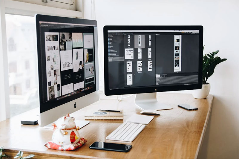
Generic stock photo alternatives kill your brand’s personality before visitors even scroll. When you use original images in your web designs, you create unique visuals that competitors cannot replicate.
Custom visual branding separates professional website development from amateur attempts. Your brand identity deserves better than overused royalty-free graphics that appear across thousands of competitor sites.
This guide reveals practical methods for creating personalized imagery that strengthens user experience design and boosts conversion optimization. You’ll master photography for websites, custom illustration work, and AI-powered bespoke visual content creation.
Original photography and handcrafted illustrations cost less than premium image licensing while delivering superior brand consistency standards. Learn to build exclusive design elements that make your client projects unforgettable.
Visual content creation techniques covered include:
- Custom photography setup and execution
- AI image assets generation with Midjourney Online or other AI tools
- Graphic design and digital art fundamentals
- Image optimization techniques for web performance
Creating Original Images with Midjourney
Getting Started with Midjourney for Design Projects
Your Midjourney account setup takes minutes. Head to Discord first. Join the Midjourney server. Link your subscription through their website.
Basic workspace organization matters:
- Create dedicated channels for different projects
- Save successful prompts in a separate document
- Set up folders for downloaded images
The prompt structure follows a simple pattern. Start with your main subject. Add style descriptors. Include technical specifications.
Basic format: /imagine [subject] [style] [technical details]
Subscription plans vary by usage needs. The basic plan gives 200 fast generations monthly. Standard offers unlimited relaxed mode. Pro adds stealth mode and more concurrent jobs.
Fast mode processes in under a minute. Relaxed mode takes 5-10 minutes but costs nothing extra after your monthly allowance.
Writing Effective Prompts for Design-Focused Images
Style and mood descriptions work better with specific terms:
- Instead of “modern” try “clean minimalist geometric”
- Replace “colorful” with “vibrant magenta and turquoise palette”
- Swap “professional” for “corporate photography aesthetic”
Technical specifications need precision. Add aspect ratios using --ar 16:9 or --ar 1:1. Quality settings range from --q 0.25 for quick drafts to --q 2 for maximum detail.
Brand colors require hex codes or specific color names. “Company blue #2E5BBA” works better than just “blue.”
Negative prompts eliminate unwanted elements:
Use --no followed by what you want to avoid:
--no text, watermarks, signatures--no blurry, low quality, distorted--no people, faces, hands
Lighting descriptions change everything. “Golden hour backlighting” creates warmth. “Studio lighting with soft shadows” gives clean results. “Dramatic side lighting” adds mood.
Refining and Customizing Generated Images
Variation commands explore different directions. Click the V1-V4 buttons under any generation. Each creates a new version based on that specific image.
U1-U4 buttons upscale individual images. This increases resolution from 1024×1024 to 2048×2048 or higher.
Regional prompting targets specific areas:
The --vary command lets you modify parts of an image. Describe what you want changed in specific regions.
Multiple generations work for complex compositions. Generate backgrounds separately from foreground elements. Combine them in post-processing software.
Blend mode merges two images. Upload your images, then use /blend with both image URLs.
Best Practices for Commercial Use
Midjourney’s commercial terms allow business use with paid subscriptions. Free trial images cannot be used commercially.
Keep detailed records:
- Original prompts used
- Generation dates and times
- Subscription status when created
- Any modifications made
Originality requires sufficient changes from generated output:
- Modify colors, composition, or elements
- Combine with other original content
- Use as inspiration rather than final product
- Add your own text, branding, or graphics
Avoid recognizable characters, logos, or trademarked elements. This includes Disney characters, brand mascots, or celebrity likenesses.
Photography Techniques for Creating Original Visual Content
Planning Your Photo Shoots for Maximum Impact
Define your visual goals before touching a camera. What emotion should the image convey? What action do you want viewers to take?
Brand message alignment happens during planning, not editing. Corporate clients need different approaches than creative agencies.
Mood boards save time and money. Collect 10-15 reference images that match your vision. Pinterest, Behance, and Instagram work well for research.
Shot lists prevent missed opportunities:
- Wide establishing shots
- Medium shots for context
- Close-ups for detail
- Alternative angles and compositions
Location scouting happens twice. Visit once for initial assessment. Return during your planned shooting time to check lighting conditions.
Logistics planning covers:
- Travel time and parking
- Weather backup plans
- Power outlets for equipment
- Restroom facilities for longer shoots
Props and styling create authenticity. Real objects look better than fake ones. Fresh flowers beat plastic flowers. Actual products work better than mockups.
Essential Equipment for Quality Original Photography
Camera choice depends on your specific needs and budget:
Smartphones work for social media content. iPhone Pro models and Google Pixel phones have advanced computational photography.
Mirrorless cameras offer portability with professional quality. Sony a7 series, Canon R series, and Fujifilm X series dominate this market.
DSLRs provide excellent value for beginners. Canon EOS Rebel series and Nikon D3500 offer good image quality at reasonable prices.
Lighting equipment transforms ordinary photos:
Natural light modifiers include reflectors and diffusers. White foam core boards cost under $10 and work as reflectors.
Artificial lighting starts with continuous LED panels. Godox and Neewer make affordable options for beginners.
Flash units provide more power but require learning. Start with one flash unit and a softbox.
Support accessories improve sharpness:
- Tripods for longer exposures
- Monopods for sports and events
- Reflectors for fill light
- Diffusers for harsh sunlight
Post-processing software ranges from free to professional. Lightroom handles most photo adjustments. Photoshop adds advanced editing capabilities.
Composition and Lighting Fundamentals
Rule of thirds places subjects along imaginary grid lines. Most cameras display this grid as an overlay.
But rules exist to be broken strategically:
Center composition works for symmetrical subjects. Diagonal lines create movement and energy. Negative space gives subjects room to breathe.
Leading lines guide viewers through the image. Staircases, fences, and roads create natural leading lines.
Natural light changes throughout the day:
Golden hour provides warm, flattering light. This happens one hour after sunrise and one hour before sunset.
Blue hour creates moody backgrounds. This brief period occurs just after sunset when the sky turns deep blue.
Overcast days work as giant softboxes. Clouds diffuse sunlight for even, shadow-free lighting.
Artificial lighting requires understanding direction:
- Front lighting eliminates shadows but looks flat
- Side lighting creates dimension and texture
- Back lighting produces silhouettes and rim lighting
Depth comes from multiple visual layers. Include foreground, middle ground, and background elements.
Different applications need specific approaches:
Web images need strong contrast for small screens. Print materials allow subtle tonal variations. Social media favors bold, attention-grabbing compositions.
Post-Processing and Editing Your Photos
Basic adjustments fix common problems quickly:
Exposure correction brightens or darkens the entire image. Highlights and shadows adjust specific tonal ranges.
White balance removes color casts from different light sources. Auto white balance works for most situations.
Contrast adjustment makes images appear sharper and more vibrant.
Brand consistency requires systematic approaches:
Create preset adjustments for recurring projects. Save color grading settings that match your brand palette.
Consistent cropping ratios maintain professional appearance across platforms.
Web optimization reduces file sizes without quality loss:
JPEG format works for most photographs. PNG format preserves transparency for graphics.
Resize images to actual display dimensions. A 5000-pixel image displayed at 500 pixels wastes bandwidth.
Platform-specific variations maximize impact:
- Instagram favors square crops
- Facebook covers need horizontal orientation
- Pinterest performs better with vertical images
- LinkedIn prefers professional, clean aesthetics
Color profiles matter for print work. sRGB works for web display. Adobe RGB provides wider color gamut for printing.
Graphic Design and Digital Art Creation
Vector Graphics and Illustration Techniques
Adobe Illustrator dominates vector creation for good reasons. Scalability matters when your logo needs to work on business cards and billboards.
Start with basic shapes and build complexity:
- Rectangles become building blocks
- Circles create organic forms
- Lines connect and divide elements
- Pen tool creates custom paths
The pen tool intimidating newcomers, but mastery opens creative possibilities. Click for straight lines. Click and drag for curves. Practice daily for two weeks to build muscle memory.
Creating scalable graphics requires proper setup:
Document size affects final output quality. Set up artboards at actual print dimensions when possible. Use RGB color mode for digital work, CMYK for print projects.
Anchor points control every curve and line. Fewer anchor points create smoother curves. Too many points make jagged, unprofessional results.
Hand-drawn illustrations gain digital polish through careful vectorization. Scan your sketches at 600 DPI minimum. Import into Illustrator and trace using the pen tool.
Digital conversion workflow:
- Clean up scanned artwork in Photoshop
- Increase contrast for clearer lines
- Import into Illustrator as template layer
- Trace over original artwork
- Remove template when finished
Icon design follows specific principles. Simple shapes work better than complex details. Test icons at 16×16 pixels to check readability.
Typography as visual elements goes beyond choosing fonts:
Letter spacing affects readability and mood. Tight spacing feels urgent. Loose spacing appears calm and luxurious.
Custom lettering creates unique brand identity. Start with existing fonts as frameworks. Modify letter shapes to match your project needs.
Digital Painting and Artistic Effects
Photoshop brushes determine painting quality more than technique. Default brushes work for basic tasks. Custom brushes create professional results.
Creating custom backgrounds starts with understanding layers:
Base layers establish overall color and tone. Texture layers add surface detail. Light layers create depth and atmosphere.
Blend modes change how layers interact. Multiply darkens underlying layers. Screen lightens them. Overlay increases contrast.
Abstract visuals work well for backgrounds and supporting graphics:
Gradient meshes create smooth color transitions. Apply them to geometric shapes for modern looks.
Noise filters add organic texture to digital surfaces. Adjust opacity to control intensity.
Cloud filters generate natural-looking textures. Combine multiple cloud layers with different blend modes.
Combining photography with digital art requires matching lighting and perspective:
Shadows must match between photographic and painted elements. Study the original photo’s light direction before adding digital components.
Color temperature stays consistent across mixed media. Warm photos need warm digital additions. Cool photos need cool digital elements.
Brush techniques separate amateur from professional work:
Pressure sensitivity varies stroke width naturally. Light pressure creates thin lines. Heavy pressure makes thick strokes.
Opacity variation adds depth to brush strokes. Lower opacity allows color buildup through multiple passes.
Artistic filters transform ordinary photos into stylized artwork. Oil paint filter mimics traditional painting techniques. Watercolor filter creates soft, flowing effects.
Template and Layout Design
Reusable templates save time and maintain consistency:
Grid systems organize content predictably. 12-column grids work for most web layouts. Magazine layouts often use 3 or 4-column grids.
Master pages in InDesign control recurring elements. Headers, footers, and page numbers update automatically across documents.
Style sheets maintain text formatting consistency. Create character styles for headings, body text, and captions. Paragraph styles control spacing and alignment.
Building brand-consistent visual systems requires documentation:
Color palettes need hex codes, RGB values, and CMYK equivalents. Document primary, secondary, and accent colors.
Typography hierarchies establish information order. H1 headings get largest size and boldest weight. Body text stays readable at 11-14 point sizes.
Logo usage guidelines prevent brand dilution. Specify minimum sizes, clear space requirements, and background restrictions.
Multiple format requirements challenge traditional design approaches:
Responsive design adapts to different screen sizes. Start with mobile layouts first. Add complexity for larger screens.
Print specifications differ from digital requirements. Add bleed areas for printed materials. Set resolution to 300 DPI minimum.
Social media formats multiply design workload:
Instagram posts work best as squares (1080×1080). Stories need vertical orientation (1080×1920). Feed carousels allow multiple aspect ratios.
Facebook covers span 820×312 pixels. Profile photos display as 170×170 circles. Event graphics need 1920×1080 dimensions.
LinkedIn company pages use 1192×220 banner images. Profile backgrounds show at 1584×396 pixels.
Asset organization prevents chaos in collaborative environments:
Folder structures need logical hierarchy. Organize by project, then by asset type (photos, graphics, fonts).
File naming conventions eliminate confusion. Use descriptive names with version numbers. “Logo_Company_v3_final” beats “untitled-1.”
Version control saves relationships and deadlines:
Save incremental versions throughout projects. “Project_v1,” “Project_v2,” etc. Track major changes between versions.
Cloud storage enables team collaboration. Google Drive, Dropbox, and Adobe Creative Cloud sync files automatically.
Team collaboration requires clear communication:
Shared style guides document design decisions. Include color codes, font specifications, and usage examples.
Feedback systems streamline revision processes. Tools like InVision and Figma allow stakeholders to comment directly on designs.
Asset libraries store frequently used elements. Logos, icons, and brand graphics stay accessible to all team members.
Design handoff specifications help developers implement designs accurately:
Measurements need pixel precision. Specify exact spacing between elements. Include font sizes, line heights, and letter spacing values.
Color specifications require multiple formats. Provide hex codes for web use, RGB for screens, and CMYK for print materials.
Export settings affect final quality. PNG files preserve transparency. JPEG files create smaller file sizes. SVG files scale infinitely without quality loss.
Conclusion
When you use original images in your web designs, you transform generic websites into memorable brand experiences. Made-to-order imagery and specialty graphics create proprietary images that competitors cannot duplicate.
Creative tools like Adobe Creative Suite enable web designers to produce one-of-a-kind visuals efficiently. Custom-created assets support responsive design requirements while maintaining loading speed optimization.
Visual storytelling methods through tailored photography and handmade visual pieces strengthen digital marketing campaigns. Your design portfolio showcases signature visual style that attracts premium client projects.
Image CDN solutions and compression methods ensure website performance impact remains minimal. Cross-browser compatibility and accessibility considerations make custom visual branding work across all platforms.
Start implementing these creative process techniques today. Original graphic content takes practice but delivers measurable conversion optimization results.
Your visual content strategy deserves better than stock photo alternatives. Create exclusive photography that tells your story.

Renowned for his expertise in logo design and visual branding, Bogdan has developed a multitude of logos for various clients.
His skills extend to creating posters, vector illustrations, business cards, and brochures. Additionally, Bogdan's UI kits were featured on marketplaces like Visual Hierarchy and UI8.
He also wrote in the past years on sites like Design Your Way, WebDesignerDepot, WPDean, Designmodo, Speckyboy, Slider Revolution, and more.
- The Windsurf Logo History, Colors, Font, And Meaning - 10 October 2026
- How to Remove Background From Product Photos (No Photoshop) - 10 October 2026
- How Designers can Build a Stronger Online Creative Identity - 9 October 2026

Bogdan Sandu is a seasoned designer who has been designing websites since 2008. Renowned for his expertise in logo design and visual branding, Bogdan has developed a multitude of logos for various clients. His skills extend to creating posters, vector illustrations, business cards, and brochures. Additionally, Bogdan's UI kits were featured on marketplaces like Visual Hierarchy and UI8. He also wrote in the past years on sites like Design Your Way, WebDesignerDepot, WPDean, Designmodo, Speckyboy, Slider Revolution, and more.
You Might Also Like