Awesome Shades of Yellow To Use In Your Designs

Picture this: you’ve just cracked open a fresh box of crayons, and there it is, that one zesty yellow crayon that makes your inner child want to color the sun in every single drawing. Now, imagine that feeling translated to design, where every yellow shade of color is a new opportunity to brighten up your day.
This stuff isn’t just sweetness and light; it’s the secret spice that can transform the ordinary into eye candy. From the delicate pastel yellow awakening a sense of serenity to a vibrant lemon hue injecting a shot of daytime into the night.
Stick around, and you’ll unlock the full spectrum of yellow shades — and how to wield them like a pro. By the end of this read, you’ll know exactly which yellow whispers or which one roars, setting the perfect mood for your space or brand. Dive in, and let’s explore how to make these shades do more than just look pretty; they’ll work for you.
Using a yellow color palette and the universal meanings of yellow
- Throughout the world, yellow symbolizes the return of the sun. It has been associated with warmth and happiness.
- In Ancient Egypt as well as in the Hindu faith, yellow shades have been associated with gods and goddesses.
- All around the world, the color yellow is used in traffic lights to symbolize the need to slow down or be cautious.
- In Egypt the yellow color was used to symbolize mourning, and during the Middle Ages yellow was worn to symbolize death.
- Although yellow is symbolic of cowardice in western countries, in Japan yellow symbolizes courage.
- In India, yellow is worn as a color of peace.
The color yellow in nature and culture
Using a yellow color will always feel warm and sunny. However, like red, yellow has two different meanings. From one perspective yellow is about sunny warmth, enjoyment and celebration. From a different perspective cowards are described as being ‘yellow’. Yellow is also the color of deceit.
The color yellow is very bright and highly visible. Despite some negative connotations, it remains a very warm color. It is because yellow is so visible that it is often used to symbolize danger as well as for emergency vehicles.
Throughout time, yellow has been used as a symbol of hope – a symbol that the sun will return out of the darkness. Women wore yellow ribbons in the hope that their men would return from war, and yellow ribbons are still a sign used as a welcome for loved ones who have gone away. However, although yellow is soft and welcoming, there is no doubt that it may also signal danger or caution (although yellow is not as threatening as red).
Using shades of yellow in digital and print design
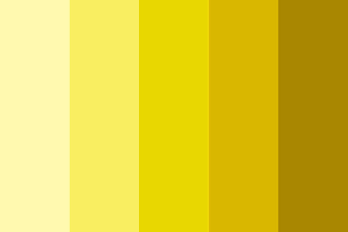
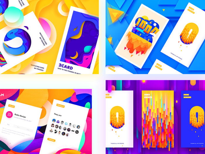
Using a yellow color palette can help you to create exciting designs. Although shades of yellow can be used alone in digital and print media, yellow works best when combined with other colors. Yellow will give your designs a fresh, sunny and even fruity atmosphere.
If you are looking for a warm color without the intensity or darkness of red and orange, yellow makes a great substitute. You can also use a bright shade of golden yellow to substitute for a gold color palette.
Yellow color combinations you can use:
- If your color palette is using subdued tones, sunny yellow will lift your designs.
- If you’re interested in creating a warm summer theme, yellow and orange make great color combinations.
- Combine rich, dark colors with pale yellows to add a vivid contrast.
- If you want to create a striking color combination, yellow and blue make great choices.
- Neutrals such as grey and a yellow color make a sophisticated combination. You could combine blacks for a strikingly modern appeal.
- If you want your designs to be warm and exciting, combine red with the color yellow.
- Add shades of yellow to olive green or brown to create an earthy palette which symbolizes harvest colors and landscapes as summer turns to fall.
- When you combine shades of yellow with lime greens you’ll create an upbeat, fruity design which feels fresh and clean. Keep colors different enough so that they look alive rather than pale and washed out.
How to create yellow color palettes
When you create a yellow color palette, you’ll be able to combine the color yellow with other colors (obviously). You’ll be able to mix shades of yellow with neutrals, or shades of reds, greens and blues. The result can be earthy, sophisticated, fresh, psychedelic or rich. Here are some attractive color combinations using the color yellow:
- 2 colors: shades of blue combined with the color yellow.
- 3 colors: mix the primary colors blue, red and yellow.
Some familiar phrases associated with yellow
Positive phrases
A yellow ribbon symbolizes the hope of a love returning, as in the song “Tie a yellow ribbon round the old oak tree.”
The phrase ‘mellow yellow’ refers to feeling completely at ease and relaxed.
Negative phrases:
Yellow-bellied refers to cowardliness. Cowards are considered to be yellow, and are sometimes called ‘cowardly custard’ after the yellow pudding.
Yellow journalism is seen to be unethical or irresponsible journalism which is used for drama or sensationalism rather than a sharing of stories or information.
Using a yellow color palette in your designs
When you use shades of yellow in your graphic design projects it’s worth noticing the subtle variations which exist. There is no single yellow color. Instead, there are shades of gold, mustard colors, ochre’s and bright yellows. There are deep yellow shades but no dark yellows. Although many colors become more intense when combined with the color black, yellow reacts badly, becoming an unappealing, sickly green color.
Points to think about when you design using shades of yellow?
Yellow is a bright and very eye catching color which attracts a great deal of attention. People are able to see yellow in at a glance. We are also far more likely to see yellow in our peripheral vision than any other color.
Yellow offers a source of light and reflexivity, which is why rooms painted in yellow often have a vivid appearance. Used carefully, yellow can be illuminating. However, too much yellow can be overwhelming.
Although yellow has been related to both sunny warmth and even associations with cowardliness, yellow can also be aggressive. Yellow is very intense and might sometimes appear too demanding or even aggressive. When yellow is used in large quantities it can become irritating.
The various shades of yellow
Yellow shades can range from deep mustard to bright golden yellow. Paler yellow colors such as cream or lemon are very popular.
Mellow Yellow Color
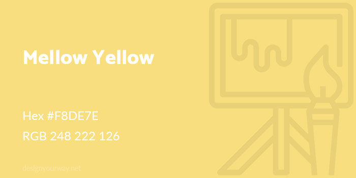
Hex #F8DE7E
RGB 248 222 126
Royal Yellow Color
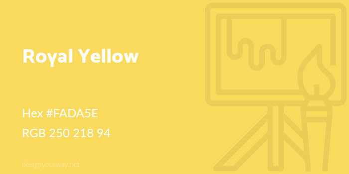
Hex #FADA5E
RGB 250 218 94
Gold Color
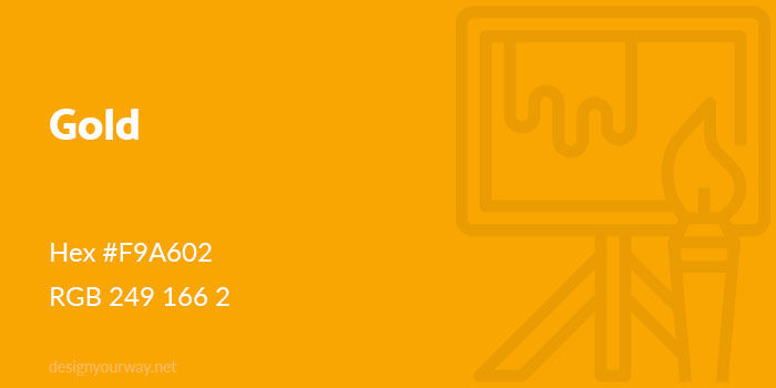
Hex #F9A602
RGB 249 166 2
Cyber Yellow Color
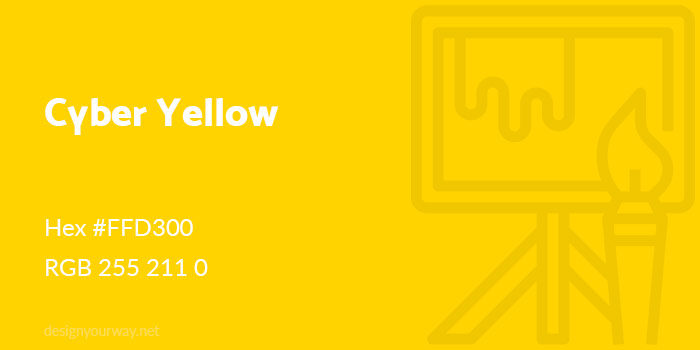
Hex #FFD300
RGB 255 211 0
Trombone Color
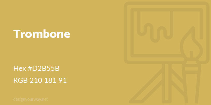
Hex #D2B55B
RGB 210 181 91
Khaki Color
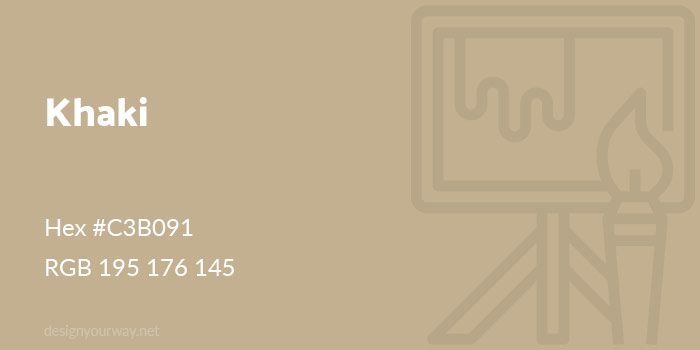
Hex #C3B091
RGB 195 176 145
Goldenrod Color
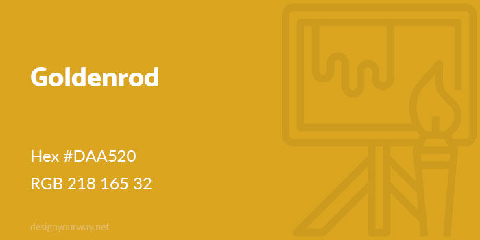
Hex #DAA520
RGB 218 165 32
Banana Color
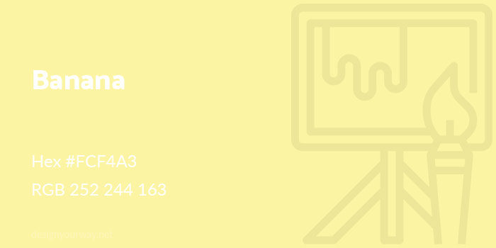
Hex #FCF4A3
RGB 252 244 163
Tuscany Color
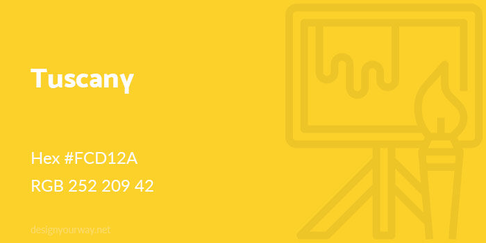
Hex #FCD12A
RGB 252 209 42
Honey Color
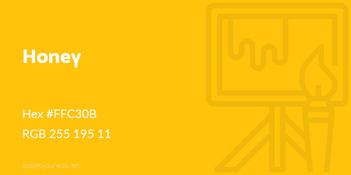
Hex #FFC30B
RGB 255 195 11
Dijon Color
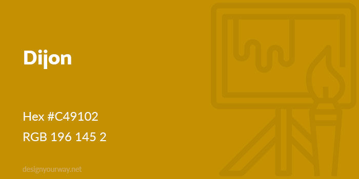
Hex #C49102
RGB 196 145 2
Bumblebee Color
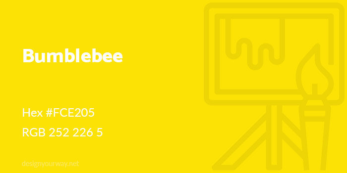
Hex #FCE205
RGB 252 226 5
Fire Yellow Color
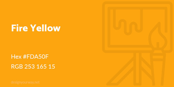
Hex #FDA50F
RGB 253 165 15
Ochre Color
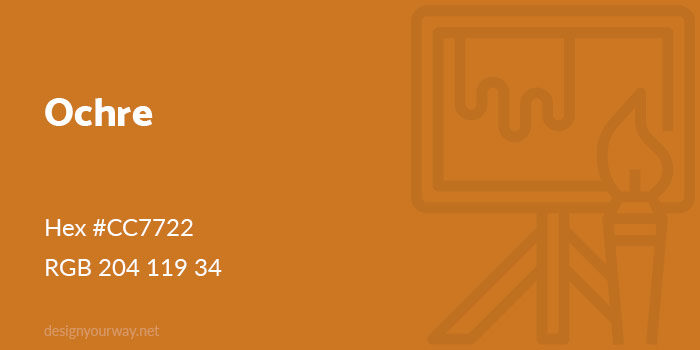
Hex #CC7722
RGB 204 119 34
Amber Color
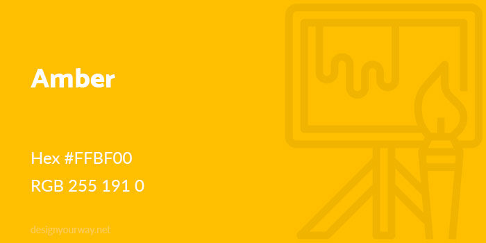
Hex #FFBF00
RGB 255 191 0
Flax Color
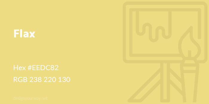
Hex #EEDC82
RGB 238 220 130
Cream Color
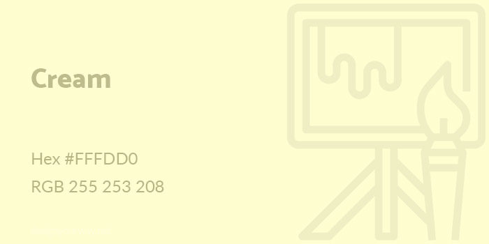
Hex #FFFDD0
RGB 255 253 208
Beige Color
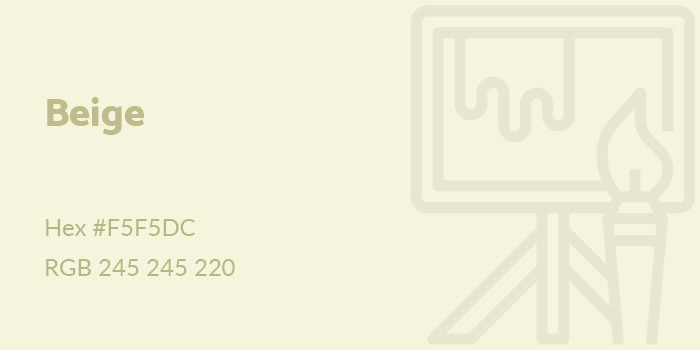
Hex #F5F5DC
RGB 245 245 220
Peach Color
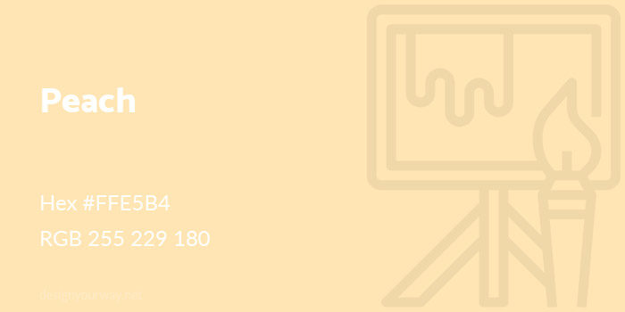
Hex #FFE5B4
RGB 255 229 180
Lemon Color
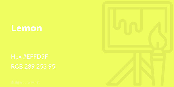
Hex #EFFD5F
RGB 239 253 95
Laguna Color
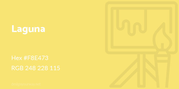
Hex #F8E473
RGB 248 228 115
Mustard Color
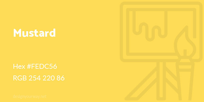
Hex #FEDC56
RGB 254 220 86
Navajo Color
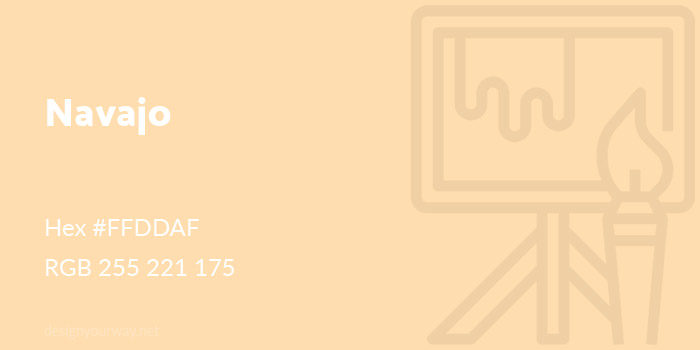
Hex #FFDDAF
RGB 255 221 175
Ecru Color
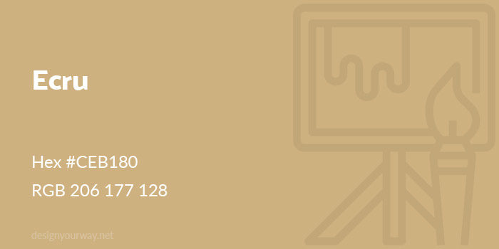
Hex #CEB180
RGB 206 177 128
Creating yellow color combinations
Now that you have an idea of the subtle shades of yellow available, you’ll be able to think of how to add shades of yellow into your designs. Yellow makes a sunny companion to darker colors, adding warmth as well as an eye catching appeal to your designs.
As mentioned earlier, yellow and blue make an attractive color combination, with the warmth of yellow contrasting with peaceful blues.
Purple contrasts highly with yellow, creating an attractive and vibrant effect.
Yellow mixed with deep greens remind us of buttercups or daffodils, giving an earthy appearance. Deep moss or olive greens will add an earthy touch.
Draw on lemon, orange and lime for a fresh, fruity palette.
Black, when combined with a bright yellow color, can create a modern, very striking look. Think of the industrial appeal of a bumble bee.
FAQ on yellow color palettes
What’s the vibe with using yellow in design?
You bet, yellow’s got that range. Warm color schemes with mustard and amber crank up the coziness, right? While those zesty lemon hues — they’re your go-to for energy. It’s all about the mood you’re aiming for and the story your design tells.
How do I pick the perfect yellow shade?
Oh, that’s a fun game. Start with what you’re feeling. Looking for a soft backdrop? Pastel yellow is your friend. Need a pop? Golden palettes never disappoint. Use color theory to mix and match, and those hex codes for yellow? They’re your precise BFFs.
Can yellow color palettes be used for branding?
Absolutely. Yellow screams attention and radiates happiness. Brands love it for the optimism. Think about what you want your brand to say, then dive into the color psychology toolbox — it’s a treasure trove.
What are the go-to complementary colors for yellow?
Roll out the color wheel, and let’s get this party started. Purples and blues are a classic hit with yellow — they’re like nature’s own contrast buttons. Placing them together? It’s like striking a visual chord that resonates perfectly.
Will yellow work in a minimalist design?
Sure thing. Yellow’s like that one bold accessory that kicks a minimalist outfit up a notch. Use mellow yellow tones to add character without the fuss. You’re looking to whisper, not shout.
How does yellow affect room ambiance?
Color harmony with yellows can brighten a room like a sunbeam on a cloudy day. But remember, your room’s feel swings on the shade you select. Earthy yellow tones ease-in comfort, while bright ones dial up the dynamism.
How can I integrate yellow into a website without overpowering it?
Think accents. Button here, banner there. Maybe a smart hover effect in a canary color blend? Or text highlights with a dab of sunshine shades? It’s about balance — a nudge rather than a knockout.
What about yellow for seasonal campaigns?
Yeah, it’s pretty season-flexible. Spring and summer? It’s a no-brainer with those seasonal colors blooming. Fall, though, saffron-inspired colors nestle right in. Winter? Offset it with crisp whites; you’ve got a festivity going.
How do I make sure the yellow doesn’t clash in my palette?
Harmony. That’s your mantra. Work in analogous colors or find a complementary palette. A tip? Visual contrast can be a friend but keep it like a well-placed spice — just enough to enhance, not overwhelm.
What’s the best practice for using yellow in print versus digital?
Oh, this is key, right? For print, get those CMYK yellow printing values spot on. It’s different from how screens sip in colors with RGB yellow values. Consistency’s the ticket, so always reference those color guides and swatches to keep your yellows true.
Ending thoughts
So, we’re nearing the finish line on this color trip, and let’s just say, yellow color palettes know how to throw a punch.
Dipping brushes into these sunshine shades isn’t just about splashing walls; it’s crafting feelings, setting scenes. Warm color schemes can turn a drab pad into a snug den. Or wanna jazz things up? Hurl in some mustard tones and watch the place sizzle.
You’ve seen color theory in action, balancing complementary colors with the pizzazz of yellows. Now, whether you’re branding or just adding a dash of dazzle to a homepage, keep in mind:
- Mood matters
- Context is king
- Harmony hits home
And color psychology? It’s like the unspoken chat between your design and whoever walks into its world.
Get playful with analogous colors, find solace in mellow yellow, and always remember, with the right palette, even a whisper can roar.
If you enjoyed reading this article about using a yellow color palette, you should check out these about shades of blue, shades of red, green color palettes, orange color palettes, and shades of pink.
- The Bethesda Logo History, Colors, Font, And Meaning - 28 April 2024
- Out of This World: Space Color Palettes for Cosmic Designs - 28 April 2024
- The Bungie Logo History, Colors, Font, And Meaning - 27 April 2024


