13 Versatile French Fonts for Your Creative Projects
Imagine unboxing a treasure trove of intricate design, each letter dancing to the timeless rhythm of sophistication and romance.
That’s the allure of French fonts, a gateway to an era where every stroke tells a tale, every curve sings of elegance.
In a sweep of Parisian flair, fonts can transcend mere letters; they embody a narrative steeped in history.
This article peels back layers of typeface allure, charting a course through the riveting world of typography, where script typeface and calligraphy fuse with modern design principles.
Embark on this journey and uncover the finesse of typography.
Discover how to harness the chic of elegant fonts, the boldness of vintage type, and the subtle art of text styling. By the end of our expedition, you’ll be fluent in the language of French type—curating fonts with the ease of a connoisseur.
Dive in. Explore sections that reveal secrets of font aesthetics, delve into the nuances of font pairings, and offer a glimpse into the digital realm of web font integration. This isn’t just about choosing a typeface; it’s about crafting an experience.
Best French Fonts For Creative Projects
| Font Name | Classification | Designer | Characteristics |
|---|---|---|---|
| Antique Olive | Sans-serif | Roger Excoffon | Contemporary, wide, organic shapes |
| Univers | Sans-serif | Adrian Frutiger | Large family, very legible, consists of a wide range of weights |
| Peignot | Decorative | A. M. Cassandre | Mix of sans-serif and serif, upper-case in two sizes (majuscules, minuscules) |
| Mistral | Script | Roger Excoffon | Mimics handwriting, has a loose, flowing style |
| French Serif | Serif | N/A | Classical serif, often with fine details and contrast |
| Ecolier | Script | Jean-Marie Douteau | Mimics traditional French school handwriting styles |
| Adobe Garamond™ | Old-style serif | Claude Garamond (revived by Robert Slimbach for Adobe) | Classic, legible, well-suited for large amounts of text |
| Auriol | Art Nouveau | George Auriol | Stylistic and curved, representative of the Art Nouveau movement |
| New French | Sans-serif | N/A | Modern approach, often clean and minimalist |
| ITC Eras | Sans-serif | Albert Boton and Albert Hollenstein | Slight slant, soft rounded curves, comes in various weights |
| Ronde Script | Script | N/A | Based on the French Ronde handwriting style, formal and curvaceous |
| Fournier | Transitional serif | Pierre Simon Fournier | Fine, traditional appearance with high contrast in stroke weights |
| Banco | Display | Roger Excoffon | Bold, heavy display font with a playful style |
Antique Olive Font
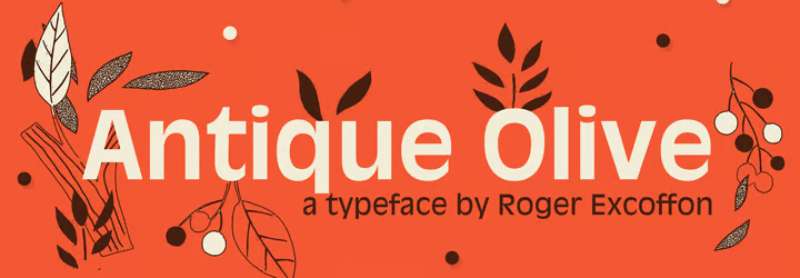
One well-liked sans-serif typeface is Antique Olive Font. Roger Excoffon, a French graphic, and online designer created this font. It is available in a range of weights and styles, including medium, condensed, condensed bold, wide, bold, and extremely bold. This typeface is utilized in the Sesame Street TV series because of its bold characters. You can use it to create card designs, game logos, wall murals, and other things. Several official businesses find this typeface helpful for their various design projects, such as t-shirt designs, product designs, mug designs, and certifications.
Univers Font
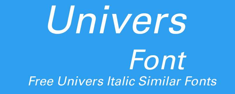
One of the most significant typographic developments of the second half of the 20th century is the font family Univers. The family benefits from having a range of weights and styles that, even when combined, convey steadiness and homogeneity. Univers is a readable font ideal for practically any typographic purpose because of its straightforward, objective forms.
The French type foundry Deberny & Peignot aimed to expand the selection of Lumitype typefaces in 1954 by including a linear sans serif type in several weights. The art director for the foundry, Adrian Frutiger, recommended against using an existing alphabet. The family was introduced by Deberny & Piegnot in 1957, and Linotype later produced it.
Peignot Font
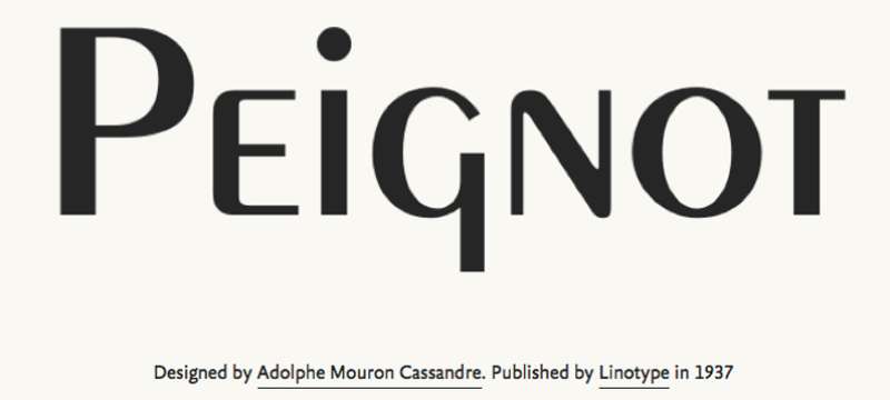
A. M. Cassandre created the sans-serif display typeface Peignot in 1937. The French foundry Deberny & Peignot commissioned it. The typeface is unique for lacking a typical lowercase and instead using a “multi-case” that combines small capital letters and traditional lowercase letters. From its introduction through the late 1940s, the typeface enjoyed modest success in the poster and advertising publication industries.
Mistral Font
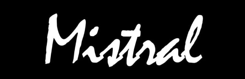
The Mistral font family was designed by French graphic artist Roger Excoffon and is named after the brisk, strong winds that blow across Southern France. All letters of the informal script known as Mistral are connected by bold strokes. Its brush-like stems, which were first introduced in 1953, appear unplanned and young. The descenders are pretty long, and the entire alphabet creates a memorable impression on the page. Mistral works well with sans-serif typefaces.
French Serif Font
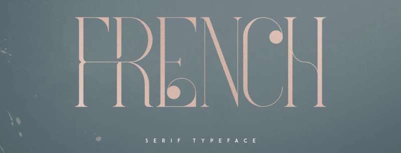
Four typefaces in the luxurious, contemporary typeface French will delight your upcoming project. Alternate glyphs, ligatures, and multilingual support are loaded. Fonts with a lot of versatility that function well in both large and tiny sizes. French works well as a classy text overlay on any backdrop image and is ideal for branding projects, home décor designs, product packaging, magazine headings, and more.
Ecolier Font
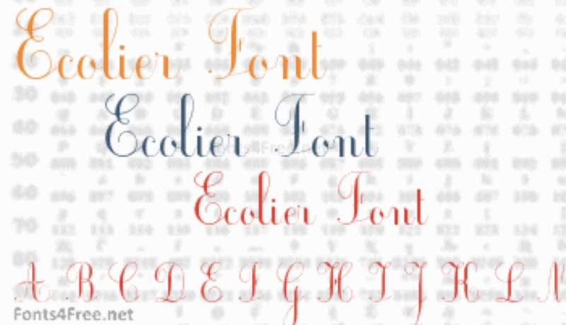
Jean-Marie Douteau created the script font known as Ecolier for use in schools. The font can be used for free for private purposes. The Ecolier font has 151 distinct glyphs and 223 defined characters.
Adobe Garamond™
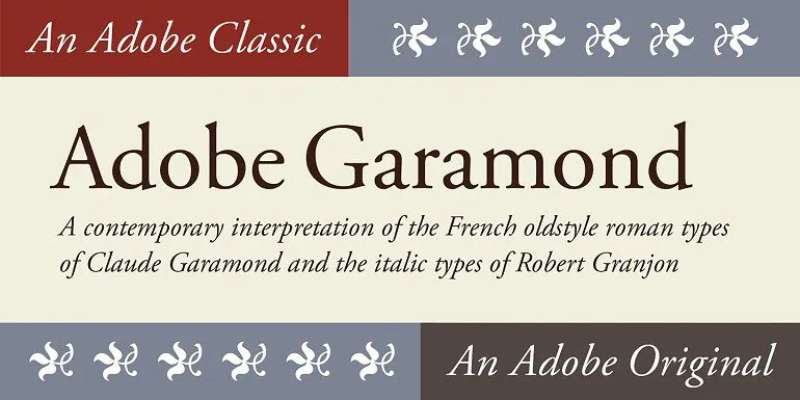
The Claude Garamond typefaces from the sixteenth century served as the inspiration for the Adobe GaramondTM font family. The italics of this serif face, which was designed by Robert Slimbach and published by Adobe in 1989, were inspired by Robert Granjon, Garamond’s assistant.
One of the most adaptable typefaces now on the market, as well as one of the most beautiful and graceful in print, is the Adobe Garamond design. Because the letterforms use less ink than those of other comparable faces, it is also among the most environmentally friendly typefaces to print. The instantly recognizable Google logo has been created using the Adobe Garamond font family.
Auriol Font
George Auriol designed the display typeface Auriol in 1901 for the Parisian foundry G. Peignot et Fils. Early in the 20th century, Auriol gained popularity in Europe and America and was frequently employed as a display type in books, posters, and the applied arts. Moreover, it was used for station signage in the Paris Métro.
New French Font

Austin Signs created and freely distributed New French, a casual, attractive, and straightforward handwritten typeface. Lowercase and capital characters, as well as multilingual accents, symbols, and numbers, are all included in the new French font. The elegant and sophisticated look of the new French font will add a touch of refinement to any creative design project. This lovely script font is ideal for logos, headlines, and brands for things like footwear, apparel, coffee shops, motorcycle clubs, posters, social media, and t-shirts.
Russelot Font
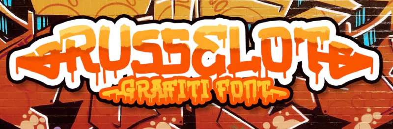
An eye-catching graffiti typeface is Russellot. primarily created as an attractive uppercase graffiti font design with a bubble appearance. This typeface has an appealing appearance that will instantly make you say “aww,” whether it’s used for massive branding text or catchy headlines. It is ideal for a variety of design tasks, including posters, logos, book covers, branding, headings, printed products, merchandise, social media campaigns, etc.
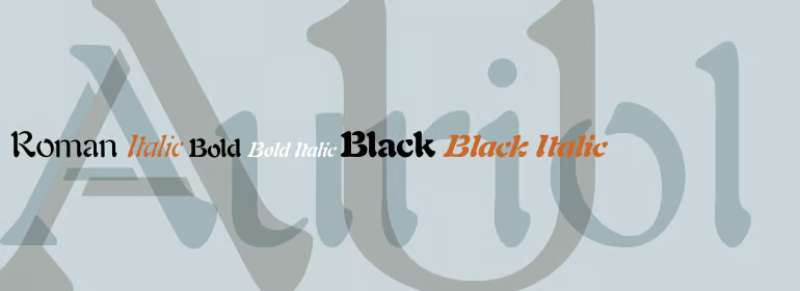
ITC Eras Font

French designers Albert Boton and Albert Hollenstein created the ITC Eras font. It has an ordinary little forward tilt and subtle variations in stroke weight that set it apart from other sans serif typefaces. ITC Eras is a free-flowing typeface that drew inspiration from both Roman capitals and Greek stone-cut lapidary letters.
Eras typefaces have a refined and tidy appearance. Because of this, you can use this font when writing essays and paragraphs, printing textbooks, creating cards, and even creating logos. This typeface can also be used for the titles of animations and websites. This font has already been used by certain designers in video games, presentations, album art, instructional videos, picture books, etc.
Ronde Script
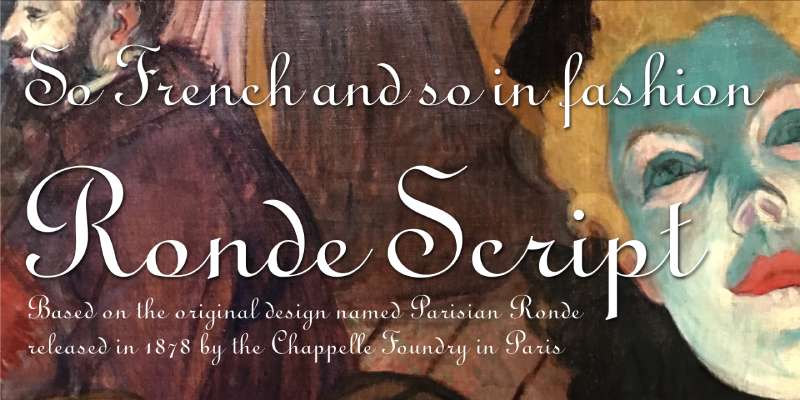
Ronde script gives the characters a rounded appearance when read as a whole since its thick strokes are nearly upright. is based on the original style known as Parisian Ronde, which the Chappelle Foundry in Paris first issued in 1878. For more than 130 years, this type of script has been a highly popular option when creating wedding invitations and numerous other official announcements. It has a formal, aristocratic, and vintage or retro feel and is very readable.
Fournier Font
Monotype created Fournier in 1924. The style is inspired by some of the most well-known designs from the eighteenth century, types cut by Pierre Simon Fournier around 1742. Fournier’s typefaces were some of the first examples of the transitional” style and served as a bridge to the more austere “modern” form that Bodoni made popular later in the century.
They had less or no bracketing on the serifs, greater contrast between thick and thin strokes, and more vertical emphasis than the old-style fonts. Fournier maintains an even color, has a light, clean appearance on the page, and offers exceptional text economy.
Banco Font
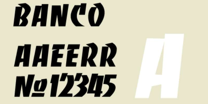
The bold decorative font known as Banco has a fantastic appearance. Phil Grimshaw created this magnificent typeface in 1997 for Linotype. The powerful font Banco, created by French graphic and poster designer Roger Excoffon and published by Fonderie Olive in 1952, served as the inspiration for this project. This is unquestionably a fantastic alternative for making larger text and larger artwork. Because nearly 400 characters undoubtedly result in a wide variety of designs. The best aspect about it is that you can also use it with other typefaces.
FAQ On French Fonts
What Exactly Are French Fonts?
Dive into the world of typeface, where French fonts are much more than a series of characters. They bring a je ne sais quoi to designs, reflecting France’s artistic legacy. Think of them as a nod to the past, a blend of tradition and chic modern lines that scream sophistication.
How Do I Find Authentic French Typeface Designs?
Hit up reputable font foundries or design resources. Uncover gems like Garamond, a quintessential legacy with French origins. Sure, the internet’s brimming with options, but seek those design houses that ooze credibility and historical roots. That’s where authenticity resonates.
Can French Fonts Be Used for Commercial Purposes?
Depends! Dig into the font licensing. Some are free for commercial use; others require you to flash the cash. Read the fine print—understanding copyright and trademark laws is key before using any font for business.
What Makes French Fonts Different from Other Fonts?
It’s the flair. A mix of elegance with an edge. French fonts often draw from history, characterized by meticulous calligraphic scripts and a touch of Art Nouveau influence. They’re not just fonts; they’re a statement.
Are There Any Free French Fonts Available?
Absolutely. Look for freebies in places like Google Fonts, but exercise caution. Free doesn’t always mean quality. I’d vouch for going the extra mile to score premium types if you’re after that genuine French vibe.
What Should I Consider When Choosing a French Font for My Project?
Consider context. Wedding invitation? Think sophisticated serifs. Gourmet menu? Perhaps something with more flourish. Always keep font aesthetics and legibility in check. Remember, the font’s role is to amplify your message, not overshadow it.
Is There a Specific Way to Integrate French Fonts in Web Design?
You bet. The web font integration game’s changed. Use the likes of CSS font-face or the Google Fonts API to keep sites sleek. Flawless performance across devices is your endgame. Think responsiveness. Think cross-browser compatibility.
How Can I Pair French Fonts Effectively?
Think wine and cheese—complementary, not competing. Balance a bold vintage type with a cleaner sans-serif for harmony. Font pairing‘s an art, a subtle play of contrast and concord. Blend a touch of extravagance with understated grace.
Why Are French Fonts Popular in Graphic Design?
They exude an unapologetic artsy allure. Graphic designers dig ’em for their versatility and vibe, shaping brands and messages with a Parisian typeface twist. They add that ooh-la-la to the overall font family of any project.
Do French Fonts Support International Characters and Accents?
Many do, but not all. Keep your eyes peeled for typefaces with extensive Unicode support when dealing with diacritics and accented characters. It’s about ensuring your message doesn’t hit a language barrier.
Conclusion
Sifting through the mosaic of French fonts, we’ve romanced the classics, jaunted through the streets of Parisian-inspired typeface, and etched our digital canvases with artistry that whispers tales of France. It’s been a journey, a deep dive into la typographie that’s as rich as a finely aged wine.
- Unlock the calligraphic enchantment; it’s more than letters on a page—it’s the soul of design.
- Remember, typography isn’t mere dressing; it’s the cornerstone of impactful communication.
- Whether it’s a vintage type that speaks to a storied past or a crisp sans-serif that cuts through the noise of modernity, the right font paves the path for the story you want to tell.
In the end, what lingers is the craft, the meticulous selection of a typeface that carries your message with the poise and prestige it deserves. Just like a well-tailored suit or an artfully composed meal, the elegant fonts we employ are a reflection of our very essence, a sartorial statement in the world of visual dialogue. So, wield these tools with care, and watch as your narrative unfolds with an unspoken sophistication inherent to French fonts.
If you enjoyed reading this article about French fonts, you should read these as well:
- Fonts similar to Lato to use in your awesome designs
- Fonts similar to Avenir that will get the job done
- Fonts similar to Garamond. The alternative typefaces
Bogdan Sandu, a seasoned designer with 15 years of diverse experience, has been designing websites since 2008.
Renowned for his expertise in logo design and visual branding, Bogdan has developed a multitude of logos for various clients.
His skills extend to creating posters, vector illustrations, business cards, and brochures. Additionally, Bogdan's UI kits were featured on marketplaces like Visual Hierarchy and UI8.
Latest posts by Bogdan Sandu (see all)
- The Capcom Logo History, Colors, Font, And Meaning - 26 April 2024
- Earth Color Palettes Grounded in Nature: 40 Examples - 26 April 2024
- The EA Logo History, Colors, Font, And Meaning - 25 April 2024