
44 Mobile Tab Design Examples To Inspire Your User Interfaces
Imagine your thumb gliding effortlessly over glass, each tap guiding you through a visual feast. That’s the magic of top-tier mobile tab design—it’s all about crafting an experience at your fingertips.
In an era where digital real estate is precious, how you utilize screen space is nothing short of art.
In this deep dive, we’re slicing through the clutter to showcase the crème de la crème of mobile tab design examples.
You’ll unlock a treasure trove of ideas, where UX patterns and responsive design principles elevate more than just aesthetics—they serve as the backbone to intuitive navigation.
As we explore, you’ll learn how to blend color schemes, leverage grid systems, and toy with touchscreen gestures to conjure designs that don’t just work—they charm.
By the end, these exemplars will not only inspire but arm you with the prowess to fashion tabs that are not just seen but felt—where every interaction is seamless, every user interface a statement.
Get ready to transform the user journey into a joyful jaunt.
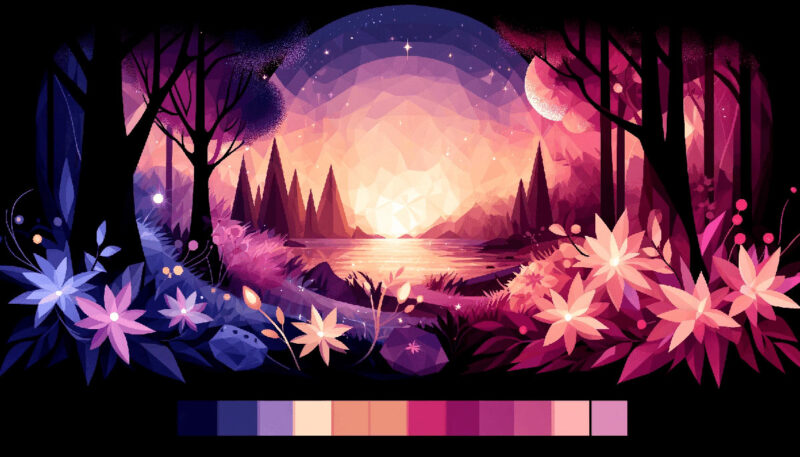
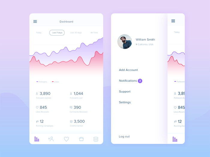
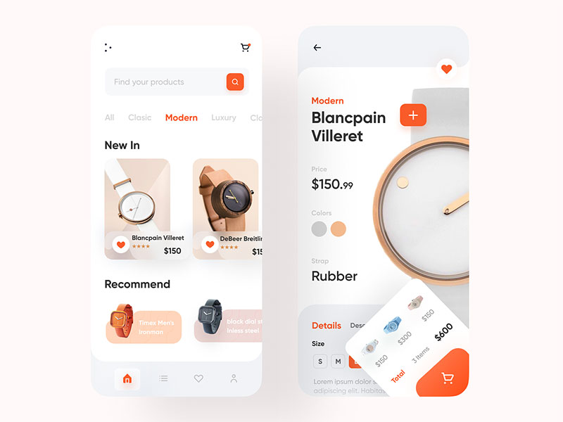
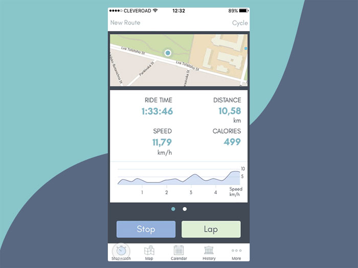
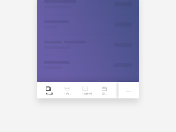
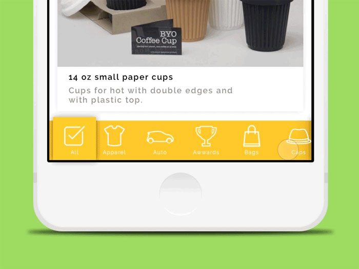
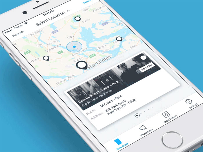
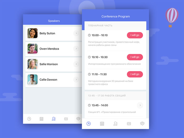
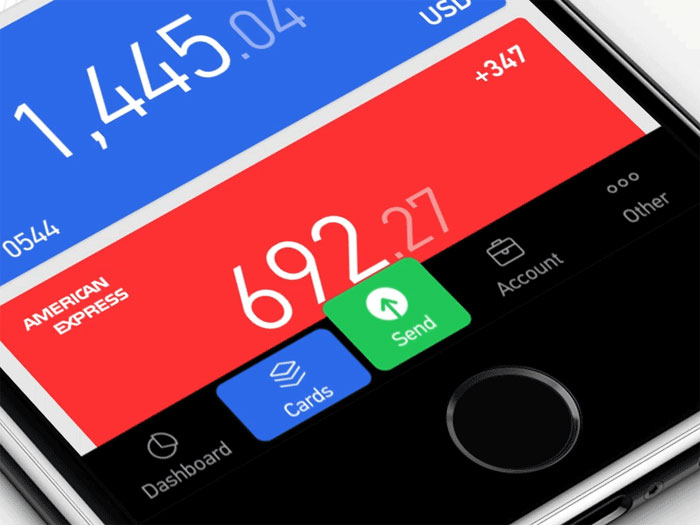
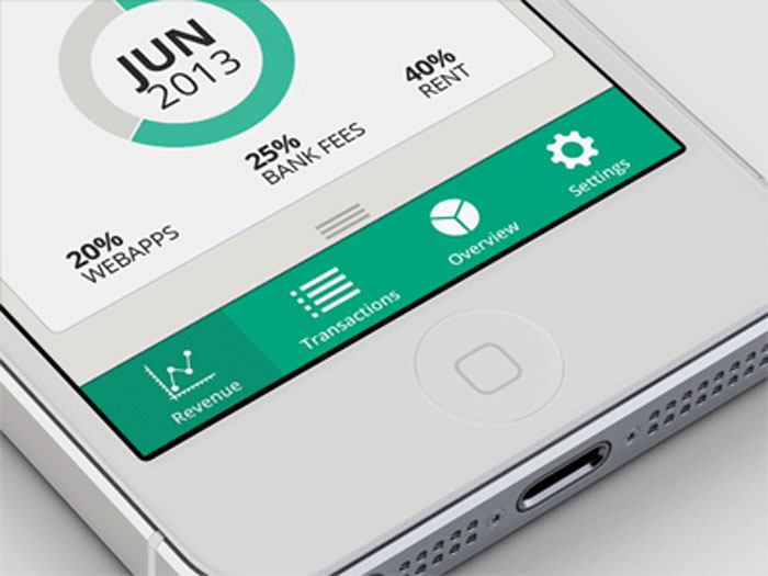
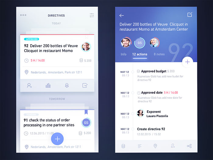
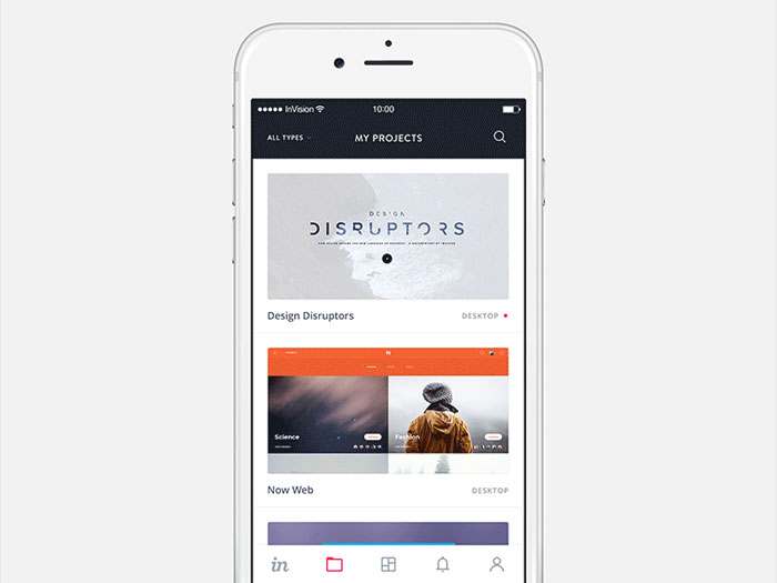
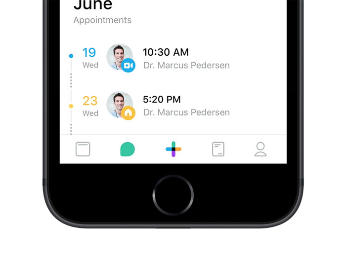
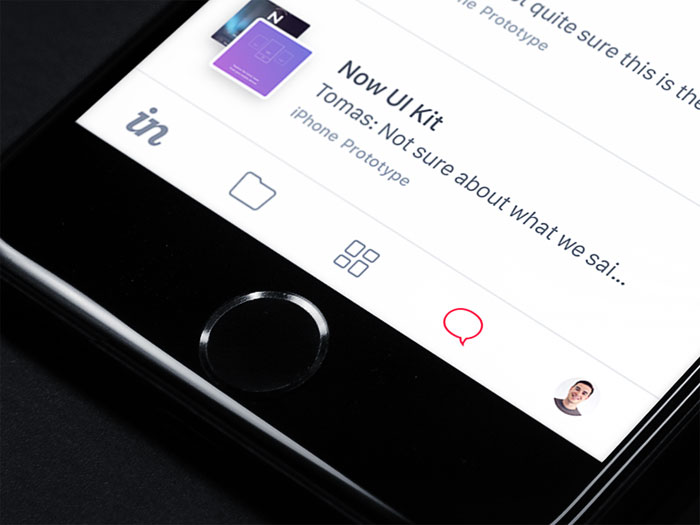
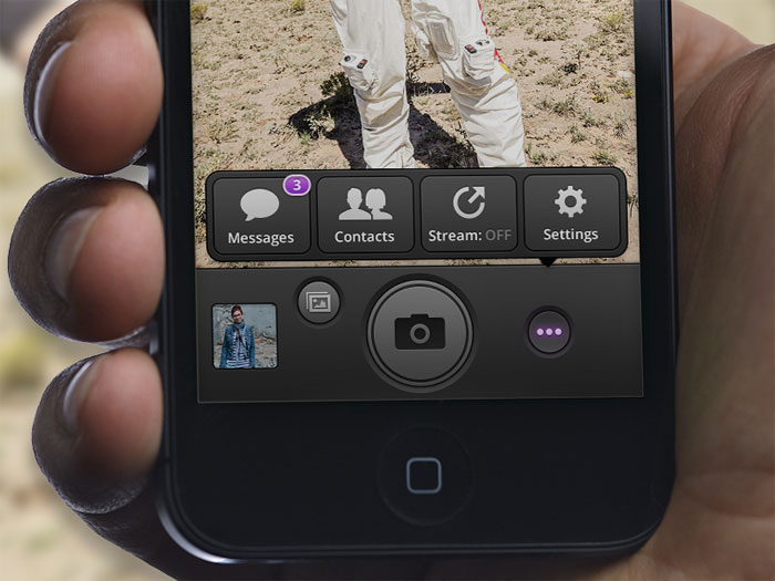
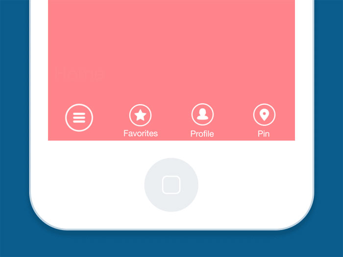
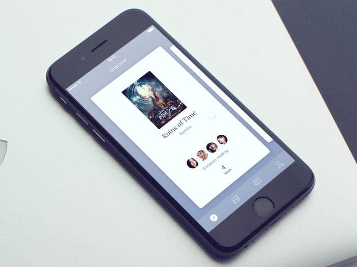
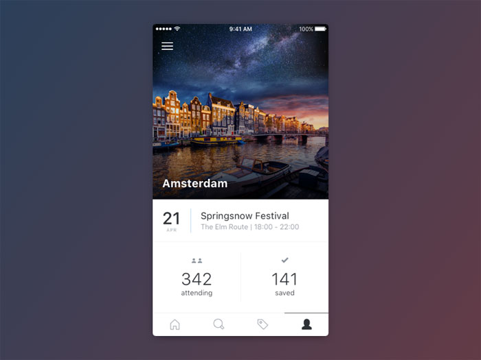
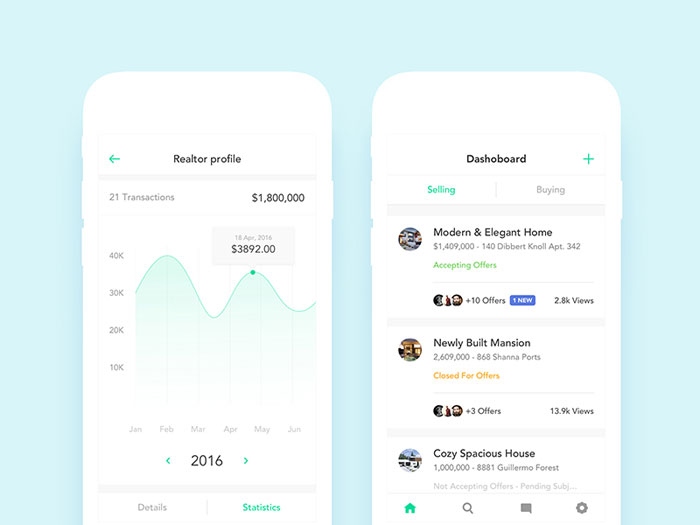
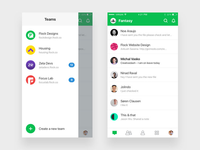
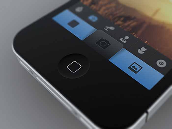
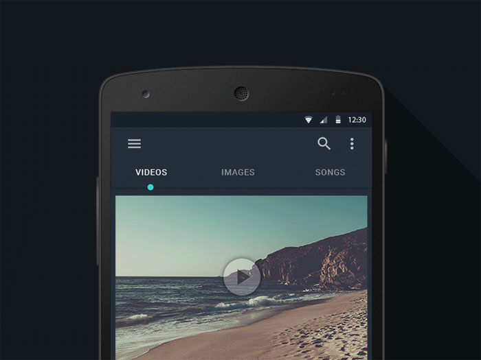
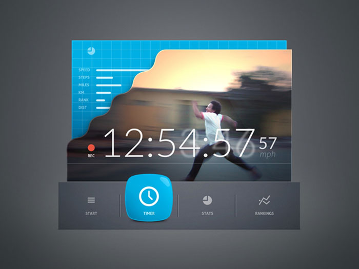
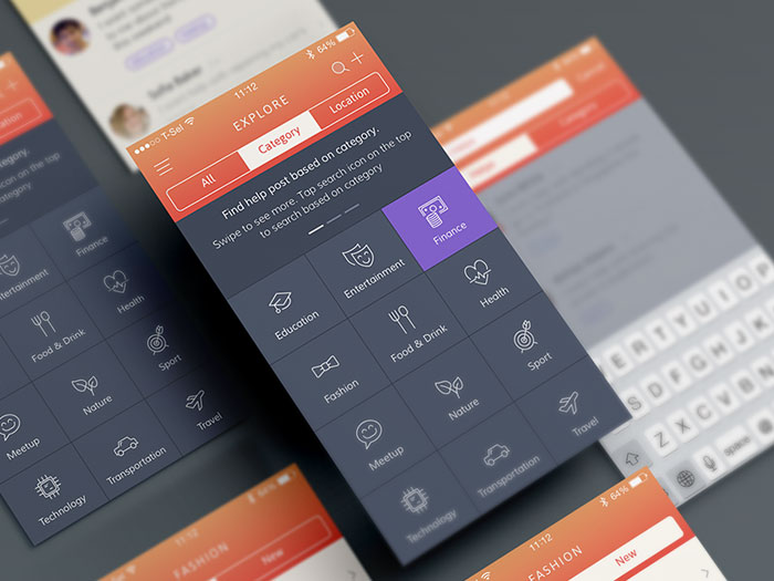
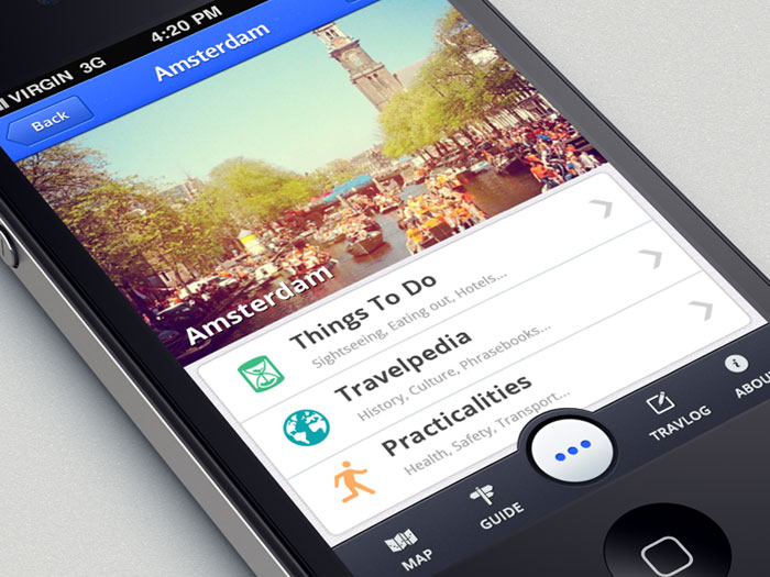
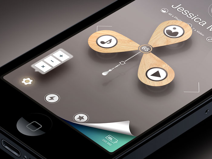
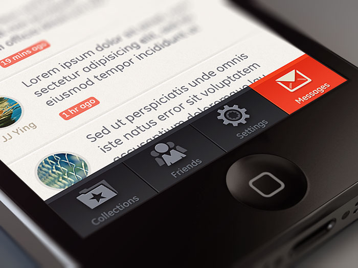
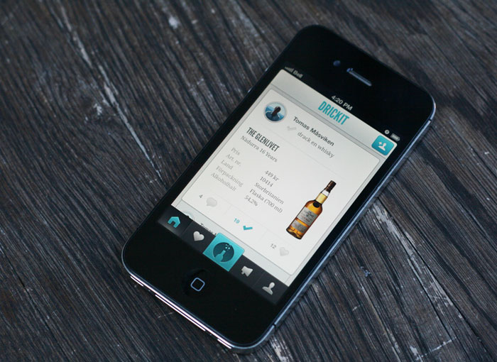
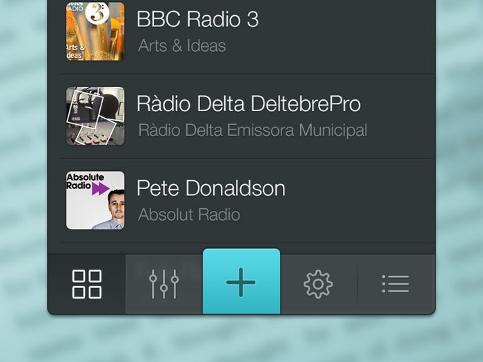
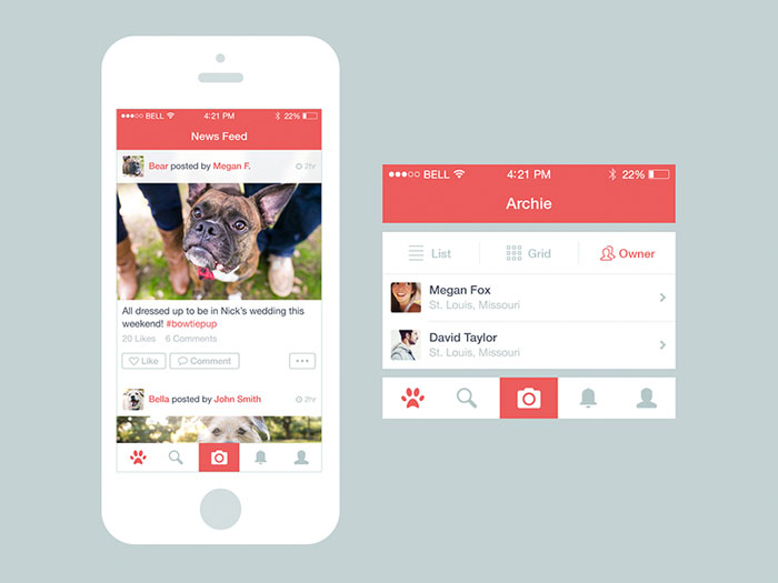
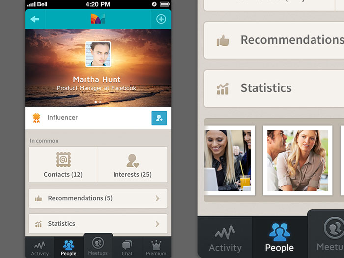
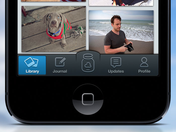
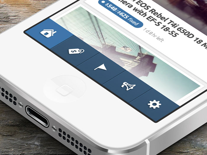
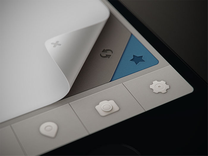
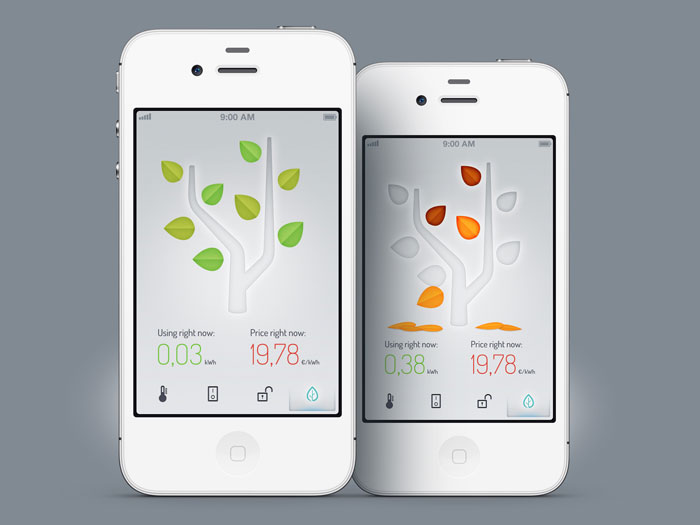
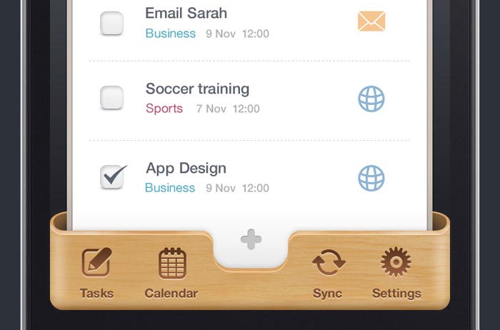
Mobile Tab Design Examples


![]()
![]()

FAQ about Mobile Tab Design
What’s the secret to killer mobile tab design?
Sure thing, it’s all about understanding that less is more. Think clean lines, intuitive touchscreen gestures, and a grid system that makes sense at a glance.
Keep your fingers happy, and users will follow like moths to a flame—swipe, tap, and cheer.
How important is responsiveness in mobile tab design?
Like a chameleon changes colors, your design’s gotta adapt. Flexibility is key—whether it’s a tiny phone or a hefty tablet, your tabs should look sharp.
Responsive design isn’t an afterthought, it’s the blueprint for a seamless user experience across devices. It’s the real proof of concept that your design holds water, no matter the screen size.
Can mobile tab design influence user behavior?
Bet your bottom dollar it can. A slick UI is the puppeteer of fingertips. Information architecture and visual hierarchy guide users subconsciously. They tap because you’ve anticipated their every move, creating a design that’s as natural as breathing.
What role do color and typography play in mobile tab design?
Ever heard the phrase ‘dress to impress’? Well, color schemes set the mood, and typography can shout or whisper your narrative.
They’re the outfit your tabs wear—essential to making a lasting first impression and keeping those eyes glued.
Do icons matter in mobile tabs?
Icons are the silent ambassadors of your brand. Choose wisely, and they’ll speak volumes without uttering a word.
They’re not just decoration; they are the road signs of the digital landscape, guiding users with the finesse of a seasoned tour guide.
What’s the latest trend in mobile tab design?
Minimalism, friend. It’s about boiling down to the essence—no fuss, no clutter. Mobile design trends evolve, but the mantra remains: Keep it simple, make it functional. New toys like gesture-based controls are cool, sure, but don’t let them overshadow the content’s throne.
How do animations enhance mobile tab design?
Animations? They’re the cherry on top. Used smartly, they breathe life into interactions.
They’re the difference between a robotic nod and a warm handshake. Animations give feedback, offer guidance, and at times, a sprinkle of delight.
What’s the biggest mistake to avoid in mobile tab design?
Ignoring the flesh-and-bone reality of users. Tiny touch targets or confusing layouts?
That’ll earn you grumbles, not gratitude. Always put accessibility features and comfort first. Remember, a frustrated user is a user you’re about to lose.
How does mobile tab design fit into the bigger picture of app UX?
Tabs are just one piece of the grand puzzle. They must play nice with the overall app layout and support consistent UX patterns.
Your design isn’t a solo act—it’s a member of an ensemble, complementing every swipe and creating harmony.
In what ways can testing improve mobile tab design?
Testing? It’s like the oracle for a designer. It reveals truths, exposes flaws, and illuminates the way.
Without usability testing, you’re designing in the dark. Listen to the users—their struggles and triumphs are your most valuable metrics, painting the road to refinement.
Conclusion
And just like that, we’ve waltzed through the gallery of mobile tab design examples, painting a picture of what’s possible in the digital playground.
Each swipe, each tap you experienced, whispers the mantra of intuitive user experience. No more stumbling in the dark, huh? It’s like we’ve got a navigation drawer filled with Usability testing triumphs, each icon design and splash of color schemes tailored to guide users with grace.
Breathe out. You’ve absorbed the essentials. We’ve seen tabs that sing, layouts that dance, all grounded in material design wisdom. Take this inspiration, mold it with your style, and watch as your next project unfolds into a prototype mobile tabs wonder. Just remember, the journey’s only beginning. Their fingers are poised, waiting for the next adventure you craft. Go ahead, be the wizard behind the curtain, and let’s transform the mundane into the extraordinary.
If you liked this article about tab bars in mobile tab UI design, you should also check out these articles:
- Mobile UI Login Form Design: How To Do It Properly
- 10 App Design Trends for 2017
- Dashboard Design: Best User Dashboard UI Examples
- User Interface Design Inspiration
- Impressive Data Table UI Design Examples You Must See
Bogdan Sandu, a seasoned designer with 15 years of diverse experience, has been designing websites since 2008.
Renowned for his expertise in logo design and visual branding, Bogdan has developed a multitude of logos for various clients.
His skills extend to creating posters, vector illustrations, business cards, and brochures. Additionally, Bogdan's UI kits were featured on marketplaces like Visual Hierarchy and UI8.
Latest posts by Bogdan Sandu (see all)
- Luxury Fonts: What Font Does Dior Use? - 17 May 2024
- The Dos Equis Logo History, Colors, Font, And Meaning - 16 May 2024
- Purple Color Palettes Fit for Royalty - 16 May 2024