37 Bad Logos That Look Just Horrible

Imagine reaching for a refreshing can of soda, only to hesitate, jarred by a logo that’s just… off. A logo gone wrong doesn’t whisper; it screams and can stick with a brand like a splatter of mustard on a white tee.
It’s like tripping on stage; everyone remembers the slip. Here’s the deal: bad logos are not just a small blip on the radar—they’re a siren call for a revamp.
Diving into the murky waters of unappealing graphics and branding blunders, we’ll decode why a poorly designed emblem can tank a brand’s image faster than a lead balloon in the ocean.
I’ll dissect the anatomy of design mistakes, the sting of public reaction, and why mastering logo design principles should be non-negotiable.
By the curtain call of this piece, you’ll unravel the tangles of visual missteps and know how to spot a logo fail from a mile off.
More importantly, you’ll learn the secret sauce to dodging those pitfalls in your own branding saga.
Examples of bad logos
Key to success

This bad logo design feels as if it is hitting you straight in the face. Its super flashy yellow is far too overwhelming and a bold in-your-face look that is hard to look at. It is good to remember that a logo should be user-friendly and print-friendly and when you print this bold and bad logo it will look worse. Especially with the chunky frame around the text.
The yellow stars too are unnecessary and make the logo tacky and the yellow text is too hard to read or decipher. You should avoid using too many shapes and gizmos and keep the design simple and clean. When you use more than one color, make sure they complement each other.
Cazz’s
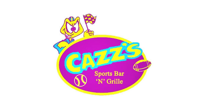
Another bad logo design with a combination of bad aspects that include poor spacing, bad textures, and gaudy colors. There are zero relationships between symbols and text, and nothing is memorable here. Bad logos often have the same elements as seen here, too confusing, too loud, too bright and overdone. It does not make any sense and a possibly good brand’s quality goes down the drain.
Smashing solicicors?
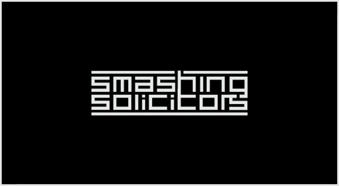
Without telling you, you know here the big mistake is and where the designer went wrong when looking at this logo. You cannot make out what the name read, and the far too modern typographic font is used in the design.
NJ Brew Tours

You will need to concentrate on this logo and to be honest the design, shape, and colors do not blend or look attractive in the least. It is too bold and too bright and therefore a bad logo design.
Psyc by the sea
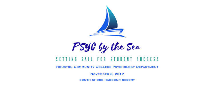
When you are looking for a good logo design, keep in mind that you are not designing a business card. One thing that you never do as shown in this logo is adding a full address and a date too. A professional logo design does not have more than three lines and you have to make the text readable too.
Coraline
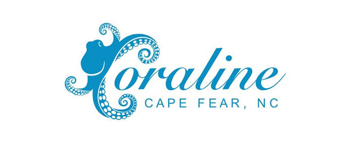
This logo shows an Octopus as a C which is the first letter of the word. While it is not the worst logo, it is very confusing as the Octopus takes the attention away from the actual name. you will be confused when trying to remember this company’s name.
Eazy Zed

Here you have a confusing logo with far too many sizes, fonts, and texts were thrown into one bad logo. Too many colors that do not match, various types of fonts and text sizes are confusing to the eye with nothing coherent about the logo. Keeping it simple, where you have no more than three lines of text. Overlapping elements as this logo depict should be avoided.
Smashing Productions
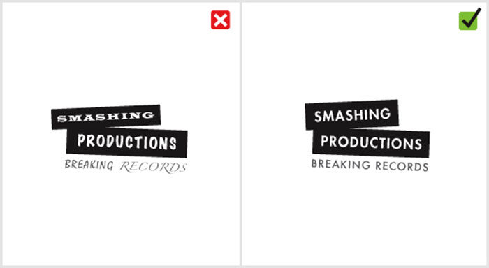
This logo is another example of a combination of bad logos thrown into one. It uses three different typefaces and you need time to wonder which is which and recognize them. It is a confusing logo and it is standard practice to use no more than two fonts if need be.
Microsoft Bing
A well-known company that continues to design bad logos is Microsoft. They even got the embarrassing honor of being awarded as the company with the worst logo design for 2009.
London Olympics 2012
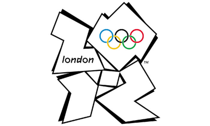
London has magnificent landmarks which make designers wonder what went on in the minds of the developers of the dissonant logo for the 2012 London Olympics. Bad comments include that it looks like a distorted Swastika. It is one famous bad logos that designers were embarrassed to see.
Airbnb
Airbnb is a home vacation or guesthouse type service rental platform with a good example of bad logo design. Advertising and branding experts agree that it is a bad logo with a cross between a triangular paperclip and the female anatomy. It’s also copied from a decades-old branding manual.
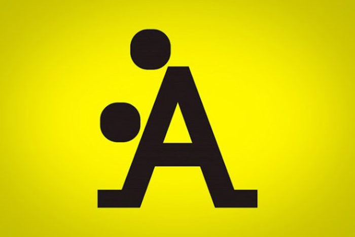
A Style
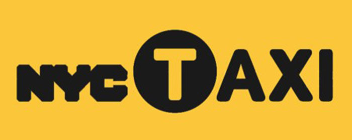
NYC Taxi
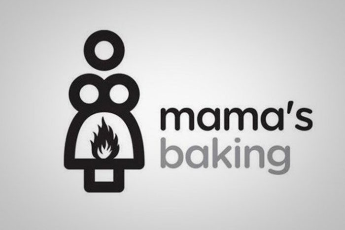
Mama’s Baking
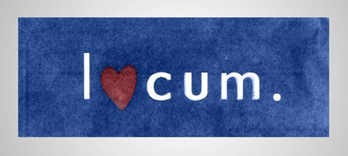
Locum
Kraft Foods

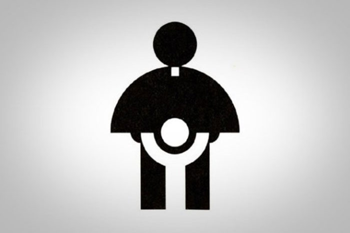
Catholic Church’s Archdiocesan Youth Commission
MSN
PathMark

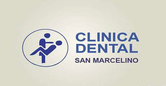
Clinica Dental
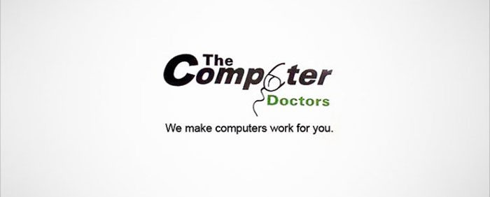
The Computer Doctors
Arlington Pediatric Center

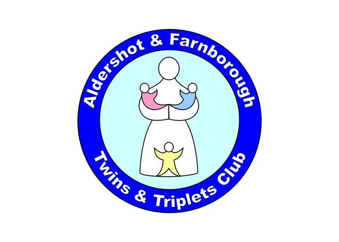
Aldershot & Farnborough Twins & Triplets Club
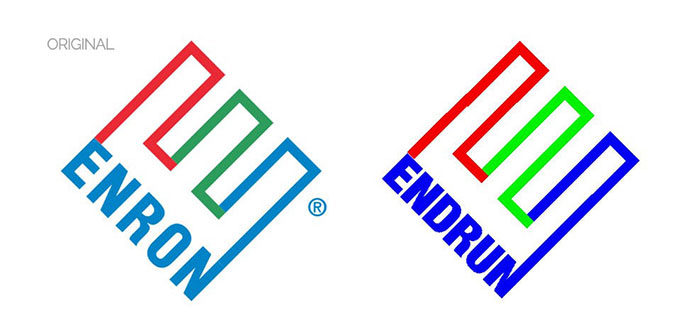
ENDRUN
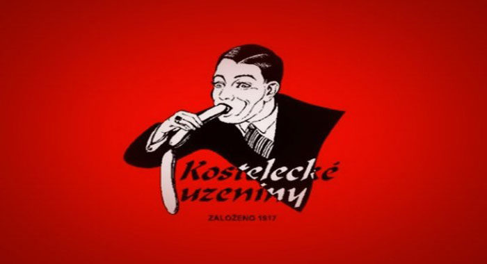
Kostelecke Uzeniny Sausages
GAP 2010

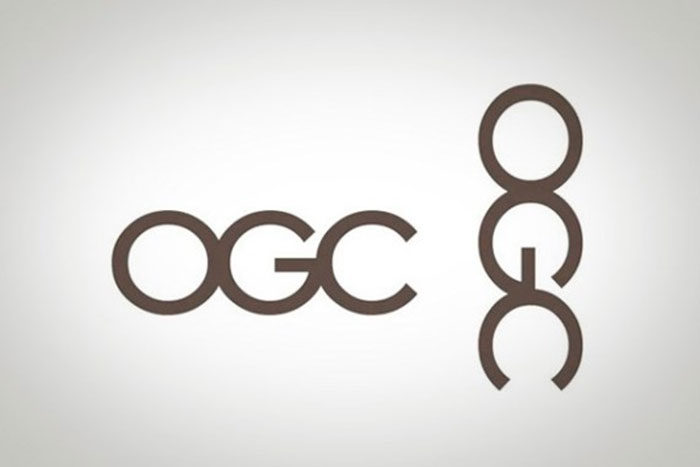
Office of Government Commerce
Hilton Worldwide
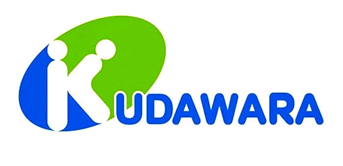
Kudawara Pharmacy
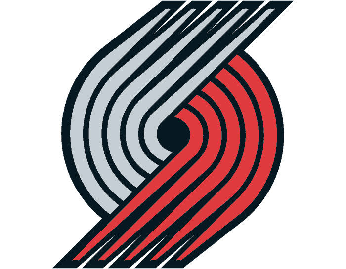
Portland Trail Blazers
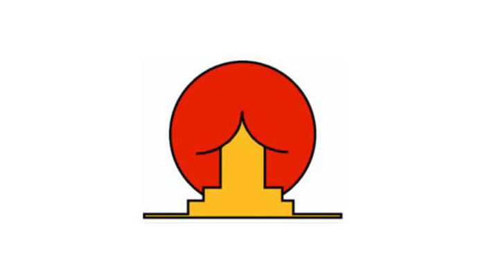
Institute of Oriental Studies
FAQ on bad logos
Why do some logos fail to make an impact?
Often, it boils down to clarity—or the lack thereof. A logo that’s a jumbled mess or too abstract can leave people scratching their heads. It’s like a visual tongue-twister; too hard to decipher means it’s easy to forget.
What makes a logo bad?
Bad logos typically miss the mark on several key design principles. They might be guilty of color clash, or maybe they try to cram in every idea under the sun. Imagine a logo trying to be a jack-of-all-trades but ending up master of none.
How can a bad logo affect a company?
It’s a bit like showing up to a tuxedo event in flip-flops. A bad logo screams ‘unprofessional’ and can really throw a wrench in the works for building consumer psychology and trust. It can directly impact a brand’s public reaction and ultimately, its bottom line.
Can a bad logo be redesigned successfully?
Absolutely! Think of it as a phoenix rising from the ashes. With a thoughtful approach to design, aligning with branding best practices, even the most cringe-worthy logos can be transformed into masterpieces of visual communication.
What are common traits of poorly designed logos?
They’re often a bit like a bad joke—hard to get and not all that memorable. Typical traits include unreadable fonts, inappropriate imagery, or being so generic they blend into the background faster than a chameleon in a box of crayons.
How do trends affect the longevity of a logo?
Trends are like the weather in Britain—constantly changing. Slavishly following them can mean a logo will age as well as a fish in the sun. A timeless logo sidesteps the fads and remains anchored in solid design principles to weather any storm.
Why is simplicity important in logo design?
Simplicity is king. It’s the secret sauce behind the stickiness of the most iconic brands. Simple logos are the ones that carve a permanent home in our brains; they’re easy to recognize, easy to remember, and translate well across diverse platforms.
How can a logo be offensive and what are the repercussions?
A logo can blunder straight into offensive territory when it’s tone-deaf to cultural sensitivities or has inappropriate imagery. When that happens, the backlash can be swift and merciless—a total branding blunder that can lead to an urgent need for damage control and redesigns.
What should businesses consider when creating their logos?
Picture a tightrope walk between creativity and clarity. Businesses should zoom in on brand recognition, effective logo characteristics, and crafting a visual identity that aligns with their values and speaks to their audience without shouting in their faces.
How does the digital age influence logo design?
The digital age has chucked out the rulebook and rewritten it in binary. Logos now need to not only look sharp on billboards but also on tiny screens. User experience online is vital—they must be scalable, versatile, and ready for the world of pixels and swift clicks.
Conclusion
Alright, so we’ve strolled down the hall of fame—or shall we say shame?—for bad logos, gawked at some horrendous design mistakes, and learned a thing or two, right? Wrap your head around this: great logos? They just click. They don’t try too hard, don’t overcomplicate things with cluttered visuals or confusing symbolism.
Here’s the closing thought: keep it simple, keep it bold, and keep it relevant. The companies that got it wrong? They probably skipped a beat on branding best practices. But those snags in design? They’re not the end. Nah, they’re just the start of a logo redesign adventure.
- Simplify like you’re explaining it to a five-year-old—because if they get it, everyone will.
- Remember, color clash is a bash no one wants an invite to.
- And for the love of all that is visual, make sure your logo tells your story, not someone else’s.
Let those blunders of the past be lessons, not your future’s blueprint.
If you enjoyed reading this article about bad logos, you should read these as well:
- Clever food advertisements that promoted these brands
- How To Make Great Poster Designs (156 Examples)
- 10 Important Qualities to Look for in a Logo Designer
- Bright Color Palettes for Eye-Catching Designs - 18 May 2024
- Venmo’s Visual Voice: What Font Does Venmo Use? - 18 May 2024
- The Hoegaarden Logo History, Colors, Font, And Meaning - 17 May 2024


