Imagine your business as a towering skyscraper. Now, focus on that gleaming emblem perched at the pinnacle. That’s your logo-a beacon drawing countless gazes, etching your brand into minds. In the bustling metropolis of the legal industry, law firm logos serve as the flag hoisted above your edifice; they signal your ethos, calibre, and the unique contour of your services.
Navigating through this article is like unfurling a blueprint of visionary branding. Here, you’re not just decorating a nameplate; you’re carving an insignia that champions your narrative. Whether you’re a legacy firm steeped in tradition or championing legal innovation, your logo’s fabric weaves your tale in a glance.
By the end of our exploration, you’ll have grasped the crux of emblematic finesse-how a simple marque can echo the profound sophisticated whispers of authority, expertise, and trustworthiness. From mastering color psychology to typographic precision, you’ll be ready to craft an emblem that not only stands out but speaks out.
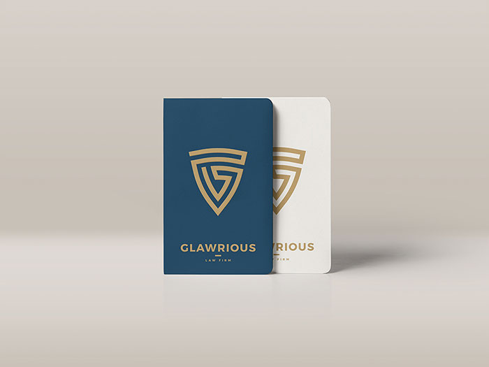
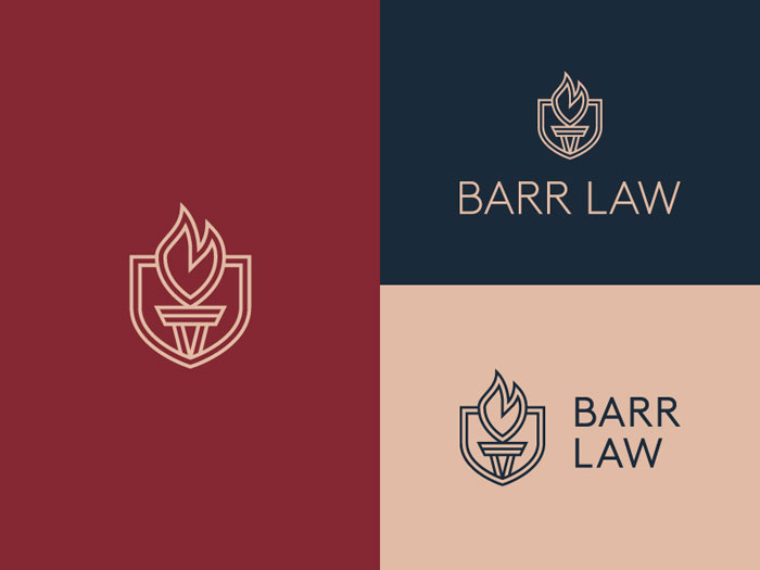
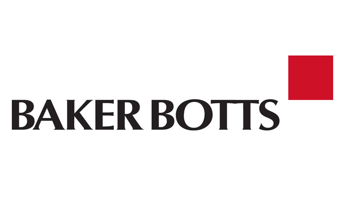
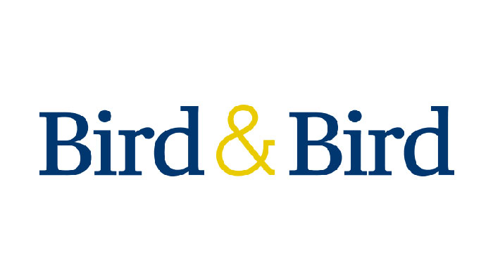
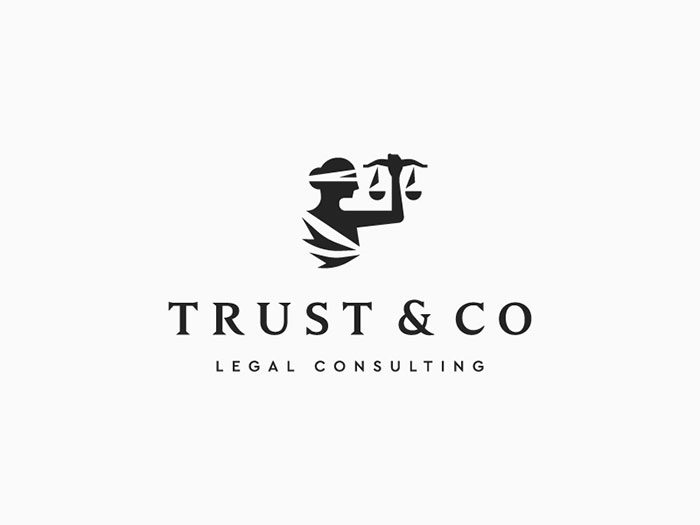
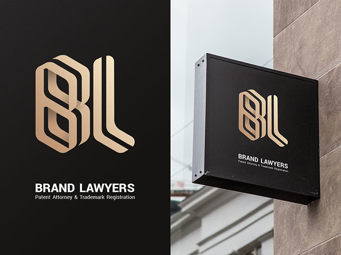
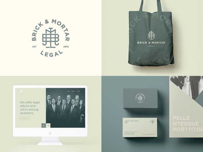
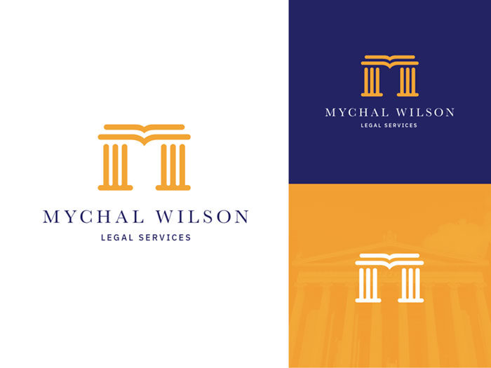
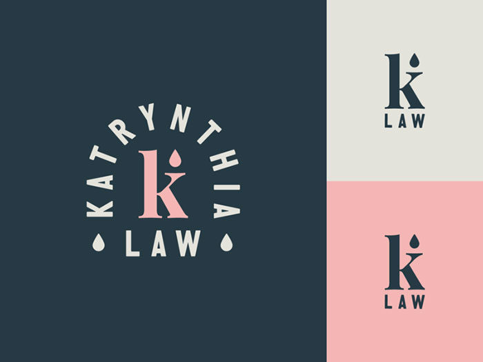
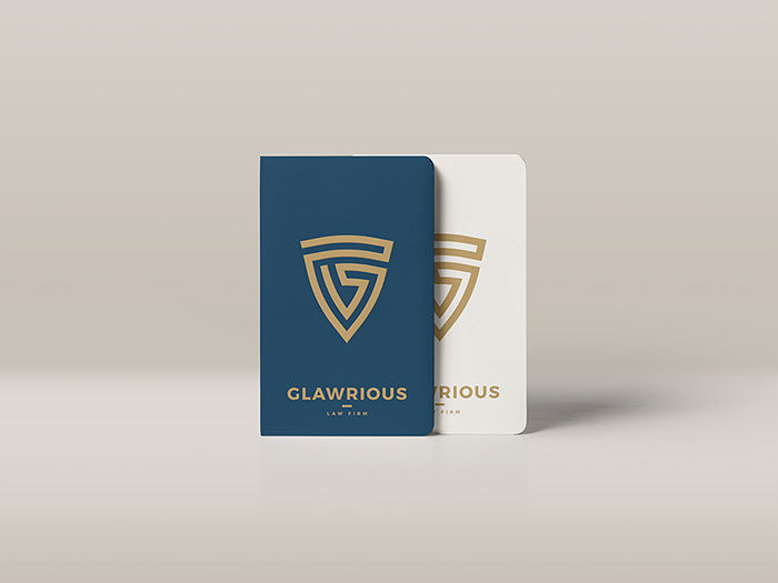
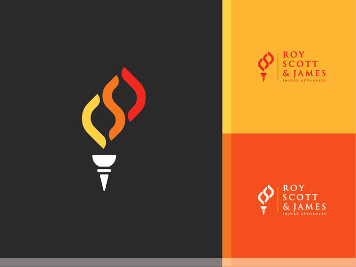
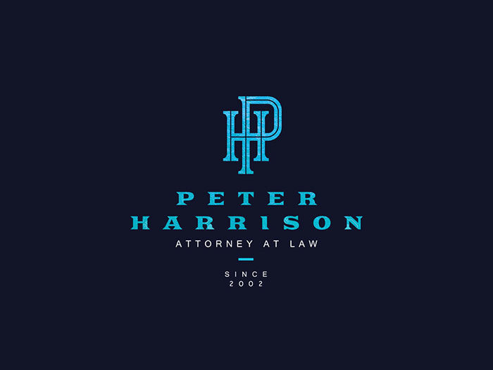
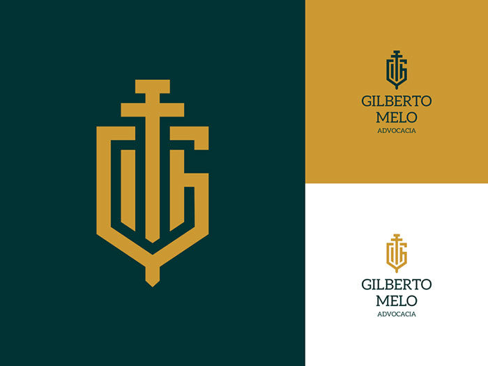
Awesome law firm logos


![]()
![]()
FAQ on designing law firm logos
Why is a logo important for a law firm?
A logo’s the handshake before the actual meeting. It sets that critical first impression and, in essence, packages your firm’s reputation, values, and professionalism in a visual punch. Your logo’s the firm’s identity-symbolizing trust, authority, and the legal acumen you bring to the table. It’s foundational in building brand recognition.
What makes a good law firm logo?
Good law firm logos meld simplicity with impact. You’re looking for that magic intersection of memorable and timeless, with just enough flair to make you distinct. A top-notch logo typically features solid, conservative colors and fonts, but it’s the subtle storytelling-hinting at your firm’s narrative-that takes it a step beyond.
How do we choose the right color for our law firm’s logo?
Color psychology isn’t just marketing fluff-it’s real and powerful. For law firms, traditional hues like navy, gray, or dark green evoke stability and trust. Yet, there’s room for a dash of personality, perhaps a bold accent color to convey your firm’s unique edge in a competitive legal landscape.
Should our law firm logo include an emblem or icon?
Icons can be your silent allies, whispering insights about your specialty or heritage. If you decide on an emblem or icon, make it relevant-scales of justice to signify balance, a gavel for jurisprudence, or a lion for ferocity. The key? It should align with your firm’s spirit without cluttering your brand.
Can we use typography alone for our law firm’s logo?
Absolutely. Wordmarks are a strong, focused way to present your firm. Choosing a powerful, fitting font can convey strength and reliability. Clever use of spacing, sizing, and even a splash of color can transform a simple name into a commanding brand entity. Less can truly be more.
How often should a law firm update its logo?
If the winds of change are brewing-think rebranding, mergers, or market evolution-then a refresh might be on the cards. But there’s no strict timeline. The ideal logo is somewhat timeless so it withstands the years without looking dated. Still, it’s smart to periodically evaluate whether your logo still reflects your firm’s current identity.
Does the size of the law firm affect logo design?
You bet. Solo practitioners might opt for a more personal touch, while a sprawling, multinational firm will likely go for broad appeal and gravitas. The size of your firm might influence the complexity of the design and the message’s scale you want to project.
How much should a law firm invest in a logo?
Invest as you would in a tailored suit: quality is key. A logo is a long-term investment in your firm’s brand. Budget for a professional who understands legal branding-you’re not just buying a design; you’re investing in your firm’s visual voice. Think of it as a strategic asset, not just a line item.
What are the legal considerations when designing a law firm logo?
Trademark it-protect your brand like you protect client’s rights. Ensure your design is original, avoids legal clichés, and respects the intellectual property of others. Remember, this isn’t just about aesthetics; it’s also about owning an exclusive marker in the legal industry’s vast marketplace.
How do we integrate our law firm logo across different platforms?
Seamless branding is the name of the game. From business cards to social media profiles, from billboards to your website header, consistency is critical. Your logo should be versatile enough to look sharp in any format-digital or print. Craft guidelines for its use, ensuring it’s displayed correctly no matter the platform.
Conclusion
So we’ve been on quite the journey, haven’t we? Started with a simple thought-law firm logos. Now, here we are, full circle.
- Boldness? Check.
- Simplicity? Double-check.
- Memorability? You bet.
From those first scribbles of creative visual storytelling to the final polished emblems of professional authority, we’ve untangled the intricacies of brand identity. It’s about distilling that mix of tradition, prowess, and a touch of modern finesse. Whether it’s the no-nonsense wordmarks or the subtly crafted icons that speak volumes without shouting, it’s clear: your firm’s logo is no mere decoration-it’s a declaration.
Doesn’t matter if you’re huge in the game or just starting. That logo? It’s your silent herald, echoing through the hallowed halls of justice and the digital corridors alike, long after the office lights dim. Craft it wisely. Let it resonate. Your firm’s story-told in a single glance.
If you enjoyed reading this article about designing law firm logos, you should read these as well:
- Designing financial logos: banking, accounting, and finance designs
- Bright colorful logos showcase: Awesome logos to inspire you
- The Adidas logo: What makes it so special
- Logomark Vs Logotype: Understanding the Difference
- Learn About The Apple Logo: The Tech Giant’s Branding
- Logo Design Cost: A look at the logo design prices
Renowned for his expertise in logo design and visual branding, Bogdan has developed a multitude of logos for various clients.
His skills extend to creating posters, vector illustrations, business cards, and brochures. Additionally, Bogdan's UI kits were featured on marketplaces like Visual Hierarchy and UI8.
He also wrote in the past years on sites like Design Your Way, WebDesignerDepot, WPDean, Designmodo, Speckyboy, Slider Revolution, and more.
- NHL Team Color Codes - 14 July 2026
- How Hosting Hermes Agent Improves Your AI Workflow Efficiency - 14 July 2026
- The Best Fonts for Titles That Command Attention - 13 July 2026
Bogdan Sandu is a seasoned designer who has been designing websites since 2008. Renowned for his expertise in logo design and visual branding, Bogdan has developed a multitude of logos for various clients. His skills extend to creating posters, vector illustrations, business cards, and brochures. Additionally, Bogdan's UI kits were featured on marketplaces like Visual Hierarchy and UI8. He also wrote in the past years on sites like Design Your Way, WebDesignerDepot, WPDean, Designmodo, Speckyboy, Slider Revolution, and more.
You Might Also Like