


5 Web Design Tips for a Mobile-Friendly Website
Did you know that more than 263 million Americans shop on the internet? That’s about 79% of the population or eight out of 10 people. Meanwhile, 54% of U.S. consumers prefer shopping online over shopping in brick-and-mortar stores.
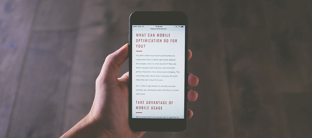
It’s also important to understand that many online shoppers are doing so on mobile devices with small screens. One source, for instance, projected that 72.9% of all e-commerce would be m-commerce by the conclusion of last year. So, m-commerce is big business. And it’s growing.
Are you positioned to meet the needs of people who want to buy what they need from your site? It depends on whether or not your site is mobile-friendly. Just because your website is effective on a large desktop or laptop screen doesn’t necessarily mean it’ll work as well on a smaller smartphone or tablet screen. You need to know what constitutes a mobile-friendly site.
Keep on reading to learn about 5 web design elements that mobile-friendly sites should have to meet the needs of customers.
Keep the Design Simple
When it comes to creating a mobile-friendly website, you’ll want to keep things simple. Too many graphics and videos will slow down the website considerably. And people don’t want to wait more than a few seconds for pages to load, so going with a simple design is the right move. A simple design will ensure that smaller screens don’t get cluttered with lots of stuff. The design will be clean and straightforward, which will help you convey the right message to your clients.
Keep Your Message Short
Think about what you want to say, and then say it in the fewest words possible. When people visit websites using their mobile devices, they scroll quickly. So, they won’t linger long enough to read a lot of text. They’ll lose interest if your site is text-heavy.
Go Easy on the JavaScript
JavaScript is a favorite among web developers–and for good reason. It’s a versatile programming language that underpins many websites. But it’s best to go easy when developing your company’s mobile website. The reason? JavaScript runs differently depending on the device and browser used. So, you won’t be able to guarantee a consistent user experience–which is the very thing you’ll want to avoid.
Use Forms Wisely
Ensure your forms are optimized for use on mobile devices. Also, consider prepopulating various fields so your customers don’t have to spend too much time entering data. You can also use a predictive address autocomplete service to make it easier for your customers to fill in their street address, city and zip code. It’s also a great way to verify the address data you’re collecting is accurate. Remember that your customers will primarily be using their thumbs to input information. So, prepopulating some of the fields on the forms will help them out.
Display Contact Information
Make it easy for people to find your contact information. They don’t want to go on an online scavenger hunt to find your address, email address, or phone number. It should be easy for them whether it means clicking on a well-titled link or finding the info on the bottom of the page.
So, how mobile-friendly is your site? The 5 issues mentioned above are some of the biggies. But there are lots of other things to keep in mind if you want a mobile-friendly website. Some of these issues can be resolved rather easily.
But there are others that a web design agency will best handle. Your online storefront is too important to be making avoidable missteps. When looking for help, it’ll help to know the difference between web design and web development. The right service provider will be able to help with either one.
Bogdan Sandu, a seasoned designer with 15 years of diverse experience, has been designing websites since 2008.
Renowned for his expertise in logo design and visual branding, Bogdan has developed a multitude of logos for various clients.
His skills extend to creating posters, vector illustrations, business cards, and brochures. Additionally, Bogdan's UI kits were featured on marketplaces like Visual Hierarchy and UI8.
Latest posts by Bogdan Sandu (see all)
- Rainbow Color Palettes for Joyful Designs - 29 April 2024
- The Bethesda Logo History, Colors, Font, And Meaning - 28 April 2024
- Out of This World: Space Color Palettes for Cosmic Designs - 28 April 2024