A single typeface choice can make readers flip past your magazine cover or stop and pick it up. That’s the reality of editorial design.
Finding the best magazine fonts means balancing readability, personality, and print performance. Whether you’re designing a fashion publication or a news weekly, your typography decisions affect everything from the masthead to body text.
This guide covers serif and sans-serif options that actually work in print. You’ll learn which typefaces top designers trust for headlines, which fonts handle small text well, and how to pair them effectively.
We’ll look at classics like Garamond and Bodoni alongside modern choices like Gotham and GT Sectra.
The Best Magazine Fonts
| Font Name | Classification & Best Use | Key Characteristics | Readability Context |
|---|---|---|---|
| Didot | Serif, Display Headers | High contrast, dramatic hairline serifs, vertical stress | Large sizes, luxury fashion |
| Bodoni | Serif, Display Headers | Extreme thick-thin contrast, geometric serifs, elegant | Headlines, premium editorial |
| Helvetica | Sans-serif, Universal | Neutral, clean, high x-height, tight spacing | All sizes, modernist layouts |
| Proxima Nova | Sans-serif, Body & Headers | Geometric with humanist warmth, versatile weights | Digital-first publications |
| Bebas Neue | Sans-serif, Display Only | All-caps condensed, bold impact, narrow width | Short headlines, youth culture |
| Montserrat | Sans-serif, Headers & Body | Geometric, urban-inspired, open apertures | Web and print, contemporary |
| Mrs Eaves | Serif, Body Text | Transitional, long ascenders, romantic ligatures | Long-form text, classical feel |
| Trade Gothic | Sans-serif, Headers | Grotesque style, industrial, irregular widths | Editorial headlines, archival |
| Franklin Gothic | Sans-serif, Headers | American grotesque, condensed, strong presence | News headlines, traditional |
| Garamond | Serif, Body Text | Old-style, refined serifs, excellent legibility | Extended reading, timeless |
| Times New Roman | Serif, Body Text | Transitional, space-efficient, newspaper heritage | Dense text, formal content |
| Baskerville | Serif, Body Text | Transitional, high contrast, sharp serifs, crisp | Premium editorial, clarity |
| Caslon | Serif, Body Text | Old-style, organic irregularities, British heritage | Long articles, warm tone |
| Neue Haas Grotesk | Sans-serif, Universal | Original Helvetica design, refined neutrality | Modern branding, minimal |
| Futura | Sans-serif, Headers | Geometric, circular forms, 1920s Bauhaus style | Display text, art direction |
| Avenir | Sans-serif, Body & Headers | Humanist geometric, balanced, organic warmth | Versatile, friendly tone |
| Brandon Text | Sans-serif, Body Text | Humanist, rounded terminals, approachable | Digital magazines, friendly |
| Mercury Text | Serif, Body Text | Modern scotch roman, sturdy, screen-optimized | Digital-first body copy |
| Goudy Old Style | Serif, Body Text | Old-style, calligraphic, diamond-shaped dots | Traditional publishing, charm |
| Minion Pro | Serif, Body Text | Modern old-style, highly legible, Adobe standard | Professional publishing |
Didot
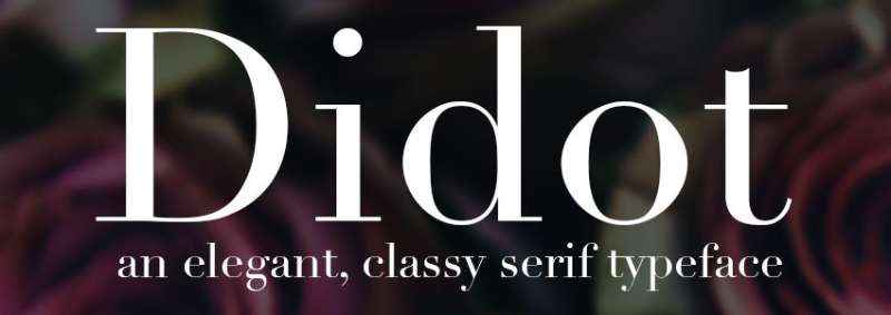
Didot’s the neoclassical serif font designed by Firmin Didot between 1784 and 1811. French printing excellence distilled into hairline serifs and extreme thick-thin contrast.
Visual Characteristics
The letterforms practically scream modernity with their vertical stress. Hairline serifs sit flat and unbracketed against thick vertical strokes, creating that signature Didone look.
Modern revivals include Linotype’s version by Adrian Frutiger (bundled with macOS) and HTF Didot by Jonathan Hoefler for H&FJ.
Hoefler anticipated hairline degradation at smaller sizes by using heavier strokes in text versions.
Readability Performance
Body text at 9-12pt demands optical sizes. Without them, you get “dazzle” where thick verticals pull attention away from the thin strokes that actually define which letter is which.
The extreme stroke contrast means digital use poses challenges. Use display versions for headlines only.
Each metal type size was custom-cut back in Didot’s day. Digital fonts made printing the same design at any size possible, but optical sizing remains critical with Didone designs.
Editorial Applications
Fashion magazines worship this thing. Vogue has used Didot on covers since 1955, and Harper’s Bazaar ran with it for decades.
Best for:
- Fashion editorial covers
- Luxury brand magazines
- Headlines and pull quotes
- Display typography above 18pt
CBS used a custom “CBS Didot” version alongside their eye logo for years. Zara’s controversial 2019 rebrand? Didot with uncomfortably tight kerning.
Pairing Recommendations
Pair Didot headlines with humanist sans-serifs for body copy.
Works beautifully with Gill Sans, Futura, or Avenir for contrast. The geometric simplicity balances Didot’s ornate drama.
Never pair with another high-contrast serif unless you want typographic chaos.
Technical Specifications
Character coverage: Latin extended, includes many ligatures and alternate characters
Licensing models:
- Linotype Didot: Commercial license required
- HTF Didot: Premium pricing through Hoefler & Co
- Theano Didot: Free open source (OFL) with Cyrillic and Greek
Formats: OpenType (OTF), TrueType (TTF), web fonts available through major distributors
Commercial versions include optical sizes (6pt, 11pt, 16pt, 24pt, 42pt, 64pt, 96pt) for proper rendering at different scales.
Bodoni
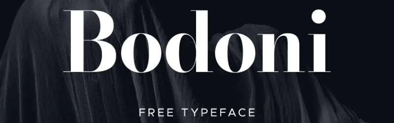
Giambattista Bodoni crafted this modern serif in late 18th century Italy, taking Baskerville’s ideas and pushing contrast to extremes. Designed from 1790s through 1813.
Visual Characteristics
High contrast hits you immediately. Thick verticals crash into hairline horizontals with flat, unbracketed serifs.
The letterforms show slightly condensed proportions with geometric construction. Vertical stress dominates throughout the character set.
Multiple revivals exist: ATF Bodoni (1909) by Morris Fuller Benton emphasized legibility over pushing printing limits. Bauer Bodoni (1926) by Heinrich Jost cranked up the stroke contrast. ITC Bodoni (1994) offers optical sizes.
Readability Performance
Text sizes need careful handling. The “dazzle effect” from alternating thick-thin strokes makes extended reading difficult.
ITC created separate versions:
- ITC Bodoni 6: Optimized for 6pt text
- ITC Bodoni 12: For 12pt text
- Bodoni Old Face: 9pt sweet spot
Display sizes love high-gloss paper that retains crisp hairline detail. Offset lithography flattens the letterpress character Bodoni originally designed for.
Editorial Applications
Upmarket magazine printing on coated stock makes Bodoni sing. It dominates high-end fashion and luxury publications.
The Washington Post uses Matthew Carter’s “Stilson” variant (originally “Postoni”) as their primary headline font.
Nirvana used Bodoni for their logo starting with Bleach, continuing through every release. CBS, RMIT University, and countless fashion brands lean on it.
Magazine categories:
- Fashion (editorial and covers)
- Luxury lifestyle
- Art and culture
- High-end corporate
Pairing Recommendations
Massimo Vignelli famously paired Bodoni with Helvetica across his work. He even commissioned “Our Bodoni” in 1989 to match Helvetica’s proportions exactly.
The classic combo: Bodoni headlines over Helvetica body copy. The warmth-meets-precision dynamic works for editorial design.
Alternative pairings include Futura, Avenir, or grotesque sans-serifs that provide geometric counterpoint without competing.
Technical Specifications
Character coverage: Extensive Latin support, many revivals include Central European characters
Popular versions:
- ATF Bodoni: 15 font families
- Bauer Bodoni: 5 font families
- ITC Bodoni: Multiple optical sizes
- Parmagiano, FB Detroit Bodoni, Lanston Bodoni: Modern interpretations
Licensing: Commercial licenses through major foundries (Linotype, ITC, URW++, Elsner+Flake)
Formats: OpenType features in modern versions, TrueType and PostScript also available
Helvetica
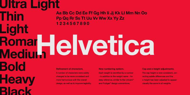
Max Miedinger designed this in 1957 with Eduard Hoffmann at Haas Type Foundry. Originally called Neue Haas Grotesk, renamed Helvetica in 1960 when Linotype licensed it.
Swiss precision in typeface form.
Visual Characteristics
High x-height makes it readable from distance. Horizontal and vertical stroke terminations create that dense, solid appearance.
Tight letter spacing was revolutionary. The strokes end on horizontal or vertical lines with unusual precision for grotesque sans-serifs.
51 fonts in the family: nine weights across three widths, plus an outline variant. Neue Helvetica (1983) unified heights and widths across the entire system.
Readability Performance
The tall x-height delivers excellent distance legibility. Perfect for signage and headlines.
Narrow apertures limit small-size performance and screen legibility. At text sizes below 10pt, consider alternatives.
Works beautifully for headlines at 24pt and above. Body text at 10-12pt performs adequately in print but struggles on screens at smaller sizes.
Editorial Applications
Everywhere. Literally everywhere.
Major publications worldwide use Helvetica for headlines, subheads, and department labels. The New York Metro signage by Massimo Vignelli made it iconic.
Strong performance in:
- News magazines
- Corporate publications
- Technology and business editorial
- Modern lifestyle magazines
Rolling Stone and countless other publications have featured Helvetica in their type systems. It’s become invisible through ubiquity.
Pairing Recommendations
Helvetica pairs with almost anything because it’s designed to be neutral.
Classic editorial combinations:
- Helvetica headlines + Garamond body (traditional contrast)
- Helvetica + Times New Roman (newspaper standard)
- All-Helvetica using weight hierarchy (Swiss style)
For more personality, pair with a distinctive serif like Caslon or Baskerville. The neutrality lets the serif shine.
Technical Specifications
Weights available: Thin, Light, Regular, Medium, Bold, Heavy, Black (in multiple widths)
Character support:
- Latin Extended
- Cyrillic (D Stempel AG version, revised 1992)
- Greek, Hebrew, Arabic, Vietnamese (Helvetica World)
- Central and Eastern European languages
Licensing:
- Available through Linotype, Monotype
- Pre-installed on macOS and many systems
- Web fonts through major distributors
Formats: OpenType, TrueType, PostScript. Variable font versions emerging.
Neue Helvetica offers better structural unity. 34 different font weights total, with 20 available in Central European versions.
Proxima Nova
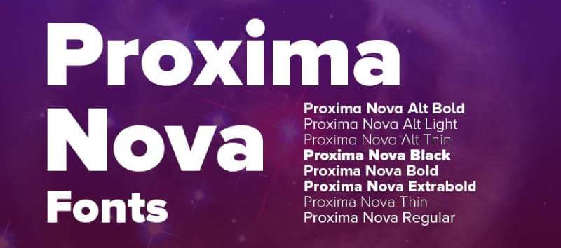
Mark Simonson released this in 2005, reworking his earlier Proxima Sans (1994). Originally sketched as “Zanzibar” in 1981.
It bridges Futura’s geometry with Akzidenz Grotesk’s versatility.
Visual Characteristics
The typeface straddles geometric and grotesque styles. Humanistic proportions meet geometric appearance in an unusual hybrid.
Eight weights from Thin to Black, each with matching italics. Five widths available: Normal, Condensed, Extra Condensed, Wide, Extra Wide. That’s 80 fonts total.
The lowercase “i” uses a circular dot versus Helvetica’s square dot. This softness-versus-hardness difference defines the character.
Readability Performance
Modern proportions make it incredibly versatile. Works as well at 9pt body text as at 72pt display.
High legibility across all sizes. The generous x-height and open apertures maintain clarity even at small sizes.
Screen rendering excellent. Became the most popular commercial web font since 2010, used on hundreds of thousands of sites.
Editorial Applications
Rolling Stone adopted Proxima Sans for their 2003 redesign, sparking wider interest.
Works across all magazine categories:
- Lifestyle and culture
- Technology publications
- Fashion (modern aesthetic)
- Corporate editorial
The clean, invisible quality means it doesn’t call attention to itself. Perfect for letting content shine.
Pairing Recommendations
Pairs beautifully with almost any serif for editorial contrast.
Try it with:
- Garamond or Caslon for traditional warmth
- Slab serif fonts like Rockwell for impact
- Another humanist sans at different weights (headlines in Bold, body in Regular)
The geometric-meets-humanist quality gives flexibility. It’s friendly without being casual, modern without being cold.
Technical Specifications
OpenType features:
- Small caps for all weights
- Old style and lining figures (proportional and tabular)
- Automatic fractions
- Case-sensitive forms
- Full ligature sets
Character coverage:
- Latin Extended
- Greek, Cyrillic, Vietnamese
- Arabic (separate family)
- Thai, Devanagari, Hangeul, Hebrew, Tamil (extended families)
- 1,453 characters in latest version
Licensing: Commercial through Mark Simonson Studio, Adobe Fonts, and major distributors
Formats: OpenType (OTF), TrueType (TTF), web fonts (WOFF, WOFF2). Variable font version available as Proxima Vara.
Bebas Neue
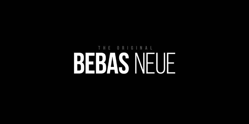
Ryoichi Tsunekawa designed the original Bebas in 2005 for typography practice and feedback. Redesigned as Bebas Neue in 2010, went open source in 2018.
All-caps display face. Bold, condensed, unavoidable.
Visual Characteristics
Tall, condensed letterforms with geometric construction. The monolinear strokes and even spacing create that clean, modern look.
Only uppercase originally, though Bebas Neue Pro (2019) added lowercase and italics after a decade of requests.
Five weights: Thin, Light, Book, Regular, Bold. Fontfabric expanded the family in 2014 with additional weights and glyphs.
The condensed width and elongated proportions make it instantly recognizable.
Readability Performance
Display use only. This isn’t designed for body text and shouldn’t be forced into that role.
Excels at 18pt and above. Sweet spot is 36-72pt for headlines and titling.
The all-caps limitation means you need careful tracking and leading adjustments. Lowercase from Bebas Neue Pro helps with text hierarchy.
Editorial Applications
Movie posters, album covers, magazine headlines. That’s the wheelhouse.
Works for:
- Music and entertainment magazines
- Sports publications (strong, masculine aesthetic)
- Fashion headlines (when paired with elegant body fonts)
- Technology and automotive editorial
The “Helvetica of free fonts” nickname stuck because of its versatility despite the all-caps constraint.
Pairing Recommendations
Needs a readable serif or sans for body copy. The display-only nature demands thoughtful pairing.
Strong combinations:
- Bebas Neue headlines + Lora or Merriweather body
- Bebas Neue + Open Sans for all sans approach
- Bebas Neue display + Georgia for editorial warmth
Never use Bebas for everything. Headlines only, always.
Technical Specifications
Character coverage:
- Basic Latin
- Extended Latin (Fontfabric version)
- Cyrillic (added by Fontfabric)
Licensing:
- Bebas Neue version 2.0: SIL Open Font License 1.1 (free for all uses)
- Bebas Neue Pro: Commercial license required
Formats: OpenType (OTF), TrueType (TTF), web fonts (EOT, WOFF, WOFF2)
Bebas Neue Pro additions:
- Lowercase letters
- True italics (not sloped romans)
- Tabular figures
- OpenType features
- 10 styles total across 3 widths
The open source status means countless derivatives exist. Stick with the official version from Dharma Type or Fontfabric’s expansion.
Montserrat

Julieta Ulanovsky designed this in 2011, inspired by 1920s-1950s signage in the Montserrat neighborhood of Buenos Aires. Released through Google Fonts.
Geometric sans-serif with urban typography soul.
Visual Characteristics
Large x-height, short descenders, wide apertures. These characteristics deliver high legibility even at small sizes.
Nine weights from Thin to Black, each with matching italics. 18 styles total in the main family.
The distinctive Q with its curved tail and the J’s crossbar make it recognizable. Geometric shapes with subtle humanist warmth.
Alternate character sets (Montserrat Alternates) and an underlined variant (Montserrat Subrayada) expand creative options.
Readability Performance
Performs beautifully from 8pt body text to 96pt display. The large x-height and open counters maintain clarity across sizes.
Screen rendering excellent. Used on over 19 million websites, making it one of Google Fonts’ most popular offerings (fourth overall).
Small descenders help with tight line spacing without sacrificing legibility. Works perfectly for magazine text blocks at 10-12pt.
Editorial Applications
The free alternative to Gotham and Proxima Nova. That accessibility drove adoption across all publication types.
Strong in:
- Digital magazines and webzines
- Lifestyle and culture publications
- Corporate newsletters
- Modern editorial design
The geometric-meets-humanist balance makes it appropriate for both serious journalism and lifestyle content. Doesn’t skew too corporate or too casual.
Pairing Recommendations
Pairs naturally with traditional serifs for editorial contrast.
Winning combinations:
- Montserrat headlines + Lora body (both Google Fonts)
- Montserrat + Crimson Text for refined editorial
- Montserrat + Merriweather for warmth
Can also work as a complete type system using weight and size for hierarchy. Thin for departments, Bold for headlines, Regular for body.
Technical Specifications
Character coverage:
- Latin Extended (250+ glyphs)
- Cyrillic (developed 2017 with Maria Doreuli and Alexei Vanyashin)
- Wide range of diacritics
- Vietnamese support
- Extensive punctuation and symbols
Licensing: SIL Open Font License 1.1 (free for all uses, including commercial)
Formats:
- TrueType (TTF)
- Web fonts (WOFF, WOFF2)
- Variable font support
OpenType features:
- Stylistic alternates
- Ligatures (standard and discretionary)
- Small capitals
- Old-style and lining figures
- Case-sensitive forms
- Subscript and superscript
The Kickstarter launch in 2011 raised nearly $10,000 from 362 backers. Continues development as a community-supported open source project.
Mrs Eaves
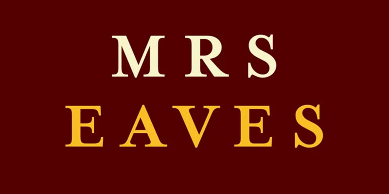
Zuzana Licko designed this Baskerville revival in 1996 for Emigre. Named after Sarah Eaves, John Baskerville’s housekeeper (later wife) who continued his work after he died.
Transitional serif with personality and quirks.
Visual Characteristics
Based on printed Baskerville specimens, not the perfect lead type. Licko studied books at Berkeley’s Bancroft Library and captured the ink spread and paper impression.
Lower contrast than typical Baskerville revivals. Wider lowercase proportions but smaller x-height relative to caps to avoid increasing set width.
The W sits narrow, the L uncommonly wide, the stroke flares into serifs more pronounced than expected. Individual characters look awkward. Together they create something special.
Extensive ligature sets including decorative combinations like “ct,” “sp,” “st” make it distinctive for display use.
Readability Performance
Display contexts are the sweet spot. Headlines, pull quotes, book blurbs, poetry.
The loose spacing makes it ramble through body text. Not economical, not ideal for long-form reading.
Best at 14pt and above. The low x-height and loose fit create lightness and airiness perfect for short text blocks.
Mrs Eaves XL (2009) offers tighter spacing and higher x-height for actual body text use.
Editorial Applications
Fashion magazines, literary publications, upscale lifestyle editorial. Anything requiring elegance and refinement.
Works for:
- Poetry layouts
- Feature article headlines
- Fashion editorial departments
- Refined cultural publications
WordPress uses Mrs Eaves for its logotype. Penguin Classics uses it for titles on current covers. Coldplay featured it prominently in A Head Full of Dreams artwork.
Pairing Recommendations
The display nature demands pairing with something functional for body copy.
Try:
- Mrs Eaves headlines + Filosofia body (both Emigre faces)
- Mrs Eaves display + Mrs Eaves XL body (designed to work together)
- Mrs Eaves + Mr Eaves Sans (the official sans companion)
Mr Eaves Sans and Mr Eaves Modern (2009) were specifically designed to complement Mrs Eaves. They share proportions, weight, and armature while standing as independent typefaces.
Technical Specifications
Family includes:
- Mrs Eaves Roman (regular weight)
- Mrs Eaves Italic
- Mrs Eaves Small Caps
- Mrs Eaves Petite Caps (shorter than normal small caps to suit the small x-height, first typeface to offer this)
Character coverage: Extensive Latin support, large ligature sets, decorative alternates
Licensing: Commercial license through Emigre
Formats: OpenType with extensive ligature support, PostScript also available
Extended families:
- Mrs Eaves XL Serif: Tighter spacing, higher x-height for body text (2009)
- Mrs Eaves XL Narrow: Condensed variant
- Mr Eaves Sans & Modern: Sans-serif companions (2009)
- Mr Eaves XL Sans, Modern & Narrow: Extended sans versions
Despite its “imperfections” and loose spacing, Mrs Eaves outsold all other Emigre fonts by many fold. Through distributors like MyFonts, it ranked among best sellers alongside Helvetica, Univers, Bodoni, and Franklin Gothic.
Trade Gothic
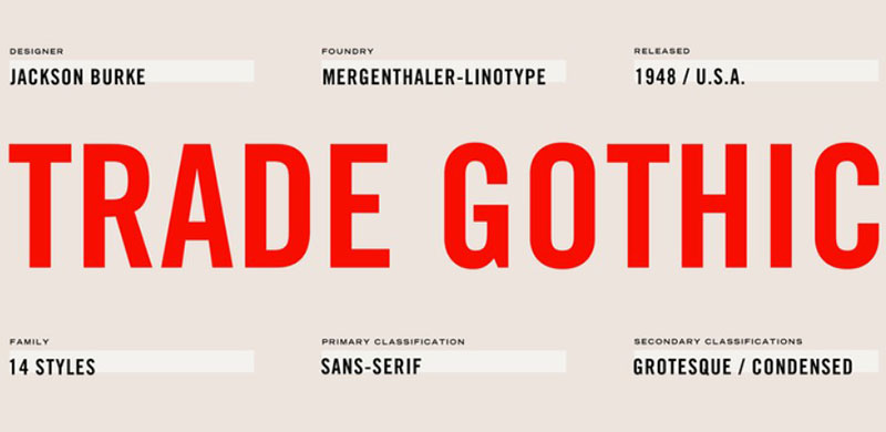
Jackson Burke designed this workhorse grotesque for Mergenthaler Linotype between 1948-1960. Released in stages over 12 years.
American grotesque with industrial strength.
Visual Characteristics
The family sprawls across condensed and extended widths with varying weights. Each style shows distinct characteristics rather than systematic interpolation.
Irregular design where some weights appear heavier or lighter than their names suggest. This inconsistency comes from developing fonts over time rather than as a unified system.
Short descenders and large x-height give it robust appearance. The slightly condensed normal width fits more characters per line than Helvetica.
Trade Gothic Next (2008-2009) by Akira Kobayashi unified the family into a coherent system with consistent interpolation between weights and widths.
Readability Performance
Excellent text performance at 9-12pt. The large x-height and open counters maintain clarity in small sizes.
Slightly condensed proportions allow more words per line without sacrificing legibility. Ideal for magazines with tight column widths.
The irregular weights of the original family create visual interest in editorial applications. Bold isn’t too heavy, Light isn’t too thin.
Editorial Applications
News magazines, business publications, industrial design editorial. Anywhere needing functional, no-nonsense typography.
Works across:
- News and current affairs magazines
- Business and financial publications
- Technology and science editorial
- Corporate communications
The utilitarian aesthetic pairs well with photography-heavy layouts. Doesn’t compete with images, just presents information clearly.
Pairing Recommendations
Pairs naturally with strong serifs for editorial contrast.
Classic combinations:
- Trade Gothic headlines + Caslon body (American magazine standard)
- Trade Gothic + Georgia (digital-friendly pairing)
- Trade Gothic + Times New Roman (news editorial)
Can work as complete system using the extended family’s widths and weights for hierarchy. Condensed for kickers, Bold for headlines, Regular for body, Extended for emphasis.
Technical Specifications
Original family variants:
- 14 fonts across various weights and widths
- Condensed versions (No. 18, 20)
- Extended versions
- Bold Condensed No. 20 (most popular weight)
Trade Gothic Next improvements:
- 51 fonts total
- Unified weight progression
- Consistent width relationships
- Improved spacing and kerning
- Extended language support
Character coverage: Latin Extended, wide language support in Next version
Licensing: Commercial through Linotype/Monotype
Formats:
- Original: PostScript, TrueType
- Trade Gothic Next: OpenType with extensive features
The condensed versions remain popular for magazine departments and navigation elements where space is tight but legibility matters.
Franklin Gothic
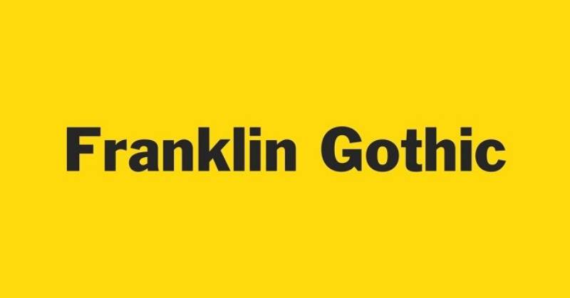
Morris Fuller Benton designed this American grotesque for ATF starting in 1902, released in 1905. Named after Benjamin Franklin, it became the quintessential American sans.
Visual Characteristics
Originally a single bold weight. Over ten years, Benton added condensed, extra condensed, italic, and shaded versions.
The two-story lowercase “a” and “g” with bowl and loop set it apart from European grotesques. The “g” has a prominent ear that sometimes rises above the x-height line.
Large x-height with strong roman proportions adapted to sans-serif style. Stroke weight shows more thick-thin contrast than modern geometric sans-serifs like Helvetica.
Square capitals, wide character widths. The lowercase forms retain serif typeface proportions, creating warmth and character missing from later monolinear designs.
Readability Performance
Body text at 9-12pt performs excellently. The large x-height and open counters maintain clarity at smaller sizes.
Slightly condensed proportions fit more words per line than Helvetica without sacrificing legibility. Perfect for tight magazine columns.
The uneven weights across the family (Bold isn’t always proportionally heavier than Medium) create interesting visual texture in editorial layouts.
ITC Franklin Gothic (1980) added four new weights by Victor Caruso with increased x-height and character width. Book, Medium, Demi, and Heavy in roman and italic made body text more viable.
Editorial Applications
News magazines, business publications, advertising. Anywhere needing no-nonsense American functionality.
Strong performance:
- Newspaper headlines and departments
- Business and financial magazines
- Industrial and technology editorial
- Corporate communications
Columbia College Chicago uses Franklin Gothic in primary branding. Star Wars subtitle cards? Franklin Gothic. The “A long time ago…” opening? Also Franklin Gothic.
Trade publications love it. The direct, bold solidity communicates without fuss.
Pairing Recommendations
Classic American editorial combinations work best.
Works beautifully with:
- Caslon body copy (American publishing standard)
- Georgia for digital-friendly pairing
- Times New Roman (news editorial workhorse)
The condensed versions excel for department labels and kickers where space is tight but clarity matters.
Can work as complete system using the extended family’s weights for hierarchy. Regular for body, Bold Condensed for subheads, Extra Bold for headlines.
Technical Specifications
Original ATF variants:
- 14 fonts across weights and widths
- Franklin Gothic Condensed (most popular)
- Franklin Gothic Extra Condensed
- Franklin Gothic Wide (1952, John L. Renshaw)
ITC Franklin Gothic additions:
- Book, Medium, Demi, Heavy
- Roman and italic for all weights
- Slightly larger x-height than original
- Better suited for extended text
Character coverage: Latin Extended, solid language support
Licensing:
- Original ATF designs through various foundries
- ITC Franklin Gothic: Commercial license
- ATF Franklin Gothic (modern): 18-font family by Mark Van Bronkhorst, Ben Kiel
Formats: OpenType with extensive features in modern versions, PostScript legacy support
Libre Franklin offers open source alternative with nine weights and italics. Public Sans, by US Web Design System, is based on Libre Franklin with modifications.
Garamond

Claude Garamont cut these types in Paris between 1530-1545. One of history’s most influential type designers, though most “Garamond” fonts today are actually based on Jean Jannon’s work from 1615.
Old-style serif, Renaissance era. The confusion about origins adds historical intrigue.
Visual Characteristics
Organic structure resembling pen-written letterforms but more structured and upright than pure calligraphy.
Modest thick-thin contrast compared to transitional and modern serifs. The stress is slightly diagonal, following handwriting tradition.
Small, refined letterforms. Garamond designed to be elegant at text sizes, not display purposes.
The lowercase “e” with its small eye, the distinctive “g” with open lower counter. Subtle details that became defining characteristics of old-style type.
Many revivals exist with wildly different characteristics. Adobe Garamond by Robert Slimbach is most faithful to actual Garamond designs. Most others are based on Jannon.
Readability Performance
Exceptional at 10-12pt body text. The modest contrast and refined proportions make extended reading comfortable.
The relatively small x-height compared to modern fonts means you need slightly larger point sizes for equivalent readability.
Works beautifully in print. Digital rendering improved significantly with high-resolution displays, but avoid using below 10pt on screens.
The ink efficiency made it popular during paper shortages. Harry Potter books? Set in Adobe Garamond, saving tons of paper across millions of copies.
Editorial Applications
Literary magazines, book publishing, cultural journals. Anywhere requiring classical refinement and scholarly credibility.
Excellent for:
- Literary and arts magazines
- Academic journals
- Cultural commentary
- Book reviews and criticism
The Google logo originally used a modified Garamond (later switched to custom sans). Dr. Seuss books use it. Penguin Books relied on it for decades.
University presses and scholarly publications consider it default. The historical associations communicate seriousness and tradition.
Pairing Recommendations
Pairs naturally with clean sans-serifs that don’t compete with its refinement.
Strong combinations:
- Garamond body + Helvetica headlines (classic contrast)
- Garamond + Gill Sans (British publishing tradition)
- All-Garamond using italic and weight for hierarchy
For digital, pair with Futura or Avenir. The geometric simplicity balances Garamond’s organic warmth.
Avoid pairing with other old-style serifs. The similar characteristics create confusion rather than contrast.
Technical Specifications
Major revivals and interpretations:
- Adobe Garamond (1989): Robert Slimbach, based on actual Garamond specimens
- ITC Garamond: Larger x-height, more condensed
- Stempel Garamond: Based on Jannon designs
- EB Garamond: Free open source with optical sizes
- Garamond Premier Pro: Adobe’s refined version with optical sizes
Character coverage: Extensive Latin support, Greek and Cyrillic in some versions
Licensing:
- Commercial versions through Adobe, ITC, Monotype
- EB Garamond: SIL Open Font License (free)
- Many pre-installed versions on operating systems
Formats: OpenType with optical sizes in premium versions, PostScript in legacy versions
The confusion between Garamond and Jannon designs persists. Most fonts labeled “Garamond” are Jannon-based. Adobe Garamond and Garamond Premier Pro are closest to actual Garamond designs.
Times New Roman
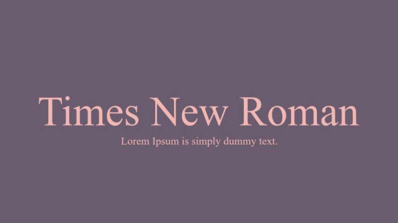
Stanley Morison designed this for The Times of London in 1931, with drawings by Victor Lardent. First appeared October 3, 1932. Initially exclusive to the newspaper, then licensed by Monotype.
Became the world’s default serif through Microsoft Word.
Visual Characteristics
Based on Monotype Plantin but with sharper serifs, increased contrast, and refined character curves. The ball terminals, straight-sided “M,” and large counters in “a” and “e” make it instantly recognizable.
Higher contrast than Plantin gives it sparkle and crispness on the page. The vertical stress and near-transitional characteristics bridge old-style and modern classifications.
The rationalistic italic owes nothing to Renaissance traditions. More 18th-century Didot influence, creating unusual pairing with the roman.
Raised x-height and reduced tracking maximized text per line for newspaper economy. Thicker vertical strokes with thinned intersections kept letters from muddling while maintaining legibility.
Readability Performance
Optimized for 9pt newspaper text. The design followed 1926 British Medical Research Council recommendations on print legibility.
Performs well at 10-12pt for general publishing. Below 9pt, the hairlines start disappearing. Above 14pt, the compromises for text size become apparent.
Screen rendering decent but not optimal. Designed for high-quality newsprint, not pixels. Works better on high-DPI displays.
The tight spacing can feel cramped in longer line widths. Fine for newspaper columns, less ideal for book-width text blocks.
Editorial Applications
Everywhere because Microsoft made it default. But that’s not where it belongs.
Actually appropriate for:
- News magazines and newspapers
- Academic publications (APA style recommends it)
- Government documents (US State Department used it 2004-2023)
- Reference materials
The newspaper origins mean it excels in multi-column layouts with varied text sizes. Display headlines, body text, captions all work within the large extended family.
Overused in amateur desktop publishing because of default status. Professional designers often avoid it for this reason.
Pairing Recommendations
The massive extended family makes it self-sufficient. Times headlines, subheads, and body work together perfectly.
When mixing fonts:
- Times body + Arial headlines (Microsoft Office standard)
- Times + Helvetica (safe, functional)
- Times + Franklin Gothic (newspaper tradition)
For editorial sophistication, pair with grotesque sans-serifs that provide clean contrast without competing for attention.
Avoid pairing with other transitional serifs or anything with similar stroke modulation. The characteristics are too close.
Technical Specifications
Variants:
- Times Roman (Linotype version)
- Times New Roman (Monotype version, Microsoft’s choice)
- Times New Roman MT
- Times Europa (digital optimization)
Large extended family includes:
- Multiple weights and widths
- Headline variants
- Titling capitals
- Small caps
- Old-style figures
Character coverage: Extensive Latin, Greek, Cyrillic, mathematical symbols. International printing requirements covered.
Licensing:
- Pre-installed on Windows (Monotype)
- Pre-installed on macOS (Linotype version)
- Commercial licenses available
- Web font versions through major distributors
Formats: TrueType, OpenType, PostScript depending on version
Walter Tracy, Allen Hutt, and others extensively documented the headline weights and titling capitals. Morison felt in 1953 that headlines mattered more than the body text in the redesign’s success.
Baskerville

John Baskerville designed this transitional serif in Birmingham, England, 1757. Cut by punchcutter John Handy. Bridge between old-style (Caslon) and modern (Bodoni/Didot).
Refinement was the goal. Baskerville wanted to improve Caslon’s designs.
Visual Characteristics
Increased contrast between thick and thin strokes compared to old-style predecessors. Sharper, more tapered serifs.
Vertical stress on rounded letters. More circular curved strokes. Greater regularity and consistency in letterforms.
The changes reflect Baskerville’s calligraphy background. He taught writing before becoming a printer, and that influence shows in the refined proportions.
Wide, gracefully bracketed serifs with flat bases. The Q has a distinctive flowing tail. The lowercase “g” features open lower counter and swash-like ear.
Multiple revivals exist. Mrs Eaves by Zuzana Licko is the most distinctive modern interpretation, with low x-height and extensive ligatures.
Readability Performance
Elegant book face that excels in purely typographic compositions. The refined beauty serves extended reading well at 10-12pt.
Higher contrast than old-style faces means it needs quality printing. Baskerville himself developed smoother paper (wove paper), darker inks, and better presses to reproduce his delicate design.
Small sizes (below 10pt) lose the hairlines. Large display sizes showcase the refined proportions beautifully.
The calligraphic influence and swashes make it particularly attractive for chapter openings and initial capitals.
Readability Performance
Text sizes of 10-12pt are ideal. The transitional characteristics create warmth without the harshness of modern serifs.
The contrast level sits between old-style and modern, making it versatile for various printing conditions. Not as demanding as Bodoni, more refined than Caslon.
Digital versions often increase the weight of hairlines slightly to compensate for screen rendering limitations. High-resolution displays handle it better.
Editorial Applications
Academic publications, literary magazines, cultural journals. The transitional nature communicates intelligence and refinement.
Strong performance:
- Book publishing and reviews
- Literary and arts magazines
- Academic quarterly journals
- Cultural commentary
University of Birmingham uses Baskerville prominently. Canadian government’s ‘Canada’ wordmark uses modified Baskerville. Castleton University built identity around it.
The elegance appeals to upscale publications without the austere coldness of modern serifs. Warmer than Didot, more sophisticated than Garamond.
Pairing Recommendations
Works beautifully with simple sans-serifs that don’t compete with its elegance.
Winning combinations:
- Baskerville body + Gill Sans headlines
- Baskerville + Futura (geometric contrast)
- Baskerville + Helvetica (Swiss precision meets English refinement)
Mrs Eaves pairs with Mr Eaves Sans (specifically designed companion). The shared proportions create cohesive systems.
For all-serif approach, use italic and different weights for hierarchy. The swashes in italic add decorative elements without additional fonts.
Technical Specifications
Notable revivals:
- Monotype Baskerville: Classic revival
- ITC New Baskerville: Includes bold weights Baskerville never made
- Mrs Eaves: Licko’s 1996 interpretation with extensive ligatures
- Big Moore: Matthew Carter’s digitization of Isaac Moore’s early adaptation
- Libre Baskerville: Free version optimized for screens with taller x-height
Character coverage: Latin Extended, varies by version
Licensing:
- Commercial versions through Monotype, ITC
- Mrs Eaves: Commercial through Emigre
- Libre Baskerville: SIL Open Font License (free)
- Pre-installed on many systems
Formats: OpenType with ligatures in modern versions, PostScript in legacy releases
The original Baskerville type was revived in 1917 by Bruce Rogers for Harvard University Press. Modern revivals added bold weights and extensive italic swashes that weren’t in Baskerville’s original work.
Caslon
William Caslon cut the original around 1725 in London. Became the standard English typeface for two centuries. Old-style serif, robust and unpretentious.
“When in doubt, use Caslon” became the printer’s motto.
Visual Characteristics
Sturdy old-style characteristics with moderate contrast. Bracketed serifs, diagonal stress in curved letters.
The typeface shows irregularities that give it character. Not geometrically perfect, but warm and readable. Letters have individual personality rather than systematic uniformity.
Short descenders relative to ascenders. The “w” is notably wide. Uppercase letters slightly shorter than ascenders of lowercase, creating even texture in running text.
The italic has distinct character from the roman, more calligraphic with swash alternates. Not simply a sloped version of the roman.
American Caslon (1916) by Morris Fuller Benton became the standard revival in the US. Big Caslon offers display weights.
Readability Performance
Rock-solid text performance at 10-12pt. The moderate contrast and robust construction handle various printing conditions well.
More forgiving than refined faces like Baskerville or Didot. Works on lower-quality paper without hairlines disappearing.
The irregularities in character shapes actually aid readability by creating distinct letterforms. Perfect geometric regularity can blur together at text sizes.
Extended reading comfort is exceptional. The old-style characteristics provide warmth that reduces eye fatigue in long-form content.
Editorial Applications
Versatile across publication types. American heritage makes it popular in US publishing.
Excellent for:
- Literary magazines and book reviews
- Heritage and history publications
- American-focused editorial content
- Traditional journalism
The US Declaration of Independence was printed in Caslon. That historical association carries weight in American publications.
The New Yorker has used Caslon variants extensively. Many university presses consider it default for scholarly publishing.
Works equally well for body text and display headlines within the same family. The range of weights and sizes provides complete typographic systems.
Pairing Recommendations
The workhorse nature pairs well with both classic and modern sans-serifs.
Strong pairings:
- Caslon body + Franklin Gothic headlines (American tradition)
- Caslon + Helvetica (functional contrast)
- Caslon + Gill Sans (British refinement)
All-Caslon systems work beautifully using roman, italic, and display weights for hierarchy. No additional fonts needed for complete editorial design.
For contemporary feel, pair with geometric sans like Futura or Avenir. The warmth-meets-geometry dynamic creates interesting tension.
Technical Specifications
Major versions:
- Adobe Caslon: Robert Slimbach’s 1990 revival
- Williams Caslon Text: Digital version for text use
- Big Caslon: Display weights for headlines
- ITC Founder’s Caslon: Based on earliest Caslon specimens
- American Caslon: Morris Fuller Benton’s 1916 ATF version
Character coverage: Extensive Latin, varies by version
Licensing:
- Adobe Caslon: Commercial through Adobe
- Various versions through Monotype, ITC
- Some versions pre-installed on systems
- Web fonts available through major distributors
Formats: OpenType with historical ligatures in modern versions
The original Caslon foundry operated for generations, with types continually refined. Modern revivals choose different periods and sizes as sources, creating variations in character.
Neue Haas Grotesk

The original name for Helvetica before Linotype renamed it in 1960. Max Miedinger and Eduard Hoffmann designed it in 1957 at Haas Type Foundry.
Christian Schwartz created a faithful digitization in 2010 that restored the original design’s character, which had been lost in Helvetica’s many digital interpretations.
Visual Characteristics
Pre-Helvetica polish. The original drawings show more personality than later Helvetica refinements.
Slightly irregular strokes and spacing compared to Neue Helvetica’s systematic approach. The “a,” “s,” and “e” have subtle quirks that disappeared in later versions.
High x-height with tight spacing, creating dense, solid appearance. Horizontal and vertical stroke terminations throughout.
The 2010 Christian Schwartz revival includes 50+ weights across multiple widths. Micro, Ultra Light through Extra Black in Normal, Condensed, and Extended widths.
Display and Text optical sizes address the varying needs at different point sizes. Display versions are more delicate, Text versions more robust.
Readability Performance
Text optical sizes work well at 9-12pt. The refinements over standard Helvetica improve legibility in running text.
Display sizes excel at headlines above 18pt. The delicate proportions that cause problems at text sizes look elegant large.
The tight spacing inherited from original Neue Haas Grotesk means careful attention to tracking in different applications. What works in headlines may feel cramped in body text.
Screen rendering benefits from optical sizing. Text versions with slightly heavier hairlines display better on lower-resolution screens.
Editorial Applications
Modern magazine design where neutrality matters but with more character than Helvetica.
Strong performance:
- Contemporary arts and culture magazines
- Design and architecture publications
- Technology editorial
- Modern lifestyle content
The restored character from the original makes it feel fresh compared to ubiquitous Helvetica, while maintaining that Swiss precision.
Fashion editorials appreciate the refined proportions at display sizes. The delicate hairlines photograph beautifully in high-quality print.
Pairing Recommendations
Works with everything because of the neutral grotesque foundation, but pairs especially well with serifs that provide strong contrast.
Excellent combinations:
- Neue Haas Grotesk headlines + Garamond body
- Neue Haas Grotesk + Baskerville (refined contrast)
- Neue Haas Grotesk + Caslon (warmth-meets-precision)
The extensive weight range allows all-sans systems. Use Ultra Light for elegant departments, Regular for body, Bold for subheads, Heavy for headlines.
For editorial sophistication, pair the Display optical size with different serif for body text. The optical sizing creates natural hierarchy.
Technical Specifications
2010 Schwartz revival structure:
- 50+ styles total
- 3 widths: Normal, Condensed, Extended
- 2 optical sizes: Display, Text
- Weights from Micro to Extra Black
- Matching italics throughout
Character coverage: Extended Latin, Greek, Cyrillic in Pro versions
Licensing: Commercial through Linotype/Monotype
Formats: OpenType with extensive features
Key features:
- Optical sizes (Display vs Text)
- Stylistic alternates
- Case-sensitive punctuation
- Tabular and proportional figures
- Extended language support
The revival corrected decades of digital drift from the original design. Schwartz studied the original metal type and pre-Helvetica specimens to restore lost character. His disappointment with digital Helvetica versions motivated the project.
Futura

Paul Renner designed this geometric sans-serif in 1927 for Bauer Type Foundry. Bauhaus influence without being officially Bauhaus.
Perfect circles, straight lines, geometric purity. Modernism distilled.
Visual Characteristics
Based on simple geometric shapes. Circles for O, Q, C. Straight lines dominate. Near-perfect geometry throughout.
The capital “O” is a perfect circle. Lowercase “o” slightly flattened for better optical balance. Single-story “a,” geometric “g” with open tail.
Originally included alternate characters that were even more geometric but proved impractical. The final version balanced geometric purity with functionality.
Large x-height relative to capitals creates even color in text. The ascenders don’t tower over caps like in Renaissance proportions.
Multiple weights from Light to Bold, with obliques (not true italics). The obliques maintain geometric construction.
Readability Performance
Display use is the sweet spot. Headlines at 18pt and above look fantastic. The geometric purity shines at large sizes.
Body text at 10-12pt works but feels cold in extended reading. The perfect geometry lacks the warmth of grotesque sans-serifs.
The single-story “a” and geometric “g” can cause confusion at small sizes for some readers. More distinctive letterforms aid recognition.
Tight spacing in running text. Needs careful tracking adjustment depending on size and application. Headlines want tighter tracking, body text needs breathing room.
Editorial Applications
Fashion magazines, design publications, modern architecture content. Anywhere geometry and precision matter.
Excellent for:
- Fashion editorial headlines
- Architecture and design magazines
- Modern art publications
- Technology content with modernist aesthetic
Vogue has used Futura extensively. Countless fashion magazines rely on it for headlines and department labels.
The geometric purity photographs beautifully. Works as well in image-heavy layouts as text-heavy pages.
Supreme’s logo? Futura Extra Bold. Ikea once used Futura before switching to Verdana. Volkswagen’s iconic identity uses Futura.
Pairing Recommendations
Pairs beautifully with classic serifs for maximum contrast between geometry and tradition.
Winning combinations:
- Futura headlines + Garamond body (modernism meets tradition)
- Futura + Baskerville (geometry and refinement)
- Futura + Caslon (cold precision, warm reading)
Can work as complete system using Light for departments, Medium for subheads, Bold for headlines. The weight range provides clear hierarchy.
For contemporary all-sans approach, pair with humanist sans like Gill Sans or sans-serif fonts with more traditional proportions. The geometric-humanist contrast creates interesting tension.
Technical Specifications
Weight range:
- Light, Book, Medium, Demi, Bold, Extra Bold, Heavy
- Obliques for all weights
- Condensed variants
- Display versions
Character coverage: Latin Extended, Cyrillic in some versions
Licensing:
- Commercial through Linotype, URW++, Neufville Digital
- Futur PT: Extended version with more weights
- Several alternative geometric sans inspired by it
Formats: OpenType, PostScript in older versions
Notable features:
- Geometric construction
- Large x-height
- Single-story ‘a’ and geometric ‘g’
- Nearly circular round forms
Paul Renner’s original designs included alternate characters even more geometric than the final release. The Bauer foundry pragmatically modified some forms for better legibility and practicality in typesetting.
Avenir
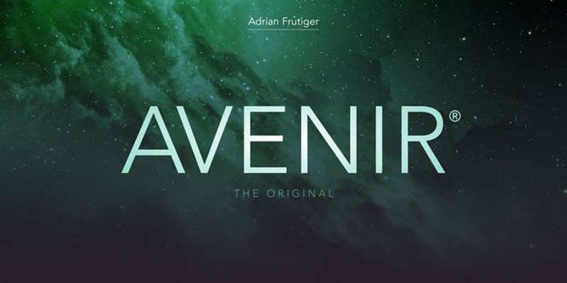
Adrian Frutiger designed this in 1988. The name means “future” in French, positioning it as his modern take on geometric sans-serifs.
Geometric forms with humanist proportions. Warmer than Futura, more personality than Helvetica.
Visual Characteristics
True verticals in straight strokes with slight weight variations that humanize the geometric construction. The “O” approaches circular but isn’t perfectly round.
The terminals on “c,” “e,” “s” are cut on a slight diagonal rather than pure horizontal. This subtle detail adds warmth.
The “t” has a curved tail rather than straight horizontal. The “Q” tail is angled, not perfectly vertical. Small details that distinguish it from pure geometry.
Six weights from Light to Heavy with matching obliques. Later extended to include Black and condensed widths.
Vertical stroke terminals, minimal stroke contrast. The even color makes it work well at all sizes.
Readability Performance
Excellent at all sizes. Text performance at 9-12pt is comfortable for extended reading. Display use at 24pt and above maintains clarity.
The humanist influence makes longer text blocks more pleasant to read than pure geometric sans-serifs like Futura.
Generous apertures in “c,” “e,” “s,” and “a” maintain openness even at smaller sizes. The characters don’t close up.
Screen rendering very good. The sturdy construction without extreme thin strokes holds up on lower-resolution displays.
Editorial Applications
Versatile across magazine categories. The balance of geometric and humanist appeals to modern editorial design.
Strong in:
- Lifestyle magazines
- Travel publications
- Contemporary culture content
- Corporate magazines
The refined but approachable character works for both serious journalism and lighter lifestyle content. Not too corporate, not too casual.
Used extensively in transportation signage (Amsterdam Schiphol Airport, for example). That association with wayfinding translates well to magazine navigation elements.
Pairing Recommendations
The warmth allows it to pair with many serifs without the coldness that geometric sans-serifs sometimes create.
Excellent pairings:
- Avenir headlines + Garamond body (modern and classic)
- Avenir + Caslon (approachable geometry)
- Avenir + Georgia (digital-friendly combination)
Works as complete system using Light for captions, Regular for body if needed, Medium for subheads, Heavy for headlines. The weight progression is well-balanced.
For all-sans approach, pair with grotesque like Trade Gothic or Franklin Gothic. The geometric-grotesque contrast provides distinction.
Technical Specifications
Original 1988 release:
- Six weights (Light, Book, Roman, Medium, Heavy, Black)
- Matching obliques
- Later additions: Black, Condensed widths
Avenir Next (2004 revision):
- Extended weight range
- Condensed and Ultra Light weights added
- Improved digital rendering
- Expanded language support
Character coverage: Extensive Latin, Greek, Cyrillic
Licensing: Commercial through Linotype/Monotype
Formats: OpenType with professional features
Key characteristics:
- Humanist proportions with geometric forms
- Diagonal terminal cuts
- Vertical stress
- Even stroke weight
- Large x-height
Pre-installed on macOS. Widely licensed. The 2004 Avenir Next revision by Akira Kobayashi expanded the family significantly and improved digital rendering.
Brandon Text

Hannes von Döhren designed this humanist sans-serif in 2010 for HVD Fonts. Modern take on grotesque sans-serifs.
Rounded, friendly, but maintains seriousness for editorial use.
Visual Characteristics
The lowercase has generous, open counters. Characters breathe on the page.
Rounded terminals on “c,” “e,” “s,” “a” soften the geometric foundation. Not perfectly circular, but clearly rounded.
Tall x-height with short descenders. Modern proportions optimized for readability across sizes.
Six weights from Thin to Black with matching italics. The italic shows true cursive characteristics, not just sloped romans.
The “a” is two-story, the “g” has a loop. Traditional grotesque characteristics with contemporary refinement.
Readability Performance
Text sizes of 9-12pt perform well. The open counters and generous spacing maintain clarity.
The rounded terminals prevent the geometric coldness that can make extended reading tiring. More comfortable than pure geometric sans.
Screen rendering excellent. The sturdy construction and open forms work well on all display types.
Slightly wider than condensed grotesques means fewer characters per line but improved legibility. Good trade-off for magazine text.
Editorial Applications
Contemporary magazine design, lifestyle content, modern editorial that needs personality without becoming playful.
Works well for:
- Lifestyle and culture magazines
- Food and travel content
- Health and wellness publications
- Modern editorial design
The friendly-but-serious balance makes it versatile. Professional enough for business content, warm enough for lifestyle articles.
Not widely known enough to feel overused. Provides distinction from Helvetica and similar ubiquitous choices.
Pairing Recommendations
The humanist warmth pairs naturally with classic serifs.
Strong combinations:
- Brandon Text + Garamond (approachable editorial)
- Brandon Text + Georgia (digital-optimized pair)
- Brandon Text + Baskerville (modern meets refined)
Works as complete system using weight progression for hierarchy. Thin for departments, Regular for body, Medium for subheads, Bold for headlines.
For variety, pair with different humanist sans at different weights. The subtle differences create sophisticated typographic systems.
Technical Specifications
Family structure:
- Six weights: Thin, Light, Regular, Medium, Bold, Black
- True italics for all weights
- Extensive OpenType features
Character coverage: Extended Latin, comprehensive language support
Licensing: Commercial through HVD Fonts, distributed by MyFonts and major resellers
Formats: OpenType with professional features
Key features:
- Large x-height
- Open counters
- Rounded terminals
- True italic designs
- Comprehensive OpenType features
Released 2010. Later expanded with Brandon Grotesque (more geometric) and Brandon Printed (distressed version). The Text variant remains most suitable for editorial applications.
Mercury Text
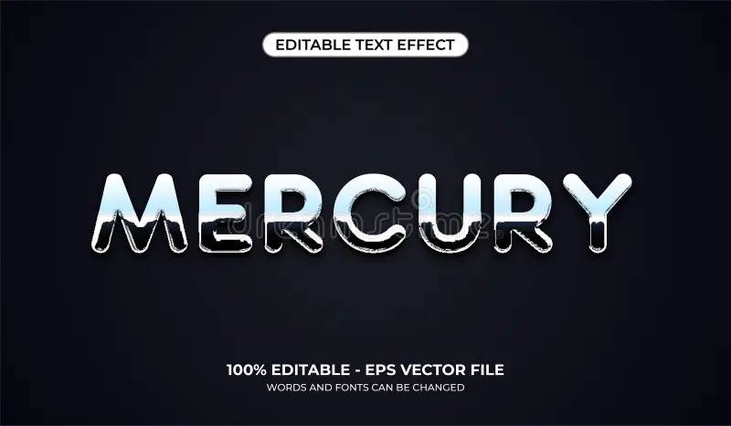
Jonathan Hoefler and Tobias Frere-Jones designed this for Esquire and Martha Stewart Living magazines in the 1990s. Purpose-built for editorial use.
Transitional serif optimized specifically for magazine body text.
Visual Characteristics
Generous apertures in “e,” “a,” “c,” “s” maintain openness even at small text sizes. Characters don’t close up in challenging printing conditions.
Sturdy hairlines that won’t disappear in magazine printing. The design acknowledges real-world printing realities versus perfect presswork.
Short descenders save vertical space in magazine layouts. More lines per page without sacrificing legibility.
Four weights with matching italics: Regular, Semibold, Bold, Display. Each weight optically adjusted for intended use cases.
Display variants for headlines show more delicate proportions. Text versions are robust for 9-12pt use.
Readability Performance
Purpose-built for magazine text at 9-11pt. The optical sizing ensures hairlines remain visible at intended sizes.
Generous apertures and open counters maintain clarity on various paper stocks. Works on coated and uncoated papers.
The short descenders allow tighter leading without collisions. Fits more copy in limited space without compromising readability.
Extended reading comfort excellent. The transitional characteristics provide warmth without the quirks that can tire readers.
Editorial Applications
Magazine body text is the primary purpose. Headlines, subheads, captions all covered within the family.
Designed specifically for:
- Magazine feature articles
- News and feature editorial
- Culture and lifestyle content
- Any publication needing robust text face
Esquire and Martha Stewart Living drove the initial design. The specifications came directly from editorial needs at those publications.
Works across publication categories from fashion to news to lifestyle. The versatility comes from pragmatic design decisions.
Not flashy enough for fashion headlines but perfect for the body text beneath them. Form follows editorial function.
Pairing Recommendations
Works beautifully with clean sans-serifs for headlines and departments.
Strong editorial combinations:
- Mercury Text body + Helvetica headlines (magazine standard)
- Mercury Text + Franklin Gothic (American editorial)
- Mercury Text + Gotham (contemporary approach)
The Display weights can work for smaller headlines and subheads, maintaining font family unity across the publication.
All-Mercury systems work well using Display for headlines, Semibold for subheads, Regular for body. The optical sizing handles the transitions.
Technical Specifications
Family structure:
- Four weights: Regular, Semibold, Bold, Display
- Matching italics for all
- Text and Display optical sizes
- Multiple width variants in some versions
Character coverage: Comprehensive Latin with old-style figures, lining figures, small caps
Licensing: Commercial through Hoefler & Co (formerly Hoefler & Frere-Jones)
Formats: OpenType with extensive typographic features
Key features:
- Optical sizing (Text vs Display)
- Short descenders for space efficiency
- Generous apertures for clarity
- Sturdy hairlines for reproduction
- Complete figure sets and small caps
The commission-based origin means real editorial needs shaped every design decision. Not theoretical typography, but practical magazine-making tool.
Goudy Old Style

Frederic Goudy designed this for ATF in 1915. American interpretation of Renaissance typefaces with distinctive personality.
Old-style serif with Arts and Crafts movement influence. More character than pure historical revivals.
Visual Characteristics
Diamond-shaped dots on “i” and “j” instead of circular. Immediately recognizable detail.
The italic shows strong calligraphic influence with pronounced swashes. Not timid about ornamentation.
Relatively small x-height compared to modern text faces. This creates elegant proportions but requires slightly larger point sizes.
The “a” has distinctive form, the “e” has small aperture. Individual characters have personality rather than systematic uniformity.
Moderate contrast between thick and thin strokes. Bracketed serifs with slight curvature.
Readability Performance
Text sizes of 11-13pt work best. The small x-height needs larger point sizes than faces with tall x-heights.
The distinctive letterforms aid recognition in reading. Characters don’t blur together despite the small x-height.
Extended reading comfort good at proper sizes. The warmth and personality make long texts pleasant.
Digital versions sometimes increase x-height slightly to improve performance at smaller sizes. Purists complain, but readers benefit.
Editorial Applications
Vintage aesthetic, nostalgic content, heritage brands. Anywhere Arts and Crafts movement associations help.
Strong for:
- Historical and heritage magazines
- Arts and culture content with vintage aesthetic
- Literary publications seeking classic feel
- Brands emphasizing craft and tradition
Copperplate printing company uses Goudy Old Style extensively in branding. The Arts and Crafts associations communicate quality and tradition.
Not for modern, cutting-edge content. The historical character works against contemporary subjects.
Magazine mastheads sometimes use Goudy Old Style for traditional, established publications emphasizing longevity.
Pairing Recommendations
Pairs well with American sans-serifs or clean grotesques that provide contrast without competing in the “old” aesthetic.
Effective combinations:
- Goudy Old Style + Franklin Gothic (American tradition)
- Goudy Old Style + Helvetica (vintage meets modern)
- Goudy Old Style + clean geometric sans for contrast
The distinctive italic works beautifully for emphasis within Goudy body text. The calligraphic swashes add elegant texture.
Avoid pairing with other Arts and Crafts era typefaces. The similar associations create confusion. Need clean contrast.
Technical Specifications
Variants:
- Goudy Old Style (original)
- Goudy Old Style Italic (calligraphic)
- Goudy Bold (added later)
- Goudy Old Style FS (ITC version)
Character coverage: Latin with historical ligatures in some versions
Licensing:
- Various versions through different foundries
- ITC Goudy Old Style: Commercial
- Pre-installed on some systems
- Public domain status on some versions
Formats: OpenType in modern versions, PostScript in legacy
Distinguishing features:
- Diamond-shaped dots
- Small x-height
- Calligraphic italic
- Moderate contrast
- Individual character personality
Goudy designed over 100 typefaces in his career. Goudy Old Style remains his most widely used design. The Arts and Crafts aesthetic distinguishes it from more historically accurate Renaissance revivals.
Minion Pro
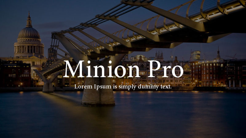
Robert Slimbach designed this for Adobe in 1990. Named after traditional names for small text sizes.
Renaissance-inspired old-style serif with extensive character set for professional typography.
Visual Characteristics
Clean old-style proportions with moderate contrast. Not as delicate as Garamond, more robust for varying printing conditions.
Slightly condensed letterforms compared to other old-styles. Fits more characters per line without feeling cramped.
The italic shows restrained calligraphic influence. Swashes available as alternates rather than default.
Multiple optical sizes from Caption (6-8pt) through Regular (9-13pt) to Display (19+pt). Each size optimized for its intended use.
Extensive character set includes small caps, old-style figures, lining figures, ornaments, swash capitals, historical ligatures.
Readability Performance
Regular optical size performs excellently at 10-12pt. The sturdy construction handles various printing conditions.
Caption optical size maintains legibility down to 7pt for magazine captions and footnotes. Heavier strokes prevent hairlines from disappearing.
Display optical size shows refined proportions at large sizes without the heaviness that makes text sizes look clumsy when scaled up.
The condensed proportions allow comfortable line lengths in narrow magazine columns. More words per line than wider old-styles.
Editorial Applications
Professional magazine publishing across all categories. The extensive character set supports sophisticated typography.
Versatile across:
- Literary magazines
- Academic publications
- General interest magazines
- Any publication requiring extensive typographic features
Adobe bundled it with Creative Suite, making it ubiquitous in professional publishing. Most designers have access.
The optical sizing addresses the full range of magazine needs from small captions to large headlines within one family.
Professional typographers appreciate the comprehensive character set. Small caps, old-style figures, and historical ligatures enable refined typography.
Pairing Recommendations
Works with almost any sans-serif because of its neutral old-style character.
Proven combinations:
- Minion Pro body + Myriad Pro headlines (Adobe’s recommended pairing)
- Minion Pro + Helvetica (functional combination)
- Minion Pro + Futura (old-style meets geometric)
The extensive family allows all-Minion systems. Display for headlines, Regular for body, Caption for small text. Optical sizing handles transitions.
For editorial sophistication, pair Minion italic and small caps within body text for emphasis and proper name styling. The character set supports refined typographic details.
Technical Specifications
Optical sizes:
- Caption (6-8.4pt)
- Regular (8.5-13pt)
- Subhead (13.1-19.9pt)
- Display (20+pt)
Weights in Regular optical size:
- Regular, Medium, Semibold, Bold, Black
- Matching italics for all weights
Character coverage:
- Comprehensive Latin
- Greek and Cyrillic in Pro versions
- Extensive special characters
- Mathematical symbols
- Over 1,000 glyphs per font
Licensing: Commercial through Adobe, bundled with Creative Cloud/Creative Suite
Formats: OpenType with extensive features
Key features:
- Optical sizing
- Small caps (proportional and all-caps spacing)
- Old-style and lining figures
- Swash capitals
- Historical ligatures
- Ornaments
- Tabular figures
Released 1990 with significant expansion in 2000 as Minion Pro with OpenType features. The comprehensive character set makes it professional typography workhorse. Adobe’s bundling with design software made it industry standard.
FAQ on The Best Magazine Fonts
What fonts do professional magazines use?
Most professional publications rely on classic serif fonts for body text. Think Garamond, Caslon, or Times New Roman.
Headlines often feature bolder choices like Didot, Bodoni, or Helvetica. Fashion magazines tend toward high-contrast serifs, while news publications prefer cleaner options.
Should I use serif or sans-serif for magazine body text?
Serif fonts generally perform better for long-form reading in print. The small strokes guide the eye across lines.
Sans-serif fonts work well for captions, sidebars, and modern editorial layouts. Many designers mix both for contrast.
What makes a font readable in print?
Good print readability comes down to x-height, letterform clarity, and appropriate font spacing. Fonts need to hold up at small sizes, typically 9-11pt for body text.
Proper leading and tracking adjustments also matter significantly.
How do I choose headline fonts for magazines?
Headline fonts should create visual hierarchy and grab attention. Display fonts like Playfair Display or Freight Display work beautifully.
Consider your publication’s personality. Luxury magazines use elegant serifs. Tech publications lean toward geometric sans-serifs like Futura.
What are the best free fonts for magazine design?
Google Fonts offers solid options. Lora and Merriweather handle body text well. Playfair Display works for fashion-forward headlines.
For sans-serifs, try Libre Franklin or Source Sans Pro. These free alternatives perform respectably, though premium fonts offer more weight variations.
How many fonts should a magazine use?
Stick to two or three typeface families maximum. One for headlines, one for body text, and possibly a third for accents or captions.
Too many fonts create visual chaos. Consistency builds brand recognition and professional appearance across your publication.
What fonts does Vogue magazine use?
Vogue’s masthead uses a custom version of Didot, that iconic high-contrast serif. Body text varies by regional edition.
The publication’s typography reflects luxury and sophistication. Many fashion magazines draw inspiration from this approach when building their own identity.
How do I pair fonts for editorial layouts?
Successful pairing fonts means finding contrast without conflict. Pair a serif headline with sans-serif body text, or vice versa.
Look for typefaces with similar proportions but different structures. Avoid combining fonts that are too similar or compete visually.
What’s the difference between print and digital magazine fonts?
Print fonts optimize for DPI and physical ink on paper. Digital fonts need screen rendering considerations.
Some typefaces include both print and web-optimized versions. Always test your choices in the actual output format before finalizing.
Do I need to worry about font licensing for magazines?
Absolutely. Font licensing varies wildly. Desktop licenses don’t automatically cover commercial print use.
Check your license terms carefully. Some fonts require separate print publication licenses. Using unlicensed fonts can result in legal issues and fines.
Conclusion
Choosing the best magazine fonts comes down to understanding your publication’s identity and your readers’ needs. There’s no universal answer.
Classic options like Baskerville and Freight Text deliver proven readability for body copy. Modern alternatives like Gotham and Apercu bring fresh energy to headlines and cover designs.
Test your selections in actual print design conditions. What looks great on screen might fail at 300 DPI on paper.
Build a consistent typographic hierarchy across your spreads. Pay attention to kerning details.
Your font choices shape how readers perceive your content before they read a single word. Make those choices count.
Start with the typefaces that match your editorial voice, then refine from there.
Renowned for his expertise in logo design and visual branding, Bogdan has developed a multitude of logos for various clients.
His skills extend to creating posters, vector illustrations, business cards, and brochures. Additionally, Bogdan's UI kits were featured on marketplaces like Visual Hierarchy and UI8.
He also wrote in the past years on sites like Design Your Way, WebDesignerDepot, WPDean, Designmodo, Speckyboy, Slider Revolution, and more.
- Pantone to HEX converter - 21 July 2026
- The Retool Logo History, Colors, Font, And Meaning - 20 July 2026
- CMYK to Pantone Converter - 19 July 2026
Bogdan Sandu is a seasoned designer who has been designing websites since 2008. Renowned for his expertise in logo design and visual branding, Bogdan has developed a multitude of logos for various clients. His skills extend to creating posters, vector illustrations, business cards, and brochures. Additionally, Bogdan's UI kits were featured on marketplaces like Visual Hierarchy and UI8. He also wrote in the past years on sites like Design Your Way, WebDesignerDepot, WPDean, Designmodo, Speckyboy, Slider Revolution, and more.
You Might Also Like