
Fonts that go with Helvetica to create awesome designs
Helvetica is undoubtedly one of the most important fonts of the generation. Since its conception in 1957 by Max Miedinger, it has managed to far exceed the font that was once his inspiration, AkzidenzGrotesk. However, despite its fame, getting fonts that go with Helvetica can be a challenge.
Combining Sans-Serif fonts is difficult if we do not know all the options we have available. Although with Helvetica the situation changes a bit due to how easy it adapts to many situations.
If you are designing a web page, a user interface, or you simply need to print documents that look good and not as a calligraphic sheet by using the same letter, then you will need to have backup fonts that can accompany the dominant Helvetica, trying not to overshadow each other. The following is a list of fonts that go well with Helvetica that you should consider.
Fonts that go with Helvetica
GARAMOND – For Helvetica to stand out
GARAMOND is a constant option when it comes to getting a partner for Helvetica. This is because Helvetica can show all its splendor in the headlines while GARAMOND offers readability for the texts thanks to its simple letters. For the best results, it is recommended to use the bold version of Helvetica.
Raleway – A bold piece
The clash of designs that Raleway creates when used with Helvetica is unique. While the first presents more risky and modern strokes, the second retains the most contemporary Sans-Serif appearance we can achieve, so both will stand out in their own way within the text.
DIN Font – Professional use
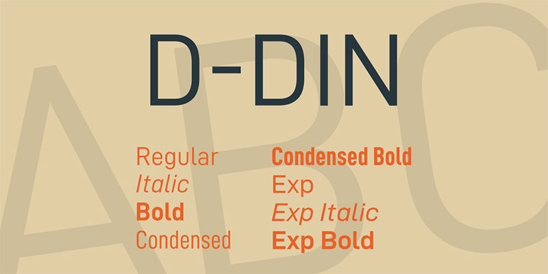
Although the different DIN fonts were born as a technical solution for industrial writings, today they are fonts that go with Helvetica without problems. The basic characteristics of DIN 1451 are fine, straight lines, without details at the ends, and with the simplest possible curves. This makes them legible letters for any situation.
Thanks to these features, the different versions of DIN have earned a place in more casual jobs, such as web pages and traffic signs.
Bodoni – High contrast
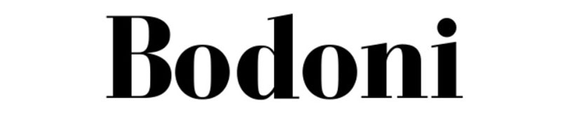
Although the original version of Bodoni dates back to 1798, it has undergone some adjustments to adapt it to the present. In this way, Bodoni is known as a letter of much contrast where we see constant transitions between thick and thin strokes.
In this case, Bodoni works best as the letter that will capture our attention, while Helvetica is used for the body of the text.
Georgia – A classic alternative
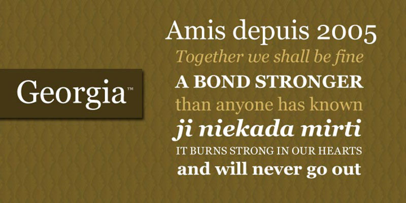
Like Helvetica, Georgia is one of the best-known Sans-Serif fonts in the world. Both share similarities that allow them to alternate between which is used for the titles and which for the text bodies. The main feature of Georgia is that the spacing between letters is wider than average, so there is no way we confuse words when reading.
Avenir – A look into the future
Inspired by Futura typography, Avenir is a French reinterpretation that adds more human details to the fonts. Avenir is a font that reflects human nature by using strokes of varying thicknesses, circles of different diameters, and fine ends.
Avenir contrasts sharply with what Helvetica offers, but this allows both to stand out on their own. Also, Avenir has an extended version that includes more than 50 styles to choose from, which broadens our range of options.
Open Sans – Perfect Impressions
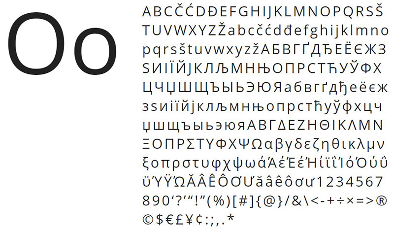
Designed by Steve Matteson, Open Sans is a very complete typeface offering 897 glyphs, including characters from CE Latin, Greek, ISO Latin 1 and Cyrillic. At the design level, Open Sans lives up to its name by providing letters with an open design, but always maintains its neutral style.
Due to the simplicity of its strokes, this typeface can be used without problems in different sizes, which makes it perfect for printing without neglecting its digital aspect.
Adelle – A flirty look

If we talk about fonts that go with Helvetica, we cannot forget the recently launched Adelle. Designed in 2009 for magazines and newspapers, this Serif typeface was modernized to be used on monitors without losing quality.
Additionally, it has seven different thicknesses, each with its corresponding italic version, all adapted for digital use.
Museo Sans – Adapts to any situation
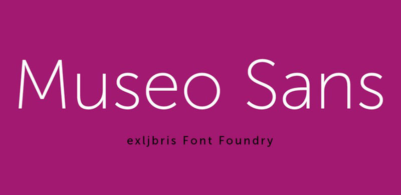
OpenType is the future due to the wide compatibility that this format offers. Museo Sans is one of the fonts that have this feature, which allows the font to adapt to different equations or user needs without losing proportions.
With regard to design, Museo Sans is a low contrast font with defined geometric shapes, which makes it ideal for digital media.
FF Tisa – A job worthy of a master’s degree
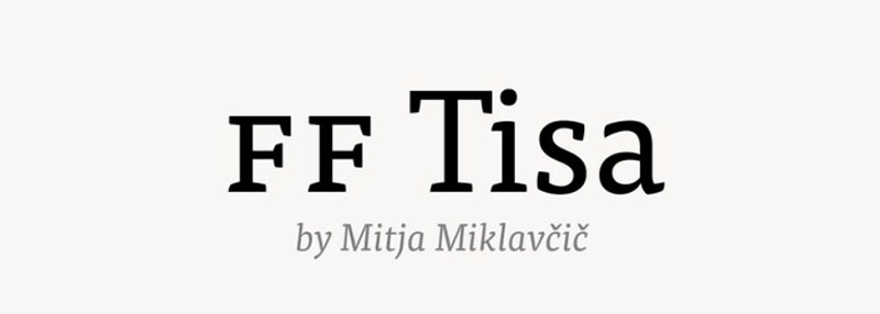
As part of the master’s degree of the designer MitjaMiklavčič, this typeface for large paragraphs was born. Due to the X-height larger than other letters, FF Tisa does not confuse the reader while watching the different sentences.
This font is specially designed for digital use and has seven different thicknesses (as usual, each with its corresponding italics).
Proxima Nova – For the new millennium
We are faced with a font that has been modernized in a surprising way. Originally known as Proxima Sans, the style catalog was expanded to 51 variants with OpenType support.
When we talk exclusively about the novelties of Proxima Nova, we find that it is subdivided into three thicknesses, each with 16 styles, so it is worth having it in our collection for any situation.
Lucida Grande – Large letters
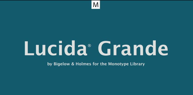
The name already gives us an idea of what Lucida Grande offers us: high-rise Sans-Serif letters. Not only are they tall, but they also have fine lines, and the space between letters has been reduced as much as possible so that we don’t have huge paragraphs.
The different options of Lucida Grande are perfect for all types of work, both physical and digital, since, in small sizes, you can still read it perfectly. Besides, it has a very complete catalog of glyphs, since it has 674 Latin, Greek and Cyrillic characters.
Visuelt – A personal design
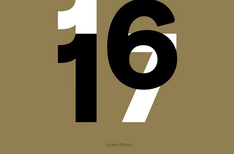
Although Visuelt was originally a custom request from a user who was looking for a simpler alternative to Apercu typography, it was updated to have a complete catalog of variants that made it a worthy commercial material.
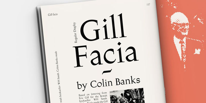
Gill Facia – Sharp letters
The main design feature of Gill Facia is the force that is applied to some strokes, which end up being so sharp that they can be confused with thick letters. Despite being created in 1932, it is still a pleasant option.
FrizQuadrata – Popular typography in culture
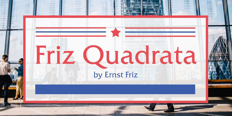
This is a whole family of fonts that go with Helvetica. Since its launch in 1965, the catalog of this font has been expanded with different variants, but all have maintained the characteristic features of being a serif letter with open bowls and flared style.
As an additional fact, FrizQuadrata is the typeface used by the bands Bad Religion and Black Flag, as well as being part of the title of the “Law & Order ” series.
Trade Gothic – A different letter
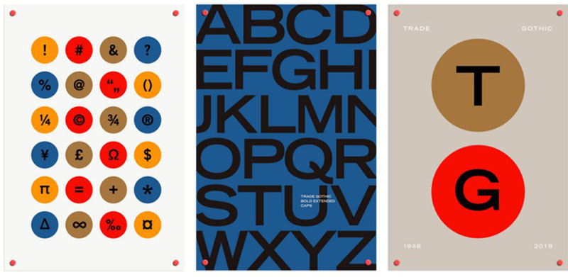
The last family of fonts that go with Helvetica is the famous Trade Gothic. Although it is a typeface that does not seem to combine very well with a Sans Serif, this disharmony makes it perfect for headlines and parts of the text that you want to highlight.
Its natural style, in addition to its more condensed version, makes it the ideal choice of newspapers and magazines.
FAQ about fonts that go with Helvetica
What are some good alternatives to Helvetica?
Well, if you’re looking for a change from Helvetica, there are a few fantastic alternatives! Some of these include Arial, which is pretty similar, Futura for a more geometric style, and Avenir, which has a more humanist touch. You can also check out Open Sans, Akzidenz-Grotesk, and Univers for other options. Each has its own distinct vibe, but they all complement Helvetica nicely!
Can I mix Helvetica with serif fonts?
Absolutely! Mixing Helvetica with a serif font can create a striking contrast that’s quite appealing. Fonts like Georgia, Garamond, and Baskerville work well with Helvetica, as they offer a more traditional feel that contrasts with the clean lines of Helvetica. Combining these fonts can provide a balanced and visually engaging design.
What’s the best font size when using Helvetica?
There’s no one-size-fits-all answer to this one, as it depends on the context and purpose of your design. For body text, 10-12 pt font size is generally a good range. However, for headlines or larger displays, you might want to bump it up to 18-24 pt or even higher. Keep in mind that legibility is key, so make sure your chosen font size is easily readable!
How can I use Helvetica effectively in my design?
To use Helvetica effectively, consider these pointers: Keep it simple, as Helvetica shines in clean, minimalist designs; don’t use too many different font weights, as it can make your design look cluttered; and use ample white space to let the font breathe. Keep in mind that Helvetica is a versatile font and can be used in a variety of situations, from professional documents to creative designs!
Are there any free alternatives to Helvetica?
Yes, indeed! There are some free alternatives that mimic the look and feel of Helvetica. One of the most popular ones is Nimbus Sans, which has a similar appearance. Additionally, you can check out fonts like TeX Gyre Heros and Arimo, which are also free and bear resemblance to Helvetica.
What are the main differences between Helvetica and Arial?
While Helvetica and Arial might look quite similar at first glance, there are some subtle differences. Helvetica has more variations in stroke thickness, making it feel more polished and refined. Additionally, Helvetica’s letters have tighter spacing, giving it a denser look. Arial, on the other hand, has more uniform strokes and looser letter spacing. That said, both are highly versatile and can be used interchangeably in most situations.
Can I use Helvetica for both print and digital design?
Definitely! Helvetica is a versatile font that looks great in both print and digital formats. It’s legible and has a clean, modern appearance, making it suitable for a wide range of applications. Just make sure to adjust the font size and letter spacing accordingly to ensure maximum readability across different mediums.
Is Helvetica a good choice for logos?
Helvetica is an excellent choice for logos, as its clean and modern look lends itself well to a variety of brand identities. Many famous companies, like 3M, American Apparel, and Lufthansa, have used Helvetica in their logos. When designing a logo with Helvetica, be mindful of the weight, size, and spacing to ensure your logo is unique and stands out.
What’s the difference between Helvetica and Helvetica Neue?
Helvetica Neue is an updated version of the original Helvetica font. It was introduced in 1983 and features a wider range of weights and variations. Helvetica Neue also has improved legibility, with better kerning and letter-spacing adjustments. While the differences might be subtle to the untrained eye, designers often prefer Helvetica Neue for its increased versatility and improved appearance.
How can I make Helvetica stand out in my design?
To make Helvetica stand out, you can try a few different approaches. Experiment with font weights, such as bold or italic, to create emphasis. You could also play with color and contrast, using vibrant shades or contrasting colors to draw attention to the text. Additionally, consider using typography hierarchy, adjusting font sizes to emphasize certain parts of your design. Lastly, don’t forget about whitespace; giving your text room to breathe can make a significant impact!
Ending thoughts on fonts that go with Helvetica
Our deep dive into the world of fonts that go with Helvetica is now complete. 🎉
I hope this exploration of fonts that go with Helvetica has sparked your creativity and given you some fantastic ideas for your design projects. And hey, if you ever need a little inspiration or a refresher, just come on back and check out this article.
Just like with any design element, the key to success is experimentation. Try out different font combinations, play around with weights and styles, and most importantly, have fun! 🎨
Remember, the world of typography is vast, and there’s always something new to discover. So, don’t be afraid to mix things up and create your own unique pairings. It’s your time to shine.
If you enjoyed reading this article about fonts that go with Helvetica, you should read these as well:
- Arabic Fonts: 60+ Fonts Available For Download
- Hipster fonts to use in your modern and cool designs
- Get a newspaper mockup from this handpicked list (Free and Premium)
- Gold Texture Examples (38 Golden Backgrounds)
Bogdan Sandu, a seasoned designer with 15 years of diverse experience, has been designing websites since 2008.
Renowned for his expertise in logo design and visual branding, Bogdan has developed a multitude of logos for various clients.
His skills extend to creating posters, vector illustrations, business cards, and brochures. Additionally, Bogdan's UI kits were featured on marketplaces like Visual Hierarchy and UI8.
Latest posts by Bogdan Sandu (see all)
- Earth Color Palettes Grounded in Nature: 40 Examples - 26 April 2024
- The EA Logo History, Colors, Font, And Meaning - 25 April 2024
- Nature Color Palettes Inspired by the Outdoors - 25 April 2024