The Best Charity Website Design Examples of the Year
Imagine a digital landscape where every click nurtures compassion and support. This is the potential of well-crafted charity website design examples—where aesthetics meet functionality to amplify philanthropic efforts.
In today’s digital era, a nonprofit’s online presence can be the cornerstone of its fundraising and outreach efforts. The nuances of user-friendly designs for nonprofits aren’t just about looking good; they serve a pivotal role in engaging visitors, building trust, and securing donations.
Through this article, I will unveil the layers of effective fundraising layouts and digital strategies that transform visitor interactions into real-world impacts.
Dive deep into the art and science behind engaging charity site features, from storytelling visual design nonprofits to donation system integrations and mobile-responsive nonprofit websites.
Whether you’re looking to revamp your existing site or starting from scratch, you’ll walk away with actionable insights to enhance your charity’s digital footprint and boost charity donations online.
Charity Website Design Examples
HAPI 128

Meet 128. It’s not just a number; it’s a sleek fundraising template perfect for nonprofits. Designed for donations, foundations, and all things charity, it’s got everything from a snazzy homepage to pages like “Our Mission” and “Causes.” And guess what? You can even pick from three different layouts for the “About Us” and “Contact” pages. Talk about options!
FRIENDS OF FRIENDLESS CHURCHES

Okay, this one’s a gem. It’s a WordPress charity website for a group that’s all about saving places of worship in England & Wales. The design? On point. They’ve played with colors in a way that makes you stop and stare. That contrast between the white and black? Pure genius.
OFF THE RECORD – SOUTH

This one’s all heart. Off the Record supports young folks with their mental health, helping them shine bright. The website? Just as bright. It’s got this vibrant color scheme, and all the must-know info is right there, front and center.
ON THE EDGE

Alright, this one’s for the endangered species out there. It’s bold, it’s colorful, and it’s got this super cool newsreel that just keeps on scrolling. Plus, the images? They’ll tug at your heartstrings. And there’s interactive stuff that dives deep into the charity’s mission.
JAI DOG RESCUE

Last but not least, here’s a website that’s all about our furry friends in Thailand. It’s fun, it’s fresh, and it’s got this clean design that’s a breeze to navigate. The fonts? The colors? Everything’s been chosen to make you smile. And if you’re multilingual, they’ve got you covered with multiple language options.
CHARITY: WATER

So, Charity: water? They’re all about getting clean water to folks who really need it. Their design? Clean, just like the water they’re providing. Those photos they’ve got? Totally heart-tugging. They make you wanna jump in and help out. And if you’re feeling generous, their homepage has this super easy donate button. Click, choose your amount, and boom – you’re making a difference. Plus, their site’s layout? Neat and tidy, from top to bottom.
RAF CENTRAL FUND

RAF Central Fund? They’re the real MVPs for the RAF crew. They’re all about helping RAF folks get active and sporty. And a little tip from them? Investing in some top-notch photos can really amp up your website’s feels.
ABLE CHILD AFRICA

These guys are the champs for kiddos with disabilities in Africa. Their site? Super user-friendly. The design vibes? Fresh and modern. They’ve got this mix of words and pics that tell you all about the awesome stuff they’re doing. And the best part? They use data and videos to really bring their mission to life.
STERLING CHARITY DONATION

Sterling’s site is all about adaptability. It’s like a chameleon, looking good on any device. And guess what? It plays nice with some of the cool tools out there, like Google maps and Elementor.
TREE AID

Tree Aid? They’re the masters of using all the digital tools. Their site is a blend of cool videos, striking pics, and some nifty animations. It’s like they’re telling you a story, and by the end, you’re reaching for your wallet to chip in.
BE ONE PERCENT

Last up, Be One Percent. Their mantra? Give a tiny bit of your cash to make a massive difference. Their site’s design is a masterclass in simplicity. It’s all about their mission, and they make it super easy for you to join in. If you’re looking for some inspo for your charity site, this one’s a keeper.
ACUMEN FUND

Acumen Fund? They started with a dream. Their motto? “Changing the Way the World Tackles Poverty.” Boom. Right there, you know they mean business. Their site makes it super easy to donate, with two big ol’ buttons right up front. And the way they break down their mission? Crystal clear.
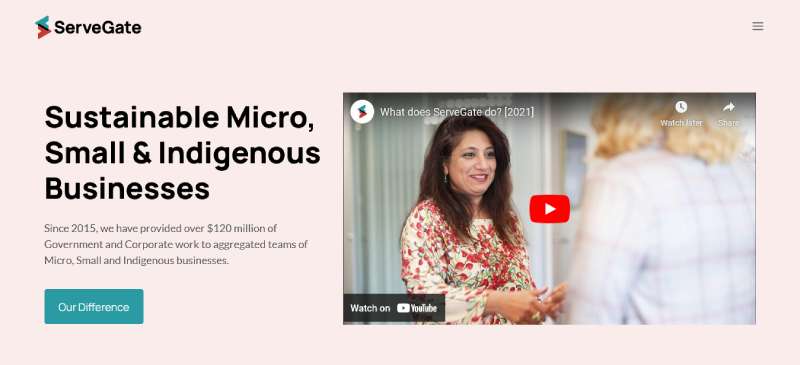
SERVEGATE
ServeGate? They’re this nonprofit from Down Under. Their site? Sleek, modern, and totally minimalistic. It’s like a breath of fresh air. The colors? Soft and inviting. It’s like they’re whispering, “Hey, come learn more about us.”
WILD AT HEART FOUNDATION

Wild at Heart? They’re all about our furry friends. Their site? A total game-changer. The pics? They tug right at your heartstrings. And the way they’ve used their space? Totally out of the box. They’ve got all the essentials, like CTAs, but they’ve jazzed them up in their own unique style.
SURFERS AGAINST SEWAGE

These guys? Ocean heroes. They’re on a mission to keep UK’s waves, oceans, and beaches clean. One look at their site, and you know they’re all about that blue life. It’s like the ocean vibes are jumping right off the screen.
CURE INTERNATIONAL

Alright, so CURE International? They’re the real MVPs. They’re out here, fixing up kiddos with disabilities in places that really need the help. Their site? It’s like a digital masterpiece. It’s got all the techy stuff – HTML, CSS, and a sprinkle of jQuery. And the cherry on top? It’s powered by WordPress. Oh, and if you’re feeling all warm and fuzzy, you can shoot a get-well message to the little warriors right from the site.
QE2 ACTIVITY

QE2 Activity Centre? They’re all about action. Their site? It’s like a mirror, reflecting all the epic stuff they do. It’s not just a site; it’s a digital showcase of their awesomeness.
TOGETHER FOR ANIMALS

These folks? Animal heroes. They’re pooling funds for five big-deal charities. And their site? It’s like a masterclass in pulling heartstrings. One look at that pic, and you’re all in. The layout? Super smooth. It guides you, tells you their story, and by the end, you’re reaching for that donate button.
KAVLIFONDET

Kavli Trust? They’re the good guys. They make money and then? They give it all away. To charities, research, culture – you name it. Their site’s got this cool header with all the social media buttons, so you can stalk – I mean, follow them everywhere.
FAQ On Charity Website Design Examples
What features are essential for a charity website design?
Accessibility and user-friendliness lead the charge. Every charity website must be accessible to all users, including those with disabilities.
Mobile responsiveness and easy navigation ensure that visitors can effortlessly access information and make donations, boosting online charity donations.
How can a charity website best encourage donations?
Strategic placement of donation buttons and clear call-to-action prompts are critical. Storytelling visual designs that convey the impact of donations create emotional engagements, compelling visitors to contribute.
Integration of secure donation systems assures donors of their privacy and security, enhancing trust.
What are the best practices for optimizing charity website content?
SEO strategies tailored for nonprofit organizations are crucial. Implement Keyword-rich headings and quality content that address common queries related to the charity’s mission.
Utilizing meta tags and descriptive ALT texts for images can significantly enhance visibility and user engagement.
What role does mobile responsiveness play in charity website design?
In today’s digital landscape, mobile responsiveness is non-negotiable. A mobile-optimized website ensures that users have a seamless experience on their devices, vital for increasing accessibility and potentially boosting donation rates due to the ease of use across different platforms.
How important is visual design in charity websites?
Visual design sets the first impression. Emotionally engaging designs draw visitors in, while a clear, coherent visual structure guides them seamlessly through the site.
Effective visual storytelling can powerfully convey the charity’s mission and impact, fostering engagement and support.
How can we build trust through charity website design?
Transparency features like detailed reports on spending and successes help build trust. Implementing a robust About Us page and displaying endorsements or partner organizations also substantial trust signals.
Security features for donation processes are compulsory to safeguard donor information.
Are there specific colors that work best for charity websites?
Colors evoke emotions and responses. Soft blues and greens often instill calm and trust, making them popular choices.
However, the best color scheme depends highly on the charity’s branding and the emotions they wish to evoke. Consistency with offline branding is key.
How can social media be integrated into charity websites?
Social media integration should facilitate easy sharing of content and events. Include social media buttons prominently on the homepage and within articles.
Encourage users to follow the charity’s accounts for updates, broadening the scope of engagement and community building online.
What is the importance of user-generated content on charity websites?
User-generated content such as testimonials, donor stories, and volunteer experiences enrich the website’s content.
They provide authenticity and personal perspectives that resonate with new visitors. Encourage community members to share their stories to boost engagement and credibility.
How frequently should a charity website be updated?
Regular updates are crucial to keep the content fresh and relevant. Updating the site with upcoming events, recent achievements, and blog posts keeps supporters informed and engaged.
Regular maintenance and updates reflect an active and evolving organization, encouraging repeated visits and ongoing support.
Conclusion
In wrapping up, exploring various charity website design examples offers invaluable insights into how effectively digital tools can be employed to advocate and fundraise for noble causes. Crafting a website that portrays a clear, emotionally engaging, and impactful story, while ensuring it is visually appealing and user-friendly, accelerates engagement and support. It is crucial that these platforms encapsulate the essence of the charity and communicate its mission seamlessly.
Key takeaways include:
- Prioritizing mobile responsiveness and user experience.
- Emphasizing the importance of secure online giving portals.
- Leveraging digital marketing to enhance visibility.
Remember, each design choice, from color schemes to the layout, plays a pivotal role in donor interactions and engagement levels. A strategically designed charity website is not just a tool; it’s a bridge connecting donors and volunteers directly to the cause and its ongoing success. Moving forward, let these examples inspire and guide your creations, amplifying the impact of each cause in the digital realm.
If you liked this article about charity website design, you should check out this article about VR websites.
There are also similar articles discussing bakery websites, manufacturing websites, surfing websites, and plumber website design.
And let’s not forget about articles on artsy websites, dietitian websites, kindergarten websites, and wellness websites.
Bogdan Sandu, a seasoned designer with 15 years of diverse experience, has been designing websites since 2008.
Renowned for his expertise in logo design and visual branding, Bogdan has developed a multitude of logos for various clients.
His skills extend to creating posters, vector illustrations, business cards, and brochures. Additionally, Bogdan's UI kits were featured on marketplaces like Visual Hierarchy and UI8.
Latest posts by Bogdan Sandu (see all)
- Why Visual Data is Good for Business - 14 June 2024
- Superhero Logos Examples: Emblems of Power - 14 June 2024
- Unique and Bold Magenta Color Palettes - 14 June 2024