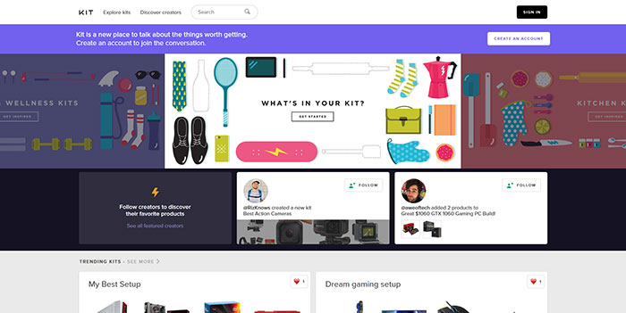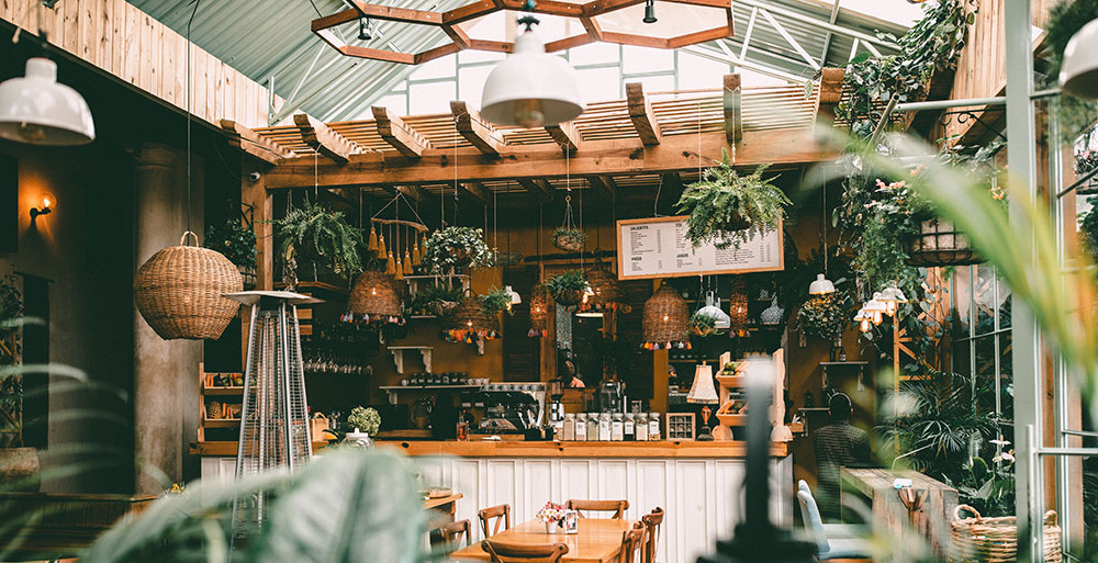
Cafe website design examples are basically a study reference: real, published cafe and coffee shop sites that show how an actual business laid out its homepage, priced its menu, and got people from looking to ordering.
Owners look at them before hiring anyone. Freelancers and small agencies do too, usually comparing layout and color choices against a few competitors already live in the same market.
The United States counted more than 45,000 coffee shops in 2025, according to Statista. That’s a lot of shops fighting for attention with whatever design budget is left after rent and equipment.
What Is Cafe Website Design
The phrase covers more than the menu page. It’s the whole site: the homepage, the ordering flow, the photography, the little branding touches that carry from one screen to the next.
It falls under the wider umbrella of web design, though the job here is narrower and arguably harder. A cafe site has to sell a feeling, the smell of espresso, a corner table on a rainy morning, through nothing but a screen.
Compare that to a full restaurant site, which usually needs table reservations, a longer course-based menu, sometimes a private events page too. A cafe rarely needs any of that.
A handful of things tend to show up on every site worth calling an example:
- A homepage that opens with a hero image or a short hero video
- A menu page in one of a few standard formats
- Some kind of ordering or reservation path, even a basic one
- Location, hours, and contact info placed where people actually look for it
Most designers study existing coffee shop sites rather than start from a blank canvas. The pattern’s already been tested thousands of times, so why guess.
What Makes a Cafe Website Design Effective
An effective cafe site gets a visitor to the menu or the order button within a few seconds of landing on the page. That’s really the whole test.
Everything else, the photography, the color scheme, whatever animation someone talked the owner into, either supports that goal or gets in its way.
Visual Hierarchy and Whitespace
The eye needs a clear path across a homepage. Five things competing for attention at once just means nobody looks at any of them.
Good visual hierarchy puts the hero image first, the call-to-action button second, the menu link third. Simple, but a lot of sites still get the order wrong.
A few mistakes keep showing up on cafe sites specifically. Equal-sized buttons that compete for the same click. A navigation bar crammed with more than six links because nobody wanted to cut anything. Text set directly over busy food photography with no overlay, so it’s unreadable half the time.
Generous white space around the hero section and menu items keeps things from feeling cluttered on smaller screens. A cafe running a short, tight menu can get away with tighter spacing than one juggling breakfast, lunch, and a full pastry case.
Mobile Responsiveness and Page Speed
Google treats a Largest Contentful Paint under 2.5 seconds as a good score, one of the three Core Web Vitals used in ranking (Google, via DebugBear documentation). Over 60% of restaurant orders are now placed through mobile apps, per Restroworks’ 2025 analysis of restaurant mobile app usage. Yelp reported a 15% increase in conversion rates after speeding up how fast its pages loaded and became interactive, according to a Conductor case study.
Most people looking up a cafe are standing nearby, phone in hand, trying to decide where to get coffee right now, not later.
A site that looks great on a laptop but takes ten seconds to load over a spotty phone connection loses exactly the customer it was built to catch. Compressing hero images helps. So does cutting back on third-party scripts. Running the page through Google PageSpeed Insights before launch catches most of what’s left, early enough to fix it cheaply.
Homepage Layout Patterns in Cafe Website Design
A cafe homepage really only has one job: keep someone around long enough to find the order button.
Hero Section Variations

That opening block acts as the focal point of the whole page, so it carries more design weight than anything sitting below it.
Most cafe homepages open with one big image, one strong photograph of a drink, a pastry, maybe the room itself, paired with a short headline and a single button. That’s the safe, common choice, and it’s popular for a reason: it loads fast and rarely looks bad.
Video is the other route. A short looping clip of steam curling off a cup, or a barista working the espresso machine, is heavier to load but a lot harder to scroll past without pausing. Larger chains with an in-house production team lean on motion more often, mostly because the extra file weight matters less when the hosting setup can handle it.
Blue Bottle Coffee takes a different tack altogether: a rotating, multi-slide promotional carousel cycling through current releases and offers, each slide carrying its own short line of copy and a button.
Navigation and Above-the-Fold Priorities

Above the fold on a cafe homepage means whatever loads before someone scrolls. It needs to answer what the place serves, whether it’s open right now, and how to order or get there, all without making anyone click.
Many cafe sites also use a grid layout further down the homepage to show off pastry cases or interior shots in a tidy row.
Stumptown Coffee gives location details their own dedicated link in the main navigation, labeled simply “Locations,” so that detail never gets buried under menu items.
Sticky navigation, the kind that stays visible while scrolling, keeps the order button within reach on longer pages.
Menu Presentation Formats on Cafe Websites
Menus end up online in a handful of different formats, and the one a cafe picks says something about how often they’re willing to update it.
PDF menu. It matches the printed menu exactly and is simple to produce or update between print runs. The tradeoff shows up on phones: pinching and zooming to read a PDF gets old fast, and screen readers can’t parse it at all, which creates a real accessibility gap.
Interactive on-page menu. This renders cleanly on any screen size and supports search, filtering, direct links to individual items. It just takes longer to set up inside the website builder, and prices have to be updated on the site itself rather than swapping out a PDF.
Visual grid menu. Pairing each item with a photo does more for appetite appeal than plain text ever will, and it works well for a short, curated list. Push it too far, though, and a long menu with lots of variations gets awkward fast, and uncompressed photo files add real page weight.
Menu photography for the grid format is almost always saved as a JPEG, since it compresses well without losing much detail. Cafes without an in-house photographer often start with stock images from a library like Unsplash before commissioning something original later.
Blue Bottle Coffee pairs each coffee listing with a flavor and roast profile rather than just a name and a price, which puts it closer to a grid catalog than a plain list.
Online Ordering and Reservation Integration
A cafe website earns its keep when the order button actually gets used, not just admired.
Most cafes wire up one of a few paths for actual ordering: a native cart built into the site, a POS-linked system like Square or Toast, or a dedicated app such as ChowNow.
| Platform | Pricing Model | Commission | Best Fit |
|---|---|---|---|
| Square Online Ordering | Free plan available, plus card processing | No per-order commission | Small independent cafes starting out |
| Toast Online Ordering | Flat monthly add-on fee | No per-order commission | Cafes already running Toast POS |
| ChowNow | Flat monthly fee, separate tablet | No per-order commission | Cafes wanting a dedicated ordering app |
| Third-party marketplaces | No monthly fee | 15% to 30% per order | Cafes prioritizing discovery over margin |
The gap between that bottom row and the rest of the table is basically the whole argument for owning an ordering system instead of renting one from a marketplace.
Card payments on a native cart usually route through a processor like Stripe, or whatever payment stack is built into Square itself.
Starbucks reported that mobile order and pay made up 31% of US company-operated transactions in its fiscal first quarter of 2024, the quarter ended December 31, 2023, according to the company’s own results.
That’s a chain with an app budget most independent cafes will never have. Still, the direction holds at a smaller scale too: a fast, simple order path pulls volume away from the counter line.
Reservations work differently. A cafe without table service rarely needs a booking widget like OpenTable at all, and a plain line stating that seating is first come, first served is honestly the more truthful design choice most of the time.
Cafes that do host events, private tastings, or the occasional reserved table tend to bolt on a simple native form rather than adopt a full restaurant booking platform.
Color Palette and Typography Choices in Cafe Website Design

Color and type carry more of the branding load on a cafe site than almost anything else, since there’s no physical room to back up the mood.
Warm, earthy palettes still dominate the category. Think terracotta, cream, muted browns that echo roasted beans and wood counters.
Newer, minimalist-leaning cafes are drifting toward monochrome palettes instead, or a single brand accent color against white or black. It reads closer to modern retail than a traditional coffee shop, and that shift looks like it’s only going to keep going.
Typography splits along similar lines. Heritage and artisanal cafes often reach for a serif font on headlines since it reads as established without trying too hard, while modern, minimal cafes lean on clean sans-serif type for headlines and body copy alike. Script fonts show up occasionally on logos, rarely in body text, mostly because they slow reading down. Google Fonts covers most of what a small cafe site needs without paying for a font license.
Contrast between text and background needs to clear the minimums set out in the WCAG accessibility guidelines, not just look good on a designer’s monitor. A pale gray headline over a cream background can look elegant in a portfolio shot and still fail plenty of real visitors squinting at a sunlit phone screen.
Which Website Builder Works Best for a Cafe
Wix remains the most widely used dedicated website builder overall, powering roughly 4.3% of all websites on the internet as of 2026, according to W3Techs.
Popularity isn’t the same thing as fit, though. The right builder depends on how much of the cafe’s business actually runs through the site itself.
| Builder | Strength | Watch Out For |
|---|---|---|
| Squarespace | Design-forward templates, low maintenance | Less flexible for custom ordering flows |
| Wix | Large template library, strong mobile performance | Can feel bloated on older devices |
| WordPress | Full content and plugin control | Core Web Vitals pass rates lag behind builders like Wix |
| Webflow | Custom design without writing code | Steeper learning curve for non-designers |
| Shopify | Built for retail alongside the cafe, bags and merchandise | Overkill for a cafe with no product sales |
WordPress.org sites pass Core Web Vitals roughly 45 to 49% of the time on mobile, compared with roughly 75 to 80% for Wix, per CrUX field data compiled in the HTTP Archive’s Core Web Vitals Technology Report through 2026. Self-hosted WordPress sites usually need a caching layer or a CDN like Cloudflare just to close that gap.
That difference matters more for a cafe than for most small businesses, since so much cafe traffic shows up on a phone from a search made two minutes ago.
Squarespace or Wix make sense for a cafe that just needs a strong-looking site with a simple order link. WordPress fits an owner who wants full control and is willing to manage performance by hand. Shopify only earns its keep if beans, merchandise, or a subscription box are a real part of the business, not an afterthought.
How Much Does Cafe Website Design Cost
Cost tracks who builds the site, not which platform it runs on.
A DIY build on a website builder runs $10 to $99 per month, mostly just the platform subscription, per Leadpages’ 2026 pricing guide. A freelance designer typically charges $500 to $5,000 as a one-time project fee, according to the same 2026 guide. An agency build with custom ordering flows or a full brand system runs $5,000 to $30,000 or more, per Leadpages.
A cafe with one location and a short menu rarely needs the top end of that range. The extra spend at the agency tier usually buys strategy, copywriting, and photography direction, not just a nicer template.
There are ongoing costs too, and they’re easy to forget in the excitement of launch: domain registration (a small yearly fee), hosting or the builder’s own plan tier, a payment processor’s transaction fees once ordering goes live, and the occasional photography refresh as the menu changes.
Skipping that ongoing budget is the most common planning mistake around. A site that looks finished on launch day still needs upkeep a year later, whether anyone budgeted for it or not.
Best Cafe Website Design Examples to Study
Studying real sites beats staring at a blank template, since the same patterns keep showing up for a reason.
| Style | Signature Move | Best For |
|---|---|---|
| Minimalist and modern | One product or scene, almost no text | Small-batch roasters, single-location shops |
| Warm and heritage | Bold color, rich photography, brand story | Cafes leaning on history or craft |
| Ordering-first | Shop and subscribe links above the fold | Cafes that sell beans or merchandise online |
Designers hunting for more reference points often browse showcase sites like Awwwards, Behance, or Dribbble instead of working from memory alone.
Blank Slate Coffee + Kitchen

Wandering Goat Coffee Co.

Dishoom

Coffee Address

Coffeebar

Ceremony Coffee

Couvee

Café Lula

Coffee Cava

The Corner Table

When Cafe Website Design Does Not Work
A cafe site can look completely finished and still fail at its one job: turning a visitor into a customer.
Speed kills conversions before design ever gets a chance to. About 53% of mobile visitors abandon a site that takes longer than three seconds to load, a figure Google has cited in its own mobile research. A striking hero video means nothing if half the audience never sees it finish loading.
A polished site can still lose to a plain listing, too. Restaurants receive roughly 7 times more views on their Google Business Profile than on their own website, according to Restroworks’ 2025 restaurant search data. A cafe that spends its whole budget on the site while ignoring that listing is polishing the part fewer people actually see first.
Ordering integration mismatched to the in-house POS creates duplicate or missed tickets during a rush. A template built for a generic small business, with no room for hours or a menu link on the homepage, hurts local visibility from day one. Navigation designed for a portfolio rather than a transaction buries the order button under one too many menus.
None of this means design doesn’t matter. It means design without the plumbing behind it, speed, local listings, a visible order path, doesn’t hold up on its own for very long.
How to Build a Cafe Website Step by Step
The order below avoids the most common rebuild-it-twice mistake, picking a builder before there’s any content to put in it.
- Lock the brand basics first. Logo, color palette, and a short menu list, before touching any software.
- Shoot or source the core photography: the hero shot, a handful of menu items, one interior image.
- Pick the builder or platform based on whether online ordering needs to run through it directly.
- Build the homepage and menu page first, well ahead of secondary pages like an about page or careers page.
- Connect ordering and, if the cafe needs it, a simple reservation form.
- Test the whole flow on an actual phone, not just a resized browser window on a laptop.
- Publish, then link the site from the cafe’s Google Business Profile and any social profiles.
Square’s own setup documentation recommends confirming menu and payment settings before the online store goes live, not after the first order comes in.
Skipping straight to step three, choosing the builder, is the single most common reason cafes end up rebuilding the whole site within a year.
Common Mistakes in Cafe Website Design
Most cafe website problems trace back to a handful of repeatable mistakes, not bad taste.
| Mistake | Why It Hurts | Fix |
|---|---|---|
| Outdated hours or closed locations still listed | Visitors show up to a locked door | Review hours monthly, tie them to the Google Business Profile listing |
| Uncompressed photography | Slower load, higher bounce on mobile | Compress and resize images before upload |
| No clear call to action button above the fold | Visitors leave without ordering or saving the location | Put one obvious action in the hero section |
| Inconsistent color or type across pages | Weakens brand identity design and recognition | Set the palette and fonts once, reuse everywhere |
Roughly 70% of small business websites lack a clear call to action on the homepage, according to commonly cited website-usability research. That single missing element explains more lost orders than a dated color scheme ever will.
A cafe that fixes nothing else on this list but adds one obvious button to the homepage usually sees the fastest return of any change here.
FAQ on Cafe Website Design
Is Cafe Website Design Different From Restaurant Website Design
A cafe site skips the table reservations and multi-course menus a full restaurant site needs. It runs leaner: fewer pages, a shorter menu, a faster path to ordering, closer to a retail storefront than a dining room.
Should a Cafe Choose a Template or a Custom Design
A template suits a single-location cafe on a tight budget that needs to launch fast. A custom build pays off once branding, unusual navigation, or a specific ordering flow matters more than speed to launch.
What Tools Do Designers Use to Build Cafe Websites
Most cafe sites get built inside a website builder like Squarespace or Wix, styled with stock or original food photography, and typeset with Google Fonts. Figma or Canva usually handles the mockup stage before anything goes live.
How Long Does It Take to Design a Cafe Website
A template-based build on a website builder usually takes one to two weeks from content to launch. A custom design with an agency runs closer to four to eight weeks, depending on photography and menu revisions.
Does Cafe Website Design Affect Local Search Rankings
Page speed and mobile usability factor into Google’s ranking signals, so a slow or cluttered site can hold back local visibility. Structured data for hours and location, plus a linked Google Business Profile, matter just as much as how the site looks.
What Should You Fix First in Cafe Websites?
Speed and a visible order path come before color palette or photography polish, every time. A slow or confusing homepage loses a customer before the branding ever gets noticed.
Fix order changes the outcome more than styling does. Load speed and mobile rendering come first, a working order or reservation path comes second, typography and color and photography polish come after that.
That order trades a flashy hero video or animated menu for a foundation that actually works, even when the animation tests better in a design review.
Cafes moving from inspiration to execution usually settle a brand identity first, so color and type choices trace back to a name rather than a passing trend. Building that foundation starts with a practical guide on how to create a brand identity.

Renowned for his expertise in logo design and visual branding, Bogdan has developed a multitude of logos for various clients.
His skills extend to creating posters, vector illustrations, business cards, and brochures. Additionally, Bogdan's UI kits were featured on marketplaces like Visual Hierarchy and UI8.
He also wrote in the past years on sites like Design Your Way, WebDesignerDepot, WPDean, Designmodo, Speckyboy, Slider Revolution, and more.
- Black Metal Font Generator - 2 November 2026
- Best Cursor AI skills for web designers building responsive websites - 2 November 2026
- Designing One Flutter App for Phones, Tablets, Mac and Vision Pro - 30 October 2026

Bogdan Sandu is a seasoned designer who has been designing websites since 2008. Renowned for his expertise in logo design and visual branding, Bogdan has developed a multitude of logos for various clients. His skills extend to creating posters, vector illustrations, business cards, and brochures. Additionally, Bogdan's UI kits were featured on marketplaces like Visual Hierarchy and UI8. He also wrote in the past years on sites like Design Your Way, WebDesignerDepot, WPDean, Designmodo, Speckyboy, Slider Revolution, and more.
You Might Also Like