
Main Typography Tips for Designers

Being a graphic designer incorporates lots of tactics and skills. Apart from working with objects and their orientation on the layout, as well as colors and silhouettes, modern professionals are expected to have a thorough grasp of lettering and typography. The text appeal isn’t limited to traditional Arial, Calibri, or Times New Roman.
The road to mastery requires effort, but it is not obscure. If you truly desire to succeed in creating gorgeous graphic designs, checking and memorizing the rules of typography is a must-have step in your professional career and training. If you are ready to make your texts carry both functional and aesthetical senses, stay tuned!
Standard Approach
Since you work with texts, it is crucial to understand what is what. When it comes to fonts, it implies a group of letters of any language that are styled in a peculiar way. Apart from traditional features that any typeface can obtain (like bold, italic, and regular), the variety of curves, angles, and other line parameters influence the overall construction of those letters in a certain font. You won’t think Helvetica Light is the same as Arial Bold, will you?
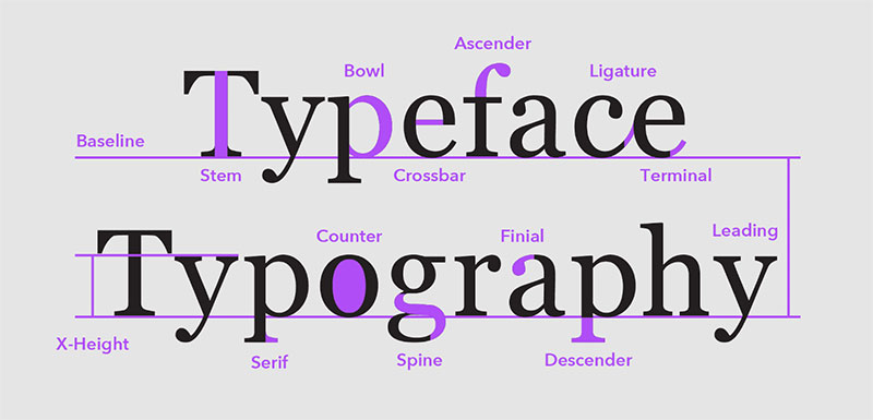
The size of text information is crucial as well. Monotonous papers are perceived like nothing more than blank spaces of a black-and-white design. One of the basic rules of typography is to make visual diversifications — several types of headings, body text varietals, and so on. The size and overall formatting of dedicated fonts and texts will also matter.
These rules of typography are something students commonly learn to get good grades at schools or other educational establishments. It is high time to level up. Keep on scrolling down the page!
How to Make Your Text More Advanced and Professional
When designers begin using text regularly, they realize there are various ways to express the same idea in an aesthetically distinct way. Let’s examine the fundamental principles of typography more closely to help you avoid the most typical rookie errors.
Three Is a Nice Number
If you are a beginning creator or if your objective is to merely organize the information on the page, it is not worthwhile to play with typefaces. Two styles are typically sufficient to meet all of your technical specifications. Additionally, you won’t fail by employing just one typography varietal and its multiple decorative elements.
Don’t Underestimate Traditional Fonts
Novice users commonly break the rules of typography by choosing too artistic typefaces. What’s the problem here? Pursuing aesthetical benefits, they frequently forget about the functional text performance — if a person can’t understand what is written because of improperly chosen typeface, it is an epic failure. To stay on the safe side, please prefer familiar fonts. If you would like them to shine with new brightness, the vector drawing app Amadine with its intuitive navigation and marvelous tools will come in handy.
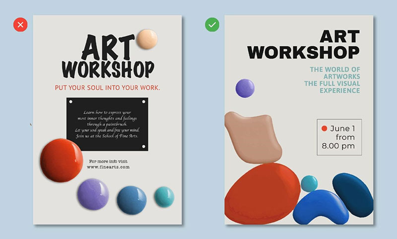
Don’t Forget About Contrasts
Even if you consider a few typefaces to meet your project goals, using contrastive tones will be a nice touch. Thanks to the vector design app Amadine, the juiciness of dedicated tones will remain the same for printed and digital materials.
Work on the Visual Structure
Your text hierarchy is extremely crucial. To improve the way your design delivers messages, please consider the following to stick to the rules of typography:
- Align the text to make any amount of words you have to style gorgeous and eye-catching. Whether it is justified, left, or center types, there are several cases of traditional solutions for particular tasks.
- Consider what line length will play the role the best. Visual text optimization is virtual, given how differently it is displayed on tablets, computers, or mobile phones.
- Don’t forget about dividing your text into paragraphs. The rule of thumb among other rules of typography is to dedicate one paragraph for one statement. Paragraph line heights vary, but choosing in the range from 120% to 170% should work out. Try to show the result to someone to check whether your taste predicates a comprehensive outcome. Being a fan or the rule of proximity will simplify the task.
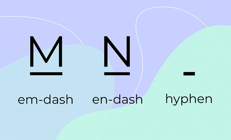
- One of the pitiest mistakes happens when novice designers just avoid important rules of grammar in styling their texts. There are canonic signs and features that should remain the same, regardless of the typeface — from the way some words and names are written to the right use of hyphen, en-dash, and em-dash.
- It is better to avoid caps lock and overcrowded design templates. Instead, do prefer free space and contrastive elements to highlight important thoughts and statements. In the vector design app Amadine, you will be able to apply these rules of typography without difficulty.
The Takeaway: Find Your Source of Inspiration and Guidance
All in all, theory and practice should go hand in hand. If you would like to apply the rules of typography and see the results here and now, the vector graphics app Amadine is the right decision. Not only does it include several templates for your typefaces, but it also shows off how its tools can be used to transform a single letter into a masterpiece — just take a look at the artwork gallery on the official page.
Being experimentative doesn’t reduce the need for clear and easily readable texts. Feel free to open your favorite all-inclusive graphic design and typography software and enter this magnificent universe of beautiful and meaningful lettering.
Bogdan Sandu, a seasoned designer with 15 years of diverse experience, has been designing websites since 2008.
Renowned for his expertise in logo design and visual branding, Bogdan has developed a multitude of logos for various clients.
His skills extend to creating posters, vector illustrations, business cards, and brochures. Additionally, Bogdan's UI kits were featured on marketplaces like Visual Hierarchy and UI8.
Latest posts by Bogdan Sandu (see all)