


Ever felt the electric charge of creativity zip through your veins? Picture the Thor logo, not just any emblem but a beacon of myth meets modern myth-making.
Here, in these scribbles, a fusion happens—a blend of thunderous Norse legends, immortalized Viking runes, clashing with the sleek Avengers emblem. It’s a dance of design, a graphic whisper of might and magic.
Navigate with me, the intricate crossroads where ancient Mjolnir symbolism carves its space in today’s cinematic universe.
From the god of thunder’s rhythm pulses a visual legacy, stamped across comics, screens, and the very fabric of pop culture. With every pixel and every line, the logo tells a tale taller than Asgard itself.
By the end of this read, unravel the logo’s lore, layer by electrifying layer.
Break down the choices that transform a simple graphic into a story-soaked powerhouse. This is the avatar of thunder, where every curve, color, and font choice amalgamates into a saga.
Dive deep. By article’s end, wield the know-how to craft iconic symbols that resonate through the ages. The thunder roars; let’s harness it.
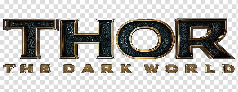
The Meaning Behind the Thor Logo

Insignia of Power
The Thor logo is like a roaring thunderstorm, a symbol of power and force. That’s right, it’s all about strength, thunder, and, well, being godlike. Thor, as we all know, is the Norse God of Thunder.
This logo captures that essence, that divine, majestic, thunderous power. It’s more than a simple visual – it’s a tale of might and magic, tucked into a sleek design.
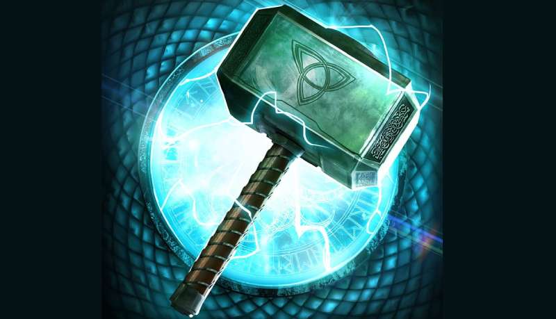
Iconic Hammer
Then, there’s the hammer – Mjolnir. That’s right, the weapon of choice for the mighty Thor. The hammer is a standout element in the logo, a symbol of Thor’s might.
The hammer is not just a tool; it’s an emblem of Thor‘s authority, his divine right. It’s been with him through countless battles, making it a key part of his identity.
The History of the Thor Logo
Origins in the Comics
Let’s travel back in time a little. The Thor logo was born in the creative minds at Marvel Comics. It all started when the character Thor was introduced to readers in Journey into Mystery #83 way back in 1962.
The logo has evolved, just like Thor himself, transforming over the years, taking on new forms, new shapes. Yet, it has always held on to its original essence – power, might, and divinity.
From Paper to the Big Screen
As Thor moved from comic books onto the big screen, his logo went through some serious transformations. The big Hollywood lights called for a more polished, more refined look.
And so, the logo was given a modern touch-up, but it never lost its roots. The hammer, the bold typeface – it’s all still there, paying homage to its origins.
The Colors of the Thor Logo
A Palette of Power
Colors speak volumes. And the Thor logo’s colors are shouting “power” at the top of their lungs. The most commonly used color scheme features the striking contrast of bold, metallic silver against a deep, dark background.
Shades of Mystery
The darker shades in the logo background set the mood, creating an atmosphere of mystery, of cosmic adventures waiting just beyond the horizon. It’s like looking into the depths of space, a nod to Thor’s extraterrestrial origins.
The Font Used in the Thor Logo

Bold and Majestic
Let’s talk about the font. It’s bold, it’s confident – it’s worthy of a God. The lettering in the Thor logo exudes power. The font used is strong, with sharp edges and a solid, block-like structure. It stands tall, just like Thor himself, representing his unwavering courage and strength.
A Touch of Norse
At a closer look, the font seems to have a touch of Norse influence. The sharp angles, the blocky design – it’s reminiscent of ancient runes, the script used by the Norse people. It’s a subtle nod to Thor’s roots, his Norse mythology origins.
The Thor Logo in Pop Culture
The Icon of a Hero
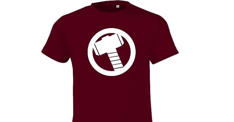

In the world of pop culture, the Thor logo is iconic. It’s seen on movie posters, comic books, and merchandise. From T-shirts to coffee mugs, the logo is everywhere, a symbol of a beloved hero.
Influence and Impact
The Thor logo is more than just a visual element; it’s a cultural icon. It has influenced design trends, inspired fan art, and has become a symbol of power and heroism in popular culture.
The Evolution of the Thor Logo
A Journey Through Time

Just like the mighty God of Thunder, the Thor logo has gone through an epic journey of evolution. From its early days in comic book panels to the shiny, 3D-rendered image we see in modern cinema, the logo has transformed while keeping its core elements intact.
Adaptation and Innovation
Throughout its evolution, the Thor logo has adapted to the visual language of its time. It has embraced innovation, whether it’s through the use of 3D effects, metallic textures, or detailed shadows and highlights, without ever losing its essence. It’s a great example of how design evolves, reflecting changes in technology and aesthetic trends.
Designing a Logo as Powerful as Thor’s
What We Can Learn
As designers, there’s a lot we can learn from the Thor logo. It’s a great example of how to capture the essence of a character or brand and translate it into a visual form. It shows us the power of symbolism, the importance of staying true to the roots, and the impact of bold and confident design.
The Importance of Evolution
The Thor logo also teaches us the importance of evolution in design. It’s crucial to keep the design updated and relevant, reflecting the changing times and trends, while keeping the core identity intact. A logo, just like Thor’s, should be able to stand the test of time, adapting and evolving, just as the brand or character does.
FAQ On The Thor Logo
What’s the significance behind the Thor logo?
The Thor logo is more than just visual flair. It’s rooted deep in Norse mythology, mirroring Mjolnir’s might, Thor’s enchanted hammer.
Symbolically, it marries old-world mystique with the modern heroism of the Marvel Universe. It’s not just a logo; it’s a nod to Asgardian heritage, thunder-powered and steeped in story.
Does the Thor logo draw inspiration from Viking symbols?
Absolutely. Think Viking runes and ancient scripts. These designs have been reimagined for the logo, transforming tales etched in stones to a symbol that’s bold and contemporary.
It is a creative remembrance, paying homage to Thor’s roots, wrapped up neatly in a comic book emblem that’s all about identity and impact.
How has the Thor logo evolved with the Marvel Cinematic Universe?
The logo’s journey mirrors the evolution of the Marvel Cinematic Universe (MCU) itself. Every flick, from the raw grit of “Thor” to the vibrant splashes in “Ragnarok,” it shifts, adapts.
It grows darker, then lighter, constantly reinventing the wheel—yet never losing that core, that god-of-thunder thunder god sigil punch.
Is the Thor logo consistent across all Marvel merchandise?
Branding, you see, it must adapt. The logo you spot on an Avengers poster isn’t a carbon copy of what’s on your t-shirt. Sure, the essence—that superhero branding—ties it all together. But nuances? They vary, tailor-fit for the medium, be it toys, apparel, or digital realms.
How important is the use of color in the Thor logo?
Color in the Thor logo isn’t just for show; it’s symbolic. Golds and silvers often thrown into the mix? They speak of Asgardian royalty. Reds highlight power; blacks deepen mystery. Every hue’s chosen with purpose, to stir something grand, echoing the might of Thunder itself.
What role does typography play in the Thor logo design?
Typography in the Thor logo is as crucial as a carefully chosen weapon. Sharp, rune-like typefaces are preferred.
They echo historical Norse vibes while keeping a foot firmly in the now. It’s about being readable yet resonant, striking a balance between heritage and Marvel Comics iconography.
Does the Thor logo appear differently in comics vs. movies?
Comics? They’re the OGs, where the Thor logo first flexed its muscles. In those pages, it’s bold, static. On the silver screen, it shapeshifts. Morphs with plot, setting, mood. Movie franchise logo design isn’t just an art; it’s a narrative device, versatile as Thor’s own journey.
What has been the fan reaction to changes in the Thor logo?
When the logo shifts, fans take notice. Some are all bravos, embracing change like a fresh coat of paint. Others? They’re more vocal, prefer the classics.
Point is, be it cheers or jeers, the logo ignites passion. It’s a superhero emblem that’s alive in the hearts of the Marvel faithful.
How does the Thor logo embody the character’s attributes?
Power. Honor. Nobility. The Thor logo embodies them all. It’s not just art, it’s a visual shout. It gives form to Thor’s ethos, wraps his essence in a banner that‘s all about valor and thunderous presence. In a symbol, one finds the spirit of the character.
Are there any hidden meanings in the Thor logo?
Hidden meanings, you ask? Well, look close. The strokes, the edges; they sometimes mimic Mjolnir‘s outline.
And those colors? They’re often reflective of Thor’s domain—like blues for the sky and silvers for storm clouds. Designers love an Easter egg; they stitch secrecy into plain sight.
Conclusion
In the dance of design where every stroke tells a story, the Thor logo stands monumental. It’s carved from a legacy. There’s thunder in its bones and history in every line.
- It connects Asgardian lore right to the pulse of our era’s digital heartbeat.
- It’s both an Avengers insignia and a runic mark from ages past.
- A tribute to Norse mythology, alive on screens and pages.
This symbol, with its unyielding curves and thunder god vigor, roots the character in our world’s visual lexicon. It’s an emblem that commands attention – an anchor of identity in the boundless sea of Marvel Comics mythology.
Bold. Magnetic. Unforgettable.
That’s the craft of a logo that goes beyond mere branding. It’s storytelling—Mjolnir held high, casting a shadow that’s both a marvel and a legacy. This design, the Thor logo, it’s not the end of a tale, but an ongoing saga of visual eloquence.
And it’s one everyone will remember.
If you liked this article about the Thor logo, you should check out this article about the Flash logo.
There are also similar articles discussing the Green Lantern logo, the Captain America logo, the Hawkeye logo, and the Black Widow logo.
And let’s not forget about articles on the Captain Marvel logo, the Wolverine logo, the Daredevil logo, and the Aquaman logo.