


When you spot the quintessential shield emblazoned with stars and stripes, a singular emblem leaps to mind: the Captain America logo.
More than just a superhero insignia, it’s a tapestry woven from threads of graphic design excellence, American patriotism, and the pulse of pop culture itself.
Dive in, and you’ll discover how this symbol stretches beyond the pages of “Captain America” comics and echoes through the halls of the Marvel Cinematic Universe—and how it catapults a mere movie premiere into an event partaken by millions.
This article peels back the layers behind the star-spanked shield, guiding you through the nuances of a brand identity that transcends.
From shield design to symbolic resonance, you’ll leave equipped with a profound appreciation for the artistry and impact of such a potent piece of iconography.
Prepare to decode the dimensions of a logo that defines heroism—serving as a beacon of valor that resonates through the fabric of comic book culture and the threads of Captain America merchandise.
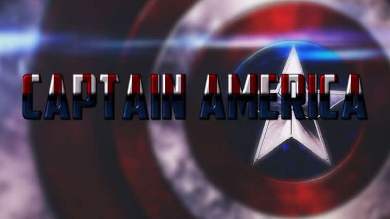
The Meaning Behind the Captain America Logo
![]()

This logo, friends, it’s not just a piece of artwork. No, no, it’s way more than that. It’s a symbol. A symbol of hope, justice, and unwavering spirit.
A Symbol of Hope
The Captain America logo, right at its core, it tells us about hope. The star in the center, surrounded by concentric circles, it’s like a beacon, a lighthouse even, guiding the way in the dark. It’s a message saying, “Hey, no matter how tough it gets, there’s always hope. Always.”
Justice Embodied
Then, there’s the justice angle. You see, Captain America, he’s not just a Super Soldier, he’s the embodiment of justice. That’s what the star represents. It’s like the North Star, guiding the lost, standing for truth and fairness.
The Unwavering Spirit
And lastly, the unwavering spirit. Just like Captain America himself, this logo doesn’t back down. It’s bold, it’s firm, it’s steady. The strong lines and solid colors, they’re saying “We’re here, we’re strong, and we’re not going anywhere.”
The History of the Captain America Logo
![]()

History, folks, is important. It’s what shapes us. And the history of the Captain America logo? It’s as rich as it gets.
Origin Days
This logo, it didn’t just appear out of nowhere. It has its roots in the Golden Age of comic books. It first appeared in Captain America Comics #1, released way back in 1941. And you know what? It pretty much stayed the same ever since.
The Evolution
There were some changes, of course. But they were subtle. The star got a bit bigger, the circles became more defined. It was like the logo was growing, maturing, just like Captain America himself.
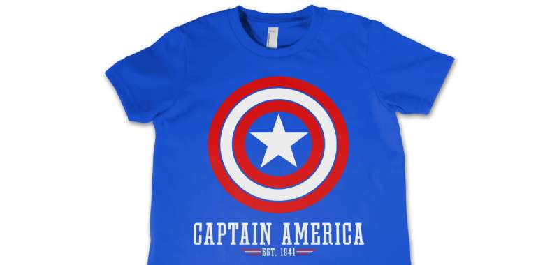
The Colors of the Captain America Logo

Ah, colors. They’re more than just hues, they’re messages, feelings, and emotions. And the colors of the Captain America logo? They’re as powerful as they get.
Red, White, and Blue
The colors of the logo, they’re the colors of the American flag. Red, white, and blue. They represent patriotism, they represent America. They’re a nod to Captain America’s origin, his purpose, his mission.
A Deeper Meaning
But they’re not just patriotic colors. Red stands for courage, for passion, for strength. White is for purity, for innocence, for integrity. And blue, blue is for vigilance, for perseverance, for justice. Every color in this logo, it has a deep, profound meaning.
The Font Used in the Captain America Logo

Typography, it’s an art. It’s not just about making words look good, it’s about making them feel good. And the font used in the Captain America logo? It’s a masterpiece.
Bold and Strong
The font, it’s bold, it’s strong. Just like Captain America himself. It’s not fancy, it’s not extravagant. It’s simple, it’s clear. It’s a message saying “Here I am, this is who I am.”
A Reflection of Character
Every letter, every curve, every line in this font, it reflects Captain America’s character. His strength, his determination, his will. It’s like the font is saying “I stand for justice, I stand for freedom, I stand for America.”
The Influence of the Captain America Logo
Ever thought about how much influence a logo can have? Well, the Captain America logo, it’s influenced so much. It’s everywhere, and it’s left its mark.
Influence on Pop Culture

First, there’s pop culture. Movies, TV shows, merchandise, you name it. Everywhere you look, there it is.
That star, those circles. It’s become a symbol, an icon. It’s influenced fashion, it’s influenced design. It’s even influenced other comic books and their logos.
Influence on Graphic Design
Then, there’s graphic design. This logo, it’s a classic. It’s a perfect example of how simplicity can be powerful. How strong lines, solid colors, and meaningful symbols can create a design that’s timeless. It’s influenced countless designers, it’s influenced countless logos.
The Impact of the Captain America Logo
And what about the impact? Oh, the impact is massive. This logo, it’s more than just a design. It’s a movement. It’s a statement.
Impact on Society
On one hand, there’s the societal impact. This logo, it’s inspired people. It’s given them hope, it’s given them strength. It’s a reminder of what we can achieve when we stand for justice, when we stand for freedom.
Impact on Individuals
On the other hand, there’s the personal impact. This logo, it’s touched hearts. It’s become a part of people’s lives. It’s on their clothes, it’s on their walls, it’s in their hearts. It’s a symbol that they carry with them, a symbol that they believe in.
So, there you have it. The Captain America logo, it’s not just a design. It’s a symbol. It’s a history. It’s a color scheme. It’s a font. It’s an influence. It’s an impact. It’s a masterpiece.
FAQ On The Captain America Logo
What’s the origin of the Captain America logo?
The logo hails from its 1941 debut in Marvel Comics’. It symbolically captures Steve Rogers’ transformation into Captain America, merging the American flag’s patriotic colors with a shield—a nod to both defense and American ideals.
Does the logo’s design hold any special meaning?
Absolutely. That shield isn’t just for show. It’s about protection, liberty, and the fight against tyranny. The colors speak volumes too—red, white, and blue, echoing the American flag, while that central star stands as a beacon of hope and unity.
Has the Captain America logo changed over the years?
It’s evolved, sure. From its comic book inception to its Hollywood glow-up in the MCU, tweaks were made. But the core—star-front center, red-white-and-blue—stays steadfast. It’s this consistency that’s kept it iconic.
Can you find hidden messages within the logo?
Hidden messages? More like an open book. The semiotics are bold—courage, freedom, heroism. The hidden part? Perhaps how deeply it’s embedded into American culture, shaping and mirroring societal values over decades.
Why is the logo predominantly a shield?
Well, that’s all about defense, right? Captain America stands for protecting ideals, for shielding the common good. That shield? It’s his commitment, his oath to safeguard everything the flag, and by extension, the logo itself represents.
What materials is Captain America’s shield made of in the comics?
In the realm of Marvel Comics, that’d be a vibranium-steel alloy mix—practically indestructible. Toss in a dash of fictional super-science and you’ve got yourself a shield as steadfast as the hero it signifies.
Who designed the Captain America logo?
Truth be told, it’s more nuanced than one person’s stroke of genius. Credit often goes to the character’s creators, Joe Simon and Jack Kirby. But the logo as we know it? It’s been shaped by countless artists over the years.
Why is the logo so popular in merchandising?
Marketing gold, this one. Superheroes sell, and with Captain America’s emblem, you’re not just donning a logo. You’re wrapping yourself in layers of heroic symbolism, graphic design excellence, and a whole legacy of Marvel myths.
How has the Captain America logo influenced popular culture?
Deeply. You’ll spot it in protest art, flying high in sports arenas, even stitched into fashion statements. It’s transcended Marvel branding, evolving into a symbol of ideals far beyond its comic book origins.
Is the Captain America logo trademarked?
You bet it is. Marvel’s legal eagles ensure that powerful symbol of superhero lore is well guarded. Makes sense, right? That logo’s a cornerstone of their brand identity, and they keep it close, like Cap’s shield in a fray.
Conclusion
Wrapping things up, we’ve journeyed around the iconic Captain America logo—how it reflects far more than just a striking visual on a superhero’s shield. It’s been stitched into the very fabric of our culture; it permeates our wardrobes, dashes across screens in Avengers flicks, and even tags along on mundane trips as part of our everyday gear.
We’ve seen how this emblem has held strong, grounded in its comic book roots while adapting to new tales and technologies. It’s more than a symbol; it’s a legacy embedded in the zeitgeist. Each curve of the star, each shade of red, white, and blue, fortifies a narrative of heroism and the undying spirit of a nation.
So the next time you catch a glimpse of that logo, remember the weight it carries—the history, the stories, the ideals. It’s a testament to the timeless nature of great design and the power of a symbol to inspire generations.
If you liked this article about the Captain America logo, you should check out this article about the Flash logo.
There are also similar articles discussing the Green Lantern logo, the Hawkeye logo, the Thor logo, and the Black Widow logo.
And let’s not forget about articles on the Captain Marvel logo, the Wolverine logo, the Daredevil logo, and the Aquaman logo.