


Imagine a single emblem capturing the essence of a hero shrouded in shadow yet embodying a beacon of hope.
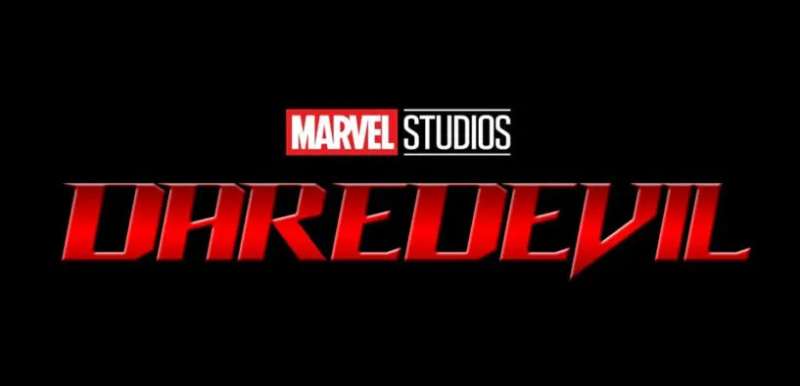
That’s the Daredevil logo: a symbol as complex and compelling as the blind vigilante it represents. Nestled within the gritty landscape of Hell’s Kitchen, this iconic design stands for justice in a city aching for a savior.
This article untangles the narrative threads woven into the logo’s fabric, charting its journey from Marvel Comics pages to the high-definition drama of the Netflix series.
As a visionary playing with pixels and palettes, I delve into the Daredevil motif’s anatomy, exploring how it mirrors Matt Murdock’s duality and his relentless fight against the city’s underbelly.
By the article’s end, you’ll grasp the power of visual identity, how superhero branding goes beyond mere aesthetics, and why a logo can be much more than a company’s or character’s badge—it’s the flag under which a whole fandom rallies.
Let’s swing from the skyscrapers of graphical mastery and land squarely on the bullseye that is the Daredevil insignia.
The Meaning Behind the Daredevil Logo

A Symbol of Vigilance
Peel your eyes, folks, ’cause we’re diving deep into the Daredevil logo. Ever notice how it’s got that raw, primal feel? That’s no accident, my friend.
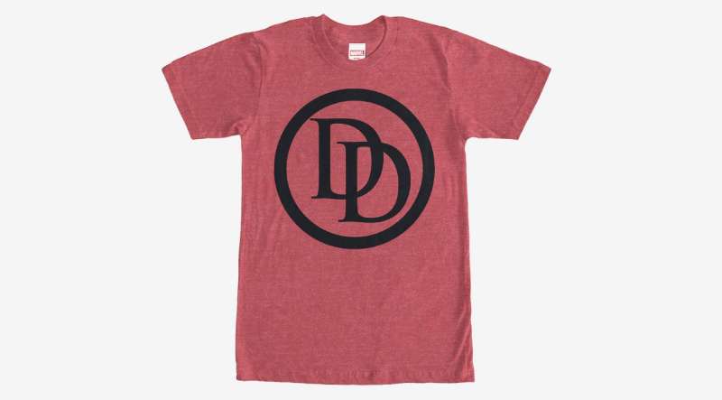
The logo’s main symbol, a double D, stands for Daredevil, our very own Man Without Fear. But it’s more than just initials. The way those Ds are angled, they’re like a pair of vigilant eyes, always on the watch, just like Daredevil himself.
Embracing the Darkness
But there’s more to the Daredevil logo than meets the eye. You see, Daredevil is a creature of the night. He’s not your bright, sunny, daytime superhero. He’s a guy who embraces the darkness, and that’s reflected in the logo.
The deep, dark background, the sharp, angular lines – they all speak to the darkness Daredevil embodies and the danger he faces every night.
The History of the Daredevil Logo

A Bold Beginning
Let’s travel back in time, shall we? When Daredevil first came on the scene, his logo was a bold, blocky affair. The double D was there, right from the start, but it was much simpler, much more basic.
It had that punchy, in-your-face style that was so popular in the ’60s. But as Daredevil evolved, so did his logo.
A Journey Towards Darkness
Over the years, the logo has grown darker, and more intense. It’s lost the bright colors and the blocky shapes of the ’60s, and it’s taken on a more mature, more dangerous feel.
It’s become a symbol of the night, of the danger Daredevil faces, and of his own inner darkness.
The Colors of the Daredevil Logo

A Palette of Danger
Colors tell a story, and the story of the logo is one of danger and darkness. The dominant color, a deep, rich red, speaks of danger and passion.
It’s the color of blood, of fire, of life and death. It’s a color that demands attention, that screams out “danger!” But there’s more to it than just red.
Shades of the Night
Look closer, and you’ll see shades of black and gray in the logo. These are the colors of the night, the world Daredevil inhabits.
They speak to the darkness Daredevil faces, the uncertainty, the unknown. Together with the red, they create a palette that is both dangerous and enticing.
The Font Used in the Daredevil Logo

Bold and Edgy
The font used in the Daredevil logo is a big part of its appeal. It’s bold, it’s edgy, it’s got that raw, gritty feel that fits Daredevil like a glove.
It’s a font that screams action, danger, and excitement. It’s not a font for the faint of heart. It’s a font for a hero who’s not afraid to face the darkness.
A Reflection of Character
Fonts tell a story, just like colors. And the font used in the Daredevil logo tells us a lot about Daredevil himself. It’s strong, it’s resilient, it’s a bit rough around the edges.
It’s a font that has seen things, that has been through the wringer, just like Daredevil. And it’s a font that keeps going, no matter what.
The Evolution of the Daredevil Logo
From Simple to Sophisticated
The logo has come a long way since its early days. It started out as a simple, straightforward design, but it’s evolved into a much more sophisticated symbol.
The changes in the logo reflect the changes in Daredevil himself – his growth as a character, and his increasing complexity. It’s been a fascinating journey, and the logo has been there every step of the way, changing, evolving, and growing with Daredevil.
A Glimpse into the Future
So what’s next for the logo? Only time will tell. But one thing’s for sure – it will continue to evolve, to change, to reflect the ongoing journey of Daredevil.
And whatever form it takes, it will always be a symbol of vigilance, of danger, of the darkness Daredevil faces and the strength he shows in facing it.
The Influence of the Daredevil Logo
In the World of Comic Book Design
The Daredevil logo has had a significant influence on the world of comic book design. Its bold, edgy style, its use of color and font, its evolution over time – all these elements have been studied and emulated by other designers. It’s become a kind of benchmark, a standard to strive for in comic book logo design.
Beyond the World of Comics

But the influence of the Daredevil logo goes beyond the world of comics. It’s become a part of popular culture, a symbol recognized by millions.
Its design has been used in merchandise, in advertising, in art. It’s become a symbol not just of Daredevil, but of the power of design to tell a story, to evoke emotion, to create a brand.
FAQ On The Daredevil Logo
What does the Daredevil logo represent?
The Daredevil logo is a visual shout-out to justice. You see, it’s not just about some superhero. It’s a beacon for doing the right thing, even when that means knocking heads in Hell’s Kitchen.
It’s Matt Murdock’s silent promise to protect his turf, emboldened in that memorable, striking “DD.”
Who designed the Daredevil logo?
Ever took a minute to consider who’s behind that slick double-D? It’s a muddled history, but the credit often swings between artists like the legend himself, Stan Lee, and the man with the pen, Bill Everett. Their creation? A bold insignia for our favorite blind vigilante.
Is the Daredevil logo trademarked?
You bet it’s under lock and key! Marvel Entertainment has that baby trademarked, which makes sense, right? It’s not just a symbol design, it’s a piece of a massive franchise puzzle. So yeah, slapping it on your homemade merch without permission? Bad idea.
Has the Daredevil logo ever changed?
Look at its history, and you’ll see that sure, this superhero emblem has seen updates. We’re talking tweaks to keep it fresh but always staying true to the iconic superhero logos vibe. Each redesign stays loyal to Matt Murdock, adding subtle modern twists.
What color is the Daredevil logo typically?
Red, folks. That deep, rich red that screams Daredevil. It’s like the guy’s own costume insignia, and it pops against his dark, night-stalking gear. It’s a color of warning, of stop-and-pay-attention—kinda perfect for a hero, don’t you think?
In which media has the Daredevil logo appeared?
Comics? Check. TV? You’ve seen it on Netflix. Movies? Been there too. Merchandise? It’s everywhere. The Daredevil emblem doesn’t shy away from the limelight, making appearances across all kinds of media.
Let’s not forget games and animated features, where this logo goes beyond its traditional terrain.
How can I use the Daredevil logo legally?
Wanna use this symbol without getting sued? Keep it personal or educational, and you might be fine. The moment you drift into making a buck off it, you’re in the deep end without your superhero branding floaties. Always check with the copyright laws, alright?
How does the Daredevil logo reflect the character’s values?
The logo’s simplicity is deceiving. It’s about justice and vigilante justice, yeah. But dive in, and you’ll see it’s more. It’s Murdock’s blindness turned into strength, those dual D’s reflecting his double life. The design’s elegance? It’s the law upholding the man.
Can the Daredevil logo be used in fan art?
Fan art, huh? Yeah, you’ll see Daredevil’s mark in loads of it. But remember, while fan art is usually chill, selling that stuff crosses over into risky business territory. Show your love, but don’t push it to where Marvel’s legal eagles take notice.
What makes the Daredevil logo iconic?
Timeless. That’s the word. It nails that pop culture symbol status by sticking to the basics. Two D’s that could stand for a dozen things, but rooted firmly in our hero’s soul. It’s simple, unforgettable, and dripping with Matt Murdock goodness. That’s iconic for you.
Conclusion
So, we’ve reached the end of this epic swing through the urban canyons to spotlight the Daredevil logo. There’s been a lot crammed into this little deep dive—history, design nuances, a smattering of legal know-how, and the cultural punch it packs.
Flipping through the visual identity of our guy Murdock, we can agree on something:
- It stands out. In a sea of complex and noisy graphics, it’s stark, it’s direct, it’s Daredevil.
- It unfolds layers deeper than Hell’s Kitchen itself. There’s symbolism, there’s blind justice, and there’s the relentless spirit. Must say, kinda like a good coffee blend.
- Whether it’s fan art or professional design, it’s clear, the logo is off-limits for commercial use without the nod from the bigwigs—it’s just the way the cookie crumbles in the world of trademark colors and superhero branding.
And here it is, the bow on top—next time you spot those twin D’s, maybe you’ll feel that little buzz of recognition, a nod to the complexity and artistry it stands for, right?
If you liked this article about the Daredevil logo, you should check out this article about the Flash logo.
There are also similar articles discussing the Green Lantern logo, the Captain America logo, the Hawkeye logo, and the Thor logo.
And let’s not forget about articles on the Black Widow logo, the Captain Marvel logo, the Wolverine logo, and the Aquaman logo.