


Picture this: a symbol, drenched in emerald radiance, that’s galvanized millions across the globe.
You’ve seen it emblazoned on tees, graffiti-ed on alleyways, and twinkling on screens—the Green Lantern logo stands as more than mere graphic. It’s a beacon of courage in a universe brimming with chaos and darkness.
In the realm of superhero lore, few insignias spark the imagination quite like the lantern. This isn’t just about a slick design; it’s about grippin’ onto the narrative tapestry that weaves together legendary guardians from a cosmos-wide corps. And here you are, diving headfirst into the crux of it all.
Unlock this article, and you’ll unravel the very threads of what makes a symbol immortal.
From Hal Jordan’s fearless flair to the fundamental lore atop Oa’s mighty peaks, we’re laser-focused on the how and why this logo’s design ignites fervor.
By the closing punctuation, expect to hold a treasure trove: decoding the visual symphony, connecting to untold merchandise narratives, and maybe even lightin’ up your own design spark. Ready to illuminate the dark? Let’s ride the light wave together.
The Meaning Behind the Green Lantern Logo

Let’s start off with the obvious – the logo ain’t just a fancy light show, right? It’s a symbol – a piece of the Green Lantern’s identity. So, what’s it mean?
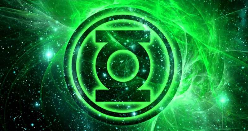
Well, the Green Lantern logo is basically a green circle with lines stretching out, almost like rays of light. It’s a lantern, yeah, but it’s more than that. It’s a symbol of willpower, courage, and the constant fight against fear.
The Green Lanterns, they’re all about fighting the good fight, staying strong, and never giving up. So, the logo? It’s a constant reminder of that.
Diving Deep into the Circle
Let’s take a closer look at the circle in the logo. It’s not just there for looks, you know. The circle, in symbolism, often represents wholeness, unity, and infinity.
For the Green Lanterns, this could mean their united front, their infinite will, or their complete dedication to their cause. Pretty deep, huh?
The History of the Green Lantern Logo
Once Upon a Time…
So, where did this logo come from? Who decided a green lantern was the way to go? Well, the logo’s been around almost as long as the Green Lantern himself.
The Hal Jordan character debuted in All-American Comics #16, way back in July 1940. The logo? It came with him, right there on his chest.
The Evolution of a Logo
But logos change, evolve, and get better with time, right? So did the Green Lantern logo. The initial one was a bit simpler, not as slick as the one we’re used to now.
Over the years, it got a bit of a makeover and became more streamlined, and more modern. But the essence? That stayed the same. The symbol of willpower, courage, unity, all that good stuff – it’s always been there.
The Colors of the Green Lantern Logo
Why So Green?
Okay, we get it – he’s the Green Lantern, so the logo’s green. But why green? Well, green’s the color of willpower in the Green Lantern universe.
It’s the force that powers the Green Lantern’s ring. So, the logo is green? It’s a nod to that – the source of the Green Lantern’s power.
Just One Shade? Nah…
![]()
But it’s not just one shade of green, you know. Over the years, the logo’s been shown in different shades, from bright neon greens to darker, more muted ones. This might reflect the different tones of the stories, the different eras, or just different artistic choices.
The Font Used in the Green Lantern Logo

Stylin’ and Profilin’
The font used in the logo is as iconic as the logo itself. It’s bold, it’s strong, it’s… well, it’s green. The letters are all uppercase, with sharp edges and corners, giving it a bit of an edgy, modern feel. It’s got that superhero vibe, you know?
Consistency is Key
One interesting thing to note is that the font has remained pretty consistent over the years. Despite the changes in the logo itself, the font has mostly stayed the same. Guess they found something they liked and stuck with it, huh?
The Impact of the Lantern Logo
Iconic? You Bet!

Let’s face it – the Lantern logo is iconic. It’s instantly recognizable, and it’s become synonymous with the character. You see that logo, you immediately think Green Lantern.
It’s been on comic book covers, merchandise, TV shows, movies – you name it. It’s a symbol that’s become embedded in pop culture.
Beyond the Pages
And it’s not just in the comic book world. The logo’s impact goes beyond that. It’s become a symbol for anyone who fights their fears, who never gives up, who stands up for what they believe in. That’s pretty powerful, don’t you think?
The Versatility of the Green Lantern Logo
One Size Fits All?
One of the great things about the Green Lantern logo is its versatility. It’s simple enough to be recognizable even when it’s small, yet it’s bold enough to stand out when it’s big. It can be used on anything – from tiny buttons to huge billboards – and it still works.
Adaptable? Check!

The logo’s also adaptable. It can be shown in different styles, different shades, and it still retains its essence. It can be modern, retro, minimalist, detailed – the possibilities are endless. And yet, no matter how it’s shown, it’s still unmistakably the Green Lantern logo.
The Influence of the Green Lantern Logo
Inspiration for the Rest
The Green Lantern logo has inspired many other logos in the comic book world. Its simplicity, its boldness, its symbolism – it’s all been a source of inspiration for other characters and series. It’s set a standard if you will.
Setting the Trend
And it’s not just about inspiration. The logo has also set trends in logo design. Its use of bold colors, strong lines, and simple shapes has influenced many designers.
It’s shown that a logo can be simple and yet powerful, bold and yet subtle. And that’s a lesson that’s been carried forward in many other designs.
So, there you have it. The Green Lantern logo – it’s not just a pretty picture. It’s a symbol, a history, a color scheme, a font, an impact, a versatility, an influence. It’s part of the Green Lantern’s identity, and it’s a part of ours too.
It’s a reminder of the power of will, the fight against fear, and the unity in our cause. It’s a beacon – a green beacon – that shines bright in the face of darkness. And that, my friend, is pretty awesome.
FAQ On The Green Lantern Logo
What’s the meaning behind the Green Lantern logo?
The Green Lantern logo, a symbol of the interstellar law enforcement group, the Green Lantern Corps, stands for willpower.
Each member’s ring, powered by will, can conjure up constructs limited only by the wearer’s imagination. It’s the sign of order, justice, and the fight against fear across the universe.
How has the Green Lantern logo evolved over time?
It’s gone through tweaks, but the core—a lantern against a green backdrop—stays classic. Artistic hands have streamlined it, made it bolder, yet that cosmic cop vibe? Yeah, that’s perennial.
Recently, it’s gotten sharper, echoing modern design while honoring the legacy of DC Comics’ rich history.
Is the Green Lantern logo the same for all the characters?
Similar? Sure. Identical? Nope. Hal Jordan’s emblem aligns with tradition, while Guy Gardner’s and John Stewart’s sport subtle variances, reflecting their individuality.
Kyle Rayner? Complete revamp at his debut. Reflects their unique approach to wielding the almighty power ring.
What does the Green Lantern logo represent in the fandom?
To fans, it’s akin to a sacred crest—superhero iconography at its finest. It’s a pledge—wear it, and you’re part of a community that values courage over fear. Merch, cosplay, even tattoos… fans rally under this banner.
Can I use the Green Lantern logo for my own projects?
Caution, friend! It’s protected by trademark laws. DC Comics? They hold the keys to that kingdom. Unauthorized use can land you in some hot, intergalactic water.
For personal, non-commercial stuff, you might slide under the radar, but selling or broadcasting? Best to get permission or aim for something original.
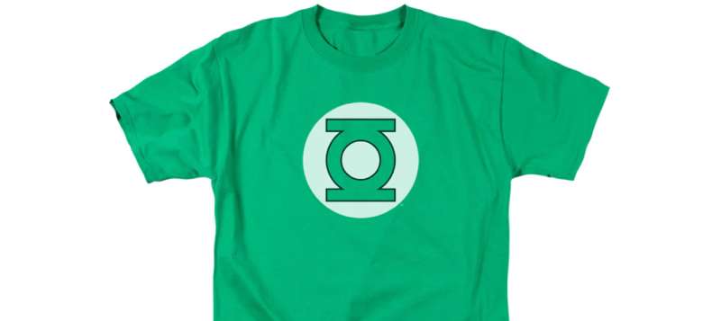
Where can I find official Green Lantern logo merchandise?
Official goodies? Dotted across comic book stores and retailers everywhere. Online? A safe bet like the comic book merchandise universe’s big players—think Amazon or DC’s own shop.
From superhero costume essentials to casual wear with a graphic punch, they’ve got you covered.
What symbolism is present in the Green Lantern logo?
This beacon o’ bravery? More than meets the eye. It mirrors the central power battery on Oa, the homeworld HQ of the Corps. Symbolizes endless possibility, the might of will over fear, connecting every member of the Green Lantern universe.
How is the Green Lantern logo used in the comic storyline?
It’s a heraldic motif, my friend. Shows up on ring-forged constructs, stamped across starships, and beyond. It’s not just branding; it’s integral to the narrative, adorns the justice league member emblem, and often signals the turning tides of an epic space opera.
Are there different colors associated with the Green Lantern logo?
Green’s in the name, but hues? There’s a spectrum. While emerald reigns for our ring-slinging pals, other Lantern Corps flaunt their colors—reds, yellows, blues, each a different emotional force. But for the Greenies? It’s all about that green and black logo magic.
How do fans perceive the Green Lantern logo compared to other superhero symbols?
Fans see the logo as semantically packed—it’s not just a symbol, it’s an oath. While bats signal shadows and spiders weave responsibility, the Lantern? That’s about inner might.
It’s smack-dab in the mythos, shoulder-to-shoulder with other iconic seals, etching its brand into the hearts of those craving epic tales.
Conclusion
So, we’ve circled back to where we started – under the luminous glow of the Green Lantern logo. Not just a simple graphic, right? It’s like that power ring itself—flush with meaning, bursting with stories. We’ve untangled the threads of its heritage, and why this emblem resonates so potently, be it on a well-worn comic sleeve or the flicker of a movie screen.
In closing, remember the logo’s essence:
- Willpower and the fight against fear, wrapped up in green and black.
- Trademarks to mind if creativity strikes and you’re itchin’ to make your mark with it.
- A global fan community standing tall, backed by a symbol they hold dear.
This isn’t just another superhero insignia; it’s a legacy etched into the cosmic lore. Whether you’re a die-hard fan or a graphic designer staring down a challenge, let the power of the lantern’s light guide your path to the next epic visual adventure. Keep that creativity soaring – after all, that’s what the guardians of the Green Lantern Corps would expect!
If you liked this article about the Green Lantern logo, you should check out this article about the Flash logo.
There are also similar articles discussing the Captain America logo, the Hawkeye logo, the Thor logo, and the Black Widow logo.
And let’s not forget about articles on the Captain Marvel logo, the Wolverine logo, the Daredevil logo, and the Aquaman logo.