


Ever gazed at a logo and felt a surge of energy, as if it somehow embodies a saga all on its own? That’s the power of the Hawkeye logo.
Etched with the precision of an archer’s aim, it’s more than just a graphic—it’s a clandestine handshake to those in the know. Here, we dive deep into the emblem that’s become synonymous with sharpshooting excellence and resilience.
Wade through the maze of symbols, and you’ll find that this isn’t just about a marvel in design. It’s a peek into the soul of a brand, the visual identity that speaks volumes before a word is even uttered.
By unraveling this tapestry, we crack the code of brand recognition—a key to the kingdom for every designer, entrepreneur, and dreamer looking to leave a mark.
In this read, expect to decode the mystique of symbols that transcend pages and screens.
From Marvel superhero insignia to the potent imagery in sports, we’re on a quest to uncover how these icons shape perception and foster communities. Here’s to designing identities that strike with the accuracy of Hawkeye’s bow and arrow.
The Meaning Behind the Hawkeye Logo

Unveiling the Symbolism
You know, there’s a whole lot more to a logo than just some fancy graphics. It’s like a secret language, telling us a story if we just know how to read it. The same thing goes for our buddy, the Hawkeye logo.
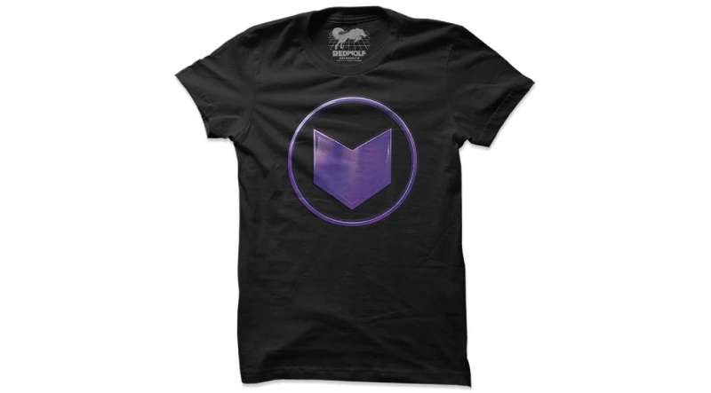
This logo is a tribute to the character, Hawkeye, from the Marvel Universe. It embodies the essence of this skilled marksman. The arrow, an inescapable symbol in the logo, points towards Hawkeye’s main weapon of choice, his trusty bow and arrow.
Power of Simplicity
The Hawkeye logo keeps things simple. No fancy stuff. This reflects Hawkeye’s character – straightforward, reliable, and no-nonsense. It’s a testament to the power of simplicity, showing us how less can sometimes be more.
The History of the Hawkeye Logo

From Comics to Screen
The logo has traveled quite a journey, just like the character itself. It started as a simple symbol in the comic books, but has now become a recognized icon worldwide, thanks to the popularity of the Marvel Cinematic Universe.
Evolution Over Time
Over time, the logo has seen some tweaks and changes, but the spirit remains the same. The arrow symbol has always been there, a constant reminder of Hawkeye’s archery skills. It’s like watching a caterpillar turn into a butterfly, each stage a little different, but the essence always intact.
The Colors of the Hawkeye Logo

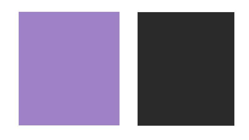
A World of Purple
It’s hard to miss the vibrant purple in the Hawkeye logo. This isn’t just a random choice. It’s a nod to Hawkeye’s classic costume from the comic books. It’s like his signature color, making him stand out in a crowd.
Contrasting Darkness
The black in the logo creates a striking contrast against the purple. It’s like night and day, yet they work together seamlessly. This contrast echoes the dual nature of Hawkeye’s character – an unerring hero who isn’t afraid of the darkness.
The Font Used in the Hawkeye Logo

Bold and Determined
The font in the Hawkeye logo is bold and assertive, just like the character himself. It’s like the logo is making a statement, standing tall and proud.
Keeping it Simple
Again, simplicity is the key. The font is clean and easy to read, avoiding any unnecessary frills. It perfectly complements the straightforward design of the logo.
The Impact of the Hawkeye Logo
Influence on Pop Culture
The logo is more than just a symbol. It’s become a part of our pop culture landscape. You see it on T-shirts, posters, even tattoos. It’s like a badge of honor for fans, a way to show their love for this Marvel hero.
Symbol of Resilience
The logo stands as a symbol of resilience. Hawkeye isn’t a superhuman. He’s a regular guy with exceptional skills, standing toe-to-toe with gods and monsters. The logo is a reminder of this, showing us that even the ordinary can be extraordinary.
The Versatility of the Hawkeye Logo
Adaptable Design

One of the great things about the logo is its versatility. It can be adapted to different mediums, from digital screens to physical products. This adaptability gives it a wide reach, making it universally recognizable.
Ever-evolving Marvel Universe
The Marvel Universe is always evolving, introducing new characters and storylines. This gives the Hawkeye logo plenty of room to grow and evolve with it. Who knows what exciting changes we might see in the future?
Behind the Scenes: Creation of the Hawkeye Logo
Crafting an Icon
Creating a logo is a bit like crafting a masterpiece. It takes time, patience, and a whole lot of creativity.
The Hawkeye logo is no exception. The designers had to capture the essence of the character, while making sure the logo was visually appealing and easy to recognize.
The Team Effort
It wasn’t just a one-man show. The creation of the Hawkeye logo involved a team of designers, working together to bring this symbol to life.
It’s a testament to the power of teamwork, showing us that great things can be achieved when we work together.
So, there you have it. The Hawkeye logo is more than just a pretty picture.
It’s a symbol that carries the spirit of a beloved character, a piece of our pop culture, and a testament to the power of design. Whether you’re a fan of Marvel or just a lover of good design, there’s something to appreciate in this iconic logo.
FAQ On The Hawkeye Logo
What’s the story behind the Hawkeye logo?
Well, it’s not just a cool-looking symbol. Originating from the pages of Marvel Comics, the logo represents the superhero Hawkeye, aka Clint Barton.
It embodies his archery skills, sharp eye, and role in the Avengers. It’s symbolism packed with action and precision, just like its bearer.
Is the Hawkeye logo trademarked?
Talk about protection! Absolutely, it falls under Marvel Entertainment’s vast umbrella of trademarks. That means the logo is not just a visual icon but also a legal strongman, safeguarding the brand identity that’s been carefully crafted over the years.
How has the Hawkeye logo evolved over time?
A fascinating journey! Originally depicted as a simple “H” with an arrow, the logo has transformed with Hawkeye’s character development in Marvel Comics and the Marvel Cinematic Universe.
It’s gotten sleeker, more impactful—reflecting the modernity of graphic design mingled with timeless superhero essence.
Can the Hawkeye logo be used for commercial purposes?
That’s a no-go zone without explicit permission. As a trademarked emblem of Marvel, any commercial use requires a nod from the big guys at Marvel Licensing. It’s a classic case of “look, don’t touch” unless you’ve got the green light.
How does the Hawkeye logo reflect the character’s attributes?
It’s all in the visuals. The logo, with its sharp lines and arrow elements, speaks volumes of Hawkeye’s archery prowess and keen vision. It’s like a visual echo of his attributes—accuracy, agility, and stealth. Superhero identity at its best!
What’s the meaning of the colors in the Hawkeye logo?
Purple and black—let’s talk color story! Purple traditionally signifies mystery and power, while black adds a touch of gravity and seriousness. Together, they match Hawkeye’s enigmatic and strong character. Oh, and did I mention they look ridiculously cool?
Where is the Hawkeye logo most commonly seen?
From comic book covers to Disney+ series posters, this logo gets around! It’s usually spotted wherever there’s a whiff of the sharpshooter—on merchandise, in the Marvel Cinematic Universe, and even at fan conventions. It’s like a beacon for all things Hawkeye.
Are there different versions of the Hawkeye logo?
Diversity is key. While the core design remains true to Hawkeye’s theme, variations do exist. Different comic series, animations, and merchandise sometimes tweak the design for a fresh take or specific branding purpose. It keeps us on our toes, visually!
Why is the Hawkeye logo popular among designers?
As a symbol, it’s the quintessential blend of power and simplicity—two holy grails in graphic design. Its adaptability and boldness make it a study in effective branding. Trust me, designers love dissecting its visual branding chops.
What do fans think of the Hawkeye logo?
Ask around, and you’ll get a chorus of admiration. It’s not just a comic book trademark—it’s a piece of the hero’s soul they can wear, display, and rally behind. It’s a symbol that unites a community, igniting a sense of belonging and fandom pride.
Conclusion
And there it is, the final bowstring twang on the Hawkeye logo. We’ve circled the target, explored the rich backdrop of Marvel Entertainment, and even tiptoed around the legalities of that infamous trademarked emblem. It’s a beacon that punches way above its weight class, balancing on the fine line between design and narrative.
So, what’s the takeaway from this whirlwind tour?
- Embrace the complexity; a logo’s worth lies in its story.
- Recognize the distinction; brand recognition and visual identity walk hand-in-hand.
- Respect the rules; trademark guidelines are the watchful protectors of creativity.
Whether you’re a die-hard fan or a designer seeking inspiration, this symbol is proof that icons are never just icons. They’re flags waving atop a brand’s territory, rallying cries for communities, and sometimes, they’re even a silent nod between those in the know—a visual shorthand for character and legacy. As we sign off, keep your creative quivers ready; there’s always another story to tell, another logo to unveil.
If you liked this article about the Hawkeye logo, you should check out this article about the Flash logo.
There are also similar articles discussing the Green Lantern logo, the Captain America logo, the Thor logo, and the Black Widow logo.
And let’s not forget about articles on the Captain Marvel logo, the Wolverine logo, the Daredevil logo, and the Aquaman logo.