


Dive deep. Picture this: an emblem, instantly summoning the power and mystery of the ocean’s depths. You’ve seen it before, the Aquaman logo, a beacon of superhero iconography as boundless as the sea itself.
Welcome to the world where design meets legend. Here, the emblem isn’t merely a graphic; it’s a gateway to Atlantis, a nod to an aquatic king, and a marquee of mythical tridents.
This isn’t about a simple brand, but the essence of Aquaman himself, Arthur Curry, and the grandeur of the DC Comics legacy.
Swim through the nuances of the Aquaman logo, from comic panels to the silver screen, where Jason Momoa emerges, not just as an actor, but an icon. We’ll explore how this logo shapes our perceptions and thrills fans worldwide.
By journey’s end, you’ll resurface with insights into the essence of superhero branding – how a symbol can echo through pop culture and the principles behind crafting a timeless emblem.
So, take a breath, and let’s submerge into a tale of design, identity, and the undulating waves of graphic design for superheroes.
The Meaning Behind the Aquaman Logo

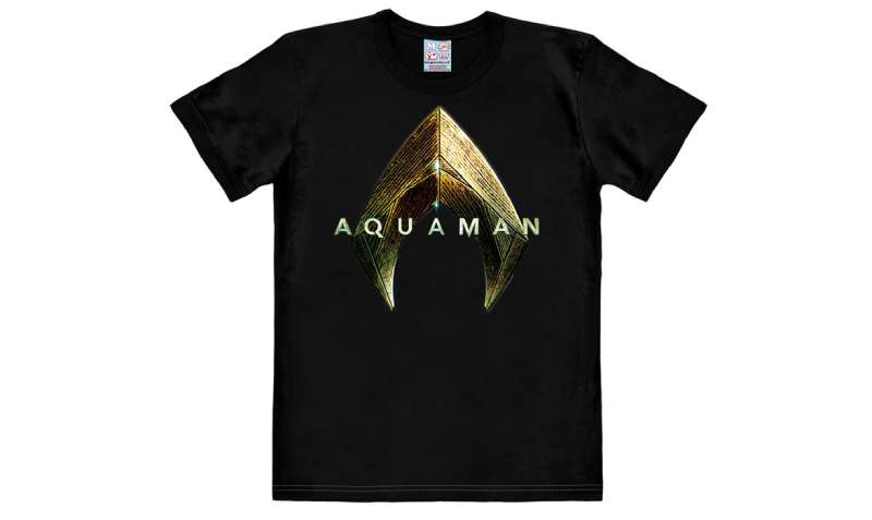
The Trident Symbol
Have you ever seen a three-pronged spear? That’s a trident. It’s the key element in the Aquaman logo. It’s the heart of the logo, the soul.
In ancient times, tridents were tools of the gods, like Neptune and Poseidon. It represents power, control over the sea, and even storms. And that’s Aquaman in a nutshell – powerful, in control, and a bit stormy, wouldn’t you say?
The “A” Connection
Now, let’s focus on the “A”. That’s right, the first letter of Aquaman. The trident is cleverly designed to form an “A”, a subtle touch that adds a personal brand.
It’s like Aquaman’s signature. And it adds an extra layer of meaning – the symbol isn’t just a trident, it’s Aquaman’s trident.
The History of the Aquaman Logo

The Evolution
Logos change, just like we do. They evolve, adapt. They find new trends, new ways to express themselves. The Aquaman logo is no different. It started simple, just a name. Then it morphed into a trident, taking on more character, more personality.
Modern Interpretations
Modern times bring modern designs. The latest Aquaman logo is all clean lines and sharp edges. It’s bold, striking. It says, “I’m here, I’m strong, and I’m not going anywhere.” It’s a symbol of evolution and survival, just like Aquaman himself.
The Colors of the Aquaman Logo
A Splash of Gold
Gold is power. Gold is royalty. And gold is the main color of the Aquaman logo. It stands out, it demands attention. And it’s a nod to Aquaman’s royal status, his power. It’s his crown, his throne, all wrapped into one.
Deep Sea Blue
Then there’s the blue. Not just any blue, but a deep, rich sea blue. It’s the color of the ocean depths, where Aquaman reigns. It brings a sense of mystery, and intrigue. It’s the color of his kingdom, his home.
The Font Used in the Aquaman Logo


Strong and Bold
Look at the Aquaman logo. What do you see? The font is strong, bold. It’s not fancy or frilly. It’s simple, direct. It’s a font that says, “I’m here, I’m strong, and I mean business.” It’s a reflection of Aquaman’s character – strong, determined, and unyielding.
Modern and Clean
The font is also modern, clean. No extra flourishes or details. It’s all about clarity, about getting the message across. It’s a style that’s popular in today’s design – less is more. It’s a font that’s as straightforward and honest as Aquaman himself.
The Impact of the Aquaman Logo on Pop Culture
Comic Book Culture

Think about it. That logo, that trident, it’s everywhere. On comic books, t-shirts, and posters. It’s become a symbol, a badge of honor for fans. It’s a sign of belonging, of being part of something bigger. It’s not just a logo, it’s a statement.
Beyond the Pages
And it’s not just comic book culture. The Aquaman logo has swum its way into mainstream media. Movies, TV shows, even music videos. It’s a sign of the times, a sign of the growing influence of comic book culture on our world.
The Artistic Value of the Aquaman Logo
Simplicity is Key
Ever heard of less is more? That’s the beauty of the Aquaman logo. It’s not complicated or intricate. It’s simple, easy to recognize. And that simplicity is its strength. It’s a design that stands the test of time.
Symbolic Imagery
Then there’s the symbolism. The Trident, the sea colors, the bold font. Each element tells a story, and adds depth to the design. It’s not just a pretty picture, it’s a narrative. And that’s what great art is all about, isn’t it?
The Logo Design Process
Inspiration and Conceptualization
![]()

Every design starts with an idea, a spark. For the Aquaman logo, it was the character himself. His strength, his connection to the sea. That was the inspiration. From there, it was all about bringing that idea to life, creating a design that reflected the character.
Refinement and Finalization
After the initial design, comes the tweaking, the refining. It’s about making small changes, adjustments. It’s about perfecting the design, making it just right. And then, finally, the logo is ready. Ready to make its mark on the world.
FAQ On The Aquaman Logo
Who designed the Aquaman logo?
Oh, the emblem that screams oceanic royalty? That’s the craft of several artists over time, tweaking it as Aquaman evolved.
You’d credit the original design back to the creators of the comic book, but the modern, sleek icon? That has the film design team’s fingerprints all over it, particularly for the movie adaptation starring Jason Momoa.
What does the Aquaman logo represent?
That symbol isn’t just for show– it’s chock-full of meaning. Standing for justice, the protection of the Seven Seas, and the strength of Atlantis, the logo’s a badge of honor.
It combines Aquaman’s heritage with his power, duty, and yes, some serious superhero swagger from the Justice League lineup.
Can I use the Aquaman logo for my merch?
Careful there, that logo’s protected tighter than Atlantis itself. It’s intellectual property owned by DC Comics and Warner Bros. Want to avoid legal trouble like Aquaman avoids a dry spell? Get permission before slapping that logo on any merch.
Has the Aquaman logo changed over the years?
Absolutely, it’s had more makeovers than a Hollywood starlet. It started off simple, reflecting comics from the Golden Age. Over the years, it’s gotten edgier, bolder, fitting for a king. Makes you wonder, will the Aquaman of tomorrow have yet another new crest?
Why does the Aquaman logo often feature a trident?
That three-pronged spear isn’t just for show; it’s the Trident of Poseidon, a power symbol and Aquaman’s weapon of choice. Gives him control over the seas and marks him as ruler of Atlantis. The trident in the logo? It’s like his royal seal.
What’s the color scheme of the Aquaman logo?
Colors pulled straight from the heart of the sea, think vibrant marine hues. Mostly, you’ll spot aquamarine tones, gold for royalty, and sometimes a hit of darker blues. These colors? They’re not random; they tell a story of water and regality.
Did Jason Momoa influence the new Aquaman logo design?
Oh sure, when Jason Momoa stormed the cinema as Aquaman, the logo got a dose of his rugged, wild energy. The current emblem reflects the film’s darker, grittier tone, and let’s just say, Momoa’s edgy vibe seeps into the logo’s design cues.
Where can I find official Aquaman logo merchandise?
Hungry for some legit merch? Your first stop should be official DC Comics outlets, and Warner Bros‘ online store. They’ve got the goods – shirts, mugs, you name it, all stashed with the legit logo. No knock-offs, pure superhero merch goodness.
Is the Aquaman logo linked to any particular comic book series or movie?
You better believe it. Each Aquaman comic series and film snapshot brings its flavor to the logo. The classic comics, those have the old-school vibe, but the new movies? That’s where the logo packs a modern punch, with hints of that graphic design for superheroes oomph.
What impact has the Aquaman logo had on popular culture?
This logo, it’s not just ink on paper. It’s a cultural heavyweight, splashed across media, igniting the imagination with thoughts of superhero aesthetics.
Whispers of Atlantis, adventure, and the thrill of the ocean surface every time that iconic symbol hits a screen or a piece of comic-con merchandise.
Conclusion
And there we have it. The journey through the deep, unraveling the tale of the Aquaman logo, has brought us back to the surface. It’s more than just a splash of color on a superhero’s chest or a piece of flashy cinema graphics.
This icon taps into a reservoir of cultural significance and a torrent of design excellence. It’s a confluence where myth meets modernity, where DC Comics artistry meets Jason Momoa’s charisma. As we’ve delved into its evolution, from the classic comic book impressions to the bold cinematic reimagining, we’ve discovered its power.
Reflecting both the stalwart hero and the king of Atlantis, the logo is a beacon, signaling the depths of imagination one can dive into. It’s a testament to the art that outlives its time, transitioning fluidly between mediums and generations.
Keep this emblem close to heart, for it’s not just a brand, but a legacy cast in the waters of creativity, shimmering with each ripple it creates in popular culture.
If you liked this article about the Aquaman logo, you should check out this article about the Flash logo.
There are also similar articles discussing the Green Lantern logo, the Captain America logo, the Hawkeye logo, and the Thor logo.
And let’s not forget about articles on the Black Widow logo, the Captain Marvel logo, the Wolverine logo, and the Daredevil logo.