

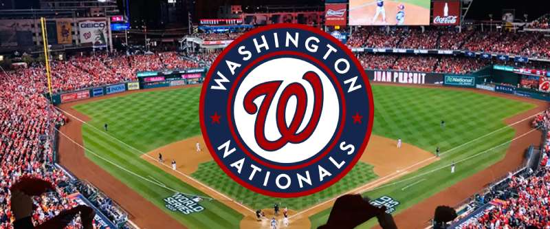
Imagine the vibrant stitching of red, white, and navy thread interwoven to form an emblem that pulses with the heartbeats of a city. The Washington Nationals logo, a tapestry of history and pride, isn’t just a symbol—it’s an emblematic whisper of every crack of the bat echoing through Nationals Park.
Carrying the legacy of a nation’s pastime, this logo is far more than mere design; it is a sentinel standing tall amidst the lore of Major League Baseball.
Through an exploration of the Curly W, its journey mirrors that of a gladiator—steeped in valor, victories, and the bittersweet taste of defeat. As the canvas unfolds, you’ll delve into the nuances that render this icon a beacon of sportsmanship and community.
Sprinkled across MLB team insignia and fan apparel, the essence of the logo transcends the fabric—it stitches together the very soul of D.C. baseball.
By the article’s end, anticipate revelations of how symbols bridge the gap between a franchise and its fervent following, integrating sports marketing finesse with unwavering team identity.
The Meaning Behind the Washington Nationals Logo
![]()

Yo, let me break this down for ya! When you first look at the Washington Nationals logo, it might just seem like a cool baseball emblem, but there’s a deep well of significance behind it.
Symbolism of the Emblem
So, the primary element is that curly ‘W’. You’d think, “Hey, that’s just for Washington, right?” Bingo! But also, the “curly” style gives it a more dynamic and fluid look, representing the energy and spirit of the team.
Relationship with the City
Now, D.C. ain’t just any city. It’s the capital of the U.S. The Nationals logo carries the weight of representing not just a baseball team, but a significant slice of America.
The emblem, in its own way, captures the essence of the place – its power, prestige, and the game of baseball that America loves so much.
The History of the Washington Nationals Logo
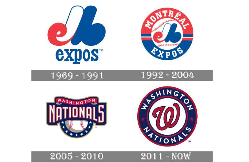

Aight, let’s take a trip down memory lane!
Early Days
The Nationals didn’t always have this sharp logo. Back in the day, the team underwent a series of logo changes. It evolved, just like the music on your playlist. But the logo as we know it today? It’s a modern classic, a blend of the old and the new.
Evolution and Modernization
Over the years, they tweaked things here and there. The logo got refined, sharper, just like a sick graphic design project. The emphasis was always on retaining the essence while adapting to the changing tastes of the era.
The Colors of the Washington Nationals Logo
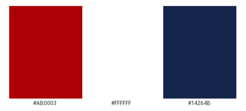

Colors speak, man!
Red and Blue
These ain’t just any colors. Red screams energy, passion, and power. Blue? It’s all about loyalty, trust, and calmness. Put ’em together and you get a fiery combo of raw energy and deep commitment. Just what a baseball team needs!
White
The white in the logo is the neutral ground. It brings out the vibrancy of the other two colors and gives them space to shine. It’s like the silent beat in a dope track.
The Font Used in the Washington Nationals Logo
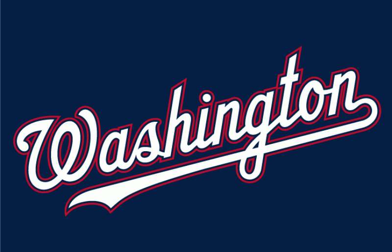

Typefaces, my friend, are everything in design!
Curly Vibes
The “curly W” isn’t just a letter. It’s an entire mood. The font is elegant yet sporty, capturing the dual nature of a team that is both aggressive on the pitch and graceful in its strategy.
Sleek and Modern
Even though it has a touch of retro, the font feels super modern. It’s like pairing vintage sneakers with a fresh outfit. Perfect harmony.
The Influence of the Logo on Merchandise
Hang on to your snapbacks!
Apparel Game Strong

Ever seen those caps and jerseys rocking the Nationals logo? The emblem’s design influences the whole merch line. From tees to hoodies, the logo is the crown jewel that adds that swag.
Beyond Just Clothes
The logo has made its mark beyond apparel. Think phone covers, wall art, and even those rad beer mugs. It’s not just a logo; it’s a lifestyle.
Fan Reactions and Legacy
This ain’t just a design topic; it’s a feels trip!
Fans’ Tattooed Loyalty
Legit, some die-hard fans have the logo tattooed. That’s some next-level commitment, showing how the emblem resonates deeply with the Nationals’ fanbase.
A Legacy Carved in Design
In the vast world of sports logos, the Washington Nationals emblem stands tall. It’s not just about a team or a sport. It’s about a community, a legacy, and a passion that gets passed down through generations. That curly ‘W’? It’s not just ink. It’s heartbeats.
FAQ On The Washington Nationals Logo
What is the significance of the Washington Nationals logo?
The Washington Nationals logo—a distinctive “Curly W”—embodies the dynamism of our capital’s team.
It’s more than graphic design; it encapsulates the spirit of D.C. baseball, pulling threads from the city’s rich heritage and the team’s own tenacious history in Major League Baseball.
How has the Washington Nationals logo evolved over time?
Starting as a simple block letter to the current red and blue “Curly W,” the Nationals emblem reflects a journey of growth. Each tweak and turn has aimed to resonate more deeply with fans, interlinking the team’s identity with Nationals Park and beyond.
What do the colors of the Washington Nationals logo represent?
Imbued with patriotism, the red, white, and navy blue mirror the Flag of the United States. This color trio delivers a visual shout-out to the national pride of Washington, D.C., offering fans and citizens alike a symbol to rally behind.
Where can I find official Washington Nationals merchandise?
Official Nats branding and the “Curly W” logo festoon a myriad of items: from apparel to memorabilia. The authentic gear is available at the team’s storefront at Nationals Park, official MLB online repositories, and authorized retail partners.
Can anyone use the Washington Nationals logo for personal or commercial purposes?
The logo, as an entity within sports marketing, is subject to strict licensing laws. Unauthorized usage, especially for commercial gain, infringes upon intellectual property rights, and MLB’s legal framework.
For personal uses, like cakes or crafts, it’s a grey area that usually necessitates formal permission.
What was the Washington Nationals logo before they moved to D.C.?
Prior to gracing the nation’s capital, the franchise was known as the Montreal Expos, sporting a stylized “M” in red, white, and blue.
Upon moving to D.C., they adopted a fresh identity, with visual cues connecting more deeply with American culture and baseball fan apparel aesthetics.
How does the Washington Nationals logo compare to other MLB team logos?
Distinct in its simplicity and symbolism, the Nationals’ “Curly W” stands out amongst other MLB emblems. It furthers sports memorabilia identity through its clean lines and patriotic palette, while offering easy recognition—a key trait in successful sports franchise branding.
Why did the Washington Nationals choose their current logo?
In the rebranding saga, they aimed to symbolize a new dawn for D.C.’s baseball saga. The “Curly W” coincided with the team’s rebirth, aligning with local sentiment and national imagery, making it more than just a baseball franchise identity; it’s a symphony of tradition and ambition.
Are there alternate versions of the Washington Nationals logo?
Major League Baseball is fond of special editions and alternate versions for events or milestones.
The Washington Nationals sometimes don alternate logos, such as patriotic versions for Independence Day games or commemorative badges to mark significant team accomplishments like the 2019 World Series victory.
How do the Washington Nationals logo and brand identity affect fan engagement?
A cohesive team mascot and the “Curly W” are more than visual cues; they’re the nucleus of fan experience.
These elements spark a sense of belonging, enhancing the connection between the team and its supporters, and are catalysts in the alchemy of athletic logo licensing and fan loyalty.
Conclusion
In the intricate dance of forms and hues, the Washington Nationals logo culminates as more than a mere motif. It is a vessel of identity, brimming with the echoes of Nationals Park, the passion of a city, and the unity of a fanbase bedecked in their cherished MLB team insignia. Encapsulating the heritage of Washington, D.C., and Major League Baseball, this icon forges an indelible mark in the realm of sports symbolism.
Through the union of tradition and reinvention, the “Curly W” blooms—a timeless sentinel amidst the evolving landscape of sports marketing and fan camaraderie. For those who don the emblem on merchandise, it becomes a second skin, a beacon of shared pride and unspoken language of support.
As we close this chapter, let it be known: a logo is not just graphic design. It’s a heartbeat, a narrative, stitched meticulously into the fabric of sports history and community. The Washington Nationals logo stands testament to that very phenomenon—a bridge from the past, anchoring the future.
If you liked this article about the Washington Nationals logo, you should check out this article about the Cleveland Indians logo.
There are also similar articles discussing the Atlanta Braves logo, the Milwaukee Brewers logo, the Chicago Cubs logo, and the Minnesota Twins logo.
And let’s not forget about articles on the New York Mets logo, the Texas Rangers logo, the Baltimore Orioles logo, and the San Francisco Giants logo.