

Imagine the brush dips into vibrant hues, tracing the contours of history onto canvas—an emblem emerges, encapsulating heritage, controversy, and the spirit of a nation.
The Cleveland Indians logo, a symbol etched into the hearts of many, stands at the crossroads of tradition and transformation.
In this tapestry of color and contention, the narrative woven speaks volumes of our society’s values versus the visual representations we endorse. We reside in an era where the marriage of design and ethics has never been more pronounced or more pivotal.
Delving into the emblem of Cleveland’s baseball team, one discovers an intricate blend of cultural sensitivity, sports marketing, and fan base reactions, all through the lens of graphic design in sports.
This article unveils the story behind the Cleveland Indians emblem’s evolution to the Cleveland Guardians, illuminating why such a shift in imagery is not just a mere facelift but a societal statement.
We’ll navigate through the undercurrents of Native American advocacy, peer into the legal labyrinth of trademark issues, and reflect on what this means for Cleveland’s baseball legacy. Engage with these strokes of insight, and emerge with a broader understanding of where art meets accountability on the grand stage of Major League Baseball.
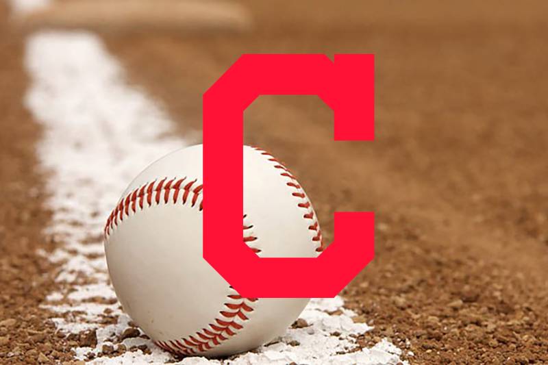
The Meaning Behind the Cleveland Indians Logo
![]()

Every design, every curve, every hue, has a story. Logos aren’t just squiggles on paper; they’re emblematic of tales and memories.
The Spirit of Baseball
The Cleveland Indians logo was never just about the team. It was about baseball. About those chill summer nights and the roar of a crowd coming alive as the bat hits the ball. The logo signified the spirit of a game so deeply entwined in America’s history.
Cultural Reflection or Misrepresentation?
The previous Chief Wahoo logo has been a subject of controversy, with some seeing it as a nod to heritage while others viewed it as a caricature, diminishing the rich culture of Native Americans. This dichotomy represents the challenges of balancing design and cultural sensitivity.
The History of the Cleveland Indians Logo
![]()

Ah, history. It’s more than just dates. It’s about shifts in thought, transformative moments, and evolutions of art and design.
Origins and Early Days
Back in the day, the team took its name in honor of a former Native American player, and the logo that followed was reflective of that inspiration.
Evolution and Changes
Over time, the logo saw various iterations, moving from simplistic design elements to more intricate ones, eventually culminating in the decision to step away from the Chief Wahoo emblem for a more neutral, yet iconic, representation.
The Colors of the Cleveland Indians Logo


Colors ain’t just colors. They’re moods, feelings, vibes.
Red: The Pulse
Red isn’t just red. It’s the adrenaline rush, the heartbeat, the passion. It’s the crowd cheering and the palpable energy in the stadium.
The Font Used in the Cleveland Indians Logo

Typeface? It’s more than letters. It’s an attitude.
Bold and Assertive
The font speaks in a voice that’s decisive. It’s not whimsical or meek. It takes space, makes its presence felt. You know, kinda like that one player who walks into the stadium and owns it.
The Emblems Over Time
Symbols evolve. So did the Cleveland Indians’ emblems.
A Symbolic Dance
From feathers to faces to the much talked about C. The shift in emblems was always more than just about aesthetics. It’s about adapting, responding, and growing.
The New Age: Transitioning Away from Chief Wahoo
In a world that’s constantly changing, sensitivity becomes vital. Moving away from Chief Wahoo was not just about a new design; it was about listening, understanding, and respecting.
The Future of the Logo

What’s next for the Cleveland Indians logo? Only time will tell, but it’s always thrilling to see how logos, like us, grow and change.
The Power of Design
In our world, design has the capability to speak volumes, to shift perspectives, and to evoke emotion. As the Cleveland Indians logo continues its journey, it’ll keep embodying the essence of the team and its legacy.
FAQ On The Cleveland Indians Logo
Why did the Cleveland Indians change their logo?
The tide of cultural sensitivity swept over the sporting world, pressing for an overdue change.
The Cleveland Indians, responding to years of advocacy by Native American groups and fans, retired their logo in favor of a more culturally respectful identity, leading to the adoption of the Cleveland Guardians moniker.
What was controversial about the Cleveland Indians’ logo?
Central to the controversy was Chief Wahoo, a caricature found offensive and racially insensitive by many. Its roots in racial stereotypes about Native Americans clashed with modern principles of equality and respect, placing the logo in the eye of a cultural storm that demanded action.
When was the Cleveland Indians’ logo first introduced?
Introduced in the late 1940s, Chief Wahoo evolved through the years but always remained a brightly colored caricature.
It depicted a Native American figure with a wide grin, becoming synonymous with Cleveland’s baseball team until the logo’s use was significantly reduced and eventually discontinued.
Who designed the original Cleveland Indians logo?
The original logo was the result of multiple iterations. The most recognizable Chief Wahoo version was crafted in 1947 by Walter Goldbach, a young artist who, at the time, likely did not fathom the future weight of his creation on the scales of sociocultural values.
What logo has replaced the Cleveland Indians’ Chief Wahoo?
As the team transitioned to the Cleveland Guardians, a new logo emerged. The modern insignia depicting a winged ‘G’ is a stark departure from the past, steering clear of human imagery and anchoring itself in references to Cleveland’s architectural heritage instead.
How has the public reacted to the logo change?
The shift has elicited mixed reactions. Loyalists clung to tradition, voicing a sense of loss, while advocates for change heralded the new Guardians name and logo as a victory for cultural sensitivity.
Fans have been experiencing a rebranding often reserved for chapters of history books.
What does the new Cleveland Guardians logo symbolize?
Encapsulating a forward-focused vision, the Cleveland Guardians’ logo symbolizes protection and resilience, borrowing from the iconic Guardians of Traffic statues that stand as sentinels over the city’s Hope Memorial Bridge.
It signifies a respectful nod to both the city and the future of the franchise.
Has MLB taken a stance on the logo change?
Indeed, Major League Baseball (MLB) has actively supported the name and logo change.
The organization has encouraged movements away from Native American imagery across the league, recognizing the need for baseball to be an inclusive sport where team identities don’t perpetuate cultural offense.
Are sports teams following Cleveland’s lead in changing their logos?
A rousing yes. The shift has sparked a broader reevaluation within sports. Notably, the Washington Football Team (formerly Redskins) embarked on a similar journey.
These changes represent a larger recalibration of sports identities, aligning with evolving standards of cultural representation and respect.
Will the old Cleveland Indians merchandise still be available?
Merchandise featuring Chief Wahoo has become a collectors’ item, with availability becoming increasingly scarce post-transition. Official channels now prioritize the Cleveland Guardians’ brand, aligning with the ethos of the updated identity.
True, vintage items linger in the realm of third-party vendors and personal collections.
Conclusion
As the final brushstrokes settle on our exploration of the Cleveland Indians logo, we stand back to appreciate the canvas of change swept across this emblematic aspect of Major League Baseball. The transformation from Chief Wahoo to the Cleveland Guardians signifies more than a mere rebrand; it echoes the resonance of heritage meeting progress on the battleground of public sentiment.
In acknowledging the potent mix of tradition and cultural sensitivity, we uncover the necessity for thoughtful design in an era where every curve and color conveys a message. Through the lens of legacy, fan loyalty, and societal impact, this logo’s journey reflects a broader narrative—one where the voices of the past and the collective call for respect coalesce into a vision for a more inclusive future.
Boldly etched in the annals of sports history, the tale of Cleveland’s baseball team logo dovetails as a lesson in creativity’s power to spark dialogue, drive change, and redefine identities for generations to come.
If you liked this article about the Cleveland Indians logo, you should check out this article about the Atlanta Braves logo.
There are also similar articles discussing the Milwaukee Brewers logo, the Chicago Cubs logo, the Minnesota Twins logo, and the New York Mets logo.
And let’s not forget about articles on the Washington Nationals logo, the Texas Rangers logo, the Baltimore Orioles logo, and the San Francisco Giants logo.