

Imagine peeling back the layers of time on a well-loved emblem, the intricacies of design telling not just a team’s tale but the heartbeat of a city. The Minnesota Twins logo hides such lore in its stitches, a symbol that’s evolved alongside the pulse of Minneapolis.
As we unravel the threads, we uncover a narrative steeped in pride and tradition, mirrored in the loyal cheers of baseball aficionados.
Delving into this article, you’ll be guided through the evolution of the Twins’ visual identity – what anchors it as an icon in the sports world.
We’ll navigate the confluence of sport, art, and business, retracing steps to where the emblem first took root in the American League Central Division, blossoming into the marketplaces of Twins fan merchandise and minted into the cultural fabric of Minnesota baseball culture.
From a graphic designer’s lens, we inspect the subtleties, the hues, and textures that detail this storied MLB team logo’s journey. By the final punctuation, expect an enriched understanding of how heritage and design interlace to forge more than just a logo – they craft identity.
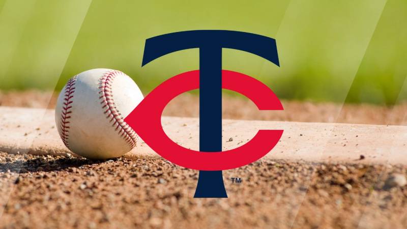
The Meaning Behind the Minnesota Twins Logo
![]()

Alright, let’s dive in. At first glance, the Minnesota Twins logo might look like a straightforward sports emblem. But just like any piece of art, there’s a lot going on beneath the surface.
Uniting Twin Cities
First thing’s first. Ever wonder why they’re called the Twins? It’s a nod to the famous Twin Cities of Minnesota: Minneapolis and St. Paul. The logo beautifully captures this duality and union.
Baseball Threads
Nope, that’s not just any round shape in the background. It’s a baseball, folks! The sport’s traditional element, representing the game’s core and the team’s heart.
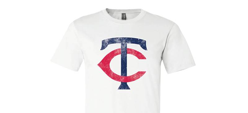
The ‘TC’ Overlay
The intertwined “TC” is kind of the star of the show. It stands for Twin Cities, in case you missed that connection earlier. It symbolizes unity and camaraderie between the two cities.
The History of the Minnesota Twins Logo

The Beginnings
Back in the day, around the 1960s, the Minnesota Twins logo underwent several transformations. Starting off, it wasn’t even close to what we recognize today.
Evolution Over Time
As with most things in design, change is constant. Over the decades, the Twins logo saw tweaks, color shifts, and even a few redesigns. But through all that, the essence remained: representing the heart of Minnesota baseball.
The Colors of the Minnesota Twins Logo

Colors. Oh man, colors play a BIG role in design. They evoke emotions, set the mood, and in this case, represent a brand or team.
Navy Blue
The dominating color. Sturdy, reliable, and strong. It’s the backbone of the logo, echoing the tenacity of the team.
Red
Accentuating the boldness of navy, the red in the logo stands out, representing passion, vigor, and the fiery spirit of the game.
The Font Used in the Minnesota Twins Logo
Now, onto the typography. The font used in the Twins logo is unique, fresh, and exudes energy.
Athletic Appeal
A touch of an athletic look, wouldn’t you say? The lettering is robust and dynamic, mirroring the fast-paced nature of baseball.
Sleek and Contemporary
While retaining a classic feel, the font edges toward modern, ensuring the logo doesn’t feel stuck in the past.
The Design Impact
Lasting Impression
A logo isn’t just an image; it tells a story. And the Minnesota Twins logo tells a tale of unity, tradition, and a deep love for baseball.
Setting the Team Apart
In the sea of baseball logos, having a unique identity is crucial. And the Twins logo has successfully set its own signature style in the league.
The Fans’ Perspective
A Symbol of Pride

For Minnesota folks and baseball enthusiasts, the Twins logo is more than just a symbol. It’s a badge of honor, a mark of allegiance.
Evoking Nostalgia
For the long-time fans, every glance at the logo is a trip down memory lane, reminiscing epic games, unforgettable moments, and the community’s shared passion.
FAQ On The Minnesota Twins Logo
What’s the story behind the Minnesota Twins logo?
The logo mirrors Minnesota’s heritage, binding Twins Cities’ kinship with baseball’s spirit. Once envisaged, it maturely evolved, akin to a well-seasoned mitt, it’s aged, integrating modern aesthetics while honoring its roots.
The emblem signifies a proud lineage, an homage to both the team and its abode, imprinted on fan hearts and MLB merchandise alike.
How has the Minnesota Twins logo changed over the years?
Adapting to design trends and cultural shifts, the logo has gracefully transitioned. From its inception, showcasing a Minn and Paul handshake, its simplification marks the timeline.
It’s an arc bending towards modernity—crisp lines interplay with heritage, echoing the club’s journey and the melange of sports team branding.
What do the colors in the Minnesota Twins logo represent?
The navy blue bespeaks professionalism and depth, red signals passion – Minnesota’s fiery love for baseball. White, the field’s purity and openness. It’s a palette speaking volumes, narratively rich, a visual chant for Twins’ valor.
What is the significance of the “TC” in the Twins logo?
Distinctively, “TC” embodies the Twin Cities, Minneapolis and St. Paul, the synthesis of two hearts beating as one in Minnesota. Planted firmly on caps, it’s an urban salute, a democratic crest, knitting together community and competition.
Can the Minnesota Twins logo be used for commercial purposes?
Not without consent. The logo is trademark-guarded, nested within legalities seeking to protect intellectual property.
Use demands navigation through licensing and official channels—a protocol dance ensuring respect for the emblem’s prestige and sports logo licensing norms.
Who designed the Minnesota Twins logo?
The lineage of designers weaves through the decades. Originals by unknown hands have been retouched by professional visionaries, an assembly of unnamed artists and creative agencies.
The baton passed with care, each leaving a delicate imprint upon the insignia, paying homage to the team’s history and Minnesota sports franchise branding journey.
What elements are included in the Twins logo?
Central to the logo is the hypnotic “TC,” flanked by a baseball signifying the game at its core. Embracing it all is the wordmark “Minnesota Twins,” a bold declaration of identity. Together, these elements are a synergy of pride and professional baseball team crests.
How often is the Minnesota Twins logo updated?
It’s a sporadic refresh, not tied to a timer but to the tides of necessity and aesthetics. When the moment hints, the logo breathes anew, replenished to stay in step with the present. It’s a rare event, marking epochs in Minnesota Twins history.
Where can I buy merchandise with the Minnesota Twins logo?
The logo blooms across the land of Twins fan merchandise: online in official MLB shops, within the hallowed halls of Target Field, and in local sports stores. Seek it, and you shall find, on apparel to trinkets, echoing your cheer.
What does the Minnesota Twins logo mean to the fans?
For the faithful, it’s a beacon, a rallying cry, a totem of sorts. It joins the fans in a silent pact, symbolizing loyalty to the game, the team, and to Minnesota. Worn with esteem, it’s more than a logo—it’s part of a familial legacy.
Conclusion
In the realm of curveballs and home runs, the Minnesota Twins logo stands steadfast—it’s more than mere embroidery on a cap or stitched emblem on a jersey. It’s a legacy interwoven with the fabric of Minneapolis-St. Paul, a testament to the indomitable spirit that graces the diamond at Target Field.
Through our exploration, we’ve played witness to the emblem’s metamorphosis. Starting from the handshake of Minn and Paul, cresting to the sleek “TC” that adorns the uniforms today, each iteration whispers tales of Minnesota Twins history and American League Central Division rivalries. As stalwarts of design, this visual odyssey accentuates how innovation can coexist with tradition, how new lines can pay homage to old stories.
As the echo of the last cheer fades, and the stadium lights dim, the logo remains—a silent guardian of past glories and future triumphs. For the fans, every glimpse rekindles a flame, a spark of passion, a sense of Minnesota baseball culture. And so, it endures, not just as a mark of a team, but as an emblem of home.
If you liked this article about the Minnesota Twins logo, you should check out this article about the Cleveland Indians logo.
There are also similar articles discussing the Atlanta Braves logo, the Milwaukee Brewers logo, the Chicago Cubs logo, and the New York Mets logo.
And let’s not forget about articles on the Washington Nationals logo, the Texas Rangers logo, the Baltimore Orioles logo, and the San Francisco Giants logo.