

Immerse yourself in the tapestry of hues and symbols where sports and artistry converge. The Baltimore Orioles logo stands as a beacon of Maryland pride, not just an emblem but a vibrant narrative woven into the fabric of baseball history.
Here, colors speak; they embody passion, heritage, and the rush of the game.
In a dance of black and orange, the Oriole embodies a delicate balance between tradition and modernity. For aficionados and newcomers alike, this insignia is a memorial cast within the diamond-shaped world of America’s pastime and the bustling streets of Baltimore.
This article invites you on an exploratory voyage, delving deep into the heart of this iconic symbol. We will unfold layers, tracing contours that spell the evolution of a legacy.
Dive into the meticulous art of sports branding, unravel the kernels of identity in the Maryland sports teams, and behold the impact of professional baseball’s imagery on fan gear and apparel.
Together, we’ll grasp the essence of what molds a mere logo into an enduring legend.
- Discover: The history etched within the Orioles insignia.
- Appreciate: The intricate dance of graphic design and sports tradition.
- Explore: How the emblem becomes a piece of cultural fabric, far beyond the baseball cap it adorns.
The Meaning Behind the Baltimore Orioles Logo
![]()

Ever noticed how emotion-evoking logos can be? They’re not just designs; they tell stories, bring communities together, and create identity. And the Baltimore Orioles logo? Oh boy, it’s a narrative in itself.
Birds and Baseball
Birds are creatures of freedom and vision. When we think Orioles, we think resilience and determination, right?
So, incorporating such a symbol into a baseball team’s identity signifies perseverance and an endless chase for excellence. The logo isn’t just about a bird; it’s about a spirit.
City Pride
Orioles aren’t just random birds; they’re Maryland’s state bird. So, this logo also reflects the heartbeat and pride of Baltimore itself. It’s like wearing your city’s essence on your sleeve…or cap.
The History of the Baltimore Orioles Logo
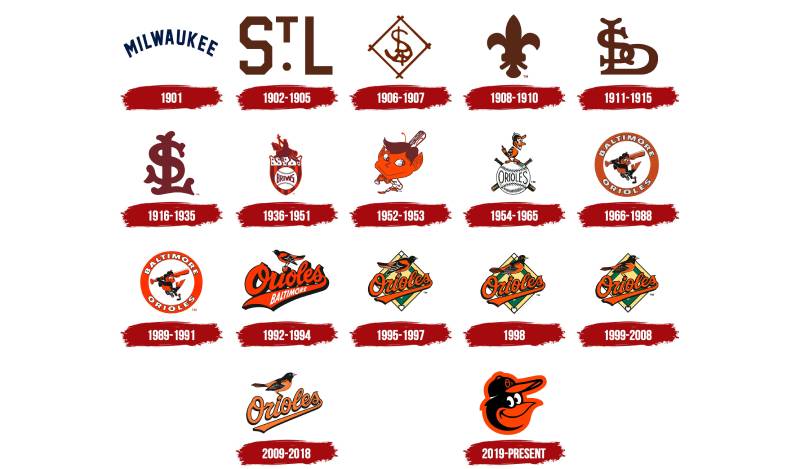

Oh, the tales logos can tell if only they could speak. But since they can’t, let’s dive deep into the past and unravel the story of the Baltimore Orioles logo evolution.
From Humble Beginnings
Back in the day, logos weren’t as flashy. The Orioles had a simple yet distinct bird representation, which over the years underwent some major glow-ups.
The Modern Era Revamp
With time, the bird got more detailed, more expressive, and way more charismatic. It became not just a logo but an emblem of the team’s evolving prowess and ever-growing legacy.
The Colors of the Baltimore Orioles Logo
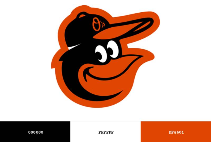

Colors, man. They’re not just hues; they convey feelings, set moods, and oh, they sure do make things pop!
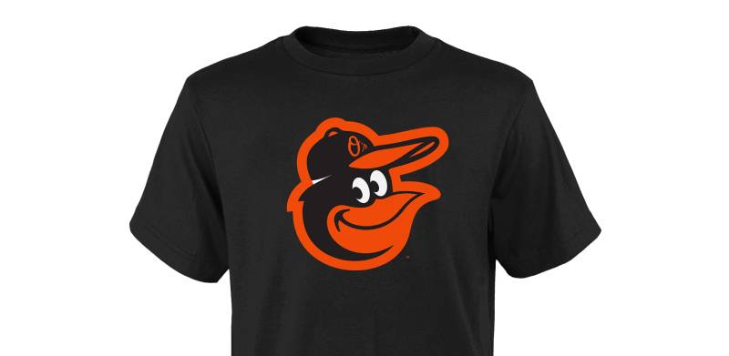
Black and Orange and Why It Matters
Orange screams enthusiasm, and black denotes strength. Pair them together, and you get an electric combo that symbolizes a fierce, passionate team ready to conquer the field. Every. Single. Time.
More than Just Aesthetics
But beyond the visual appeal, the colors resonate with the heartbeats of fans, turning stadiums into a sea of vibrant energy and sheer anticipation.
The Font Used in the Baltimore Orioles Logo
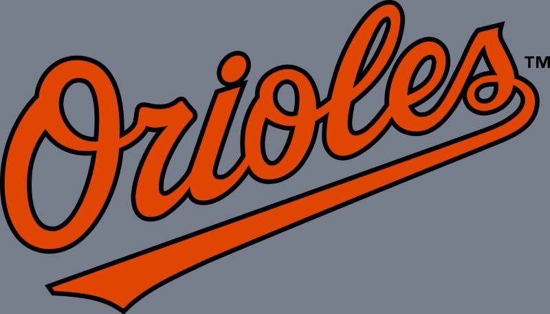

Words aren’t just words when they’re stylized. The font used in the Orioles logo? It’s not just lettering; it’s personality in textual form.
Bold and Dynamic
The typography is sturdy and bold, echoing the team’s solid performance and dynamic approach. It makes a statement even before the players step onto the field.
Curves and Angles
Every curve, every angle in the font is a nod to the intricacies of the game. It complements the bird, the colors, and encapsulates the essence of baseball.
The Artistry and Craftsmanship
Let’s appreciate the unsung heroes, yeah? The artists who craft these emblems deserve some major applause.
Detailed to Perfection
The intricacy of the bird, its feathers, the gleam in its eye—it’s all a testament to meticulous craftsmanship.
Evolution with Time
As the sport changes, so do the artistic demands. The Orioles logo’s journey is a testament to how art evolves to reflect the times and the vibe of the audience.
The Impact on Fans and Culture
What’s a team without its fans? And this logo has cemented its place in fan culture.
More than Merchandise

Caps, jerseys, mugs—you name it. The Orioles logo turns everyday items into memorabilia, cherished not just for the brand but for the memories they evoke.
Culturally Iconic
The logo has transcended beyond baseball, becoming a symbol for Baltimore’s spirit and a cultural icon recognized even by non-baseball fans. It’s not just sporty; it’s artsy.
FAQ On The Baltimore Orioles Logo
What is the significance of the Baltimore Orioles logo?
The logo encapsulates more than just a team; it’s a symbol of Maryland pride. The Oriole, Maryland’s state bird, is a nod to local heritage, depicted in the team’s distinctive black and orange palette, representing the vibrant spirit and resilience of the community and its beloved baseball history.
How has the Baltimore Orioles logo evolved over the years?
Over the years, the logo has morphed, reflecting the team’s trajectory. From realistic bird renditions to sleek, cartoonish forms, the logo’s evolution mirrors the trends in graphic design and sports branding, bridging Camden Yards’ past and present while clutching to the timeless essence of baseball tradition.
Who designed the current Baltimore Orioles logo?
The current logo, an ornate blend of tradition and flair, doesn’t credit one single designer. Driven by collaborative creativity, it’s the product of sports branding experts and the team’s internal vision, shaped by fan feedback and an unyielding passion for the game.
Why are the colors black and orange used in the Orioles logo?
Black and orange are thread deep in the Orioles’ identity; more than just aesthetic choices, these colors hark back to the bird itself, weaving a rich narrative that circles right back to the oriole, synced harmoniously with the competitive essence of Major League Baseball.
What are the guidelines for using the Baltimore Orioles logo on merchandise?
Merchandise utilizing the logo adheres to strict MLB guidelines—usage must reflect respect for trademarks, coherence across all sports merchandise, and a celebration of the Major League Baseball identity.
It’s a delicate dance—ensuring respect for the Orioles insignia, ensuring each piece mirrors the brand’s integrity.
Is the Baltimore Orioles logo trademarked by Major League Baseball?
Absolutely—like a treasured heirloom, the logo is safeguarded under trademark law. Its unique identity, associated closely with both the Baltimore Orioles and Major League Baseball (MLB), is shielded from unauthorized use, shielding the brand and its storied legacy.
What do fans think about the Baltimore Orioles logo?
Fans hold the logo close to their hearts—it’s a badge of honor. Steeped in nostalgia, spruced up with a modern edge, it stands as a symbol of the enduring bond between the team, the game, and its dedicated fanbase who don apparel emblazoned with this iconic emblem.
How does the Orioles logo represent the city of Baltimore?
The Orioles logo is a beacon that projects Baltimore’s narrative on a grand stage—the local love affair with the bird, the distinctive color scheme, and the community spirit is all celebrated in a single badge, an emblem that soars beyond the sports arena to become a part of the city’s identity.
Can the Baltimore Orioles logo be used for non-commercial purposes?
Usage for non-commercial purposes, such as personal art or local fan events, still necessitates caution. MLB’s trademarks aren’t to be toyed with; a straightforward request process exists, ensuring the logo’s sanctity and the Orioles’ image is upheld even off the professional baseball field.
Where can I buy official Baltimore Orioles logo merchandise?
Seeking the genuine Orioles essence in merchandise? Direct your eyes to official Major League Baseball outlets and authorized sports merchandising companies.
These havens boast the real deal—quality gear, from baseball caps to jerseys, all adorned with the team’s licensed insignia, saturated with the spirit of Camden Yards.
Conclusion
In the tapestry of Major League Baseball, where tradition and modernity are interwoven with athletic prowess and city pride, the Baltimore Orioles logo stands out as a masterstroke of design. This emblem, steeped in the rich heritage of Maryland and echoing the distinctive charm of Oriole Park at Camden Yards, has been a beacon for fans and a symbol of the team’s undying spirit.
As the final inning of our exploration draws to a close, we come away with a deeper appreciation for the subtleties of sports branding. The Orioles logo isn’t just an insignia—it’s a storyteller, a guardian of history, and a familiar friend on gear and memorabilia.
- It soars beyond the confines of a typical logo.
- Embodies the heart of a city and its beloved bird.
- Resonates with the powerful crack of a bat, echoing through the annals of baseball.
In contemplating this iconic symbol, one can’t help but feel connected to the grand narrative of both the Baltimore Orioles and the soulful city they call home.
If you liked this article about the Baltimore Orioles logo, you should check out this article about the Cleveland Indians logo.
There are also similar articles discussing the Atlanta Braves logo, the Milwaukee Brewers logo, the Chicago Cubs logo, and the Minnesota Twins logo.
And let’s not forget about articles on the New York Mets logo, the Washington Nationals logo, the Texas Rangers logo, and the San Francisco Giants logo.