


Imagine a symbol that captures the heart of a city and the spirit of a game loved by millions. The Chicago Cubs logo is not just a mark; it’s a storied emblem soaked in history and passion, a beacon to baseball fanatics and design enthusiasts alike.
Iconic, enduring, it stands as a testament to the timeless bond between a team and its community.
In this exploration, you’ll unfurl the layers of this beloved insignia. From the ivy-adorned walls of Wrigley Field to the emblematic red, blue, and white, every curve and color whispers tales of triumphs, tribulations, and the undying hope of “maybe next year.
” Understanding the Cubs logo is to grasp the essence of baseball branding and its impact far beyond the diamond.
Your journey here will decode the symbology etched within the fibers of jerseys worn by legends and fans alike. It’s more than fabric; it’s a fabric of a legacy woven into the very heart of Chicago’s culture.
Ready to dive into a visual odyssey? Let’s unravel the history behind the stitchings of the Chicago Cubs logo.
The Meaning Behind the Chicago Cubs Logo
![]()

Oh, buddy! The Chicago Cubs logo isn’t just a design. It’s a story. Every curve, every shade, every nuance packs in layers of emotions, traditions, and memories.
The Circle of Unity
The Cubs’ emblem, wrapped in a circle, symbolizes unity, inclusivity, and wholeness. It’s a kind of hug, wrapping fans, players, and everyone in between in a warm embrace. You can almost hear the crowd’s roar when you gaze at it.
The Cub: More Than Just an Animal
It’s quite straightforward, right? Cubs = Baby Bears. But wait, there’s more to it.
The young bear signifies vigor, energy, and a fiery passion for the game. It represents the club’s continuous rejuvenation, always rising, always pushing.
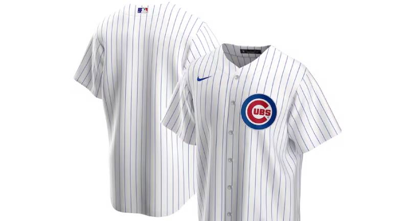
The History of the Chicago Cubs Logo
![]()

Rolling back the years, let’s time travel a bit. Each tweak, each transformation, they tell tales of bygones.
The Birth of the Logo
The inception of this iconic logo dates back to the early 20th century. Picture this: Baseball was gaining traction, and here came a team from Chicago stamping their mark. The initial designs were simple, yet unforgettable.
Evolution with Time
From minimalistic to detailed, from black and white to radiant colors, the logo witnessed change. But like your favorite childhood snack, the core essence? Unaltered.
The Colors of the Chicago Cubs Logo

Colors aren’t just, well, colors. They’re emotions splashed on a canvas. Let’s decode, shall we?
The Radiant Red
It’s the lifeblood of the team. Fiery, vivacious, and ever so vibrant. When you see that red, you think passion. You think commitment.
The Deep Blue
Ah, the depth of the ocean and the vastness of the sky. This blue? It’s trust, stability, and the profound legacy the team carries.
The Font Used in the Chicago Cubs Logo

You might think, “It’s just letters, right?” Nah, man. Fonts? They’re the voice when visuals remain silent.
Typeface Tells Tales
The Cubs’ logo typeface has a retro vibe. It speaks of history, yet it’s so darn contemporary. It’s classic, a bit like old vinyl records, emanating tunes of nostalgia.
A Nod to the Fans
Let’s chat about those die-hard, jersey-wearing, chant-screaming fans.
The Emotional Connect
The logo is more than just an emblem for the fans. It’s a badge, a symbol of allegiance. When fans sport that logo, it’s not just support; it’s undying love.
The Stadiums’ Echo
If walls could talk, Wrigley Field would weave tales of roaring crowds, all echoing the logo’s pride.
The Global Influence
Baseball might be America’s game, but the Cubs’ influence? Global, mate.
Beyond Borders
From caps in Canada to shirts in Shanghai, the logo’s reach tells us it’s not just about a game. It’s about the spirit, transcending boundaries.
Collaborations and Merchandise

Ever seen those trendy jackets with the logo? Or those sneakers? It’s a brand, a lifestyle, a statement. The logo’s not just on the field, it’s on the streets, turning heads.
FAQ On The Chicago Cubs Logo
What Inspired the Chicago Cubs Logo Design?
The Cubs logo has undeniably taken several turns over its history, yet it remains a classic emblem of baseball culture.
Initially inspired by a need for simple recognition, it’s evolved, incorporating the city’s spirit and the iconic colors of red, blue, and white, reflecting the uniforms worn by countless legends.
How Has the Logo Changed Over Time?
Trace the logo’s journey, and you’ll notice substantial adjustments. Starting as a simple bear, it was transformed multiple times, adding a C, embracing bolder fonts, and integrating a Chicago-esque feel, mirroring the team’s development and the evolution of a historical Cubs cap insignia.
Why Does the Logo Use a Bear?
Once upon a time, a cub meant a young, ferocious bear. It symbolized the fresh talent on the Cubs early teams. This imagery stuck, becoming a mascot for the team and giving the Chicago Cubs a presence akin to the Chicago sports brand persona that’s now revered.
Can the Logo Be Used for Personal Merchandise?
Heads up: The Chicago Cubs logo is trademarked. Using it on personal merchandise without permission might slide you into legal hot waters. Fans better stick to official Cubs merchandise, ensuring both support for their team and legal peace of mind.
What Do the Colors in the Logo Represent?
The logo’s colors are as much a part of its DNA as Wrigley Field is to Chicago. The deep blue symbolizes loyalty and excellence, while the red accentuates energy and passion. The white? It’s a canvas for endless possibilities and victories, past and future.
Is the Logo Embodied in the Chicago Cubs Mascot?
Absolutely, you bet it is. Clark the Cub proudly embodies the Cubs logo on his attire. He’s an energetic representation of the team, engaging with fans and donning gear that reflects the iconic Cubs colors, also giving life to the logo off the field.
What’s the Significance of the ‘C’ in the Logo?
That ‘C’? It’s more than a letter; it’s a hallmark of identity. Rooted firmly within the Chicago Cubs logo, it’s a symbol that connects the team to its home city, enveloping the essence of Chicago baseball culture within its storied embrace.
How is the Cubs Logo Different from Other MLB Team Logos?
The Chicago Cubs logo has a unique, historic charm that sets it apart. While other MLB logos vary in complexity and design, the Cubs logo boasts a classic simplicity, captured in an emblem that has stood the test of time, much like the ivy of Wrigley Field.
What’s the Best Way to Buy Official Chicago Cubs Logo Merchandise?
To score official gear, head to trusted retailers or the Cubs’ official store. It’s a safe bet for authenticity, ensuring you’re getting merchandise that’s the real McCoy, and your purchase supports the team.
Are There Any Special Editions of the Chicago Cubs Logo?
Indeed, special occasions call for unique flair. The 2016 World Series win saw special edition logos grace merchandise and fan memorabilia. These editions become cherished fragments of the Cubs’ storied timeline, much like a treasured Harry Caray broadcast.
Conclusion
And so, we’ve rounded the bases on the Chicago Cubs logo, a beacon steeped in the heritage of the game and the city it calls home. It’s more than just a mark; it’s an heirloom that tells of epic plays, the crack of bats, and the roar of the Wrigley Field faithful.
This dive into the logo’s DNA dissects each thread of blue, red, and white—honoring a history rich with legends and a future ripe with promise. These colors and symbols transcend the sport, evoking a community’s bond, revolutionized in a patch of fabric that pulses with the heartbeat of Chicago.
For the love of the game, and the love of design, the iconic emblem stands unyielded. It’s a homage to the past and an emblem for tomorrow—gleaming under stadium lights, it’s a symbol that forever flies the W for fans indulging in sports lore and the artistry woven into the very fibers of the Cubs’ narrative.
If you liked this article about the Chicago Cubs logo, you should check out this article about the Cleveland Indians logo.
There are also similar articles discussing the Atlanta Braves logo, the Milwaukee Brewers logo, the Minnesota Twins logo, and the New York Mets logo.
And let’s not forget about articles on the Washington Nationals logo, the Texas Rangers logo, the Baltimore Orioles logo, and the San Francisco Giants logo.