


Imagine a symbol that instantly sparks recognition, that singular emblem radiating with identity and pride. The Kia logo—it’s more than just a piece of branding; it’s the face of innovation and ambition on a global scale.
The streets hum with a diverse palette of these badges glinting under city lights, each one a storyteller, each one a promise of quality and design finesse.
In the torrent of automotive giants, Kia’s emblem stands as a testament to the company’s mettle and evolution.
Let’s navigate through the riveting saga of a logo that’s more than just a design—it’s a nod to heritage and a leap into the future.
With your mind at the wheel, we’ll delve into the tapestry woven by South Korean automakers, the subtleties of corporate identity, and the strategic revamps that transform customer perception.
You’ll emerge from this read not just informed, but inspired, having unraveled the intricate layers behind a seemingly simple symbol.
The journey will also underscore the critical bearings of brand equity—a triumph for any driving force in the marketplace.
So buckle up. It’s not just about a car logo; it’s about the story it drives forward.
The Meaning Behind the Kia Logo
![]()

Let’s dive in, shall we?
A Tale of Letters
When you look at the Kia logo, what you see first are those letters. K, I, and A. Seem simple, right? Yet, they hold more meaning than you might think.
See, ‘Kia’ hails from the Korean words ‘ki‘ (起 – to rise or come up out of) and ‘a‘ (亚 – Asia). So in essence, Kia translates to “rising out of Asia”. Pretty deep for just three letters, huh?
The History of the Kia Logo
![]()

Strap in, folks. We’re going on a time travel trip.
The Humble Beginnings
Back in the 40s, Kia was all about bicycles. Yeah, you read that right. Bicycles. The first logo was just a simple text, very different from what we see today.
The Evolution
Through the years, the logo evolved, just like the company. From bicycles to motorcycles, then trucks, and finally cars. And with each step, the logo transformed, finally taking the shape we know today in the 90s.
The Colors of the Kia Logo
Kia’s logo, man, it’s unmistakable.
Raw Power
Black. Like the night sky. The color of mystery. Intense. It’s daring, it’s bold. There’s no messing around with this, it screams authority.
Twisted Ribbons
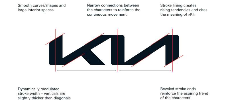
The actual design? Picture this – a couple of intertwined ribbons, free-flowing, totally casual but with a purpose. They form the letters ‘K’, ‘I’, ‘A’. Each letter somehow slightly detached, but in a funky way.
The Font Used in the Kia Logo
Next up, let’s talk about that sleek font.
Simple Yet Powerful
The Kia logo uses a custom, stylized font. It’s bold, it’s simple, and it’s confident. Kinda like Kia itself, wouldn’t you say?
The Impact of Italicization
Also, notice the italicization. It gives the logo a sense of motion, suggesting speed and forward movement. That’s pretty cool for a car company, right?
The Symbolism in the Kia Logo

This might seem a little philosophical, but bear with me.
The Power of Symmetry
The Kia logo is symmetrical. It’s an unspoken nod to balance, harmony, and perfection. It’s Kia’s way of saying, “We strive for perfection in every car we make”.
The Effect of Rounded Edges
Have you noticed how the edges of the letters are rounded? That’s not a design fluke. It softens the look of the logo, adding a friendly, approachable vibe. It’s like Kia saying, “We’re powerful, but we’re also here for you.”
The Kia Logo and Brand Identity


Lastly, let’s see how the logo contributes to Kia’s brand identity.
Creating a Global Impact
As we’ve seen, the Kia logo signifies a global presence. This is a huge part of Kia’s brand identity, emphasizing their desire to have a worldwide impact.
Signifying Quality and Trust
The letters KIA, in their bold and straightforward font, represent the company’s commitment to quality and trust. They’re saying, “We’re Kia, and we stand behind our cars.” It’s a powerful statement, one that’s helped build their solid reputation.
Reflecting Innovation
The modern design of the Kia logo reflects the company’s innovative spirit. It’s fresh, it’s stylish, and it’s forward-thinking – much like Kia’s approach to car manufacturing.
So, there you have it. The Kia logo is more than just a logo. It’s a story. It’s a promise. It’s a symbol of what Kia stands for – quality, innovation, and a commitment to making a global impact. Pretty cool, right?
FAQ On The Kia Logo
What’s the story behind the Kia logo?
The Kia logo packs a punch with its sleek simplicity. You know, it reflects their ethos—’The Power to Surprise’.
Pivoting from a basic name-in-a-circle design, the latest logo boasts an unbroken, rhythmic script that suggests movement and ascension—an emblem of Kia’s daring innovation and growth in the global market.
Has the Kia logo changed over time?
Absolutely, it’s had a few makeovers. From the original 1952 cycle, the emblem has morphed, showcasing Kia’s shifting tides and international brand evolution.
The most recent 2021 unveiling was a bold step, ditching the familiar oval for a more fluid and futuristic style—signaling a brand not just keeping pace but setting it.
What does the Kia logo represent?
The logo is more than just eye candy; it’s a flag bearing the brand’s essence. Its interconnected letters embody unity and progress while echoing Kia’s dedication to creative solutions and customer satisfaction.
It’s like a visual handshake promising reliability paired with that zest for the future.
Why did Kia opt for a logo redesign?
Kia’s switch-up was more than just a fresh coat of paint—it marked a full-throttle leap into their ‘New Kia’ strategy.
Picture this: a sign of modernity, embracing change, and embracing a bold stance in the electric vehicle surge. They’re not just selling cars; they’re selling a renewed lifestyle.
Is there a meaning to the typography in the Kia logo?
That’s right, the typography isn’t random; it’s calculated. The stylized, continuous strokes signal a break from the ordinary, a nod to innovation. It’s their way of saying Kia isn’t static—it’s dynamic, it’s forward-moving, and it’s not content with resting on yesterday’s laurels.
How does the Kia logo differ from other car brand logos?
Kia’s emblem stands out with its bare-bones, type-centric approach—eschewing common brand symbols for straightforward boldness. It’s minimalistic, yet it captures the spirit of a car manufacturer that’s looking to chart its own path and steer clear of the conventional roadway.
What impact did the redesign of the Kia logo have on the brand’s image?
The revamp was like a jolt of adrenaline to Kia’s image, infusing the brand with a cutting-edge aura.
It aligned them with other industry disruptors—those who don’t just evolve but look to reshape the whole playing field. It’s all about underscoring Kia’s role as a trendsetter, not just a trend follower.
Are there any hidden messages in the Kia logo?
Isn’t everyone hunting for Easter eggs these days? The Kia logo keeps it subtle, but the symmetry and forward tilt in the lettering may suggest progress and speed.
It’s like whispering their aspirations to the consumer without screaming in their face—a subliminal message of constant momentum.
How do consumers perceive the new Kia logo?
Consumers? They’ve taken notice. The feedback loop sings with words like “modern”, “progressive”, and “sophisticated”. It’s resonating with the Insta-generation craving for innovation and finesse.
This isn’t your grandad’s car emblem—it’s a totem of cool that’s drawing eyes in a saturated market.
Can the Kia logo aid in the company’s marketing strategy?
Spot on, it can, and it does. That logo’s like a trusty compass—it guides their entire marketing fleet, providing a visual anchor that ties every campaign together.
It’s the battle standard atop every advert, every dealership, marrying brand recognition with a customer’s penchant for the new-wave Kia vibes.
Conclusion
Wrapping things up, the Kia logo stands as a beacon of innovation, a visual pledge etched into the psyche of the modern motorist. This insignia—reimagined, bold, and brimming with intent—speaks volumes. The journey from a plain typeface surrounded by a circle to the sleek, rhythmic contour that graces today’s models is a tale of metamorphosis.
- It’s a symbol that mirrors Kia Motors Corporation’s ethos and direction.
- It’s a story of how a brand evolves its visual branding to stay ahead.
- It’s a reminder that in the world of automotive logos, courage and clarity reign supreme.
So, think of the Kia logo not just as a label but as a banner under which the automaker marches into the future. With each twist of the road, this logo will continue to encapsulate the spirit of a car manufacturer that dares to drive the world forward—boldly and without hesitation.
If you liked this article about the Kia logo, you should check out this article about the RAM logo.
There are also similar articles discussing the Porsche logo, the Ford logo, the Toyota logo, and the Cadillac logo.
And let’s not forget about articles on the Jaguar logo, the Chrysler logo, the Maserati logo, and the Dodge logo.