


Imagine you’re zipping down Route 66, the hum of the engine is your soundtrack, when suddenly, glimmering in the rearview, there it is—the unmistakable Dodge logo.
It’s more than just a badge; it’s a symbol that’s driven through the heart of Americana.
This article’s going to grip your curiosity, take it on a design detour, exploring how that iconic Dodge emblem has evolved, steadfast like the cars it represents.
Here, you won’t just scavenge facts; you’ll unearth the marrow of an emblematic journey—from the Dodge Brothers’ initial vision to the fiery tail of the Viper, and how the Dodge crest became an insignia of muscle car prowess.
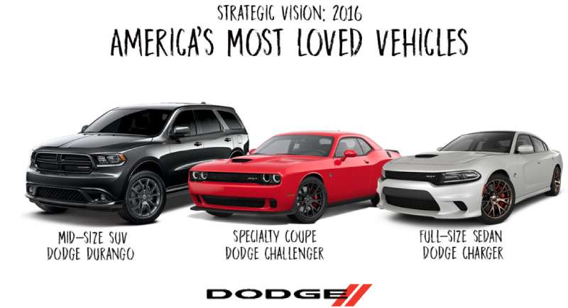
By the end, you’ll no longer just glance at the logo; you’ll see it, and understand the emblematic artistry that stitches Dodge’s cornucopia of automotive marvels together—street Kings like the Charger and the impenetrable Durango.
So buckle up; let’s dive head-first into this tale of steely aesthetics and reverberating heritage.
The Meaning Behind the Dodge Logo

The Ram’s Head
At the heart of the Dodge logo, a symbol that’s rugged and full of grit stands tall. It’s a ram’s head. You’ve seen it, right? This isn’t a random choice, friends. Nope. It tells a story about strength and power.
It’s like Dodge is saying, “Our cars are just as tough as a ram”. The ram, you see, it’s a beast that won’t back down from a fight. And that’s what Dodge wants you to feel when you’re behind the wheel.
The Star
And then there’s that star, right in the middle. But hold up, it’s not just any star. It’s a Pentastar. Now, this might sound a bit ‘out there’, but hear me out.
The pentastar is all about balance and harmony. It’s like Dodge is whispering, “Yes, our cars are tough, but they’re also balanced and harmonious”.
The History of the Dodge Logo

First Steps
Taking it back to the early days, we’re talking about the 1900s here. The Dodge logo wasn’t what it is now. Oh no, it was simpler, more straightforward. It was just the word “Dodge” in a simple font. No rams, no pentastars. Just the name, standing proud.
The Evolution
As time ticked on, Dodge decided it was time for a shake-up. They wanted something that shouted, “Hey, look at us!”. So, they introduced the ram’s head in the 90s. It was a bold move, and it paid off.
It was like they’d found their spirit animal, and people loved it. Then came the pentastar in the 2000s, adding that dash of harmony we talked about earlier.
The Colors of the Dodge Logo

The Powerful Red
First thing you notice about the Dodge logo? It’s that fiery, bold red. It’s the color of passion, of power, of love. It’s like Dodge is shouting, “We’re here, and we’re not afraid to show it”.
The Pure Silver
Then, there’s the silver. It’s sleek, it’s sophisticated. It’s the color of technology, of innovation. It’s Dodge’s way of saying, “We’re not just about power, we’re about progress too”.
The Font Used in the Dodge Logo

Bold and Sturdy
The font used in the Dodge logo is just as important as the rest. It’s bold and sturdy. It’s the kind of font that tells you Dodge isn’t messing around. It’s a font that means business, just like the cars they make.
Simple Yet Impactful
It’s also simple, not too flashy. It’s like Dodge is telling you, “We don’t need to show off. Our cars speak for themselves”.
The Logo’s Impact on Brand Recognition

Instant Recognition
You see that ram’s head, and you know it’s Dodge. You see that fiery red, and you know it’s Dodge. The logo has done its job. It’s made Dodge instantly recognizable. It’s like a beacon, guiding you to their cars amidst a sea of others.
Emotional Connection
But it’s not just about recognition. It’s about making you feel something. When you see that logo, you feel the power, the passion, the innovation. It’s all there, in one simple logo.
The Future of the Dodge Logo
Consistency is Key
One thing’s for sure, Dodge isn’t likely to change their logo anytime soon. They’ve found something that works, something that people recognize and connect with. So why change it?
The future of the Dodge logo is all about consistency. It’s about sticking to what works and making it even better.
Innovating While Retaining Identity
That said, Dodge isn’t afraid of a little innovation. Just like their cars, they’re always looking to push the boundaries, to try something new.
But whatever they do, they’ll always retain that core identity. The ram’s head, the pentastar, the bold red – these are things that are here to stay.
So there you have it. The Dodge logo is more than just a pretty picture. It’s a symbol of power, of innovation, of balance. It’s a beacon of recognition and a source of emotional connection.
It’s a testament to Dodge’s past, a sign of their present, and a hint at their future. It’s Dodge, through and through.
FAQ On The Dodge Logo
What’s the story behind the Dodge logo?
Oh, the Dodge logo. It’s quite the tale—originally portrayed by the famous Dodge Brothers emblem, a nod to the founders. Since then, it’s morphed across time, yet consistently reflected Dodge’s robust DNA.
Currently, you spot the ferocious Ram, mirroring the strength of their lineup, especially those hefty Ram Trucks.
How has the Dodge logo changed over the years?
Like a chameleon, it’s shifted appearances—always keeping us on our toes. From the rudimentary 1914 Stars and Globe to a charged Ram, it’s danced through forms, including the fraternal Dodge Brothers text and the Pentastar stint.
Each transformation, a fresh chapter in that muscular American Muscle Car library.
Is the Ram logo the same as the Dodge logo?
Once hitched, now amicably split. Until 2010, the Ram confidently stood as the Dodge emblem. A corporate shuffle later, and Ram trucks became their own entity. Bold, standalone, yet sharing ancestry—like cousins at a family mopar.
What does the Dodge logo represent?
It’s the gladiator of logos, each iteration championing the Dodge ethos. Think durability, innovation, and potency.
Like a badge of honor, it pledges allegiance to performance and American craftsmanship—the musculature of each Dodge Charger, the pulse of innovation beating through.
Why did Dodge choose a ram for its logo?
The ram—talk about a headstrong choice. This beast signifies unyielding force and that forward charge. Dodge latched onto this spirit animal to project power, perfectly aligning with Dodge’s troop of muscle cars. It’s as though each taillight whispers: “resilience”.
Is the Dodge logo different from other car brands?
Absolutely. It’s Dodge’s fingerprint—distinct and storied. Not just your everyday car symbol, it’s a dynamo of design that mirrors Dodge brand history. Looks across the lot, and it’s the emblem that will gun your engine with its iconic stance.
What was the original Dodge logo when the company was first founded?
Memory lane, right? The original logo rolled out sporting a globe flanked by two interlacing triangles forming a six-pointed star—Dodge Brothers’ signature. It emphasized a global perspective, a prelude to their future as globetrotting automotive champs.
When did Dodge last update its logo?
Recent history buffs, unite—it’s been a bit. The head-butting Ram parted ways in 2010, leaving Dodge with just the wordmark and dual stripes—the epitome of sleek minimalism. Fluent in modernity, poised and ready to accelerate into future chapters.
Why did Dodge separate from Ram in terms of branding and logo?
Call it corporate evolution. In 2009, decisions up the chain at Chrysler (part of the global giant Stellantis now) crowned Ram with its own kingdom, thereby promoting each brand’s unique identity—Dodge’s racing pulse vs. Ram’s workhorse stature.
Does Dodge use the Dodge Brothers emblem today?
Nostalgic, right? Not in the lead role anymore, but Dodge Brothers Company influence lingers, specially in vintage or special edition arenas. It’s like the heritage seal; not front-lining the hood, but whenever it shows up—hello, classic swagger.
Conclusion
Well, we’ve scorched the pavement on this one. The journey through the twists and turns of the Dodge logo history—a blend of American culture and raw, mechanical artistry—brings us to now, a contemporary badge, a storyteller on wheels.
So, what gives, right?
- We’ve gawked at logos that harked back to the Dodge Brothers, symbols that anchored Dodge in the automotive industry.
- We’ve witnessed that emblem transform, break free, morph into the standalone Ram Trucks logo.
And here’s the kicker—the evolution isn’t over. Not close. As the tides of design ebb and flow, so too will that symbol sitting gallantly on grilles.
Thinking aloud, it’s more than just metal and paint. It’s a heritage—forged of steel, sweat, and the stuff of legend. If you ever find yourself nose-to-nose with the Dodge logo again, you’ll get it—the weight it carries, the stories it tells. It’s never just a logo; it’s a legacy etched on asphalt.
If you liked this article about the Dodge logo, you should check out this article about the Lamborghini logo.
There are also similar articles discussing the Bentley logo, the Hyundai logo, the Jeep logo, and the Audi logo.
And let’s not forget about articles on the Cadillac logo, the Jaguar logo, the Chrysler logo, and the Maserati logo.