


Imagine this: you’re cruising downtown, the city lights blurring past. Suddenly, a sleek silhouette catches your eye; it’s that unmistakable Cadillac crest. It stands not just as a badge but as a symbol, one that’s endured over a century of automotive history and style revolutions.
The Cadillac logo is more than a mere emblem; it’s the heart of a brand that marries opulence with innovation.
In this dive into design elegance, we’ll explore the tale woven into the very fabric of Cadillac’s visual identity.
Unpack the lineage behind the shield, the nuanced shifts of the crest, and how it encapsulates heritage and prestige.
From passionate car aficionados to those intrigued by the alchemy of branding, this article will drive you through the intricate lanes of the Cadillac logo’s evolution.
By journey’s end, you’ll grasp the significance of each curve and color within Cadillac’s emblematic iconography. Buckle up; we’re peeling back the layers of an automotive icon.
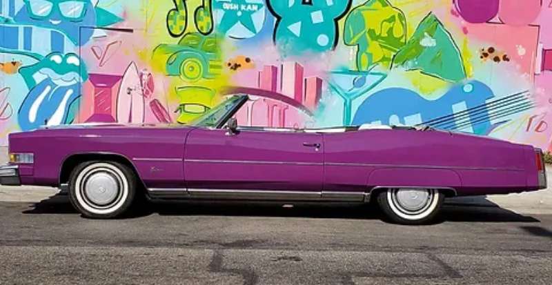
The Meaning Behind the Cadillac Logo
![]()

When you think of a Cadillac, the image that probably pops into your head is one of luxury, class, and style. Let me tell you, their logo is no different. The logo is a true representation of the Cadillac brand and what it stands for.
The Crest
So, the first thing you notice in the logo is the crest. The crest is derived from the coat of arms of Antoine de la Mothe Cadillac, the founder of Detroit and, supposedly, a distant relative of the Cadillac company’s founder. Isn’t that quite the connection?
The Ducks
Now, let’s talk about those funny little birds you see on the logo. They’re not actually birds; they’re ducks. Or, if we want to get all technical, they’re merlettes. In heraldry, merlettes symbolize integrity and clarity. And what better qualities for a car company to embody, right?
The History of the Cadillac Logo
![]()

Man, oh man, the Cadillac logo sure has been through some changes over the years. It’s like a butterfly, constantly evolving and becoming even more beautiful with time.
The Beginning
In the beginning, the logo was a complete replica of the Cadillac family’s coat of arms. All the colors, symbols, even the crown, were directly taken from the family’s coat of arms. Now, that’s what I call staying true to your roots.
The Evolution
Over time, the logo started evolving. The crown got dropped. The merlettes started disappearing one by one. The shield shape became sleeker, more streamlined. It was like watching a caterpillar transform into a butterfly.
The Colors of the Cadillac Logo
The colors of the Cadillac logo? They are audacious, they are vivacious, they are pure Cadillac.
Pristine White
First up, let’s chat about the white. Not just white, but sparkling white. It’s more than a color – it’s a statement, screaming luxury in its purest form. It’s like the brand whispering, “Hey, we’re all about elegance and exclusivity here!”
Sophisticated Black
Then, we swing to the black. It’s the epitome of chic, boasting a power and sophistication that’s simply irresistible. It’s the classic tuxedo, never going out of style.
The blend of black and white in the logo is like the perfect symphony – harmonious, striking, and absolutely captivating. It’s the epitome of the brand’s commitment to luxury, quality, and style.
The Font Used in the Cadillac Logo
The font used in the Cadillac logo? Pure class. It’s bold, it’s beautiful, and it’s oh-so-very Cadillac.
The Style
The font style is a sans-serif. It’s clean, it’s modern, and it’s straight to the point. Just like the cars they make.
The Boldness
Then there’s the boldness. The font is so bold and so prominent. It screams luxury and style, just like their cars.
The Logo’s Influence on Car Design
The influence of the logo on Cadillac’s car design is evident.
The Shield Shape
The shield shape of the logo is mirrored in the design of the cars. Think about it. The angular lines, the streamlined design, all reflect the shield shape of the logo. It’s like the cars are wearing the logo, not just sporting it.
The Colors
The colors of the logo also influence the car designs. The gold and black are often used in the interior design, creating a sense of luxury and elegance. It’s like sitting in a piece of art, not just a car.
The Logo’s Impact on Brand Identity
![]()

The logo has a massive impact on the brand’s identity.
Symbol of Luxury
The logo, with its bold colors and sleek design, has become a symbol of luxury. When you see the Cadillac logo, you instantly think of class, style, and sophistication. It’s not just a logo; it’s a statement.
Emphasis on Heritage
The logo also emphasizes the brand’s rich heritage. The crest and the merlettes, they all connect back to the brand’s roots, to its beginnings. It’s like carrying a piece of history with you, everywhere you go.
The Logo in Popular Culture
The logo has had quite the journey in popular culture as well.
In Music
Who hasn’t heard of the countless songs that mention Cadillac? From Bruce Springsteen’s “Pink Cadillac” to Macklemore’s “White Walls”, the Cadillac logo has danced its way into our hearts through music.
In Movies

And let’s not forget the movies. The Cadillac logo has made appearances in a number of films, adding a touch of class and luxury to the silver screen. Remember the iconic pink Cadillac in “True Romance”? That’s the power of a logo.
The Future of the Cadillac Logo
Who knows what the future holds for the Cadillac logo?
Continued Evolution
If history is anything to go by, we can expect the logo to continue evolving. Maybe it’ll become even sleeker, even more streamlined. I, for one, can’t wait to see what the future holds.
Expanding Influence
And perhaps the logo’s influence will expand even further. Maybe we’ll see it influencing more than just car design. Maybe we’ll see it in fashion, in architecture, in art. The possibilities are endless.
In conclusion, the Cadillac logo is much more than just a logo. It’s a symbol of luxury, a reflection of heritage, a beacon of style. It’s a statement, a promise, a commitment to quality. It’s not just a logo, it’s a Cadillac.
FAQ On The Cadillac Logo
Why does the Cadillac emblem symbolize luxury and prestige?
The Cadillac emblem, with its iconic crest and wreath, serves as a beacon of luxury. It’s a historical nod to the brand’s commitment to quality and upper echelon status.
This logo is synonymous with premium American craftsmanship, making it a powerful symbol within the General Motors family and the automobile industry.
What’s the origin of the Cadillac logo’s design?
Delve into the Cadillac logo, and you’ll find a tale as rich as the brand itself. Tracing its roots back to the family crest of Antoine Laumet de La Mothe, sieur de Cadillac, the name behind the company.
Infused with nobility, the emblem reflects a storied heritage intertwined with automotive elegance.
Has the Cadillac symbol gone through many changes?
You bet, the Cadillac badge has evolved, reflecting the brand’s growth and the pivotal shifts in automotive design.
From the early simplistic emblems to the latest sleeker shield, each redesign captures the essence of the era, all while holding onto the luxe vibe of those iconic LSI keywords: “Escalade,” “V-Series,” and “American luxury vehicles.”
What do the colors and symbols in the Cadillac logo represent?
Each hue and figure is brimming with meaning. The silver and black tones echo innovation and sophistication, while the red and gold suggest passion and riches.
The crest’s elements – merlettes, crown, and laurel wreath – speak to valor, royalty, and triumph in the Automobile Industry, synonymous with the Cadillac’s brand identity.
Why is the Cadillac logo considered iconic in the car industry?
The Cadillac insignia is more than just a car company trademark. It’s a beacon of stability in an ever-shifting landscape. Like other timeless automotive symbols, it captures the spirit of its era and exudes a sense of arrival. The logo doesn’t just signify a car; it signals a lifestyle.
Is the Cadillac emblem featured differently on various models?
Indeed, the Cadillac shield is adapted per the character of each model. Look at the sporty V-Series; the logo’s given a more aggressive, modern twist, closely linked with its performance identity.
In the luxurious Escalade, it appears grander, aligning with the vehicle’s commanding presence.
What makes the Cadillac logo stand out from other car logos?
It’s the mix of history, opulence, and a dash of modernity. Brand recognition is at the heart of the Cadillac emblem. It stands out with its distinctive crest and is often larger than life, just like the cars it represents. It’s more than a logo; it’s an aspirational symbol.
Can the Cadillac logo be customized for personal use?
Customization of the Cadillac badge by individuals is a dicey area – think trademark rules and brand integrity. Generally, any alterations for personal use would need to steer clear of legal and branding no-nos.
Cadillac’s monogram is meant to remain pristine and unchanged to protect its heritage and prestige within the brand evolution.
How has the Cadillac logo influenced the brand’s marketing?
The logo’s influence is huge. It’s a central piece of Cadillac’s marketing campaigns. It vouches for quality and magnificence before the car even gets a glance.
The Cadillac crest anchors advertisements with a recognizable visual that resonates with luxury car brand identity and the promise of a premium experience.
Does the Cadillac emblem reflect the company’s future direction?
Spot on! As Cadillac treads into the future with electric models and advanced tech, the logo has undergone a transformation to stay relevant. It’s sleeker and more refined, mirroring the brand’s forward thrust while paying homage to its luminous past.
It signals that Cadillac’s tradition will drive its innovation, solidifying its status in the new age of automotive design.
Conclusion
Wrapping up our visual joyride with the Cadillac logo, it’s clear: we’re not just talking about an emblem. We’ve journeyed through a narrative rich with heritage, where crests reflect innovation and luxury sedans become storytellers. This isn’t merely a brand identity; it’s a testament to the enduring legacy of an American luxury vehicle.
Remember, the logo’s transformation mirrors an ongoing saga. From the ornament on a classic Cadillac Eldorado to the digital footprints across Cadillac’s marketing campaigns, that insignia evolves yet remains steadfast—a beacon of prestige in a sea of automotive emblems.
And as designs wax bold, we’re here, onlookers, appreciating the artistry that keeps the wheel turning, ensuring that whenever you spot that shield, you instantly recall the grandeur associated with the name Cadillac. Here’s to the deep dives and the icons that stand the test of time, driving forward, emblem shining, steering the future of auto elegance.
If you liked this article about the Cadillac logo, you should check out this article about the Lamborghini logo.
There are also similar articles discussing the Bentley logo, the Hyundai logo, the Jeep logo, and the Audi logo.
And let’s not forget about articles on the Jaguar logo, the Chrysler logo, the Maserati logo, and the Dodge logo.