

Ever paused mid-scroll, a logo grabbing your eyeballs, whispering tales of grit, power, and heritage? The RAM logo does that.
It’s not just a badge; it’s a symbol, a flag borne by a fleet of iron horses galloping down highways, etched deeply in the soul of American automotive culture—a beacon of brawn and endurance.
Nestled in this article’s folds, a deep dive awaits. What’s in a logo? More than you think: history, evolution, the anatomy of recognition.
You’ll embark on a journey through the intricacies of automotive branding, unearthing the essence of visual identity that empowers names like Ram 1500 to resonate beyond their metallic frames.
Push past the surface where lays the blueprint of a logo that defines a legacy.
Why does a simple visual cue like the RAM head badge trigger a constellation of thoughts about pickup trucks, strength, and reliability? By the tail end, you’ll not just see but understand—how a single icon encapsulates the spirit of a brand and its iron-clad promise to deliver. Lean in, let’s decode symbols.
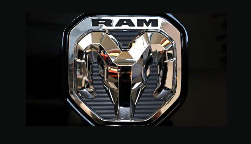
The Meaning Behind the Ram Logo
![]()

The Ram logo illustrates strength and durability, two attributes fundamental to the brand’s reputation in the pickup truck market. This emblem is more than a mere symbol; it is an encapsulation of ethos and purpose. The portrayal of the Ram signifies a relentless force, an animal known for its robustness and sheer power, steadily aligning with the tough nature of the vehicles.
Symbolism and Representation
The Ram head design is iconic, symbolizing not only the animal’s vigour but also the indomitable spirit sought after by truck owners. It becomes a beacon of resilience in the face of challenges. Its forward stance is assertive, connoting the forward thrust and ambition of the brand and its customers.
Brand Identity
In the automotive emblem universe, the Ram logo is a standout, a testament to the mission of a company that prides itself on delivering trusty, durable vehicles. The logo aligns perfectly with attributes such as towing capacity and off-road capability, which are intrinsic to the models bearing this badge. Potential customers instantly recognize these values in the mere glance at the logo.
Customer Perception
For customers, the Ram logo evokes a sense of reliability, a promise of capability whether on backcountry trails or urban roads. It conjures thoughts of vehicular fortitude, linking the driver to an identity that exudes confidence and control.
The History of the Ram Logo
![]()
The genesis of the Ram logo dates back to the early 1930s, pioneered by Walter P. Chrysler for Dodge vehicles. Initially, it graced the hood of Dodge cars as a hood ornament and, over the years, evolved into one of the most identifiable marks in the truck industry.
Walter P. Chrysler’s Vision and Dodge Connection
Chrysler’s vision was to imbue Dodge vehicles with a distinct identity, leveraging power and fearlessness through the Ram iconography. Its association with Dodge Ram continued until the brand’s division under Stellantis, where Ram emerged as a separate entity specializing in pickup trucks and commercial vehicles.
Morphing Through the Decades
Over decades, the Ram logo has undergone refinements to its aesthetic. From the more detailed renditions of the past to the streamlined, assertive logo seen today, each iteration has reflected contemporary design trends and the evolving ethos of the brand.
Autonomy and Evolution
Gaining autonomy, Ram Trucks adopted the Ram’s head as the lone symbol of its burgeoning identity in the vehicle manufacturing industry. This change marked a new era, an unambiguous declaration of Ram Trucks’ exclusive focus on crafting vehicles that encapsulate the strength denoted by their logo.
The Colors of the Ram Logo
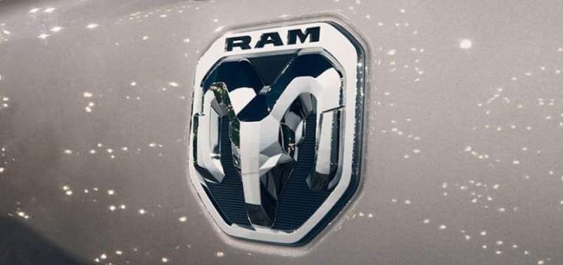

Every hue in the Ram logo has been meticulously chosen for its psychological impact and its resonance with the DNA of the brand.
The Prominence of Black
Black dominates, exuding professionalism and sophistication. This color choice incarnates power and solidity, mirroring the robust nature of Ram Trucks. It’s a color that speaks to the determination and seriousness with which the brand approaches vehicle design and performance.
Accents and Backgrounds
Backgrounds often shimmer in metallic silver or chrome, a nod to industrial strength and cutting-edge technology. These accents are not mere aesthetic choices but strategic enhancements that impart a sense of durability and modernity.
Nuances and Adaptations
Depending on the application and model, color nuances might appear, each thoughtfully integrated to complement and highlight the boldness of black and the sleekness of chrome.
The Font Used in the Ram Logo

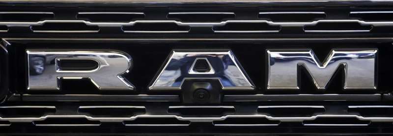
The typographical choices of a brand are as critical as the iconography. In the case of the Ram logo, the font has been chosen to convey sturdiness and readability.
Clarity and Strength
Bold sans-serif fonts are used, favoring clarity and ease of reading. This choice is intentional, ensuring the name stands strong, easily distinguished amidst a myriad of signs and symbols in the automotive market.
Design Rationale
The strategically selected spacing and proportionality of the letters in the Ram font foster a sense of stability and cohesion, reflecting the characteristics of the vehicles themselves.
The Overall Impact
Through typography, a subtle yet vital communication happens. It professes a brand’s values and becomes synonymous with them. In Ram’s case, the type embodies the brand’s commitment to performance and reliability.
Evolution in Branding
Transition from Dodge to Ram
The split from Dodge allowed Ram to establish a definitive and autonomous brand identity. This separation granted the freedom to sculpt a narrative centered solely on pickup trucks and commercial vehicles, focusing on the core strengths emblematic of the Ram name.
Modern Marketplace Positioning
In the present-day competitive American truck market, a logo is paramount in positioning. The evolution of the Ram logo is a careful adaptation designed to cement Ram’s presence and authority in the sector, matching contemporary consumer expectations.
Impact on Marketing and Consumer Connections

Link to Lifestyle
Marketing materials featuring the Ram logo transcend mere product placement. They forge a link between lifestyle and utility, associating the emblem with freedom, adventure, and strength, aligning with the marketing narratives seen in commercials and print ads.
Consumer Trust and Brand Equity
The steadfast presence of the logo across years builds consumer trust and enhances brand equity. It’s a promise, a warranty of sorts, representing not just a vehicle but a companion ready to meet the challenges of rugged terrains and heavy loads.
The careful cultivation of the Ram logo reflects a nuanced understanding of visual appeal and the psychological bedrock of branding. It isn’t just an emblem; it’s a chapter of legacy, a whisper of the wild, and a shout of certainty that reverberates with every truck that rolls off the production line bearing its mark.
FAQ On The RAM Logo
What’s the History Behind the RAM Logo?
The RAM badge descends from Dodge’s storied past. Originally debuting in the 1930s, it’s a nod to durability, with the Ram symbolizing strength.
Through the years, the emblem evolved with the brand—remaining synonymous with resilient vehicles that push past rough terrain like a true leader of the herd.
Does the RAM Logo Represent Anything Specific?
Yep, it screams toughness. That recognizable Ram head—mighty horns and all—is the epitome of raw power. It’s not just there for show; it’s a statement, a visual promise that these trucks, from the Ram 1500 to the heavy-duty lines, are built to tackle anything thrown their way.
Has the RAM Logo Changed Over Time?
Sure has, like any great symbol. Starting with that ’30s art deco style, to the more streamlined looks of today, the emblem’s taken many forms.
It’s mirrored the journey of Ram itself, maturing to reflect current automotive logo design trends while keeping the brand’s rugged charisma intact.
What Do the Colors in the RAM Logo Mean?
Can’t miss those shades—an assertive black accenting a metallic background. These colors aren’t random.
Black screams dominance, elegance, and the metallic sheen? It’s all about innovation and the future-facing tech that Stellantis packs under the hood. Together, they’re a beacon of quality in the automotive branding universe.
Is the RAM Logo Unique to the Brand?
You bet. While Ram started under the Dodge umbrella, the Ram’s head badge became the face of Ram Trucks after their spin-off in 2010.
Since then, it’s been this marque’s unique stamp—unequivocally identifiable, loaded with its own storied charm distinct from the Dodge lineage.
Can I Customize the RAM Logo on My Truck?
Truck lovers live for custom vibes. And get this, there’s a whole scene around personalizing emblems and badges. Whether it’s an aftermarket flourish or a special edition touch, having a twist on that iconic Ram head badge is like wearing your own spin on truck couture.
Are there Legal Restrictions on Using the RAM Logo?
As with high-stakes poker, don’t raise without the right hand. The logo, a legal trademark, is guarded territory.
Using it without permission from Stellantis could slam brakes on your plans, with a legal backlash. So rule of thumb—reach out, get consent before you brandish that emblem elsewhere.
What’s the Significance of the RAM Logo in Marketing?
This isn’t mere branding; it’s a beacon. In a sea of vehicles, that head badge, with its brand recognition and visual identity, makes a b-line straight for driver desires.
It’s more than marketing; it connects—tugging on emotions, signaling a bond of trust between the drive and the driven.
How Does the RAM Logo Compare with Competitor Truck Logos?
Now, we’re not throwing stones, but when it hits the fan, Ram stands its ground. In the arena of truck logos, it’s the bull among steers, full of brand image clout. Competitors have their symbols, sure, but Ram’s got that mix of legacy and muscle that’s hard to overlook.
Will the RAM Logo Evolve with Future Models?
Take it to the bank, evolution is a given. As technology shifts and design tastes change, that emblem will adapt.
But here’s the kicker—it’s always gonna stay true to what Ram Trucks are about: brute strength and unyielding tenacity. The future’s look? Expect bold, but the soul—the same.
Conclusion
And there we have it. What we’ve unpacked today is more than just a simple tour through the aesthetics of the RAM logo—it’s the dissection of an identity, a deep thrust into the heart of branding excellence. This symbol, with its robust horns and unwavering gaze, encapsulates a legacy. It’s an emblem for those who conquer trails and cut through the mundane, a badge for the bold.
- From the art deco origins to the sleek modern revamps
- The color psychology untangled
- The emblem’s sturdy fortress in intellectual property
Each thread we’ve pulled unravels the story of a logo that’s much more than an ornament on a grille. It’s a standard bearer for quality. As creators, spectators, or devotees of design, we embrace the power of such symbols. They are not just brands on metal but markers of culture—potent, silent heralds of stories waiting to be told. Keep watching. This isn’t where the art ends—it’s where it steers off-road, into the wilds of innovation.
If you liked this article about the RAM logo, you should check out this article about the Kia logo.
There are also similar articles discussing the Porsche logo, the Ford logo, the Toyota logo, and the Cadillac logo.
And let’s not forget about articles on the Jaguar logo, the Chrysler logo, the Maserati logo, and the Dodge logo.