

Imagine a symbol, instantly recognizable, that speaks volumes without uttering a single word. That’s the power of a logo. And not just any logo – we’re diving into the iconic GMC logo, a marque of strength that adorns the grilles of America’s beloved trucks and SUVs.
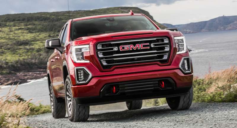
From the assertive stance of the GMC Sierra to the commanding presence of the Yukon, this emblem embodies an entire lineage of handiwork synonymous with durability and professional-grade quality.
In the bustling landscape of the automotive industry, a well-crafted symbol stands as a beacon, telling tales of heritage, signaling advancements, and, yes, kindling desires for adventure.
By the end of this read, expect to decode the brand identity etched in every curve and color of the GMC insignia.
You’ll trace its evolution, grasp the principles of logo design that empower this American car brand to resonate across the marketplace, and recognize how it cements its status as a pillar of vehicle marketing.
The journey will untangle:
- The history encapsulated within the badge
- Design elements that capture the spirit of General Motors Company
- Insights into what sets this particular truck manufacturer logo apart in a sea of automotive emblems
The Meaning Behind the GMC Logo

A Journey into the Essence
A true symbol, this logo, it’s a journey into the heart of an American classic, GMC. The letters themselves seem so simple, but they carry a weight, a legacy. The ‘G’, ‘M’, ‘C’ standing tall and proud, representing General Motors Company.
You see, logos are like storytellers. They communicate without uttering a single word, and the GMC logo, well, it’s quite the narrator.
The Shield
Now, check this out – the shape surrounding those letters. Notice it? That’s right, it’s a shield. Symbolizing strength, durability, and protection, the shield reflects the core values that GMC holds dear.
It’s an assurance, a silent promise that GMC vehicles are designed to withstand the test of time and the challenges of the road.
History of the GMC Logo

A Ride Through Time
Here, we’re hopping onto the time machine, back to the origins of the GMC logo. Picture this – the year is 1912. General Motors Truck Company unveils their first ever logo, a simple yet elegant ‘GMC’ embossed on their vehicles. It’s like the birth of a legend, you know?
Evolution
But like every great story, this logo has seen its fair share of transformations. Over the years, it’s adapted, evolved, always striving for that perfect balance between tradition and innovation. From a modest monogram in the early days to the iconic shield we know today, the logo’s evolution mirrors GMC’s growth as a company.
Colors of the GMC Logo
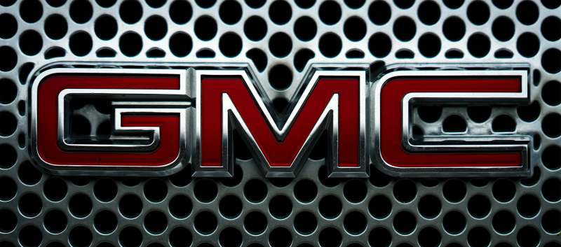
Time to roll out the carpet for the colors of the GMC logo. It’s a breathtaking tango between red and silver.
Powerful Red
First, let’s talk about the red. Bold, fiery, and brimming with power. It embodies GMC’s dynamic spirit and adventurous heart. This red isn’t shy, it’s a passionate powerhouse, screaming GMC’s dynamism from every pixel.
Shimmering Silver
Next up, silver. It’s not white, it’s more, it’s silver. Sleek, modern, and absolutely stunning. It’s the spotlight that makes the ‘GMC’ shine, letting it announce its arrival with flair. Against the passionate red, it’s a beautiful contrast.
This duo, the red and the silver, it’s a visual symphony that mirrors GMC’s dedication to superior quality and excellence. Stunning, isn’t it?
The Font Used in the GMC Logo

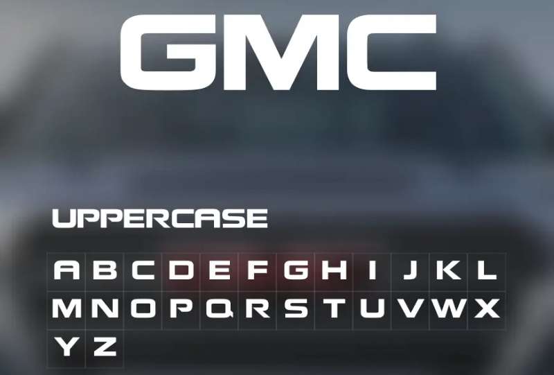
The Style
You’ve got to admire the font. It’s bold, it’s commanding, much like the vehicles it represents. A custom design, the font is a perfect blend of classic and contemporary. It’s a testament to GMC’s ability to balance tradition with modernity.
Symbolism
Each letter, ‘G’, ‘M’, ‘C’, they stand tall, just like the towering giants that GMC produces. And the all-caps? That’s no accident. It signifies authority, power, a sense of confidence that GMC exudes.
The Evolution of the GMC Logo Design
A Century of Change
Over a century, and yet the essence remains the same. The evolution of the logo design is a story of adaptation, of growth. It’s about staying true to one’s roots while embracing the future.
Reflecting Identity
Each change, each tweak in the design reflects a shift in GMC’s identity, mirroring the company’s journey. It’s like looking at a timeline, except this one is told through art and design.
The Global Impact of the GMC Logo

A Global Icon
Across borders, beyond boundaries, the logo is recognized globally. It’s a testament to GMC’s worldwide impact, a symbol of American automotive excellence that’s admired the world over.
The Power of Recognition
The power of a logo lies in its ability to be instantly recognized, and GMC has aced this game. The moment you see the bold red shield, the white letters, you know it’s GMC. It’s a mark of trust, a badge of quality that resonates with people across the globe.
The Influence of the GMC Logo on Car Culture
A Symbol of Strength
When you think of strength, power, and durability in the car world, what comes to mind? For many, it’s GMC. This iconic logo has influenced car culture by representing robust and reliable vehicles. It’s a symbol that resonates with car enthusiasts, auto professionals, and everyday drivers alike.
Inspiring Others
GMC’s logo has been a trendsetter in the automotive industry. Its simplicity, boldness, and the power it projects have set the bar high. It has inspired other brands to follow suit, making the logo not just a brand identity, but a design icon.
In the Hearts of the People

A Beloved Symbol
Ask any GMC owner what the logo means to them, and you’ll hear words like ‘trust’, ‘reliability’, ‘quality’. The GMC logo isn’t just a brand mark; it’s a beloved symbol that carries emotional value for many.
A Part of the Family
For many, GMC vehicles are more than just cars or trucks. They’re part of the family, companions on countless journeys, and the GMC logo?
It’s like a family crest, a symbol of the bond shared between the people and their beloved GMC vehicles.
FAQ On The GMC Logo
What does the GMC logo represent?
The GMC logo isn’t just a random symbol; it’s a hallmark of the robust General Motors Company heritage. Think relentless durability and professionalism.
It’s a beacon signaling American automotive excellence, with every line and curve there to remind you that you’re dealing with a titan of truck manufacturers.
How has the GMC logo evolved over time?
Oh, it’s a real journey through time! Starting as a simple acronym, the logo morphed through the years, adding bolder letters, more refined lines, and capturing brand identity evolution.
Today, it speaks to modernity while nodding respectfully to its storied past in auto logo evolution.
What color is the GMC logo?
Red and white, baby. That’s the power combo. Red for passion and energy, and white for purity and integrity. These aren’t mere colors but a reflection of the brand’s ethos and its commitment to the automotive industry.
Is there a difference between the GMC and Chevrolet logos?
Sure, they’re corporate cousins, but they’re distinct. Chevy sports the bowtie, while GMC flaunts a bold, squared-off letter ‘G’ encasing the rest of its name. It’s less about flair, more about the no-nonsense, professional grade badge they stand behind.
What elements are included in the current GMC logo design?
Front and center, there’s the sturdy ‘GMC’ letters, encased in a square that underlines the brand symbol strength. It’s clean, it’s sleek, it screams truck manufacturer logos: simple yet potent.
Why does GMC use the letters as their logo?
Letters create instant brand recognition, a critical aspect of brand identity. Just those three letters, G-M-C, and there’s an immediate connection to everything the brand represents. It’s all about being straightforward and recognizable in the vehicle logo design game.
What is the significance of the red color in the GMC logo?
That red? It’s all about passion for the craft, the fire in the belly for making vehicles that lead, not follow. In branding elements, color can communicate intention, and for GMC, it’s the undeniable ambition to be top of the food chain in American car brands.
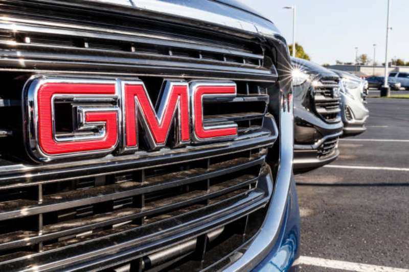
Can you find the GMC logo on all their vehicles?
Absolutely. It’s a badge of honor, taking pride of place on every grille and tailgate. Whether it’s a GMC Sierra or a GMC Yukon, the logo’s there, a stamp of trust and vehicle marketing ingenuity.
Has the GMC logo ever been redesigned for a specific model?
Now that’s where the GMC Denali enters the conversation. This high-end trim sports a few tweaks to the standard logo, giving it an extra sprinkle of finesse. Subtle changes like these amplify the luxury vibe, showing off the brand symbol flexibility.
What does the GMC logo mean for brand identity in the automotive market?
In the world of cars and trucks, your emblem is your story. GMC’s logo spells out reliability, premium quality, and a touch of American legacy. It gives the General Motors Company a face that helps it stand out in the bustling automotive industry.
Conclusion
So, we’ve cruised through the essence of the GMC logo—a badge more than emblematic of sheer utility and American automotive tradition. You’ve got the gist now, right? It’s way more than what meets the eye. It’s history, it’s artistry, all rolled into one enigmatic icon.
The palette, bold red and white, isn’t just about looking pretty. It’s an unspoken promise, a nod to adventure-seekers and the hard-working crowd. Every GMC vehicle model, draped with this insignia, is a testament to that enduring commitment. It’s woven into the fabric of their brand identity—a roaring declaration that General Motors Company is here to lead the pack.
And there you have it. The DNA of a truck legend, decoded right down to its graphic roots. A story that stretches from the GMC Denali trims to the sprawling SUV branding landscape. A narrative as compelling as the roar of a V8 on an open stretch. That’s the GMC logo for you, standing tall in a legacy of chrome and steel.
If you liked this article about the GMC logo, you should check out this article about the Alfa Romeo logo.
There are also similar articles discussing the Lexus logo, the Mazda logo, the Aston Martin logo, and the McLaren logo.
And let’s not forget about articles on the Acura logo, the Chevrolet logo, the Genesis logo, and the Maybach logo.