

Picture a symbol that encapsulates elegance, power, and a storied history in automotive excellence; that’s the Aston Martin logo. An embodiment of British luxury and a beacon for sleek design, it’s not just a badge—it’s a statement.
This iconic emblem, with its illustrious wings design and racing heritage, tells a tale of prestige and performance.
Through this piece, we unveil the layers that compose the Aston Martin identity, from the logo evolution to its influence in shaping the automotive luxury lifestyle.
Expect to unravel the threads of tradition and innovation that align to forge a corporate identity recognized worldwide.
You’ll emerge with insights on how branding elements, such as the prestigious automaker logo, resonate beyond the realm of car enthusiasts, sculpting an iconography that’s undeniably aspirational.
Dive in, and by the article’s end, the emblem of Aston Martin will signify much more than a luxury sports car identity—it will be the story of vehicular artistry itself.
The Meaning Behind the Aston Martin Logo

Delving into the emblem that graces each luxurious, high-performance vehicle emanating from this renowned British automaker, one cannot help but be intrigued by the symbolism embedded within. The Aston Martin logo, often described as a pair of wings, conveys a message of ambition, freedom, and speed. The wings are traditionally associated with the Greek god Hermes, a deity who personified quickness, and they imply that the vehicles possess a celestial quality—a chariot of the modern age that can transport its occupants with god-like velocity.
This winged emblem also holds connotations of prestige and excellence. It is a projection of the driver’s aspirations, a visual representation of soaring above the mundane, and of embracing the pure exhilaration that comes with driving a piece of automotive art. The combination of speed and luxury is succinctly captured by this logo, making it much more than a mere brand identifier—a manifesto of an elite driving experience.
Inside each detail, the Aston Martin badge crystallizes an ethos of automotive design, standing as a bastion of British heritage while evoking the avant-garde spirit woven into each vehicle. It embodies a promise of unyielding quality and a forward-looking philosophy, showcasing the meticulous craftsmanship that the brand is known for worldwide.
The History of the Aston Martin Logo

Trace the lineage of this revered symbol, and you’ll uncover a narrative steeped in the evolution of a motoring legacy. The genesis of the Aston Martin logo dates back to 1913, when founders Lionel Martin and Robert Bamford embarked on their mission to craft racing cars that represented the pinnacle of performance and design. The initial emblem was decidedly simple, embracing the merging of the founders’ last names, but the essence of what the badge would become was already taking form.
As the years passed, the insignia underwent several metamorphoses, each iteration encapsulating the era’s spirit and the brand’s progressing vision. In 1927, the iconic wings made their first appearance, and since then, they’ve become integral to the brand’s identity, with subtle refinements reflecting the evolving landscape of automotive excellence.
The legacy of the iconic Aston Martin insignia is witnessed in its chronological transformation—a visual diary of automotive history. Its durability in design demonstrates Aston Martin’s unwavering dedication to heritage and progress in high-end vehicle manufacturing, ensuring that with each new model rolls off the production line, it carries a century’s worth of innovation and iconography.
The Colors of the Aston Martin Logo
Colors possess the profound ability to convey brand philosophy in a silently eloquent language. Aston Martin’s logo predominantly employs a palette of green, black, and white. Herein, green—deep and resolute—resonates with the brand’s British roots, serving as an homage to the isles that birthed this automotive giant. A land where racing heritage thrives and where the union of elegance and machinery has long been celebrated.
The choice of black for the logo’s typography and outline stands as a statement of sophistication and power. It leaves no room for misinterpretation—this is a marque associated with opulence and decisiveness, where every contour of the logo has been crafted to translate strength and assurance.
Finally, the white space, which rests within the logo’s wings and around the iconic text, promotes an air of purity and clarity. White’s presence in this storied emblem suggests a canvas waiting to be imprinted with the legacy of each individual vehicle and its driver.
The selection of these colors was not arbitrary. They act as the standard-bearers of the brand’s identity, shaping perceptions and reinforcing Aston Martin’s place within the upper echelons of luxury sports car manufacturers.
The Font Used in the Aston Martin Logo

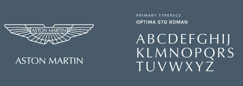
The typeface encased within the Aston Martin logo is as much a part of its identity as the wings themselves. The font is bespoke, speaking volumes about customization and personal touch—a testament to the brand’s commitment to exclusivity. It carries a certain grandeur, with letterforms crafted to evoke timelessness while standing firm against the ebb and flow of fickle design trends.
This proprietary font not just serves the purpose of legibility—it seems to command respect. Each curve, each straight line, conveys a balance between agility and stability, reflecting the characteristics inherent in the automaker’s creations.
The Logo’s Placement on Vehicles
The strategic placement of the Aston Martin emblem on the vehicles is a study in brand visibility and product identity. Residing confidently on the grille, the logo becomes the face of the machine—a welcoming gesture as it approaches, and a symbol of superiority as it departs. It’s a hallmark of craftsmanship and design, a signature that preludes the experience of interaction with unmatched automotive quality.
On the rear, the logo becomes a parting seal, a final statement of having witnessed something extraordinary. It’s as if the wings themselves are propelling the vehicle forward, bestowing a sense of authority and performance assurance to the driver, passenger, and onlooker alike.
The Impact on Brand Recognition


In the realm of luxury vehicles, brand recognition is paramount. Herein, the Aston Martin logo serves as the lodestar, guiding the brand’s presence in a sea of competitors. It’s an emblem known across continents, synonymous with unrivaled craftsmanship, state-of-the-art technology, and an unparalleled driving experience.
The impact of the logo extends beyond visual aesthetics. It taps into the emotive cores of consumers and enthusiasts alike. It’s a beacon for those who seek the ultimate in sophistication and driving pleasure—a visual shorthand for a legacy of British excellence and an ambassador of high-end vehicular aspiration.
Through its logo, Aston Martin doesn’t merely mark its territory in the automotive landscape but asserts its philosophy of fusing performance with elegance, making the emblem a universally recognized icon of opulence and speed.
FAQ On The Aston Martin Logo
What does the Aston Martin logo represent?
The logo, with its iconic wings, symbolizes speed, freedom, and aspiration, much like the avian creatures it takes after.
It’s intertwined with Aston Martin’s luxury and grand tourer pedigree, essentially capturing the essence of what the brand stands for: elegance in motion underpinned by power and heritage.
Why has the Aston Martin logo changed over time?
Change, they say, is the only constant. The Aston Martin logo has evolved to keep pace with design trends while retaining its core British luxury car emblem status.
Each iteration reflects the era, aligning the brand’s identity with contemporary aesthetics, without losing its heritage and recognizable identity.
What does the Aston Martin logo look like?
The logo boasts a pair of wings, akin to freedom and speed, combined with the Aston Martin name elegantly sprawled across.
It’s simplistic, yet sophisticated—a luxurious badge that’s undeniably associated with a prestigious automaker and instantly ignites dreams of luxury sports cars.
When was the Aston Martin logo first introduced?
Rewind to 1913, when Aston Martin was just a fledgling car manufacturer. That’s when we saw the birth of its first logo.
It’s since become an automotive branding titan, synonymous with high-performance vehicles and racing heritage but has kept the roots of its bygone days intact.
Is the Aston Martin logo one of the most recognized car logos?
Absolutely, it stands with the giants. The Aston Martin logo holds its own among the most recognized emblems.
It conflates prestige, racing lineage, and British craftsmanship, becoming a luxury lifestyle icon beyond just the auto industry, amplified by its appearance alongside James Bond.
What color is the Aston Martin logo usually?
It dons a regal silver and green palette. Silver reflects sophistication and modernity, while green ties back to its British heritage.
This combination exudes luxury and exclusivity, traits at the core of the Aston Martin brand, making the logo more than just a vehicle badge.
Has the Aston Martin logo ever appeared in movies?
Indubitably. James Bond, agents and espionage, right? The Aston Martin logo has graced the silver screen alongside 007 more times than one can count.
It’s this cultural entity, this connection to a universe of cool, calm, and collected that’s cemented the logo in pop culture lore.
What models feature the Aston Martin logo?
All models wear the logo proudly: from the bold DB series to the marvel of engineering that is the Valkyrie.
It’s a testament to the brand’s luxury vehicle category and its standing in the sportscar championship racing world, the logo unfailingly asserts Aston Martin’s identity across its fleet.
How can I get a genuine Aston Martin logo for my car?
Steer towards an authorized Aston Martin dealership. That’s the safest harbor for genuine automotive branding elements.
They guarantee authenticity, whether you’re looking to replace a faded badge or adding that touch of luxury car insignia to your ride. After all, only the real deal does your Aston justice.
Who designed the current Aston Martin logo?
The current logo was refined with a contemporary twist under the discerning eye of Marek Reichman, Aston Martin’s Chief Creative Officer.
His vision is etched into the wings, ensuring it embodies the sleek design and British elegance for which Aston Martin is globally applauded; a modern marvel steeped in motor racing heritage.
Conclusion
Navigating through the twists and turns of the Aston Martin logo narrative, we arrive at the journey’s end. It’s clear now, how a mere symbol transcends its visual boundaries to ink its mark on a luxury lifestyle and a racing heritage that’s uniquely Aston Martin.
We’ve witnessed the transformation of an emblem that’s grown alongside a brand with roots deeply planted in British soil. It stands as a beacon of prestigious automaker history, a narrative mirrored in every Aston Martin that leaves the showroom – from the DB series to the exotic Valkyrie.
This logo isn’t just metal upon leather. It’s a promise, a whisper of the iconic wings design intertwined with power, audacity, and opulent design. May every glance at that prestigious emblem remind you of what it represents: a journey not just of a brand but an icon that continues to rev the hearts of many, an automotive marque par excellence.
If you liked this article about the Aston Martin logo, you should check out this article about the Alfa Romeo logo.
There are also similar articles discussing the Lexus logo, the Mazda logo, the McLaren logo, and the Acura logo.
And let’s not forget about articles on the Chevrolet logo, the GMC logo, the Genesis logo, and the Maybach logo.