


Picture this: You’re cruising downtown, the streetlights casting glimmers over polished metal and glass—then it catches your eye.
The unmistakable Genesis logo. More than just metalwork, it’s a story, a silent ambassador to a world of luxury on wheels.
So, what’s in a badge? Stick around, and we’ll delve deep into the visual symphony of the Genesis emblem.
We’ll explore its evolution, its battle to stand out in the luxury vehicle market, and the meticulous craft behind the wing-shaped icon that graces the grille of these South Korean masterpieces.
You’re in for a treat if design tickles your fancy or if you’re just keen to understand the power of a high-end auto logo.
By the end, you’ll unravel the tale behind the badge that speaks volumes without uttering a single word.
Expect to emerge with a fresh lens on the emblematic identity that drives Genesis forward, and perhaps, drive your perception of branding to new heights.
The Meaning Behind the Genesis Logo

Wings of Luxury
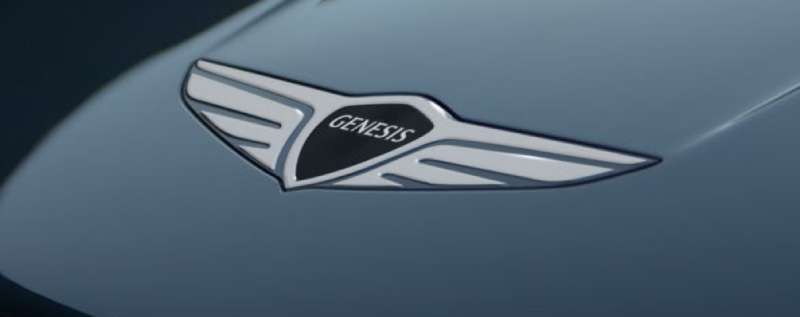
Look at the Genesis logo. It instantly says ‘luxury’, right? That’s the power of good design. Those wings, they’re not just there to look pretty.
They symbolize speed, freedom, and – this is key – aspiration. They show Genesis reaching for the sky, aiming to fly higher and higher in the world of automotive design.
The Hexagonal Badge
Then there’s the hexagonal badge, a geometric marvel sitting right in the middle of those wings. Now, hexagons are everywhere in nature, from the cells of a honeycomb to the crystal pattern of a snowflake. What better way to represent Genesis‘ commitment to natural, intuitive design? It’s a subtle touch, but it makes a big statement.
The History of the Genesis Logo

Origins and Evolution
So where did this striking logo come from? Well, Genesis was born as a luxury offshoot of Hyundai, and they wanted a logo that spoke to that heritage while also forging its own path. In the early sketches, you can see elements of the Hyundai logo, but there’s a new, more aerodynamic feel.
Over the years, it evolved, with the wings becoming more streamlined, the badge more pronounced, reflecting the brand’s growing confidence and stature.
The Winged Emblem Takes Flight
Fast forward to today, and the Genesis logo is instantly recognizable. It’s a symbol of luxury and ambition, a testament to the brand’s commitment to pushing boundaries and redefining standards. A logo is more than just a picture; it’s a story, and the Genesis story is one of relentless pursuit of excellence.
The Colors of the Genesis Logo

Black and Silver: The Colors of Elegance
When you think of luxury, what colors come to mind? Probably black and silver, right? They’re classic, timeless, sophisticated – just like Genesis.
The black represents power and elegance, while the silver suggests modernity and innovation. Together, they form a color scheme that perfectly encapsulates what Genesis is all about.
The Power of Simplicity
But let’s not forget the simplicity of the color palette. It’s not about being flashy or over-the-top; it’s about communicating a clear, strong message. The Genesis logo does this beautifully, with its monochrome scheme creating a sense of unity and cohesion.
The Font Used in the Genesis Logo


A Typeface that Speaks Volumes
The Genesis logo doesn’t just rely on visuals; the typography is equally important. The brand name is written in a clean, modern sans-serif typeface. It’s bold, clear, and easy to read, reflecting Genesis’ commitment to transparency and straightforward communication.
The All-Caps Statement
Notice how the brand name is in all caps? That’s not by accident. It creates a sense of authority and confidence, showing that Genesis isn’t afraid to stand out and make its presence known.
The Symmetry of the Genesis Logo
A Balanced Masterpiece
Take a step back and look at the Genesis logo as a whole. Notice the symmetry? It’s beautifully balanced, with the wings extending equally on both sides of the badge. This symmetry suggests stability and harmony, qualities that Genesis strives to embody in its vehicles.
The Circle within the Hexagon
And then, nested within the hexagonal badge, there’s a circle. Circles are a universal symbol of wholeness and completion. In the Genesis logo, it symbolizes the brand’s commitment to providing a complete, holistic driving experience.
The Impact of the Genesis Logo


A Symbol of Trust
A logo is more than just a pretty picture; it’s a symbol of a brand’s identity. And in the world of luxury vehicles, trust and reliability are paramount. The logo, with its sleek design and clear, confident typography, communicates these qualities effortlessly.
The Power of Recognition
But perhaps the most significant impact of the logo is its recognizability. Whether you see it on a car’s grille, in a magazine ad, or on a billboard, you instantly know what it represents. It’s a testament to the power of good design, of finding a visual language that speaks to people and sticks in their minds.
The Evolution of the Genesis Logo in the Future
Staying True to Its Roots
As we look to the future, it’s clear that the logo will continue to evolve. But no matter how it changes, it will always stay true to its roots. The wings, the hexagonal badge, the clean typography – these elements are at the heart of Genesis’ identity, and they’re here to stay.
Adapting to Changing Times
But just as Genesis continually pushes the boundaries of automotive design, so too will its logo continue to innovate. Maybe we’ll see new colors, new shapes, or even new ways of interacting with the logo in a digital space. But whatever happens, you can be sure it will be exciting, bold, and quintessentially Genesis.
FAQ On The Genesis Logo
What’s the story behind the Genesis logo design?
Imagine a blend of tradition and futurism, that’s where it hits. The Genesis emblem reflects a luxurious wing-shaped insignia, nodding to the classic spirit of flight and speed.
It’s the brainchild of designers aiming for elegance that perfectly captures the brand’s leap into the premium car league.
How does the Genesis logo differentiate from other car brand symbols?
It strides on the fine line of distinction and familiarity. While wings aren’t unique in automotive emblems, the sleekness of the Genesis badge sets a luxury vehicle branding tone.
Its horizontal spread implies stability, its silver sheen speaks class, unmistakably Genesis in the roar of competitors.
What alterations has the Genesis badge undergone since its inception?
Subtle yet impactful, like a master’s brushstroke refining a painting.
From a more detailed crest to a streamlined automotive logo design, the Genesis emblem has evolved to resonate more with the minimalistic, modern aesthetics, carving out a distinct corporate identity within the Hyundai luxury division’s portfolio.
Is the Genesis emblem reflective of the brand’s South Korean heritage?
Absolutely, but in a globally appealing way. The Genesis insignia merges South Korean finesse with international luxury car symbol standards.
It’s not about commonplace symbols but striking a chord with universal aspirations of premium brand identity, blending craftsmanship and innovative automotive design that transcends borders.
How does the Genesis logo impact customer perception of the brand?
First impressions count, and the Genesis emblem nails it. It brings an aura of exclusive car range and sleek sophistication, setting the stage for an expectation of unmatched quality and performance.
It’s the handshake before the deal, the promise of a high-end auto logo that holds weight.
Can you find the Genesis badge on all of their car models?
It’s the artist’s signature on every masterpiece. Yes, from the sporty Genesis Coupe to the luxurious Genesis G90, the signature wing-shaped logo is placed proudly, a beacon of the brand’s unyielding commitment to luxury car series values and unmistakable identity.
What does the design process for a car logo like Genesis involve?
Art meets science. It takes a team: designers, marketers, and consumer psychologists, brainstorming, sketching, and refining.
It’s a meticulous dance of visual brand language, analyzing shapes, colors, and the emotional resonance they wield. The result? A Genesis badge that’s not just seen but felt.
How does the Genesis emblem contribute to the brand’s marketing?
Think of it as a silent pitch. The Genesis logo conveys prestige, innovation, and elegance—core tenets of the brand’s narrative.
It’s a visual shorthand for automobile marketing, a hook that captures attention and seals the Genesis story and brand loyalty in the beholder’s mind.
Is the wing motif a common feature in luxury car logos, and how does Genesis stand out?
Wings? Quite the crowd. But the Genesis logo flies higher with its sleek, horizontal orientation—none of the heavy ornate stuff.
It’s all about balance, suggestive of freedom, speed, and class—crafted to boldly stand out in a market positioning that whispers “elite.”
How has the integration of the Genesis logo evolved in digital media?
Digital’s the brave new world. There, the Genesis emblem has embraced versatility. It adorns webpages, social media banners, and ads, subtly Hamilton’s display becoming a digital marketing beacon.
They’ve adapted the iconography for the online advertising space, ensuring that the Genesis presence is impactful, scalable, and memorable.
Conclusion
So there you have it. It turns out that the emblem on the grille of a Genesis isn’t just another pretty face in the crowd. The Genesis logo speaks a language where design, heritage, and future aspirations meet.
You’ve walked through the story, seen the evolution from a detailed crest to contemporary minimalism, and looked at how deeply this icon impacts the brand’s soul. It’s the handshake before the drive, the promise of luxury for those who know that substance and style aren’t mutually exclusive. It’s clear now, isn’t it? The way that a simple badge can become the heartbeat of a brand—the wing-shaped insignia doesn’t just lead; it inspires.
As the city lights fade behind you and the open road beckons, the emblem ahead is more than a guide—it’s the symbol of a journey crafted in luxury and propelled by innovation. When next you glimpse the Genesis logo, remember the legacy and craftsmanship it carries forward, riding high on the wings of progress.
If you liked this article about the Genesis logo, you should check out this article about the Alfa Romeo logo.
There are also similar articles discussing the Lexus logo, the Mazda logo, the Aston Martin logo, and the McLaren logo.
And let’s not forget about articles on the Acura logo, the Chevrolet logo, the GMC logo, and the Maybach logo.