


The Acura logo doesn’t just sit pretty at the hood’s tip; it whispers a saga of innovation, a beacon of luxury, signaling more than a car — a lifestyle. Delve into this insignia’s universe, where each curve and angle spells precision, each gleam mirrors pedigree.
You’re not just buying metal on wheels; you’re signing up for an ethos wrapped in chrome.
Dive with me into the emblem’s anatomy, trace the journey from paper sketches to iconic moniker.
We’ll decode subtleties hidden in its symmetry, stories etched within that enigmatic ‘A’.
Beyond a mere luxury car emblem, discover a narrative fused with Japanese heritage, resonating with gearheads and novices alike.
By article’s end, you’ll be fluent in more than the Acura symbol’s meaning; you’ll grasp the life-force of automotive emblems.
As I peel back layers of brand identity and design language, brace for a vista where brand recognition weds artistry, where the Acura’s badge isn’t just seen but felt.
The Meaning Behind the Acura Logo

Inception and the Concept
Before we deep dive, let’s picture this. Acura. What comes to your mind? A glimmering emblem, right? A symbol that’s more than just a hood ornament.
Now, the Acura logo. It’s a stylized “A”, right? Or is it? Let’s go deeper. The emblem, in fact, is an artistic interpretation of a caliper. You know, the precise tool used by engineers, draftsmen and all those guys who are into creating things with absolute accuracy.
Symbolism and Significance
The caliper idea represents precision. It stands for the meticulousness and accuracy put into each Acura vehicle. Precision Crafted Performance – that’s the credo at Acura. They’ve got this obsession with precision, you see.
But there’s more! The caliper motif also portrays the letter “A”. It’s a clever dual symbolism, isn’t it? A nod to Acura, the name, the brand.
The History of the Acura Logo

The Birth of Acura
Back to the time machine. The year was 1986. Acura was born, a leap by Honda into the luxury vehicle market, primarily in North America. A fresh brand. A fresh identity. And thus, the Acura logo was born.
Logo Evolution: A Timeless Journey
Over the years, the logo has retained its essence. Acura didn’t resort to drastic makeovers. It’s like that timeless classic in your wardrobe that never goes out of style. Sure, there were subtle updates. But the soul? It remained. The caliper. The precision. The “A”.
The Colors of the Acura Logo
Silver: The Metallic Majesty
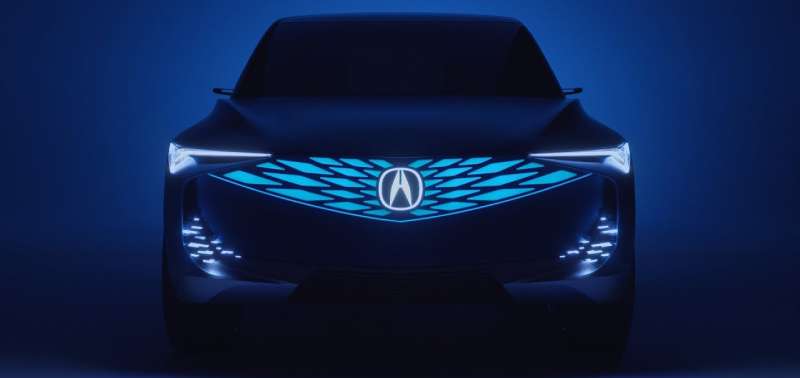
![]()

The logo is often seen in a metallic silver shade. Elegant. Sophisticated. Just like the vehicles themselves. Silver symbolizes modernity, sleekness, and a hint of mystery.
The Power of Contrast: Black and White
But then, you also see the logo in a stark contrast of black and white. The high contrast brings out the emblem, makes it pop. It’s more visible, assertive, and bold.
The Font Used in the Acura Logo
Simplicity and Class
The Acura wordmark. Simple. Clean. It uses a customized sans-serif font. Sans-serif, you ask? Those are the fonts without the tiny feet, or ‘serifs’, at the end of strokes.
They’re modern, streamlined, and clear. Just like Acura’s brand identity.
The Acura Logo and Brand Recognition
The Logo as a Brand Ambassador
A logo, it’s like a silent ambassador, right? The logo does a stellar job. It’s distinct. Recognizable. You see it, and you instantly know it’s Acura. It speaks volumes about the brand’s commitment to precision, performance, and luxury.
The Logo in Advertising and Marketing
In the world of advertising and marketing, the Acura logo is a superstar. It’s the crown jewel in print ads, commercials, and billboards. It’s a symbol of aspiration, appealing to those who seek luxury and performance in their ride.
The Acura Logo in Pop Culture


The Silver Screen and the Silver Logo
Have you noticed? The Acura vehicles, and the logo, they’ve had their share of the limelight in movies and TV shows. It’s a symbol of status, style, and high-tech elegance.
The Acura Logo in Digital Media
The digital realm, it’s a whole new game, right? Social media, online ads, video games. The logo made its presence felt here too. The logo stands out, catches the eye, and resonates with the digital-savvy crowd.
The Impact of the Acura Logo on Car Design
Inspiration and Influence
The Acura logo, it’s not just about branding. It also inspires the design and aesthetics of Acura vehicles. The precision and symmetry of the logo reflect in the sleek lines and balanced design of their cars.
The Logo as a Design Element
Ever noticed how the logo is seamlessly integrated into the car design? It’s not just slapped on.
It’s an integral part of the vehicle’s aesthetics. From the placement on the grille to the steering wheel, the logo adds a touch of class and identity.
The Future of the Acura Logo
Timeless yet Adaptable
What’s the future of the Acura logo, you ask? Well, while the emblem remains timeless, Acura is not one to shy away from innovation. As the brand evolves, so could the logo, adapting to new trends and tastes, while staying true to its core ethos.
The Logo in the Era of Electric Vehicles

Electric Vehicles (EVs) are the future, right? As Acura moves into this exciting space, the logo could play a significant role. It might evolve to represent the brand’s commitment to sustainable luxury, a blend of high-end aesthetics and eco-consciousness. The future of the Acura logo, just like its cars, promises to be an exciting ride!
FAQ On The Acura Logo
What does the Acura logo represent?
The Acura emblem, quite the conversation starter, isn’t just an ‘A’ for Acura. It’s a caliper, a tool measuring precision, mirroring the brand’s pursuit of perfection.
A nod to technology and engineering finesse, it centers Acura as a titan in luxury vehicle circles, where meticulous craftsmanship is the norm.
Is the Acura logo a letter or a symbol?
Oh, it’s sleek, it’s savvy, and it’s more than a mere letter. This emblem is symbolism perfected.
Bridging ‘A’ for Acura with an engineer’s caliper, the logo symbolizes accuracy, crafting cars with a precision that’s nearly obsessive. It’s a brand identity slamming on the gas, propelling beyond the ordinary.
Why did Acura choose their current logo design?
Picture this: Acura’s diving into the luxury auto pool. They need a splash, an emblem to turn heads. They opt for the caliper – bold, purposed, evoking automotive badge design excellence.
Acura chose it to stand out in a sea of badges, a beacon of precision crafted performance.
How has the Acura logo evolved over time?
Evolution’s slow, but Acura’s logo kept pace with the times. Birthed in the ’80s, it’s held its core – the caliper. Yet, tweaks in design have polished its presence, reflective of Acura’s own growth and brand history. It’s more than a luxury car emblem, it’s adaptability manifest.
What colors are used in the Acura logo?
Suave. That’s the Acura logo in a single word. Clad in silver and black, sporting that minimalist vibe, it’s a testament to the vehicle branding elements that capture modern luxury.
Silver for sophistication; black for the bold – it’s color doing the heavy lifting in car logo aesthetics.
How does the Acura logo compare to other car brand logos?
In the highway of logos, Acura stands proud. It sidesteps the crowded script logos, the rampant animals, the crests and shields.
Its engineered grace, symbolizing precision, sets a different kind of benchmark, much like car manufacturers seek to carve out their own road in design and identity.
Can the Acura logo be used legally by third parties?
Legal talk, right? Here’s the gist: Acura’s logo is a trademark. That means hands off unless you’ve got permission from the big guns.
It’s their corporate shield, reserved for official stuff – dealerships, authorized merch, you get the drill. For your thing? Best to steer clear or ask nicely.
What significance does the Acura logo have in branding?
In the branding rodeo, Acura’s emblem is a bucking bronco. It’s the silent bodyguard of the brand recognition game.
Each glance at the logo broadcasts luxury vehicles, top-tier automotive class, and an unspoken promise: Acura doesn’t just make cars; they craft statements on wheels.
How is the Acura logo integrated into their car designs?
Ever notice an Acura rolling by? The logo’s smack in the front, unmissable. It’s the crown on the grille, a corporate identity stamp on alloys, steering wheels, you name it. Integrated with poise, the logo is the heartthrob on Acura’s sleek, luxury car silhouettes.
What are the brand values expressed by the Acura logo?
Acura’s logo casts a long shadow of brand value. It’s precision, innovation, and a slice of the future all polished and presented.
This emblem is Acura whispering its mantra – Precision Crafted Performance, where each car is a testament to refined engineering and an upscale driving experience.
Conclusion
Surveying the landscape of luxury automotive emblems, the Acura logo stands as a paragon of the intersection between art and precision, harmonizing Japanese luxury vehicle heritage with an unwavering commitment to automotive badge design excellence. Through the lens we applied, every contour of that emblem unveiled a story — a meticulous narrative so indicative of Acura’s brand identity.
As this exploration wraps, the emblem’s caliper contours have journeyed from a simple design element into a complex beacon of Acura’s philosophy — Precision Crafted Performance — echoed within every car carrying that proud insignia, from the sleek Acura NSX to the robust Acura RDX. It symbolizes a promise, one that melds brand recognition with the tactile sensation of gripping the wheel of innovation.
Leave with this: every glance at the Acura logo from here on isn’t just a fleeting view of a car passing by; it’s a snapshot of legacy, quality, and a future-forward mindset, masterfully crafted into a single, iconic marque.
If you liked this article about the Acura logo, you should check out this article about the Alfa Romeo logo.
There are also similar articles discussing the Lexus logo, the Mazda logo, the Aston Martin logo, and the McLaren logo.
And let’s not forget about articles on the Chevrolet logo, the GMC logo, the Genesis logo, and the Maybach logo.