


Whisked straight from the vigorous heart of Milan, the Alfa Romeo logo stands not merely as a mark of high-end auto craftsmanship but a narrative woven with the threads of myth and legend.
This emblem, rooted deep in Italian luxury and racing heritage, stretches out its influence far beyond mere metal and rubber.
Here’s the scoop — you’re about to delve into the origins, evolution, and cultural potency of that undying serpent emblem.
Within this read, you’ll uncover the emblem’s kinship to the ancient Visconti family crest, and how it survived the fast lane of design shifts to remain an icon on the highways of change.
If you’re itching to know why that Biscione still makes hearts race, and how it could inspire your designs, buckle up.
From its historic ties to the Quadrifoglio cloverleaf, through the stylish grille it adorns, and right into the driver’s spirit it ignites, this article turns the spotlight on a logo that’s more than just branding—it’s a symbol that drives passion into the heart of the beholder.
The Meaning Behind the Alfa Romeo Logo
![]()

Hey, let’s dive straight into the heart of the matter. The Alfa Romeo logo is not just a pretty face, it’s a story, an enigma, a drama in its own right. Let’s dissect this, shall we?
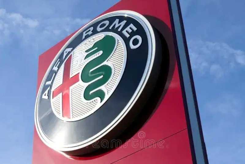
The Fierce Biscione
Here’s the deal. On the left side of the emblem, you’ll spot a big green serpent, known as Biscione. It’s not just any snake, though.
The creature is chowing down on a human, showing its fierce power. This part of the logo is a symbol of the powerful Visconti family of Milan. It’s a bold statement of the car’s Milanese roots.
The Red Cross on White
Switch to the right side of the logo, and you’ve got a bold red cross on a silver-white background. It’s not just any cross, it’s the symbol of Saint George, the patron saint of Milan. It’s a nod to the city, the birthplace of Alfa Romeo.
The History of the Alfa Romeo Logo
![]()

So, let’s take a step back in time. The Alfa Romeo logo didn’t just pop out of nowhere. It’s got a rich history that’s as intricate as the design itself.
The Early Beginnings
Back in 1910, Alfa Romeo wasn’t even Alfa Romeo yet. It was A.L.F.A., which stands for Anonima Lombarda Fabbrica Automobili.
The logo was created by a draftsman named Romano Cattaneo. He drew inspiration from the Visconti family coat of arms and the emblem of Milan, and voila, the iconic logo was born.
Through the Years
Over the years, the logo evolved. It saw minor tweaks here and there, but the core elements – the Biscione and the cross, remained intact. It’s a testament to the timeless design and the brand’s deep-rooted connection with its origin.
The Colors of the Alfa Romeo Logo
![]()

Let’s talk about the colors. There’s something about the combination of green, red, white, and blue that just works. It’s more than aesthetic, though. Each color carries a meaning.
The Vibrant Green
Green is the color of the Biscione. It symbolizes growth, harmony, and freshness. It’s a reminder of the brand’s constant evolution and its commitment to innovation.
The Bold Red
Red represents the cross, and it’s a symbol of passion, power, and love. It encapsulates the brand’s passion for speed and power.
The Soothing Blue
Blue encircles the entire logo, a symbol of depth and stability. It reflects the trust and reliability of the brand.
The Font Used in the Alfa Romeo Logo
![]()

Now, about the font. It’s clean, it’s simple, it’s bold. The all-caps, sans-serif typeface in the Alfa Romeo logo screams modernity and elegance. It’s a perfect balance to the complexity of the emblem.
The Evolution of the Alfa Romeo Logo
You know what they say, change is the only constant. The Alfa Romeo logo is no exception. While the core elements remained intact, the logo saw its fair share of tweaks and modifications.
The Shift in Design
Over the years, the logo has transitioned from a more detailed and intricate design to a sleeker and more modern look. It’s a reflection of the brand’s adaptability and its knack for staying current and relevant.
The Impact of Technological Advancements
As technology advanced, so did the design techniques. The logo started to incorporate 3D effects, gradient colors, and shadowing. This change brought a sense of depth and realism to the logo, making it more visually engaging and dynamic.
The Perception of the Alfa Romeo Logo

Last but not least, let’s talk about how the logo is perceived in the eyes of the world.
The Logo as a Status Symbol
The Alfa Romeo logo carries a certain prestige with it. It’s seen as a symbol of luxury, power, and sophistication. When you see that logo on a car, you know it’s not just any car. It’s an Alfa Romeo.
The Logo as a Connection to Heritage
The logo also serves as a connection to the brand’s rich heritage. The Biscione and the cross are constant reminders of the brand’s origin and history. It’s a logo that carries a story with it, and that’s what makes it so special.
So there you have it. The Alfa Romeo logo is more than just a pretty design. It’s a symbol of the brand’s history, its values, and its commitment to excellence. Whether you’re a car enthusiast or not, there’s no denying the power and the charm of the Alfa Romeo logo. It truly is a work of art.
FAQ On The Alfa Romeo Logo
What’s the story behind the Alfa Romeo logo?
The serpentine drama and the crimson cross—these aren’t just random artistic flings. They hail from the Visconti family crest and the flag of Milan, respectively.
This historic emblem fuses nobility with municipal pride, capturing the pulsating essence of the Italian spirit in a luxury car brand’s badge.
Why does the Alfa Romeo logo have a snake?
Ah, the snake – or the Biscione, as it’s known. This emblematic serpent is a slice of Milanese aristocracy. It represents the Visconti family’s power, one of the city’s ruling dynasties ages ago.
The serpent symbolizes renewal, like cars pushing the edge of innovation, rebirthing with every model.
Is there a meaning to the human figure in the logo?
There’s always been something mythical about that human figure being devoured by the serpent in the Alfa Romeo logo. Some peg it to ancient tales of serpents symbolizing human rebirth.
It’s a conversation starter, representing not just a meal but the idea of continuous regeneration and the Alfa Romeo’s enduring legacy.
What does the red cross on the Alfa Romeo logo signify?
The red cross is as Milanese as the Duomo itself, part of the city’s storied emblem. It’s not just a design choice; it’s a nod to the Crusaders and a symbol of civic pride. It paints Alfa Romeo not just as a car manufacturer but a bastion of Italian history and valor.
Has the Alfa Romeo logo changed over time?
Sure, it’s taken a spin or two through the years—streamlined for the modern age, but it’s always kept its core DNA intact.
The serpent, the cross, they’ve remained as the witnesses to the brand’s journey through time, while the logo’s shape and style have revved up to speed with the sleek aerodynamics of today’s aesthetics.
What does the Alfa Romeo logo mean to enthusiasts?
To the enthusiast, it’s more than just branding; it’s a stamp of performance and sophistication. It’s the promise of Italian craftsmanship, the adrenaline rush of the racetrack, and the legacy of Alfa Romeo that started in 1910.
It’s style, speed, and heart—all wrapped into one iconic symbol.
Are there hidden symbols in the Alfa Romeo logo?
Not quite hidden, but layered with meaning. For example, the green Quadrifoglio cloverleaf tucked in — it’s synonymous with Alfa Romeo’s racing success and a hallmark of their high-performance models.
It whispers of luck, but shouts of a triumph-fueled lineage, as if to say, “This isn’t just a car. It’s a winner.”
Is the Alfa Romeo logo trademarked?
Spot on. It’s not just trademarked; it’s a guarded relic of the brand’s identity. It’s a piece of legal and marketing might that says—the serpent’s allure, the cross’s bravery—they’re as much a part of Alfa Romeo as the engines that roar to life when you hit the ignition.
Why does Alfa Romeo use the color schemes of red and green in their logo?
The red and green? They’re like Italy’s heartbeat, mirroring the national flag and embodying the passion that Italian car brands are known for.
Red screams of the vigour and performance Alfa Romeo promises, while green tips hat to the racing soul, the good fortune the Quadrifoglio brings.
What’s the relationship between the Alfa Romeo logo and the brand’s identity?
Every contour of that badge is married to Alfa Romeo’s identity. It’s a symbol of Italian luxury, a whisper of Milan’s historic streets, and a shout from the racetracks.
It’s woven into the narrative that Alfa Romeo isn’t just about cars—it’s about a legacy that travels well beyond the road.
Conclusion
Wrapping this up, it’s clear—the Alfa Romeo logo is far more than a shiny ornament on a grille. Behind the bold red, the snaking Biscione, lies a saga. It’s a tale of Italian luxury, innovation intertwined with tradition, and a racing soul that refuses to decelerate.
- Milan’s echoes, from the Visconti family to the medieval streets, live through it.
- The emblem evolves, remaining steadfast to its racing heritage and historical icons.
- The luxury sports car narrative keeps unfolding, with each model donning the badge.
This logo doesn’t just signify Alfa Romeo’s identity; it revs up feelings of exclusivity, power, and an undying legacy. It’s a conversation piece, a point of pride for car enthusiasts, and a marker of what sets the brand miles apart.
Here’s to designs that roar louder than engines — those that give the world something not just to look at but to talk about and remember, long after the rubber blazes past.
If you liked this article about the Alfa Romeo logo, you should check out this article about the Lexus logo.
There are also similar articles discussing the Mazda logo, the Aston Martin logo, the McLaren logo, and the Acura logo.
And let’s not forget about articles on the Chevrolet logo, the GMC logo, the Genesis logo, and the Maybach logo.