


In the heart of Texas, a visual symbol unites fans with the fervor of basketball—a distinctive logo that’s as bold and spirited as the city it represents.
The San Antonio Spurs logo is more than just an emblem; it’s a beacon of legacy, pride, and competitive excellence. As the vibrant hues of fiesta colors dance in the streets, so does the silver and black resonate within AT&T Center, pulsating with energy at every game.
Immerse in the narrative of this iconic sports symbol. Unravel the story woven into the seams of every piece of official Spurs apparel. Discover the evolution, the inspiration behind the silhouette that graces fan gear across the globe.
By article’s end, the intricacies of this emblem will no longer be mere visuals but a storied chronicle of NBA logo history.
Dive into the elements of design, the strategic choices that render this NBA team logo a formidable avatar of a celebrated franchise.
Join me as we unveil the creative anatomy of the Spurs’ identity, an insignia symbolic of the basketball logo inspiration that ripples through the realm of sports.
The Meaning Behind the San Antonio Spurs Logo

A Design That Dances Between Tradition and Innovation
Oh man, you gotta admit, there’s something mesmerizing about the San Antonio Spurs logo. A lil’ cocktail of minimalism and the Wild West, you know?
It’s got that cowboy grit yet maintains a sleek, modern edge. When you look at that spur symbol—yeah, the U-shaped metal piece cowboys wear on their boots—you’re not just seeing an accessory. You’re taking in a whole legacy.
Cultural Footprints & Community Vibe
Think San Antonio, think Texas, think basketball culture. Right there in the logo, you can almost feel the pulse of the city’s historic streets and local basketball courts.
The Spurs logo does more than just represent a basketball team; it’s a nod to the local culture. It screams, “This is who we are,” and I think that’s pretty rad.
The Geometry of Success
Let’s get into the nitty-gritty details. The proportions and geometry here are no joke. Those clean lines, the symmetrical spur, the circle that frames it—it all comes together to create a balanced, eye-catching emblem.
When you’ve got that logo on, you’re part of a bigger story. You’re embodying precision and focus, values that resonate with the San Antonio Spurs franchise.
The History of the San Antonio Spurs Logo

The Early Days: From Chaparrals to Spurs
Before they were the Spurs, they were the Dallas Chaparrals. Yeah, doesn’t have the same ring, does it?
The logo back then was nowhere near as iconic. But as the team moved to San Antonio and got rebranded, that’s when the legendary spur made its entrance. And it’s been holding court ever since.
The Evolution: Tweaks & Transitions
This logo didn’t just pop up overnight, you know? It’s seen some tweaks here and there, minor facelifts to keep up with the times.
Like, there was this one version with a lil’ pop of Fiesta colors, paying homage to the city’s annual Fiesta San Antonio. Though the design has evolved, the central element—the spur—has always been the star of the show.
The Colors of the San Antonio Spurs Logo

A Symphony in Black, Silver, and White
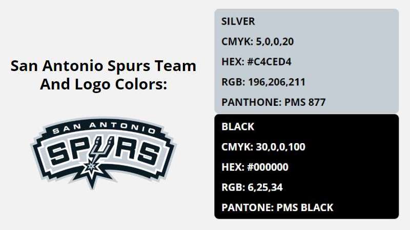
The San Antonio Spurs palette is pretty straightforward: black, silver, and white. These shades are all about class, simplicity, and boldness.
The black screams power and intimidation, while the silver and white lighten the mood, bring in that elegance. No fuss, just a color scheme that matches the team’s no-nonsense style of play.
Color Psychology & Fan Identity
Colors do more than look pretty. They create feelings and set the mood. The monochrome palette of the Spurs logo is an excellent example of less is more.
It connects with fans on a psychological level, generating a sense of loyalty and a vibe of understated confidence.
The Font Used in the San Antonio Spurs Logo

An Ode to Readability and Athleticism
While not the first thing you notice, the font in the San Antonio Spurs logo isn’t just any ol’ typeface. It’s clean, it’s straightforward, but it’s got an athletic punch to it. It’s like the typographical version of a slam dunk.
Font Selection: The Technicalities
Choosing a font is not as easy as you’d think. It has to jive with the overall look and feel, the “mood” of the logo, you know? The Spurs nailed it by going with a sans-serif font that’s easy on the eyes and syncs well with the bold, graphical elements of the design.
Fresh Merch & Iconic Moments

Apparel that Screams Spurs
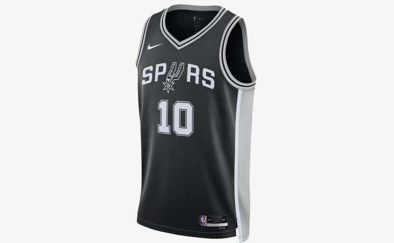
Dude, ever put on a jersey or cap with that San Antonio Spurs logo? Instant style elevation.
The logo’s appeal isn’t limited to the court; it dominates fan fashion, too. From jerseys and hoodies to keychains and car decals, that logo is everywhere.
Memorable Visual Moments
Whether it’s the dramatic final seconds of a playoff game or a community charity event, the Spurs logo often finds itself in the middle of iconic moments. It’s more than ink and thread; it’s an emotional symbol connecting the community with the players.
The Spurs Logo in Pop Culture
When the Logo Goes Viral
You might’ve seen memes or videos where the Spurs logo is the main star. It’s not just a sports emblem; it’s a cultural icon. Social media campaigns, advertising collabs, or even art installations—the logo has a life beyond the basketball court.
A Stamp on Entertainment
Movies, music videos, or even street art, you’ll sometimes find the Spurs logo subtly (or not-so-subtly) included. It’s like the ultimate Easter egg for any Spurs fan and another testament to how much this symbol represents not just a team but a community.
FAQ On The San Antonio Spurs Logo
What’s the history behind the San Antonio Spurs logo?
The origin traces back to the inception of the Spurs as a basketball force. Transitioning from the Dallas Chaparrals to the beloved San Antonio Spurs, the logo has evolved, capturing the essence of the team and its Texas roots.
Once a simple ‘Spur’ illustration, it now stands as a sleek and modern symbol of sports iconography, mirroring the team’s narrative and championship titles.
How has the Spurs logo changed over the years?
As the team’s prowess grew, so did its visual identity. Every alteration reflected the era, from the initial ‘Spur’ graphic to incorporating state-of-the-art design trends.
The logo’s transformation has been nuanced, with the most prominent change being the integration of a bolder typeface and a shift toward a more minimalistic, dynamic emblem.
What are the official colors of the San Antonio Spurs?
Silver and black reign supreme, a color palette that’s become synonymous with the Spurs. These hues symbolize the team’s sleek professionalism and enduring spirit.
Occasionally, fiesta colors make an appearance, celebrating the city’s vibrant culture and providing a playful twist to the classic color scheme.
Why is the Spurs logo so popular in merchandise?
Distinct and instantly recognizable, the logo’s popularity is a testament to the Spurs loyal fan base and the team’s influential brand.
From jerseys to hats, it adorns a myriad range of merchandise, fostering a sense of belonging among fans and securing its place as a cultural entity within both the NBA and the global sports merchandise market.
What’s the significance of the spur element in the logo?
The ‘spur’ is a nod to cowboy culture, an SEO entity inherently Texan, evoking a sense of rugged individualism and endurance.
It’s emblematic of the team’s fighting spirit and serves as a call-to-action, spurring fans and players alike toward unity, passion, and resilience on and off the court.
Is there a meaning behind the U-shaped figure in the Spurs logo?
Yes, it’s a stylized spur that reflects the team’s name and serves as a physical representation of the motivational push—the spur to action. As part of the design, it reinforces the connection between the team, its values, and the history of South Texas.
Can I use the San Antonio Spurs logo for my own projects?
The Spurs logo is a trademarked image, meaning it’s legally protected. Its usage without permission could lead to copyright infringement. For personal projects, it’s best to reach out to the team for authorization, but commercial or public use typically requires a licensing agreement.
Has the NBA ever objected to the design of the Spurs logo?
As far as public records show, no official objections have been lodged by the NBA regarding the Spurs logo’s design. It aligns with the league’s branding requirements and is an approved emblem within the NBA’s marketing and merchandise portfolios.
What inspired the current design of the Spurs logo?
The current design is the result of a deliberate blend of modern aesthetics and homage to San Antonio’s heritage.
The iconic spur symbol draws from South Texas culture, while the sleek, minimalistic design trends hint at the team’s contemporary character. Designers sought to encapsulate both heritage and modernity in a single, enduring image.
How do fans perceive the change in the Spurs logo?
Reaction has been varied, as with any change that impacts a beloved symbol. Some embrace the updated branding for its freshness and contemporary appeal, viewing it as a physical representation of the team’s evolution.
Others cling to the nostalgia of past designs, emphasizing the emotional connection fostered over years of support for the Spurs legacy.
Conclusion
In the realm of design, every stroke, every shade carries meaning. The San Antonio Spurs logo—with its bold lines and stoic, stark hues of silver and black—is an entity that speaks. It speaks of tenacity, of cultural richness, rooting itself as an icon within the NBA team logos landscape. Remarkably, it remains as much a symbol of professional basketball, as it is intertwined with the spirited chorus of San Antonio’s legacy.
In this exploration, we’ve journeyed through its history, understanding how the essence of the logo has adapted, mirroring the team’s evolution. We’ve dissected its components, from the majestic spur to the profound simplicity of its color story. The logo stands firm, a beacon of identity in the realm of sports.
As our exposition concludes, let this emblem remind us all—design is more than an aesthetic choice; it is the unspoken language connecting fan gear, franchise, and community alike.
If you liked this article about the San Antonio Spurs logo, you should check out this article about the Portland Trail Blazers logo.
There are also similar articles discussing the New Orleans Pelicans logo, the Philadelphia 76ers logo, the Boston Celtics logo, and the Indiana Pacers logo.
And let’s not forget about articles on the Los Angeles Clippers logo, the Oklahoma City Thunder logo, the Phoenix Suns logo, and the Charlotte Hornets logo.