


Dive into the fusion of history and artistry that shapes the Indiana Pacers logo, a beacon of athleticism and identity. At its core, this emblem encapsulates the spirit of Indianapolis, echoing tales of basketball battles and the pursuit of glory within the NBA’s bustling arena.
As you journey through this article, you’ll unravel the logo’s evolution, its colors resonating with a fervor for sports and civic pride.
Discover how this vibrant insignia not only showcases the team’s branding but also stitches the fabric of sports merchandise markets with threads of blue and gold.
By article’s end, you’ll grasp the transformative power of sports team trademarks—from crafting visual identities to kindling fan passions. We’ll delve deeply, examining not just the aesthetics but the essence of the Pacers emblem design that adorns everything, from jerseys to the heart of a city.
Prepare to embark on an exploration of a symbol that isn’t merely an icon; it’s a reverberation of the Hoosiers’ legacy.
The Meaning Behind the Indiana Pacers Logo

The Essence of Speed
Pacers – the word itself oozes motion. When we chat about the logo, it’s all about speed.
It derives its inspiration from the pace cars in auto racing. And isn’t Indiana known for its racing heritage? Yeah, that’s the connection.
The logo serves as a metaphorical nod to the Indianapolis 500 and the pace cars that lead the way.
Basketball Elegance
Peep at the logo and there’s a basketball, right? It ain’t just there because they play basketball. It’s a clever representation of the sport, state, and speed. Everything combined into one sleek icon.
The History of the Indiana Pacers Logo

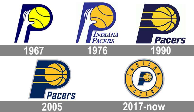
Vintage Vibe
Back in the 60s, the Pacers debuted with a hand-dribbling basketball. Vintage? Totally. It had its own charm. But like all things, it evolved.
Modern Transformations
As years rolled by, the logo morphed. The basketball got swankier, with cleaner lines and a contemporary twist. The Pacers were not just sticking to tradition, but adapting, showing they’re in the present game.
The Colors of the Indiana Pacers Logo

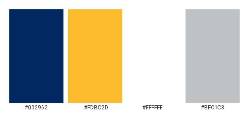
Navy Blue: The Dominance
Navy isn’t just a color. It’s an emotion, a statement. It screams dominance, making its mark every time you gaze at the logo. It symbolizes power and integrity.
Gold: The Grandeur
Gold, pals, ain’t just bling. In the Pacers logo, it epitomizes excellence and the pursuit of championship glory. Every team wants the gold, both in medals and legacy.
The Font Used in the Indiana Pacers Logo

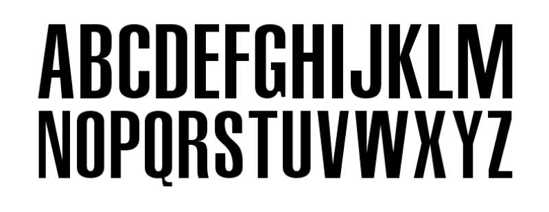
Simplicity Meets Style
The font? It’s got no frills but it’s got the thrills. Simple, readable, but carries a weight. When you read “Pacers”, it feels like a team that’s grounded but ready to sprint.
Evolution of Fan Merchandise

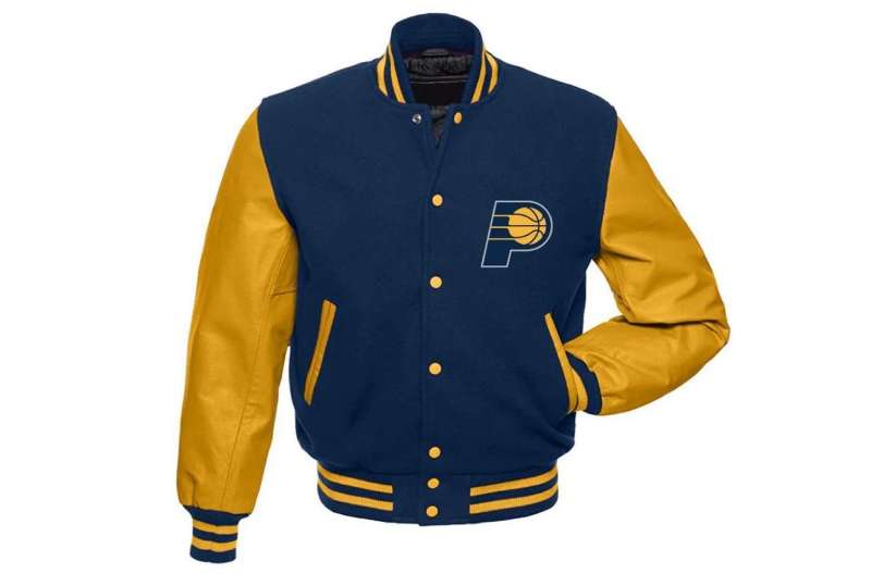
From Tees to Tattoos
Ever noticed the Pacers logo on fan gear? From tees to caps, it’s all over. And some die-hard fans? They’ve inked it. That’s brand loyalty for ya!
The Influence on Pop Culture
Logos ain’t just for games. They find their way into music videos, street art, and even movies. The Pacers logo, with its distinctive design, has made a mark beyond the court.
The Indiana Pacers Logo in Global Context
International Recognition
Basketball is global, and so is the Pacers’ logo. Fans from Tokyo to Timbuktu rock the Pacers merchandise, not just because of the sport but because the logo’s design transcends boundaries.
Adapting to Global Trends
In an era of minimalistic designs, the Pacers’ logo remains iconic, keeping its core elements while adapting to global aesthetics. It’s a global emblem in a local jersey.
And that’s the Indiana Pacers logo for ya, not just a design, but a story, an emotion, and a legacy. Cool, right?
FAQ On The Indiana Pacers Logo
What is the significance behind the Indiana Pacers logo?
The Indiana Pacers logo elegantly interweaves Indianapolis history, creating an icon reflecting speed and heritage.
It traces back to the state’s pivotal role in harnessing racehorse and Pacers teams, thus charging forward with an emblem that epitomizes continual motion and the indomitable spirit of basketball.
How has the Pacers logo evolved over time?
A dynamic journey through visuals, the Pacers logo has maneuvered from its classic 1970s NBA script to the sleek, modern lines seen today.
Retaining the blue and gold palette, the emblem design transitions mirror the franchise’s growth and the city’s vibrant evolution in the sporting realm.
Why are the colors blue and gold chosen for the logo?
Blue and gold stand proud, channeling Indiana’s state flag and the hues of sportsmanship. These colors in the Pacers branding reflect loyalty and excellence, mirroring the state’s fervor for basketball while stitching unity across various forms of Pacers merchandise.
What elements are included in the Pacers logo design?
A blazing basketball signifies the sport’s fiery heart, accompanied by the swift “P” harnessing the pace. Together, they highlight the team’s journey within the NBA, embracing iconic sports emblems and infusing them with a local touch, crafting a unique visual identity.
Is there a mascot depicted in the Pacers logo?
While the logo itself doesn’t feature a mascot, it radiates the energy associated with one. The Pacers emblem design forgoes anthropomorphic charm, opting instead for bold graphic representation. The mascot, Boomer, complements the logo, adding character off the court.
What is the public perception of the Pacers logo?
Public sentiment often admires the Pacers logo for its simplicity, nodding respect to classic sports logo evolution. It evokes community and togetherness, much like a modern crest that fans and players rally behind as the franchise’s visual identity.
How does the Pacers logo represent the team’s brand?
The logo encapsulates the Pacers’ brand, a conduit of professional basketball crests and the spirit of Indianapolis. It’s more than a visual; it’s the team’s narrative and aspiration, a badge worn with pride by players and fans alike, forwarding the brand in the NBA team insignia context.
How often does the Pacers logo get updated?
Updates are sparing, ensuring longevity and brand consistency. Strategic changes are implemented to keep the logo contemporary, yet faithful to its origins—reflecting the vibrant flux of Indiana Pacers’ dedication to stay ahead in the visual stakes of sports team trademarks.
Has the Pacers logo been involved in any controversies?
The Pacers logo has remained relatively uncontroversial, steering clear of contentious redesigns or misinterpretations. It stays rooted in the collective sports logo evolution, focused on the team and region’s proud NBA identity, avoiding the pitfalls common in visual overhauls.
How does the Pacers logo influence team merchandise?
The Pacers logo is instrumental, weaving through the tapestry of team merchandise graphics.
Its striking presence encourages brand loyalty and aids in the merchandise’s appeal, from jerseys to memorabilia, spurring a vibrant market aligned with the iconic sports emblems of the Pacers’ illustrious brand.
Conclusion
In culminating our expedition through the essence of the Indiana Pacers logo, we’ve embraced the rich tapestry of design elements that mirror the team’s dynamism. This emblem, steeped in a legacy cradled by the competitive spirit of the NBA, does more than articulate an identity—it breathes life into the fabric of Indianapolis.
- The logo’s blue and gold palette paints pride across the state’s canvas.
- Its evolution whispers tales of iteration, adhering to the pulse of sports logo evolution.
- The graphical elements champion a narrative that’s inherently Hoosier—a saga of passion and unity.
Approaching branding as a seamless symphony where each note contributes to the overall melody, the Pacers emblem design reveals that the convergence of form and meaning births a resonating icon. Engaging with this logo is an ode to understanding not just a visual motif but a community’s heartbeat. And so it stands: a beacon of anticipation for every game, every cheer, an unwavering symbol of basketball kinship.
Staring at the logo, one sees the crossroads of past and present—a visual legacy, illustrating the march of time, the echo of sneakers on court, and the perennial roar of the Indiana crowd.
If you liked this article about the Indiana Pacers logo, you should check out this article about the Portland Trail Blazers logo.
There are also similar articles discussing the San Antonio Spurs logo, the New Orleans Pelicans logo, the Philadelphia 76ers logo, and the Boston Celtics logo.
And let’s not forget about articles on the Los Angeles Clippers logo, the Oklahoma City Thunder logo, the Phoenix Suns logo, and the Charlotte Hornets logo.