

Within the electric arena of NBA fervor, an emblem embodies the spirit of a team, its community, and its relentless pursuit of greatness. The Los Angeles Clippers logo—a tapestry of history, color, and design—not only adorns jerseys but captures imaginations.
Delving into this insignia, we unravel more than threads; we find echoes of sports team logos past, refreshed identity, and the Los Angeles sports culture that envelops it.
This storied franchise’s basketball insignia serves as both a rallying cry for the Clippers fan base and an essential piece of its brand identity.
Through this article, a map to understanding the significance and evolution of the Clippers’ visual identity will unfold.
We explore the symbology behind the LA Clippers brand, the influence of sports merchandising, and how a simple graphic design can encapsulate the essence of a city’s love for basketball.
Prepare to dive deep into a tale written not only in hues and lines but also in the passion and dreams of a community.
The Meaning Behind the Los Angeles Clippers Logo

Oh, logos. These are not just simple graphics, mate! They tell a story, an emotion, an identity.
The Emblem and its Strength
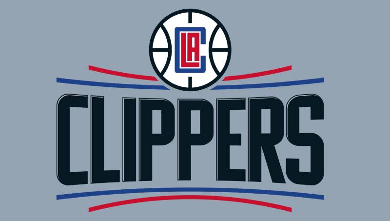
Have you ever given a good look at the Los Angeles Clippers logo? It’s not just about basketball.
The emblem gives off vibes of strength, resilience, and spirit. Basketball is full of dynamism, and so is this emblem. You see that cool basketball silhouette right at the center? That’s the team’s heartbeat!
The Intertwined LA
The logo beautifully wraps the initials “L.A.” around the basketball, portraying how the game is intertwined with the city’s essence. LA is not just a place, it’s a vibe, a culture. And this intertwining showcases that unique bond.
The History of the Los Angeles Clippers Logo
![]()

Ah, history! Every great thing has a story.
The Evolution
The Clippers weren’t always the Clippers. They started as the Buffalo Braves.
With time, as they relocated and changed, so did their logo. But one thing stayed consistent: the emblem’s soul. As they transitioned to the West Coast, their logo adopted more vibrant shades and designs. Talk about a glow-up!
The Rebrands
Throughout the years, the Clippers logo underwent a few facelifts, taking on various shapes and colors. But the spirit of competition and sportsmanship? Oh, that remained untouched.
The Colors of the Los Angeles Clippers Logo

Color me impressed!
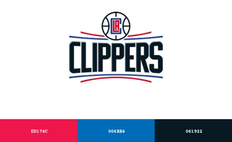
The Power of Red, Blue, and Black
The dominant shades of red, blue, and black in the Clippers logo are not only visually striking but also deeply symbolic. Red embodies passion, energy, and action.
Blue stands for trust, loyalty, and confidence. Black, often overlooked, is a color of strength, authority, and sophistication.
Together, these colors encapsulate the team’s essence, spirit, and determination.
The Dash of White
Subtle but significant. White speaks of purity, innocence, and wholeness. It complements the vibrant red and blue, giving it a balanced, cohesive look.
A Pinch of Black
The Font Used in the Los Angeles Clippers Logo

Let’s talk type!
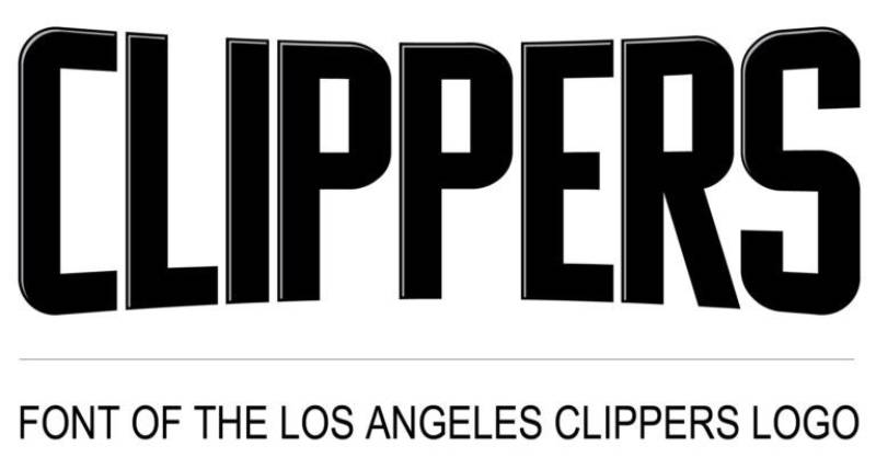
The Strength in Letters
The font used in the Clippers logo is bold and edgy. It signifies strength and dominance on the court. Fonts speak, and this one yells “Victory!”
Uniqueness in Simplicity
Though not overly complex, the font’s uniqueness lies in its simplicity. It’s easily recognizable, ensuring the team’s brand stands out.
The Influence on Pop Culture
Merchandise Mania
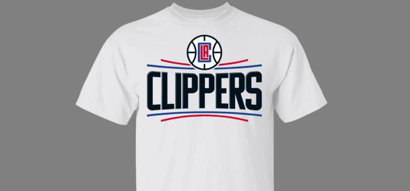

From jerseys to hats, the logo’s aesthetic appeal has turned it into a pop culture symbol. Fans proudly flaunt merchandise with this iconic design.
Beyond the Basketball Court
This logo doesn’t just belong on the court. Its influence has seeped into music videos, fashion lines, and even street art around LA.
Design Inspirations from the Logo
Modern Minimalism
The Clippers logo showcases how powerful minimal design can be. In today’s age, where less is more, it stands as an inspiration for budding designers.
Bold and Beautiful
Its vivid colors and robust font style give a masterclass on how to be bold yet sophisticated in design. Ideal for anyone looking to make a statement.
FAQ On The Los Angeles Clippers Logo
What’s the History Behind the Los Angeles Clippers Logo?
The Los Angeles Clippers logo has sailed through a sea of change since the team’s inception. Once borrowing from its San Diego roots, today’s design is drenched in red, white, and blue, a patriotic nod to American heritage and an embodiment of the team’s resilent spirit.
Why Does the Los Angeles Clippers Logo Use Its Particular Colors?
Red, white, and blue, the Clippers’ hue trio, wasn’t random choice. They’re classic, quintessentially American colors, synonymous with passion, purity, and steadfastness—qualities that the franchise aims to project.
Are There Hidden Meanings in the Los Angeles Clippers Logo?
Beyond the surface, the Clippers logo is a masterclass in symbolism, the basketball enveloped in the ‘C’ hinting at unity, while the sharp typeface mirrors the team’s forward-thinking dynamism and aggressive strategy on court.
How Often Has the Los Angeles Clippers Logo Changed?
Not unlike other NBA team emblems, it’s seen several facelifts since its origin. From a simple sailboat to the contemporary basketball crest, the Clippers’ emblem evolution reflects an ongoing quest for identity and brand perfection.
What Was the Public Reaction to the Latest Logo Redesign?
In the swirling winds of public opinion, reactions to the latest Clippers branding were mixed. Die-hards felt nostalgic, while others embraced the fresh, modern twist, a constant cycle of reverence and rebirth that sports logo redesigns often stir up.
Who Designed the Current Los Angeles Clippers Logo?
The current Clippers graphic design is a product of a collaborative blitz—internal team minds converging with outside creative muscles, marrying franchise legacy with contemporary style under the guidance of Clippers’ ownership and executive leadership.
Does the Los Angeles Clippers Logo Represent Anything About the City?
Absolutely, it’s a beacon of Los Angeles sports teams, melding the city’s bold, trailblazing vibes with athletic excellence—a visual fist-bump to LA’s eclectic and dynamic sensibilities.
How Do the Los Angeles Clippers Incorporate the Logo Into Their Marketing?
Cleverly! The Clippers visual identity features across all merchandise, from towering billboards to the fabric of fans’ jerseys—a strategic omnipresence that keeps the brand soaring in visibility and pride.
What Are Some Unique Merchandise Items With the Los Angeles Clippers Logo?
From the expected jerseys and caps to unexpected realms—the Clippers’ iconic basketball symbols find their way onto an array of items like limited-edition sneakers, collectible figures, and even tech accessories, each carving out its slice of Clippers lore.
How Does the Los Angeles Clippers Logo Compare to Other NBA Logos?
It stands its ground with confident lines and a bold color story. While each NBA branding marks a unique territory, the Clippers’ ensign is undeniably ensconced within the league’s pantheon of iconic visual identities.
Conclusion
As the final note on the Los Angeles Clippers logo reverberates, one sees more than a mere emblem; it’s a narrative wrought in contours and colors, a silent herald of a team’s saga and its city’s heartbeat. This logo stretches beyond the court, interweaving with Los Angeles sports culture, painted with strokes of NBA team emblems, capturing eyes and hearts alike.
- A look back gives due reverence to the evolution, from humble motifs to iconic branding.
- The present speaks boldly, embracing modern graphic design principles.
- The future? It’s a canvas awaiting its next Clippers branding masterpiece.
Carrying the torch of Los Angeles sports teams, this logo stands not just for the players but for every supporter, every Clippers fan base member whose loyalty is as fierce as the lines defining this insignia. So here’s to the logo that transcends basketball—a symbol that embodies the energy of a metropolis, its ambitions, and its indomitable Clippers spirit.
If you liked this article about the Los Angeles Clippers logo, you should check out this article about the Portland Trail Blazers logo.
There are also similar articles discussing the San Antonio Spurs logo, the New Orleans Pelicans logo, the Philadelphia 76ers logo, and the Boston Celtics logo.
And let’s not forget about articles on the Indiana Pacers logo, the Oklahoma City Thunder logo, the Phoenix Suns logo, and the Charlotte Hornets logo.