


A singular surge of adrenaline pulses through the veins of a stadium roaring with fans; at the heart of it, colors clash and thunder rolls, emblazoned on the chests of athletes and supporters alike.
The Oklahoma City Thunder logo, more than a mere emblem, paints the saga of a franchise steeped in the soulful rhythms of basketball.
In the forge of competitive sports, where heritage and future collide, visual branding becomes the silent herald of identity.
This very beacon of pride takes center stage, a product of meticulous crafting, pulsating with the heritage of the Oklahoma City Thunder and the spirit of the NBA. It is an avatar for what every jump shot, every cheer, and every heart-stopping buzzer-beater represents.
Readers will peel back layers of this iconic symbol, traversing through the tessellations of its history, the subtleties of its design evolution, and the seismic impact it leaves on sports marketing, team branding, and the throngs of basketball fans tethered to the heartbeat of the game.
Discover the alchemy in the synthesis of form and color that forges an emblem resonating far beyond the hardwood—each curve, hue, and stitch a silent testament to the Oklahoma City heritage.
The Meaning Behind the Oklahoma City Thunder Logo
![]()

Yo, let’s dive deep into this. The Oklahoma City Thunder logo isn’t just some random design that they picked out of a hat. Nah, there’s some cool and symbolic stuff going on.
Symbols and Vibes
Firstly, thunder. Think about it. It’s powerful, it’s electric, and it’s unpredictably wild. Just like the game of basketball, yeah?
The logo’s design tries to capture that essence. You see those bold lines and the sharp edges? That’s the intensity and the drama of the game.
Community Connection
The shield in the logo? Well, it’s more than just a fancy shape. It represents protection and unity. It’s like a nod to OKC’s tight-knit community, saying “Hey, we got your back!”
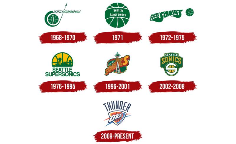
The History of the Oklahoma City Thunder Logo

Let’s hop into the time machine and rewind a bit, alright?
Beginnings
When the team moved to OKC from Seattle, it wasn’t just about shifting cities. It was a fresh start. A new identity.
That’s when they decided they needed something that screamed “OKC” but also “We mean business!” So, in came the Thunder and its logo.
Evolution? Not So Much
Unlike other teams that keep tweaking their logos every few years, OKC decided to keep it real. They’ve pretty much stuck with the original essence, and why not? If it ain’t broke, don’t fix it!
The Colors of the Oklahoma City Thunder Logo
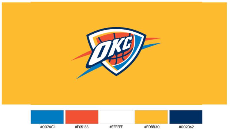

Colors ain’t just colors, mate. They tell a story.
Blue: Depth and Loyalty
The blue in the logo? That’s depth, stability, and trust. It’s like the deep bond the team shares with its fans. Unbreakable.
Orange: Energy and Excitement
Then there’s the burst of orange, which is all about enthusiasm, creativity, and determination. Like that adrenaline rush when you’re a point down with seconds to go.
The Font Used in the Oklahoma City Thunder Logo
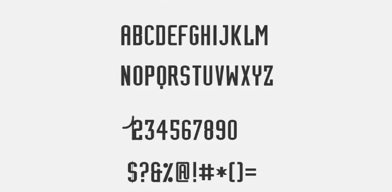

Man, don’t even get me started on fonts!
Bold and Intense
The font they’ve used? It’s strong, modern, and a tad aggressive. Just like the team’s playstyle. It’s not fancy cursive or anything; it’s to the point. And that’s what the Thunder is all about.
The Influence on Merchandise
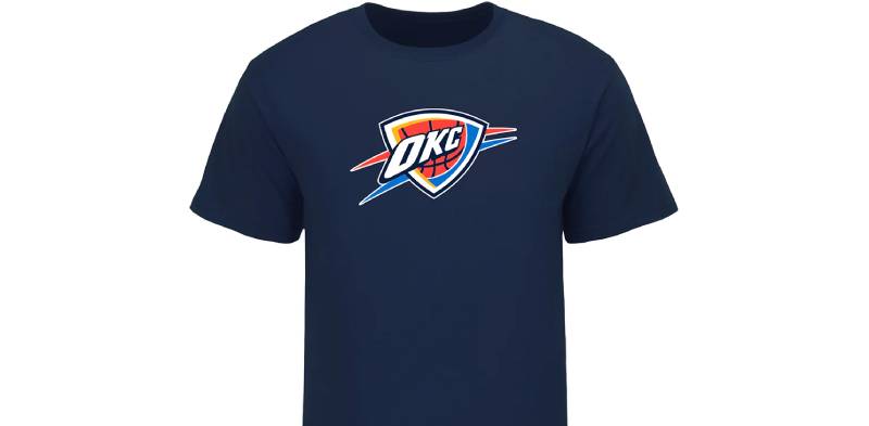

Ever notice how the OKC merch is so rad?
Street Style Influence
The logo’s vibe seamlessly transitions into apparel, making it more than just fan gear. It’s got that street style touch, thanks to the logo’s modern appeal.
More than Just Jerseys
From caps to kicks, the design elements derived from the logo have made OKC merchandise a popular choice, not just among fans, but style enthusiasts too.
Fan Reception and Legacy
What do the fans think? That’s what really counts, right?
Instant Love
When the logo first rolled out, it was a hit. Fans felt it was a perfect representation of the team and the city.
Legacy
With time, it’s not just become a logo but a symbol of pride for the community, making its mark not just in the NBA but in the world of sports logos overall.
FAQ On The Oklahoma City Thunder Logo
What inspired the design of the Oklahoma City Thunder logo?
The clash of energy and spirit ignites the concept behind the logo. It embodies the very essence of Oklahoma—dynamic, resilient, and proud.
Elements are drawn from the state’s rich heritage, paired cleverly with basketball’s vigor to create an icon that truly stands for the team’s identity.
How has the Thunder logo evolved over the years?
It’s a tale of transformation. Initially, the emblem carried a simplicity, mirroring the team’s inception. Progressively, it evolved, embracing sophistication while retaining its core—depicting a basketball ensconced in a vibrant storm, each iteration a nod to an unyielding connection to the local community and fans.
What do the colors in the Thunder logo represent?
Each hue pulsates with symbolism. The Oklahoma sky inspires the blue, representing loyalty and unity. The sunset’s orange injects energy and passion, while the yellow lightning bolt delivers a jolt of intensity.
A burst of thunderous force encapsulated in a palette that’s uniquely Thunder.
How is the Oklahoma City Thunder logo different from other NBA logos?
Distinctiveness reigns here. The Oklahoma City Thunder emblem marries a love for the sport and regional homage, avoiding a mascot to instead harness natural phenomena as its muse.
It forays beyond the basketball realm, uniting a city’s spirit in its very fiber; a contrast to peers on the NBA canvas.
Can the Thunder logo be used for personal projects?
In the realm of intellectual property, the Thunder logo is a guarded jewel. Its usage is regulated stringently by NBA guidelines.
Personal projects must navigate these waters carefully—unauthorized use could lead to infringement woes, dampening creative spirits with legal storms. Seek permission, for legal peace is key.
What role does the logo play in Thunder’s branding?
It’s the cornerstone of visual language speaking volumes in silence. The logo waves the flag of brand recognition, a beacon drawing in fans, shaping the Thunder narrative.
It crowns merchandise, dominates promotional material, and tints the digital presence, embodying a consistent and resonant visual branding anchor.
Who designed the Oklahoma City Thunder logo?
The name remains a riddle, wrapped in the enigma of team collaboration. Though no single graphic designer steps into the spotlight, it’s known that expertise flowed from the NBA’s reservoir.
A team effort, leaning on branding savvy, gave us the storm-charged image etched in Thunder history and identity.
Why does the Thunder logo not include a bison?
Choice steers this ship. The Thunder team sought a logo that could encapsulate both the team’s verve and Oklahoma’s essence.
While the bison stands as a state symbol of strength and resilience, the choice to harness the power of atmospheric phenomena won, channeling an electrifying spin on conventional sports logos.
How does the logo impact Thunder’s merchandise sales?
It’s a siren’s call to collective identity. The logo, splashed across a sea of merchandise, beckons Thunder followers far and wide.
Each sale is testament to its success—a stitch of unity, a woven patch of loyalty, converting fans into walking emblems of team support, pride, and revenue streams.
What cultural significance does the Thunder logo hold in Oklahoma City?
More than a logo, it represents a heartbeat. It’s etched into the skyline, a cultural monolith connecting people under a shared banner.
Its significance stretches beyond the court—it’s a badge of belonging, a communal emblem etched into the very fabric of Oklahoma City’s vibrant, thundering heart.
Conclusion
Embarking on a journey through the design cyclone of the Oklahoma City Thunder logo, we’ve danced with colors that echo the Oklahoma skies, traced the outlines that map a team’s history, and felt the electricity of an identity potent in its representation of a community united by hoops.
- It’s not mere branding.
- It’s storytelling through art.
- It’s pride fused with pixels.
Measured in strokes and shades, the emblem is a beacon in the NBA universe – not just a logo, but a visual anthem that fans wear with spirited defiance. Now acquainted with its every curve, hue, and intention, we step back, eyes focused on the wider canvas, recognizing the fusion of sport and artistry.
Let the clap of thunder linger, knowing it’s emblematic of the cacophony in the Chesapeake Energy Arena and beyond. There’s a palpable sense of wonderment in how a simple symbol can capture so much—the rush of the game, the voice of Oklahoma City, and the pulse of the Thunder.
If you liked this article about the Oklahoma City Thunder logo, you should check out this article about the Portland Trail Blazers logo.
There are also similar articles discussing the San Antonio Spurs logo, the New Orleans Pelicans logo, the Philadelphia 76ers logo, and the Boston Celtics logo.
And let’s not forget about articles on the Indiana Pacers logo, the Los Angeles Clippers logo, the Phoenix Suns logo, and the Charlotte Hornets logo.