

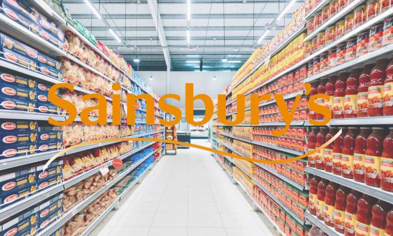
Imagine unfurling a map of contemporary branding; the Sainsbury’s logo blazes like an orange beacon, central and unmistakable.
This icon serves not merely as a marker for a British supermarket chain but as a potent symbol etching the nexus between consumer and culture.
Within this treatise, embark on an exploration of the logo’s colorful odyssey—a tapestry woven from threads of brand evolution and visual identity.
As the proverbial needle dances across the fabric, discover the artistry and strategic acumen behind Sainsbury’s emblematic insignia.
Expect revelations that dissect the retailer visual representation, insights that radiate beneath the vibrant hues and beyond the stark curves of typography—each line a deliberate stroke of marketing genius.
Unearth the chronicles behind the brand recognition that the Sainsbury’s logo garners, gripping consumer psyche with magnetic fidelity.
By the final punctuation, anticipate a profound comprehension of the nexus where graphic design converges with corporate branding; where logo redesign lovingly coexists with heritage.
Herein lies the cultivated essence of a behemoth in the retail landscape, its logo less a mere symbol and more a storyteller of unparalleled consumer perception.
The Meaning Behind the Sainsbury’s Logo

A Mark of Trust
The Sainsbury’s logo, familiar to many, isn’t just a mere emblem. It stands as a hallmark of trust. When people see this logo, they immediately associate it with a legacy of providing high-quality products and an unwavering commitment to customer service.
This is more than just branding—it’s a relationship that has been cultivated over many years.
Symbol of Evolution
Over the years, the Sainsbury’s logo has adapted to the changing times while retaining its core identity. This ability to evolve reflects the brand’s commitment to stay relevant and adapt to changing customer needs, yet remain rooted in its values.
The History of the Sainsbury’s Logo

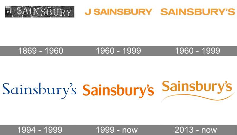
From Humble Beginnings
It’s quite the journey, you know. The logo we recognize today didn’t just pop up overnight.
It has its roots deep in the company’s inception when it was just a small store. Over time, as the brand expanded and its offerings grew more diverse, so did its emblematic representation.
A Series of Transformations
The logo underwent a few revamps, each capturing the spirit and essence of the times. Yet, no matter its design, it’s always felt familiar, like an old friend. That’s the beauty of a brand that knows its identity and stays true to it.
The Colors of the Sainsbury’s Logo


A Hue of Confidence
Orange, the most dominant color in the Sainsbury’s logo, isn’t just picked at random. It embodies energy, warmth, and the zest of life. It’s a bold choice, representing a brand that’s confident in its mission.
Contrasting Balance
The white backdrop serves as a serene canvas, bringing balance and allowing the vibrant orange to pop. It’s like the quiet but essential base in a dish that lets the spices shine.
The Font Used in the Sainsbury’s Logo
Simple Yet Distinctive
Fonts can tell you a lot. The typeface in the Sainsbury’s logo is clear and straightforward. No fancy frills. It speaks of a brand that’s transparent in its dealings, direct in its approach, and places the customer above all.
A Balance of Modern and Timeless
Though modern in its look, the font has a timeless feel. It’s not swayed by fleeting trends. Instead, it reflects a brand that wishes to be a staple in households for generations to come.
The Impact on Pop Culture
A Symbol in Daily Life
Beyond the aisles and checkouts, the Sainsbury’s logo has etched its mark in popular culture. It’s there in films, on TV, in music videos, subtly making its presence felt. An icon that resonates with the masses.
The Merchandise Magic
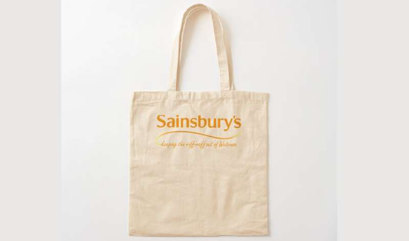

Ever noticed those cool tote bags or mugs with the Sainsbury’s logo? The brand has smartly woven its identity into everyday products, making it a part of daily life in more ways than one.
Evolution in the Digital Age
A Logo That’s Everywhere
In today’s digital-first world, the Sainsbury’s logo isn’t confined to just storefronts. From apps to social media to online stores, it adapts and thrives. Its design ensures it looks crisp whether on a mammoth billboard or a tiny smartphone screen.
Keeping Up with the Digital Crowd
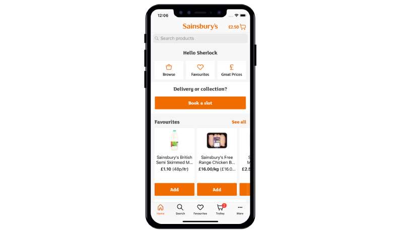

Sainsbury’s understands the pulse of the digital age. The logo, in all its vibrant glory, seamlessly integrates into various digital platforms, ensuring the brand’s essence is felt everywhere.
FAQ On The Sainsbury’S Logo
What’s the history behind the Sainsbury’s logo?
It’s a tapestry of tradition. The logo has evolved, embodying the company’s adaptability and commitment to retail innovation.
From its inception, it was designed to resonate with the British populace, projecting brand evolution with every tweak, echoing retail industry dynamics and consumer trends.
Why does the Sainsbury’s logo predominantly use orange?
Orange exudes warmth, vibrancy, and energy—qualities Sainsbury’s aspires to be associated with.
It’s central to their brand colors, a strategic choice that stands out on the busy streets of the United Kingdom, reflecting the brand’s visual identity and facilitating instant brand recognition.
Has the Sainsbury’s logo undergone significant changes?
Yes, the emblem has undergone discernible metamorphoses. With every refresh, there’s a reflection on current design trends and brand positioning.
It’s the company’s way of ensuring the corporate branding remains relevant, mirroring supermarket logo design practices, and maintaining a robust connection with consumers.
Who designed the current Sainsbury’s logo?
The current Sainsbury’s logo was crafted by a team of adroit designers, tasked with the challenge of blending heritage with a modern touch. Their focus—creating a symbol that narrates the company’s history while ushering in its contemporary spirit.
What do the colors and fonts of the Sainsbury’s logo represent?
Typography and color in the Sainsbury’s logo are wielded with purpose. The orange signifies zest and approachability, while the font, distinctive and bold, imparts a sense of reliability and trustworthiness—a nod to the UK retailer insignias‘ principles.
How does the Sainsbury’s logo reflect the company’s values?
The Sainsbury’s logo mirrors corporate ethos—quality, service, simplicity.
Each aspect, meticulously considered, assures customers of the brand’s dedication to consumer perception, ethical sourcing, and community involvement—a true reflection of Sainsbury’s foundational beliefs.
What impact has the Sainsbury’s logo had on the brand’s marketing strategy?
Significant. The logo anchors Sainsbury’s comprehensive marketing strategy, acting as a cornerstone for campaigns. It’s a symbol that informs brand aesthetics, around which narratives of quality, innovation, and customer focus gracefully orbit.
How does Sainsbury’s protect its logo from misuse or imitation?
Vigilance and legal shielding—it’s how Sainsbury’s safeguards its iconic logo. By setting stringent branding guidelines, pursuing trademark protection, and monitoring usage, Sainsbury’s keenly prevents dilution of their visual identity.
In what ways does the Sainsbury’s logo influence consumer behavior?
Consumer perception is swayed subtly yet powerfully by the logo. It encapsulates a shopping experience—one that promises both familiarity and novelty. This perception is pivotal, coaxing customers back, time and again, into Sainsbury’s welcoming embrace.
How does the Sainsbury’s logo compare to those of its competitors?
It stands tall. Amidst competitors, the Sainsbury’s logo is a testament to creativity and consistency.
While others shift and pivot, Sainsbury’s maintains a steady balance of recognition and freshness, ensuring its brand recognition remains as tenacious and inviting as ever.
Conclusion
Stepping back, the journey across the vibrant landscape of the Sainsbury’s Logo concludes here. A tale woven through hues of orange, united by typography that speaks both authority and warmth, ultimately solidifying an icon in the retail sector.
- The logo’s narrative is rich; emboldened by past brand evolutions, the image stands testament to a relentless pursuit of relevance.
- Each curve and shade serves as a beacon, guiding consumer perception through familiar aisles, enticing them with a promise of quality—a silent vow etched in every emblematic flourish.
- As a symbol, it’s a steadfast flag under which countless transactions and interactions unfurl, nurturing the Sainsbury’s corporate image with every exchange.
In retrospect, the logo doesn’t just signal a store’s entrance; it’s a threshold to an experience crafted carefully through decades of tradition and innovation. It’s this profound understanding that the iconic logo isn’t merely a motif—it’s the heartbeat of a brand, resonating with every shopper’s step into the world of Sainsbury’s.
If you liked this article about the Sainsbury’s logo, you should check out this article about the 7-Eleven logo.
There are also similar articles discussing the Albertsons logo, the Aldi logo, the Carrefour logo, and the Circle K logo.
And let’s not forget about articles on the Costco logo, the Giant logo, the QuikTrip logo, and the Safeway logo.