

Icons speak. Louder than words, even louder than actions. The QuikTrip Logo says much about the journey of a brand that fuels America—literally and metaphorically. It’s a visual handshake, a first impression gracing countless corners from Tulsa to Tampa.
Delving into this symbol, we explore not just a design, but the pulse of a retail giant.
You’re in for an odyssey through color schemes and corporate identity, unveiling a tale of gas stations, convenience, and a relentless pursuit of customer satisfaction.
Within these lines lies insight on building a branding colossus. The evolution of a simple emblem reflecting an empire of travel centers, the subtleties of marketing collateral, and the symphony of graphic design—all distilled into the emblem we know and trust.
Grasp the essence of visual storytelling as we dissect how QuikTrip Kitchens and QT Rewards enrich this tapestry. By journey’s end, a logo won’t just be a logo. It will be a story—a franchise’s beating heart, an emblem of customer perception.
Embark, and see beyond color and form.
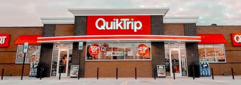
The Meaning Behind the QuikTrip Logo
![]()

Hey there, fellow design enthusiast! Let’s dive deep into the QuikTrip logo and what it represents.
A Glimpse into Simplicity
At first glance, the QuikTrip logo might just seem like another company emblem. But that’s the beauty of it. Its simplicity draws you in. Quick stops and fast service – it’s all subtly embedded in the design.
More than Just a Name
The brand’s name, “QuikTrip,” emphasizes speed and efficiency. But, when you look closely at the logo, you’ll see this commitment to ‘quickness’. The very flow and structure scream “fast”, “convenient”, and “on-the-go.”
The History of the QuikTrip Logo
Alright, gather ’round for a little story time!
Beginnings and Branding
Years back, when QuikTrip first started, logos were mostly about brand recognition. But over time, as the company evolved, so did its image.
Transformations Over Time
The QuikTrip emblem has witnessed its fair share of tweaks and turns. Yet, it’s always kept its essence, ensuring that it resonates with the times but doesn’t lose its core identity.
The Colors of the QuikTrip Logo


Color me intrigued! Ever wonder about the color choices in logos? Let’s decode the QuikTrip palette.
Red: The Dominant Hue
Red in the QuikTrip logo isn’t just for style. It signifies energy, passion, and action. When you’re zipping in and out of a convenience store, that’s the vibe you want, right?
The Subtle Complements
And then, there’s the balancing act with neutral shades, offering a contrast and ensuring the logo isn’t shouting too loudly at you.
The Font Used in the QuikTrip Logo
Typeface matters, my friends! Here’s what’s up with QuikTrip’s.
Bold and Direct
Have you noticed how the QuikTrip logo’s font stands tall and proud? It’s bold. It’s direct. No frills, no fuss. It aligns with the brand’s promise of quick service.
Modern Appeal
While the typography has a certain classic charm, it also vibes with contemporary design aesthetics. It’s a bridge between the brand’s rich past and its modern-day relevance.
The Symbolism of the Logo
Ever wondered if there’s more than meets the eye?
Circles and Continuity
Notice the circular motifs? Circles often symbolize wholeness, unity, and continuity. It’s like QuikTrip’s way of saying they’ve got everything you need, in one full loop.
Directional Cues
There’s a sense of movement in the logo. Everything seems to be pointing forward, indicating progress and forward momentum. It’s all about moving ahead!
Pop Culture References

You see logos everywhere. Movies, music videos, and more. How has the QuikTrip logo fared?
Spotted in the Limelight
The logo isn’t just on storefronts. It’s made sneaky appearances in popular culture, weaving its way into the backdrop of our lives.
The Iconic Status
When a brand’s logo gets a nod in pop culture, it’s like a rite of passage. It moves from being just a brand emblem to a cultural icon.
FAQ On The QuikTrip Logo
What does the QuikTrip logo represent?
The logo signifies more than a simple emblem; it’s a symbol of convenience intertwined with adventure. Its red and yellow hues echo energy, capturing the essence of bustling travel centers and the commitment to fuel both vehicles and people on the go.
Who designed the QuikTrip logo?
While specifics may be shrouded in the annals of corporate history, it’s certain that the design was likely commissioned by QuikTrip’s founders to embody the brand’s vibrant and welcoming ethos. The outcome? A recognizable beacon for travelers nationwide.
Has the QuikTrip logo changed over the years?
Indeed, it has evolved to keep pace with design trends and reflect the company’s growth. Subtle yet impactful changes have ensured the logo remains current while retaining its iconic elements, staying true to QuikTrip Corporation’s roots.
What are the colors of the QuikTrip logo?
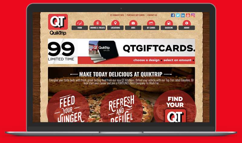
The emblem showcases a palette of red and yellow, a fusion of warmth and vitality. These colors are not just visually arresting; they’re also deeply entwined with the QT brand identity, beaming from pumps to storefronts.
Can third parties use the QuikTrip logo?
Third-party use is tightly regulated to protect the brand. Strict brand guidelines dictate usage, safeguarding QuikTrip’s trademark and ensuring consistent representation across all platforms and franchisees.
What is the significance of the font in the QuikTrip logo?
The font choice exudes simplicity and clarity. Such crisp typography aims for instant recognition, mirroring the brand’s straightforward approach to customer satisfaction in their travel centers and through services like QuikTrip Kitchens.
How is the QuikTrip logo used in marketing?
It serves as the cornerstone of QuikTrip’s marketing collateral. From billboards to QT Rewards, the logo’s consistent application fosters strong brand recognition and a cohesive visual branding strategy that customers can trust.
How does QuikTrip protect its logo from misuse?
QuikTrip vigilantly monitors and enforces its trademark rights to prevent unauthorized or misleading representations of their logo. Legal protocols are in place, ensuring brand integrity is uncompromised.
What psychological impact does the QuikTrip logo have on consumers?
Its vibrant colors and recognizable design are crafted to inspire confidence and a sense of familiarity. Ultimately, it’s more than marketing; it’s an invitation to a reliable refueling haven—a signpost for quality and comfort on the road.
What are the challenges in designing a logo like QuikTrip’s?
Designing a logo to represent an empire demands a blend of simplicity and memorability. The challenge lies in balancing a timeless quality with adaptability to resonate across convenience store chains and leave an indelible mark in the minds of consumers.
Conclusion
Embarking on this journey, unraveling the narrative behind the QuikTrip Logo, it’s clear that a logo’s tale is rarely told in a single stroke of the designer’s pen. Across landscapes of bustling commerce, the emblem stands, a beacon among the convenience store chains, speaking in hues louder than words.
This saga woven through time—a saga of brand evolution, corporate identity, and color psychology—leads us to a culmination. The trademark we’ve dissected carves its identity deep in the canvasses of gas stations and QT Kitchens, echoing a brand’s heartbeat with every glance.
In the symphony of visuals, every curve, color, and character sings. As travelers and consumers move in a world blanketed with symbols and signs, QuikTrip’s marquee is a melody that lingers, not just a guidepost on the road but a landmark in the retail branding universe.
And so, from red and yellow swirls to typographic clarity, this icon transcends mere shape and form. It is an invitation, an assurance, a familiar smile—an unwavering promise of what lies within.
If you liked this article about the QuikTrip logo, you should check out this article about the 7-Eleven logo.
There are also similar articles discussing the Albertsons logo, the Aldi logo, the Carrefour logo, and the Circle K logo.
And let’s not forget about articles on the Costco logo, the Giant logo, the Safeway logo, and the Sainsbury’s logo.